 I make a habit of going to the SEO Ranking Factors panel at SMX Advanced every year. You always get some good information and interesting thoughts on what’s changing in the world of ranking factors, and this year was no exception. Here is my overview of the three speakers and what they shared.

Marcus Tober, Searchmetrics
Marcus began his talk by focusing on the role that correlation studies play in the industry and how those studies have taken a great deal of flak lately.
In my opinion, this flak has been a bit unfair and the result of many people misusing the insights reported. When people misuse information, it’s not the information that is at fault.
As a result of the feedback (flak) given, Marcus took a very different look at eight different vertical markets across a number of different factors to evaluate how behavior varies across each of the sectors.
The sectors he selected to examine were:
- Dating.
- Wine.
- Recipes.
- Fitness.
- Furniture.
- Car tuning.
- Divorce.
- Credit.
The first factor that Marcus spoke about was the use of microdata. For this, he compared the dating, recipes and divorce markets. The results were as follows:

As you can see in the line charts, there are no major correlations, but clearly, microdata is used much more in recipe sites, probably because of the visual benefits they bring due to the markup of the search results.
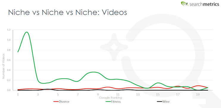
For the next sector, he looked at videos in the divorce, fitness and wine verticals. Here you can see that the correlation in the fitness sector is quite high for the first few positions:

Note the absence of videos in both the divorce and wine sectors. They would not really fit the intent of the user in either market, but fitness does, as seeing how to do an exercise is important.
The third factor Marcus presented was the number of paragraphs on the page, and for this, he looked at divorce, fitness and wine again. Here you can also see little correlation between the number of paragraphs and ranking in any market sector. However, the usage level is highest for divorce, followed by fitness, with wine coming in a distant third:

Social signals was the next segment, using the dating and divorce sectors. Here are the results:

Here we see a strong correlation between the number of social signals and ranking for the dating sector, but none for the divorce sector. This makes sense, though there is a lot of social chatter about dating, but not so much for divorce. Of course, this doesn’t mean that social is a ranking factor, just that there are strong business reasons for dating sites to be active on social media.
Keep in mind Facebook, LinkedIn and Google Plus have all stopped publishing like and share counts for a reason. If the social media sites don’t value these signals, why should a search engine?
In his next section, Marcus focused on factors that are measured by Lighthouse Tools, which are built into Chrome. The factors that the toolset looks at include:
- Performance.
- Progressive Web Apps (PWAs).
- Accessibility.
- Best practices.
- SEO.
Looking at the first factor, performance, we see no positive correlation:

Interestingly, no page scored higher than a 41, and the scale goes to 100. At least at this point in time, you don’t need to have an 80 to be better than most. However, with PWAs we see a clear correlation, as shown here:

In contrast, we don’t see any correlation at all with accessibility or best practices. There was also shown to be some correlation with what Google calls search engine optimization (SEO), as shown here:

Mordy Oberstein, Rank Ranger
This presentation began by looking at the rate of change we see in the search results since 2015.
Mordy presented data across five different niches where they looked at the top five results across a wide range of queries to see how much they have changed.
By 2016, they saw the same results in the same order only 27 percent of the time, and by 2018, this has dropped to 10 percent of the time.
The number of sites involved in the results was 1,316 in 2016 and then jumped up to 2,200 by 2018. Clearly, there seems to be a lot of volatility in the results. Mordy added one more look at this by showing Organic Visibility charts for Progressive, State Farm and Allstate. Here is the chart for Progressive:

Tons of volatility there! Next, he provided an example of a specific search query:

Note the presence of consumerreports.com and nerdwallet.com in the results here. They are informational sites. It seems Google has mapped in a new intent.
Looking at the entire top 10 results, six were sites where you can buy insurance, and four were sites where you can learn about car insurance.
The lesson here is that the e-commerce sites should consider creating informational content, even for queries with such clear commercial intent.
RankRanger tried 100 more “buy” type keywords:
- 40 percent of all the results were informational.
- 69 percent were best product listings.
- 31 percent were buying guides.
This fits very well into a concept that I call ranking slots. If you have an e-commerce site, and four of the current rankings in the top 10 for your target phrase are informational, you have only six available slots for your commercial page in that search engine results page (SERP).
What will help you rank for the e-commerce slots will be different from what will help you rank for the informational slots. You’ll need to focus your content and optimization strategy on what best meets with the user’s intent.
In the case of “buy car insurance,” if you’re trying to capture traffic with an informational page, what is the likely intent of a user who typed that phrase, but who actually wants information?
This is definitely an area for us all to start thinking about!
Jeff Preston, Disney
Jeff works on the entertainment side of Disney, with sites like disney.com, starwars.com and espn.com.
Jeff started us with two stories to drive home the point he was making about data. The first one is the tragic story of Air France Flight 447, which crashed into the Atlantic Ocean.
A major reason this horrific plane crash happened was that it had a faulty sensor. This broken senor caused other sensors to send bad data, and the pilots misread the data as a result.
The second flight was a Quantas flight where one engine blew up. They had 58 error messages and over 100 alarms going off, with fuel leaking out of the plane. Yet the pilots managed to land the plane on a 4,000-meter runway, even though the calculated runway length they need to make it safely was 3,900 meters. This meant they had zero margin for error.
In this second scenario, the pilots succeeded in landing the plane because they were able to ignore the noise in the data and focus on the data that mattered most.
Jeff was making the point that in the world of SEO, we also have too much data, and it’s easy to run in the wrong direction with it. It’s important to stay calm, learn from the case studies of people you trust and conduct your own tests.
During the rest of Jeff’s presentation, he discussed some of the tests he has done.
Moving a site to https
Disney has migrated dozens of sites to https. Bottom line: The company has seen no material impact on rankings or traffic.

Does AMP have a traffic impact?
Jeff says in the US, the answer appears to be no:

This is not surprising, as Google has said that accelerated mobile pages (AMP) are not a ranking factor. Note, if you have a news site and appear in the AMP News Carousel, that should drive incremental traffic, though those placements would not be seen by traditional rank-tracking methods.
In contrast, experiments on international sites did appear to go up on a UK-based site where AMP was implemented:

There was an even larger spike in Brazil.
Removing low-quality content
On one of its sites, Disney removed about 80,000 low-quality uniform resource locators (URLs) and saw a large-scale spike in traffic. Ironically, this test led to realizing a second important SEO point, which is what happens when you later remove critical 301 redirects from a site.
On the site where they removed the low-quality URLs (the spike up in the chart below), some period of time later 301 redirects that were part of a prior site move were removed. Even though they were about two years old, it quickly became evident that Google was still dependent on them as traffic took a deep dive:

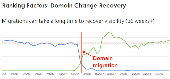
The speed of recovery from a domain change
Jeff shared two case studies of domain name changes. The first one took quite a long time to recover:

However, in a second example he shared, it took only about four weeks to recover. The point here is that “your mileage may vary!”
Last, but not least, they had one experience on a site where a canonical loop was introduced into the site. Evidently, Google still has not let traffic recover from this loop yet, even though the fix has been in place for some time.
Summary
It’s clear that big changes have unfolded over the past year. Google has done a lot to remap how ranking is done and has made great strides in mapping the best user intents to each search query. In particular, this varies by market, and it varies within each type of query.
More than ever, understanding the needs of your target user base is essential, as this sets you up best for success in reaching those target users through search.
In addition, you need to learn to read the data the right way. Don’t get lost in the overall noise and claims about what’s happening out there. Focus on what matters, and you’ll be in a much better position to succeed.
Opinions expressed in this article are those of the guest author and not necessarily Search Engine Land. Staff authors are listed here.
