Guidelines for great creative from the world’s largest video sharing site
At a time when it’s never been more difficult to cut through the clutter and resonate with your target audience, it’s crucial that marketers master the skill of developing stand-out digital creative. In a recent post for Smart Insights, we learned that 63% of users ages 18 to 34 are using ad-blocking software, whilst 41% of internet users overall block ads. And a recent survey from Australia showed that it has become increasingly difficult for consumers to recall any distinctive TV advertising (good or bad), yet another indication that not only are consumers switching their viewing habits but are also zoning out when exposed to poor creative.
YouTube has recognized the difficulty brands face to create content that effectively captures their audience’s attention and have developed a very helpful and comprehensive Playbook for Creative Advertising. The playbook is a detailed guide based on a collection of learnings from some of the most successful videos and campaigns on YouTube and is a fascinating read for brands, businesses and agencies alike.
The playbook covers a range of topics, from channel and advertising strategy to measurement and optimization. However, for this post I wanted to look a little closer at the section on Guidelines for Great Creative and summarise the key takeaways along with some additional insight and examples, I gathered from Google directly ahead of the playbook’s launch earlier in the summer.
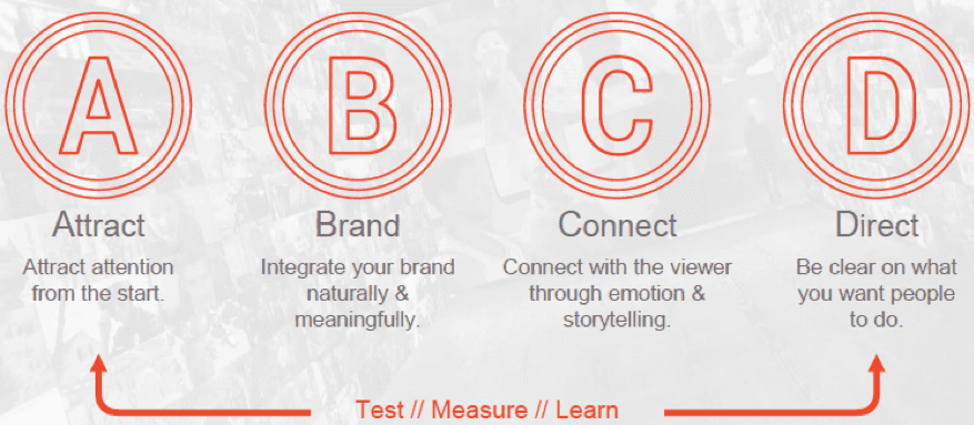
The ABCDs of effective creative for YouTube
Based on a data pool drawn from over 6,000 ads across multiple sectors in the FMCG industry and a range of insights from TrueView Brand Lift studies, Google have put together a set of recommendations that give marketers a creative framework when concepting ads for YouTube. The recommendations fall under the following categories:
- Attract
- Brand
- Connect
- Direct
A: Attract
As an advertiser, you have limited time and opportunity to capture your audience’s attention. When a consumer is on YouTube, they’re often there for fun or entertainment so you need to produce something compelling enough to stand out.
Frontload your story arc
Regardless of the format, it’s crucial to capture the audience’s attention early on. Users have limited time and attention so it’s important to hook them quickly.
This example from US nappy brand Luvs is a great example of a story that immediately grabs your attention from the very beginning before cleverly taking you quickly and concisely through to the core brand message.
Use people and familiar faces
Featuring a person, especially someone familiar, famous and/ or friendly, at the beginning of the ad can lead to increased viewership. As humans, we’re automatically drawn to creative that features someone we can relate to and YouTube have indicated that celebrities, women, and children often have the highest impact.
Although this example from Always is part of the wider #LikeAGirl campaign focusing on female empowerment, the YouTube ad is still very effective in its own right. In addition to using clear branding from the very beginning, as a viewer you’re immediately drawn into the story and introduced to a group of young women and girls explaining their experiences.
B: Brand
Although standing out and grabbing attention is key, it’s essential to have clear, prominent branding within the ad. Whilst it’s important to integrate your brand within the first 5 seconds, the trick is to do so naturally so that the brand feels a part of the story rather than something separate.
It’s also worth acknowledging that how you feature your brand will depend on the brand metrics you’re looking to influence. For example ad recall is the extent to which an ad is remembered regarding a brand, product or service, whilst brand awareness is the extent to which consumers are familiar with a particular brand of goods or services. All the tactics featured with the ‘Brand’ section (as well as the other three sections), can impact these two metrics in different ways.
Brand placement
Instead of using logos or overlays within the creative, consider how you can use the product itself. This feels a lot less clunky and is also much more effective. Although ads with the brand in the first five seconds have higher ad recall, they’re more likely to be skipped. And YouTube studies have also shown that viewers are less likely to watch and remember ads when they feature floating brand logos that aren’t actually on the advertised products.
The Zach King Tic Tac ad is a great example of making the product and brand the star of the show. It helps that the content itself is clever and fun, and in addition to this the logo features in the first five seconds and is intrinsically tied to the product throughout the ad.
Reinforce with audio
YouTube studies have shown that audio mentions of the brand correlate with increased Brand Lift. When implemented in the right way, the audio mentions can be used to reinforce the visual branding as seen in this short but effective ad from Pampers:
C: Connect
The power of storytelling is something we’ve covered on Smart Insights previously and is one of the most effective ways of connecting with the viewer and keeping them engaged for longer, all of which is associated with a lift in brand awareness and consideration.
Create an emotional connection
Developing content that has an element of humour or suspense is associated with an increase in ad recall. In some ways, this might seem obvious but for a small brand looking to break-through this is one of the best opportunities to stand out and build awareness when up against larger opposition with established brands and deep pockets, something Dollar Shave Club proved back in 2012:
Break the fourth wall
Interacting with the viewer directly, as demonstrated in the Dollar Shave Club example above, is a great way of creating a point of difference by challenging the audience’s preconceptions. Breaking the fourth wall has been associated not only with an increase in brand lift but also an increase in engagement with the narrative, both during and after the story has ended. Here’s another classic example from Old Spice:
D: Direct
The final element in YouTube’s creative principles is concerned with what you want the viewer to do after you’ve captured their attention. This is a crucial step in digital and something not always possible with traditional video and therefore a great opportunity to signpost a next step and boost brand lift at the same time.
Use a clear call to action
Be clear and direct with what you want people to do, whether that’s clicking through to your brand’s website, watching another video or subscribing to your channel. As with any marketing campaign or programme, the CTA enables us to entice viewers to take an action that benefits us in some way so it’s important to be single-minded with the message we use.
The ‘Best Day of my Life’ ad from Shell uses a very CTA throughout the video, utilizing the #makethefuture hashtag at the beginning and end of the ad (as well as within the video title) and the ‘Show Your Support’ info card in the top right corner, which links through to the company’s donation Tumblr site.
Take advantage of YouTube’s interactive platform features
The info card in the Shell ad referenced above is just one example of a number of YouTube’s interactive platform features that enables marketers to enhance their calls-to-action within the videos and provide an easy path to continued engagement and an opportunity for viewers to take an action right from the video player.
In addition to info cards, there are also call-to-action overlays, shopping cards and end screens. You can find more information on interactive elements on Google Support.
The US ad for the Kia Niro is a great example of a brand using multiple interactive features and call-to action throughout the video to guide the viewer throughout the ad. In addition to a constant ‘subscribe’ CTA overlay in the bottom right (unfortunately, not present on this example), the ad also uses different info cards at different stages of the ad (including ‘Want to learn more?’, ‘See the Tech’ and ‘Infotainment’) and an impactful end screen with different ways to view more entertaining content, information about the car and click through to get a quote on the Kia website.
Summary
When you’re brainstorming and crafting video concepts, remember ABCD:

Make an impact from the very start to grab the viewer’s attention, integrate the brand naturally to improve ad recall, establish a connection with good storytelling and finally use a clear CTA to drive brand lift and make it easy for viewers to take action.
