The trend in web design lately, among other things, is the use of large, high-quality, professionally-produced imagery. This is because images improve the visual appeal of your company’s website and can help effectively tell your company’s story. Uwishunu has done an excellent job of complementing the content and strengthening its brand with its evident, yet minimal, use of photography.
Despite an internet of resources, most websites don’t use imagery well. Considering the quality of these images, chances are that most companies just haven’t given imagery as much thought as it needs or deserves. With platforms like Wix or Squarespace putting so much emphasis on website building, it’s difficult to fully comprehend the need for stunning imagery online. What they forget to tell you is that with great imagery comes great responsibility: write good content and use in moderation.
There is an extensive list of dos and don’ts when it comes to website design and content creation, but we’ve narrowed them down to a few that will immediately improve your online presence.
Do tell a story.
Don’t regurgitate details, but do craft a narrative. There is a place for more more information or specifications—products. Craft a story and punctuate them with images to help guide your user. Don’t just tell them how you do a thing; you need to tell them why and sell the idea.
Do use your images as needed only.
Content should be the focus; images should help illustrate the narrative. You want to tell your company’s story or any story, but like any children’s book, your audience needs visual stimulation to prevent reader’s fatigue. Highlight those key points in the story with some visual dynamite. A purposefully used image will engage your readers and keep them wanting more. Not enough imagery leaves the reader bored and willing to bounce. Too many images overwhelm them. It’s a delicate balance.
Don’t put your images on the back burner.
The biggest problem I see in sites is that images are often an afterthought or used only as design elements. We’ve all seen those sites with parallax animations and video backgrounds with very little text. Not only are you leaving your audience with a need for more information, but you’re also effectively confusing them. Without content to inform your image choices, you have only visual fluff that can alienate some users, or at the least, restrict discovery of your content. The primary goal of any website is to keep people engaged and well-fed. Any hurdles put up to the contrary affect that bottom line.
Do focus on the details.

This is important, especially if you sell products. One of the biggest downfalls of corporate sales is poorly photographed product and lack of detailed imagery. Anyone who compares products online expects to see items at 360 degrees, and in some cases, a look at the inside. Just because the back or side is unimportant to you as a company doesn’t mean it’s not important to your users. Apple, and recently Microsoft, are fantastic at exploring the ins and outs of a product visually. Though it’s always best to A/B test product pages to increase conversions, I venture to guess that you’ll find people convert better when given a detailed look, empowering them to make an informed decision.
Don’t rely too heavily on stock photography sites.

Your website’s imagery should be authentic and personal. I can’t stress this one enough. Stock photos have their uses, but your site isn’t one of them. To be successful online, you need to be seen and heard and stand out above the rest. Stock photos, if anything, tend to throw up a red flag for me; and I expect this is probably true for most people. Stock photo-heavy sites tend to feel fake or staged. Remove your stock photos and replace them with pictures of your actual company, product, story, or location. You’d be amazed how quickly you’ll improve the feel of your website.
If you have to rely on stock photos for some reason, look toward options like Unsplash or Pexels, which provide a source of professional, crowd-sourced images. To your users, these images will appear far more honest than the traditional stock photo site.
Do have an image hierarchy or focus.
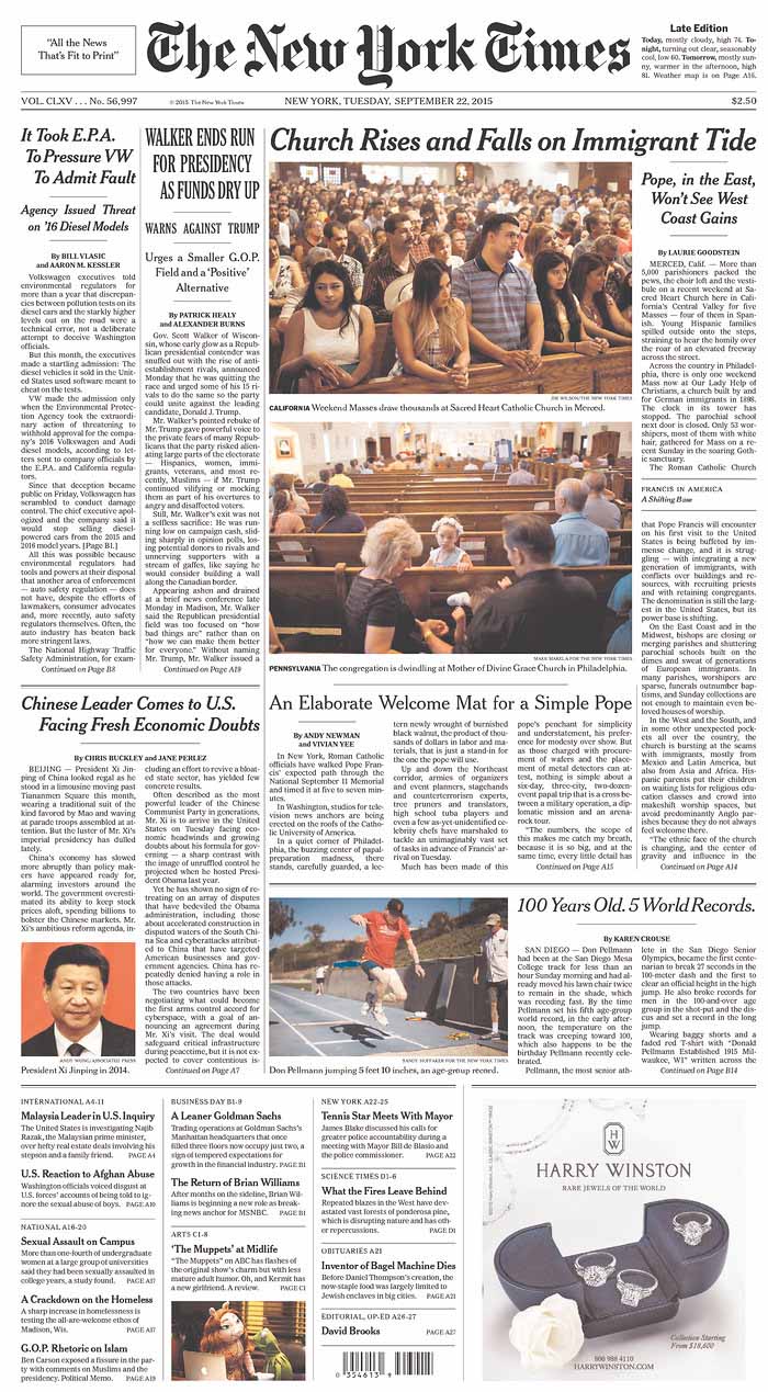
Like content, images carry varying weight, some more significant than others. I like to tell people to refer to The New York Times or any newspaper to see how images are used.

You’ll find that the more relevant the content, the larger and more powerful the images. This should be true for websites, as well. Featured or focus content should be more important or more focused, supporting images next and so on.
Do take advantage of the GIF format (if it makes sense).
When most people think of GIFs I imagine they’re also thinking about memes, but the file format works informatively as well. From Amazon to Google and Apple to that app that just launched, companies are utilizing GIFs to help bring life to their products. The most common use of GIFs in this way are screen captures―desktop or app-specific animations to illustrate a feature or highlight a function (see below). Windows users could use an app like LICEcap. And while Mac users can also use it, I prefer Recordit.

Whether taking advantage of the meme craze to have a little fun, or showing a short repeating clip of video (or more likely a screen capture), a GIF is sure to help give your page a little pizzazz.
Summation
Websites are an expression and extension of your brand and your images are a direct representation of the quality of your work. Your users expect you to be authentic and they’re smart enough to know when things aren’t, in reality, how they appear online.
Trust us. This is what we do.
