Style Guides can offer a lot of value to your organization’s digital presence and even reduce cost associated with design and development time. We’re going to talk about why you need one, but first we need to talk about what a Style Guide actually is.
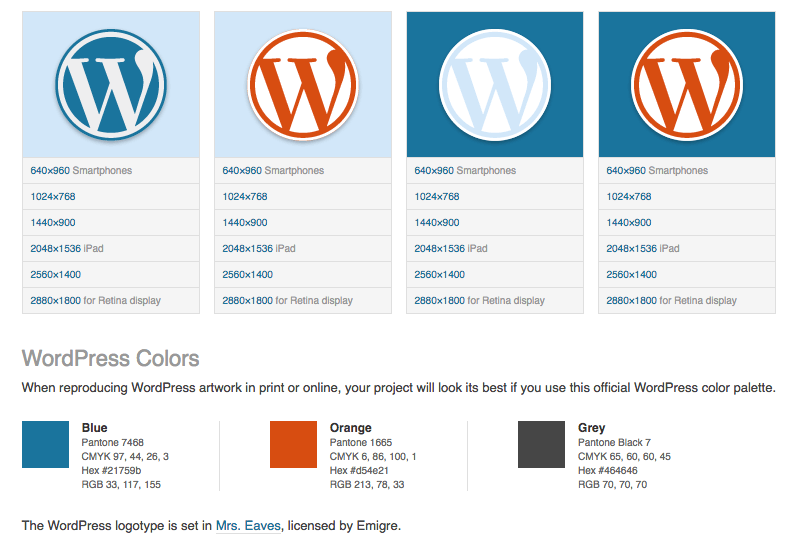
You can think of Style Guides in the same light as the more traditional Brand Guidelines. In fact, they will normally include at least baseline information from the Brand Guidelines themselves (as long as the organization actually has some branding information). Where the two diverge are that Brand Guidelines normally only include which fonts should be used, basic color palettes, and logo usage. Style Guides, on the other hand, go far more in depth.
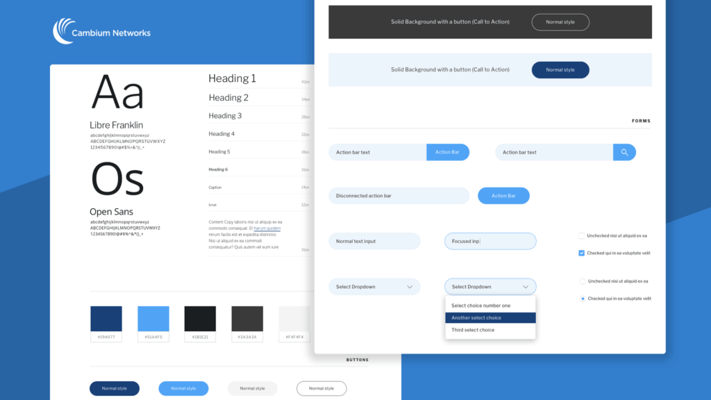
Take a look at a section of the WordPress Brand Guidelines for an example, and compare that with the screenshot from a Style Guide we built for one of our clients.


Brand Guidelines provide good information and help to ensure brand consistency across different mediums, but when it comes to actually building a product like a website or app, it leaves a lot of room to the imagination—a little too much room.
Style Guides go beyond basic color, font, and logo usage to provide a very detailed road map of how commonly used website elements should look and be used, such as buttons, form inputs, navigation systems, headings, body text, etc.
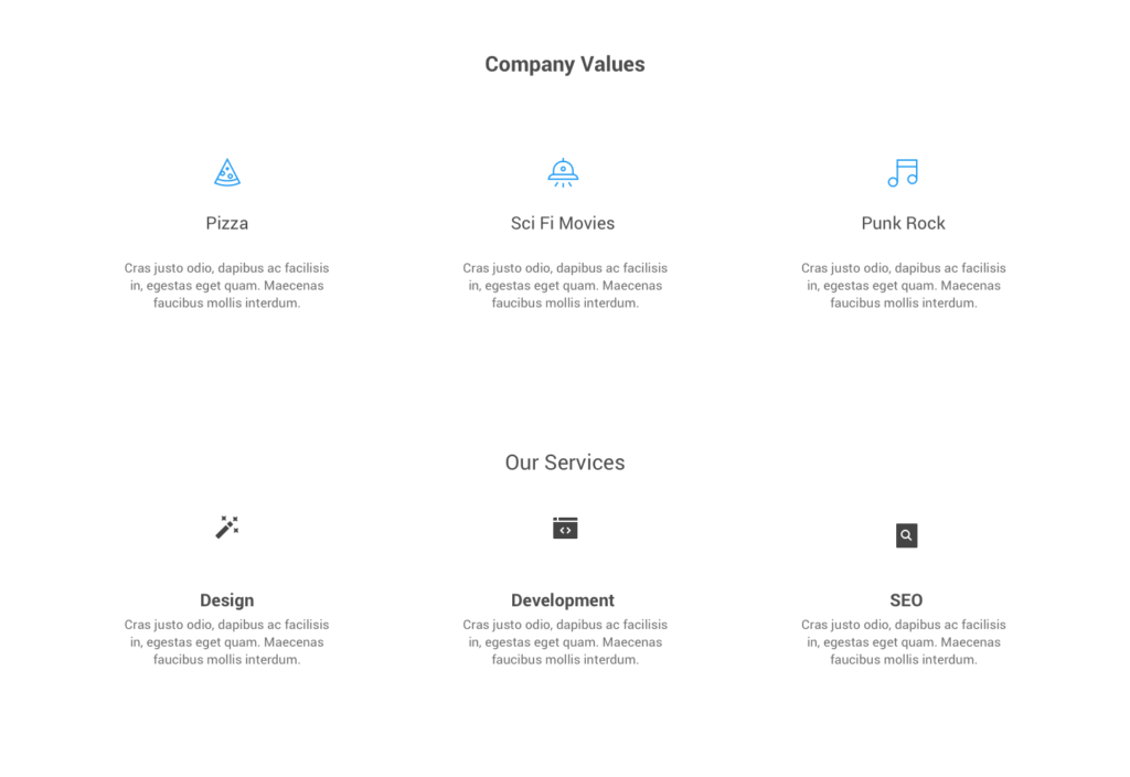
Another great thing about Style Guides is that they help us create a visual language for your product. Take a look at the screenshot below where the two sections have different icon styles, fonts, and typography. It’s not a huge difference, but it’s enough to make the page look unprofessional. Now, multiply that across 40-60 pages and multiple sites and you have a pretty big problem on your hands. This is especially true if your goal is to position yourself as a professional and trustworthy business (remember, people are wary of poorly designed websites).

Style Guides are normally created in whatever design program the rest of the product is built with, such as Sketch or Photoshop. They can also be converted to code and used to rapidly piece together new pages of the site without even creating full mock-ups. There’s a great post on our blog about the difference between Style Guides and Pattern Libraries, which goes into more detail about using code-based Style Guides (Pattern Libraries).
Later, we’ll touch on how you can harness the power of these Pattern Libraries without investing the time and money into building a full-fledged Library.
Now that we know what a Style Guide is, let’s talk about why your organization needs one and how you can save time and money by employing them.
Why your company needs a Style Guide
Style Guides offer two incredible benefits to your organization—the ability to create a consistent look and feel throughout the site, and a tool which affords designers and developers with a way to easily and quickly create new pages for your website or app.
Let’s dig into these two benefits.
Quickly Create New Pages and Features
At WebDevStudios, we provide each of our clients with a complete Style Guide. Some of them have even said they use them internally to make sure print materials, internal documents, etc. all have a consistent look. Most of our clients will take advantage of the Style Guide in the browser.
We provide clients with a robust and modular “blocks” based system for building out new pages of their website. You can think of it like a Page Builder, but much more user-friendly and with far superior performance (Page Builders can often produce nasty code and slow your site down).

This system allows clients to piece together a new page for the website in no time at all, without having to focus on the design of these elements (remember, the blocks come straight from the Style Guide). Now, instead of having IT code a new page, or hiring an agency for a one-off job, clients can easily build them out within minutes.
Visual Consistency
Imagine if large companies such as Microsoft and Apple didn’t employ Style Guides across their various digital properties. They may have several in-house and outsourced teams that work to create new designs for them, each bringing their own “style” with them. The Style Guide forces these teams to work within a set of constraints to ensure each page has the same baseline styles.
But won’t Style guides make every page look templated and boring?
At first glance, you may think style guides are essentially Lego blocks for constructing new pages, which may create a boring experience. And while they do afford us with a modular system for picking various pre-made blocks of styles (like Legos), this doesn’t necessarily mean every page will or should look the same. It’s just like how a “Star Wars” Lego set looks a lot different than the “Jurassic Park” set.
There are definitely times when you will be able to simply pick pieces from the Style Guide and assemble a new page, and that’s one of the benefits. But there will always be certain pages of your site that are more important and will require art direction and dedicated mock-ups. Think your homepage, the product page, careers page, etc. With these pages, you want to tell a story and really engage with users on a deep level. That can certainly be accomplished with the Style Guide, and chances are, you’ll still use many pieces of it, but these are the pages where you can truly provide a unique design (while staying within the bounds of the Style Guide).
A good example of innovation through a set of constraints can be found in Jazz. In 1959, Miles Davis gathered several of the best Jazz musicians together into a tiny studio to record the innovative record Kind of Blue. The way Jazz was played at the time was very sporadic, with notes flying up and down the entire musical scale. We know it as “bebop.”
Davis wanted a new approach for this record and instead had the musicians play within a set of constraints–only a few scales and modes–a small box on the guitar neck instead of the entire neck. The resulting record would change the way Jazz was played forever and is largely considered a masterpiece.
When we stop thinking of constraints as limiting and look at them as a tool to innovate with, Style Guides can help us accomplish some pretty cool things.
Go get your style on!
So hopefully by this point, you have a good understanding of the benefits Style Guides can bring to your organization and are ready to get started on your very own. If you’d like some examples of more great Style Guides online, I’ve created a brief list of some of my favorites:
Let us know in the comments if you have any great examples of Style Guides you’re a fan of or any other tips you use to ensure visual consistency in your projects.
