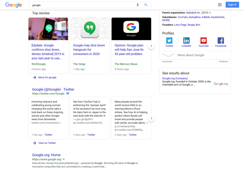
Google has confirmed with Search Engine Land that they have begun rolling out a new search results page design that has the a rounded search bar that sticks to the top of the page as you scroll through the search results. Google began testing this new design back in August and is now rolling it out to all searchers.
New header: The main difference from the old search bar header is that the new one now will stick to the top of the search results page as you scroll down to see more search results. The old design did not do that, in order to access the search bar, you had to scroll back up to the top of the page.
The other difference is the search bar is no longer a box, it is now rounded.
Here is how it looks when you scroll down the page:

Only on desktop: The new design is only on desktop search results, not the mobile search results.
Why does it matter? The new design feels different and is an update to the old search results design. Any change Google makes leads to a lot of complaints by dedicated and loyal searchers. So you can expect some complaints about the new design. It also might lead to more searches, because the search bar is more accessible at the top of the page as you scroll through the search results.
