Over a year ago, I did a live critique of DigitalMarketer Lab Members’ landing pages on our weekly Office Hours webinar training. During that Office Hours segment, I identified four main landing page criteria that every landing page must consider.
Now, I’ve expanded that list with a 15-Point Audit across those four categories that will tell you how your landing page stacks up.
NOTE: You’ll get a downloadable version of the 15-Point Landing Page Audit once we’re done explaining how to use it… 🙂

The Landing Page Audit worksheet has five components (labeled above):
- Grading Elements – Evaluating elements like the headline, offer, trust, visuals, etc…
- Grading Criteria – Grade these elements based on specific criteria.
- Element Scores – Score each element separately on a scale from Exceptional to Unsatisfactory.
- Final Score – Receive an overall score out of 100.
- Action Items – Take action to improve the elements that don’t receive a perfect score.
With all of the Landing Page editors or themes you can use out there, it is REALLY easy to create Frankenstein’s monster without even knowing it — this will give you the process you need to avoid doing that entirely.
The Components of the Landing Page Audit
As you start grading your pages (or other people’s pages), you’ll go from the abstract feeling of, “Man, that page pops,” to knowing exactly WHY it “pops” (sorry, designer friends, I know you hate that term).
The four landing page categories are:
- Offer
- Form
- Trust
- Visual Hierarchy
There are 15 elements to a landing page audit within those categories:
- Clarity
- Scent
- Relevance
- Visualization
- Visible Form
- Appropriate Number of Fields
- Compelling Form Headline
- Visible and Noticeable Call-to-Action (CTA)
- Professional Design
- Relevant Trust Icons
- Authentic Testimonials
- Clear Privacy Policies
- Using Visual Queues to Highlight Key Areas
- Page Design Fits a Singular Theme
- Supporting Imagery
Who Should Use This Landing Page Audit?
In this post, you’ll learn to evaluate and improve each of these elements. Then, you’ll get access to our Landing Page Audit spreadsheet.
Here’s how to put this audit to work:
- Email Marketers – You should definitely direct your traffic to a solid landing page, and the better the landing page the better your email campaign. 🙂
- All Pay Per Click (PPC) Marketers – We all know how important a well-crafted landing page is for our PPC campaigns. Use this audit to squeeze even more revenue!
- Business Owners and Managers – Landing pages are easier to create than ever, and it’s likely yours could use a tweak. See how your campaigns stack up or evaluate how your team creates their landing pages!
- Agency Owners and Freelancers – Audit the landing pages of your clients so you can help them improve their campaign conversion rates.
To show you this audit live in the wild, I’ve added new landing page critiques of big brands (and some little ones) you can learn plenty from — but first, let’s look at each of these important landing page elements in a bit more detail.
Landing Page Audit Category 1: Offer
The offer is the most critical part of any landing page.
No matter how well designed your landing page actually is, it won’t mean a darn thing if you have a crappy offer. 
When scoring your offer, you need to pay attention to four main points:
- Clarity
- Scent
- Relevance
- Visualization

All four of these points work together. You need to have a clear offer, meet your user’s expectations (scent/relevance), and attractively depict the offer and benefits.
You’ll find that you want your offer to be as well rounded as possible, so if you see a dip in the numbers here, definitely start working here.
Landing Page Audit Category 2: Form/CTA
Most landing pages have some kind of form on them unless they are a click-through landing page that leads directly to some kind of check out.
If your landing page is the latter, then make sure that CTA button is noticeable and that your cart page actually makes sense.
For pages with forms, you want to make sure your form is understandable and that people are willing to fill it out. The length of your form is contingent upon the offer’s perceived value.
If there is low value, then you can only ask for an email. If there is high value, you can start asking for more information.

This section’s break down is pretty straightforward.
First, if a visitor can’t see the form then they aren’t going to fill it in. That’s why this is the first “all or nothing” score. They either see it or they don’t.
Earlier I explained how important it is to have an appropriate number of form fields for the perceived value of the offer. A form with a lot of fields should have a high-perceived value.
If people are going to give up their information, they need a good reason to do so.
It’s also important to use a solid form headline! Don’t just reiterate something said on the page already or use a generic “Fill in this form” headline.
Try to draw their attention and speak to the desired end result.
(RELATED: Use this Headline Swipe File to get more clicks)
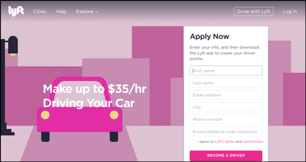
If you have a form or just a simple CTA, you need to make sure the copy is clear and actionable, and that the CTA stands out. Lyft does an amazing job with this (while still using their brand colors).
I can’t help but look at the button.
Landing Page Audit Category 3: Trust

Face it, people have trust issues online!
It’s your job to ease your visitors’ anxiety and convince them to convert. In order to develop trust, you are going to need a few things:
- A relevant trust icon
- Non-anonymous testimonials
- Clear privacy policies
- Relevant guarantees
- Return policies (if applicable)
I didn’t include “Professional Design” in the list here because I wanted to talk about it at length. 
At DigitalMarketer, we’ve gone on record saying, “What is beautiful doesn’t always convert,” and while that is true, it is still important to put effort into your design because people will judge your credibility based on the design.
Let’s play a game!
Which mode of transportation would you take to Hogwarts? (Let’s assume there is a speed charm on the van so either mode of transportation will get you there at the same time.)

Now, if you are a consumer online and you were choosing to buy the same product from two different sites where the design differed in the same way, who would you buy from (assuming they have the same product and messaging remains consistent)?
…Yeah, I thought so.
Landing Page Audit Category 4: Visual Hierarchy

This might be the least important of the four landing page pillars, but it is still important.
Your page layout not only helps develop trust, but it is a representation of your brand and also dictates eye flow.
The latter is very important because you want to make sure people are looking in locations that actually matter. An unbalanced landing page that lacks any visual hierarchy will confuse your visitors, and a confused visitor does not convert.
Here are a few things to ask when looking at your page’s visual hierarchy:
- Does the page design maintain the “ad scent“?
- Are your images competing with your CTA?
- Is your most important content being accentuated by the page layout via location, coloration, and visual cues?
How to Use the 15-Point Landing Page Audit
The audit tool is very easy to use. This short video will teach you to get started improving your content in minutes.
Okay, so designing a great landing page requires a lot of attention to detail, but if you successfully incorporate these four pillars you should be good to go.
(NOTE: The Audit works best in Adobe Acrobat)
Now, let’s get to the good stuff — landing page critiques! Click on any of the months below to be taken to that month’s batch of critiques:
August 2017
For this installment, I’m critiquing some pretty big names (I’m sure you’ll recognize at least one of them). See how their landing pages stack up, so you can avoid the mistakes they made and find inspiration from what they got right.
This month, we’re bringing you…
Landing Page

Offer: 16
This is a great offer!
It speaks to a desired end result, tells you what you’re going to get right away, and it even gives you a free preview with a video at the top (if you click the play button, the rest of the page slides down — so you can still convert on the page while watching the preview).
I don’t know who Andrea Stolpe is, but Berklee wisely gives a recap of her credentials and why you should trust her to be your music teacher.
Overall, this is a clear and compelling offer that is tightly worded and visualized beautifully through the video.
Form/CTA: 15
Berklee does a good job with the form.
It stands out visually, thanks to a visual cue pointing down to it from above. It breaks the fold, which encourages the visitor to scroll down.

They also don’t ask for too much information. (The final question, “I’m interested in,” could be removed — but it’s probably worth asking since it provides them with valuable information on each new lead.)
The two things that could be improved here are:
- The “password” field seems out of place. What they are doing here is getting the visitor to create an account. There’s no problem with that, I just think they should explain that a little better so the visitor knows what they’re signing up for.
- The “Submit” button is very blah. Make this more compelling. This can also help clarify what the visitor is actually signing up for (see point #1).
Trust: 12
Overall, they’re doing a good job of building trust with the visitor.
First of all, there’s the name recognition of a great school.
But they go beyond that at the bottom of the page by pointing out some of the awards they’ve won, helping to drive home the point that this is a reputable establishment you can trust.
The only trust area where this page could use some improvement is with customer testimonials, which are lacking. Since this is an online class, they may already have online reviews that they could leverage on a page like this.
Visual Hierarchy: 10
This is clearly a well-designed page that makes good use of visual cues to highlight key area.
Their only supporting imagery is the fullscreen background video; they might want to test that against a smaller, more traditional video screen to see if more visitors engage with that.
Landing Page Grade: B+ (89)
Not much to say here. This is a great landing page with a superb offer. Well done!
Landing Page

Offer: 8
Here is a great example of why offer clarity is so important.
The headline on this landing page is, “Save Big on Stairlifts.” So, you might be thinking that this is a company that sells low-priced stairlifts… right?
Wrong.
 ContractorLink is actually a service that connects you with contractors. But that isn’t clear at first glance; you have to read the sub-headline to figure that out. (And even then, it still seems a little confusing.)
When your headline is this vague, it’s a problem.
Saving money on stairlifts is one benefit of using this service, and that benefit should be communicated on this landing page. But overall the offer on this page needs to be made clearer, more specific, and more compelling.
They also fail to include any sort of visualization of the offer, which could go a long way in helping visitors understand it.
Form/CTA: 16
Overall, this landing page is not doing so hot. But the form is one place where they get it right.
For starters, it’s a multi-step micro-commitment form.
Which is cool!
By asking questions one at a time (instead of all at once), they are easing people into the form and probably improving conversions compared to a standard form.
The most impressive part of this form, however, is how well they are able to verify your information on the fly.
I tried typing in several fake phone numbers and email addresses, and it wouldn’t let me continue without supplying more authentic details.
Given how many forms tend to include bogus contact info, this is a great way to improve your lead quality! 
It’s rare to see these two things (a multi-step form with authentication) combined together so well. For that reason, I’m giving ContractorLink’s Form/CTA a perfect score.
Not that this form couldn’t be improved.
For one thing, ContractorLink would probably get more contacts if they reduced the number of required fields in this form.
It also wouldn’t hurt to give the form itself a more compelling headline.
“Enter Your Zip Code” isn’t adding anything here. Especially since that exact phrase is repeated in the placeholder text in the text box.
Otherwise, though, this form is doing a great job at qualifying visitors and probably delivers high-quality leads.
Trust: 8
I have no real reason to trust these guys.
Yes, there’s a BBB logo… but it doesn’t show their grade or give a link to their BBB profile. In other words, they could have an F rating on BBB for all I know.
Tell me more about these contractors: Are they accredited? Certified? Experienced? Why should I trust your contractors over any others?
And what about testimonials? Surely, they have a few happy customers who would be willing to say a few words.
Knowing that other people have had a good experience with this company would go a long way in making me feel more comfortable contacting them.
Visual Hierarchy: 7
It’s a bit of a mixed bag here.
On one hand, they do a very good job of highlighting the form. That form is the star of this page; it’s front and center, as it should be, and the focal point of the page.
They also do an OK job of highlighting some of the benefits below that (like the ability to compare contractors, get a free quote, etc.).
But there’s a whole big section of this page that 90% of people probably are never seeing.
Why, you ask?
It’s because of that tiny little ghost button at the bottom that reads: “Show More Content.”

When you click that button the page expands, roughly doubling in size, revealing more images, copy, and sales points at the bottom.
The problem here is that content shouldn’t be hidden. They need to get rid of that button and simply show the content all the time.
It’s very easy to miss that button; I’ve been scrolling up and down this page many times now, and I almost didn’t even see it. 
Other than that, there are a number of other things that can be improved here.
First of all, there are some bullet points at the top of the page that look like they should be links… but they’re not. That’s confusing.
And finally, while they do have some decent supporting images at the bottom, they all appear to be stock photos.
Real pictures of their contractors and some of the jobs those contractors have completed would go a lot farther in generating trust in the visitors.
Landing Page Grade: D (65)
Overall, not a good showing for this landing page.
But there is hope!
The good news is that many of the problems on this landing page are surface-level stuff that would be relatively easy to fix:
- Hire a copywriter to clarify your offer.
- Get a designer to fix some of your page layout issues.
- Throw in some real pictures and customer reviews.
Do those three things and this landing page will be rockin’ and rollin’.
Landing Page
Offer: 8
The offer on this landing page could use some work.
What are you getting here?
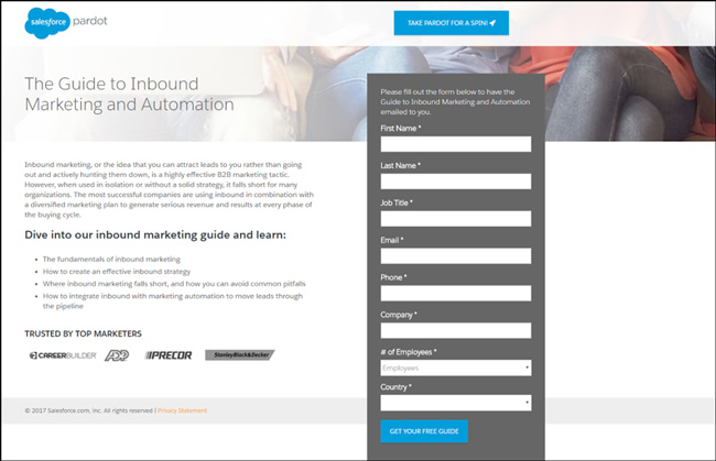
“The Guide to Inbound Marketing and Automation.” That, by itself, is pretty generic-sounding. Specifically, what is it you’re going to learn about inbound marketing and automation?
You know you’re getting some kind of guide, but you don’t really know what to expect.
Another problem with this offer is that it’s intimidating.
People are busy and don’t have time to read a novel-length ebook. The fact that this ebook sounds so all-inclusive makes it sound like a lot of work.
Finally, let’s talk about the images… or, the lack of them. And in particular, this page doesn’t have any visualizations of the product.
If you were able to see the product, it would go a long way in communicating the value of the offer (especially if it’s a well-designed, high-resolution image). As it is, we’re left to imagine what this guide might look like.
Form/CTA: 9
Let’s start with what they’re doing right:
- First of all, the form is visible above the fold. (Yay!)
- Second, the form actually breaks the fold… which is a good way of making people scroll further down the page.
Now, let’s look at what can be improved…
First, there are a lot of fields.
Do they really need all this information?
If so, fine… but every added field is reducing form completions. If they could remove a few fields they would almost certainly get more conversions on this page.
Also, I’d like to point out that every field has an asterisk marking it as required. That isn’t necessary — just remove all the asterisks.
Finally, let’s look at the form headline: “Please fill out the form below to have the Guide to Inbound Marketing and Automation emailed to you.”
Not exactly what I’d call a compelling headline. There’s no benefit communicated, no reason WHY I should fill out this form.
Trust: 10
Overall, it’s not a bad design.
I knocked off a point for their lack of imagery, but otherwise, it’s a clean and professional-looking page. They also have a clear link to their privacy policy.
Here’s where things go downhill.
First of all, they aren’t making very good use of their trust icons. They have a few icons, but it’s not clear what they’re referring to. They don’t really mean anything.
What does it mean that they are “trusted by top marketers” like CareerBuilder and ADP? Do these companies use Salesforce? Did Salesforce help grow their sales in any way?
It’s not clear at all.
Finally, here is a big fail: lack of authentic testimonials.
A big and established company like Salesforce is sure to have some good testimonials, so why aren’t they on this page?
This is low-hanging fruit that they are missing out on.
Visual Hierarchy: 6
Overall, Salesforce gets a so-so grade on visual hierarchy.
They do a good job making the form stand out through an effective use of color and design. Notice how the dark background makes it stand out from the rest of the page.

However, they have a competing call-to-action immediately above the form (a button that says “Take Pardot for a spin!”). This button changes color when you hover over it, which is really drawing their visitors’ attention away from the form.
Competing CTAs are usually a bad idea on landing pages. But this is especially bad since it merely takes you to a carbon copy of the same landing page without the button.
Landing Page Grade: F (55)
Not a great showing here for Salesforce.
There are a lot of things that can be improved on this page, like…
- Tightening up the form, including a visualization of the offer
- Adding in some authentic testimonials
 But that is all surface-level stuff that won’t address the bigger issues, which is NOT having a compelling offer.
It all starts with the offer and having something your visitors want. And I can’t imagine very many visitors are thrilled to download “The Guide to Inbound Marketing and Automation.”
Salesforce needs to rethink what they’re offering on this landing page and then rewrite the copy accordingly.
Printland Landing Page Review
Landing Page

Offer: 6
It’s clear WHAT they do, but what’s missing here is WHY I should consider Printland for my customized book printing.
Do you do it fast? Do you offer higher quality? Lower prices?
There’s nothing on this page that compels me to contact Printland. Their offer needs a lot of work, both in terms of clarity and persuasion.
Form/CTA: 8
The vagueness continues.
What are you getting when you fill out this form?
The answer isn’t clear until you reach the submit button, where you discover that you’re contacting them for a free quote.
First of all, there’s no value in that. In fact, I don’t even know what I’m getting a quote FOR.
Again, there’s nothing that compels me to fill out this form.
Another big problem is the headline.
 The headline of the form should give a CLEAR and COMPELLING reason to fill the form out. It should contain a benefit that makes me want to give you my contact information.
What’s the headline on this page?
Their phone number.
It’s a competing call-to-action, which is never a good thing on a landing page… especially as the headline of your form.
Pretty much the only thing this form gets right is the button, which is big and orange and stands out as a button.
The rest needs to be completely rewritten.
Trust: 9
Let’s start with what they get right. Well, they do include some testimonials…

…although they are some of the worst testimonials I have seen.
And they do include an impressive array of featured clients and partners, although they don’t offer any testimonials or results from these partnerships. I’m not even totally sure I believe some of them are really Printland clients.
Add in the fact that…
- the page has grammatical mistakes
- copy that was obviously not written by a native English speaker
- and keyword-stuffing at the bottom
…and this is a page I would be very suspicious of giving my contact information to.
Visual Hierarchy: 3
The hierarchy and design here are terrible.
For starters, they switch back and forth between left- and center-aligned; one, two, and three columns; all with no real flow of information — in other words, the information in one panel does not logically lead me to the next panel at all.
I mean, come on — they put their corporate office address in a panel in the middle of the web page. You don’t exactly need to be a marketing expert to know that kind of stuff belongs in the footer.
No, no, no.
Landing Page Grade: F (43)
The first thing they need to do here is to think about what it is they’re offering visitors. What can you give people in terms of value?
Then, once that’s figured out, I would scrap this landing page and start over. Just try something new.
My recommendation? Honestly, I would get a landing page builder and start with one of their templates.
I wouldn’t even try to save this landing page. Just start over and try something new.
Landing Page

Offer: 9
The offer on this page is fairly clear — you’re getting a subscription to People magazine for $1.42 per issue — but it goes downhill from there.
First, there’s the confusing subtext. Is it an additional 23¢ per issue for print, digital, or both? Is that 23¢ figured in the $1.42/issue?
But they don’t really give any reason WHY you should sign up for a subscription:
- What do you get?
- What will you read about?
- What will you learn and discover?
They’re also making a big mistake with their anchoring here. Normally when you present one of your options as a “Best Deal,” as they do here, you do it when you have multiple offers to choose from (3+).
But when you only have two options to choose from, and you designate one as a “Best Deal,” then you’re basically saying the other option sucks.
Form/CTA: 11
At first glance, the two CTAs on this page seem pretty bland.
But when you click on them, each one expands with two radio buttons. Then when you select a radio button, a popup appears promising to save you $5 if you pay in advance.

All that stuff works great and actually makes for a pretty cool form.
The problem is that you don’t see any of that stuff until you actually click the button!
They make it too hard to get engaged with the form, which I would guess is depressing their conversion rate.
Trust: 9
The only thing this page has going for it in the “trust” category is the People brand name. People is a well-established magazine, so I recognize that. That name makes me feel a little bit more comfortable.
Otherwise, there isn’t much here to put my mind at east.
The poor page design leaves me feeling suspicious of whoever is trying to sell me this subscription, and there aren’t any testimonials or trust symbols to speak of.
The only trust symbol is a “Norton Secured” logo, which is smartly placed next to the credit card field.
Other than that, though, I really don’t trust this page.
Visual Hierarchy: 4
Definitely not a professional design. It looks dated, unfocused, and unclear.
I like the stuff at the bottom — the microsite thing once you click the buttons — but the top of the page above the field is pretty bad.
Plus, there’s nothing to direct your eyes to the buttons (which don’t really stand out, since they are the same color as the header background).

They do have some supporting imagery, but it’s pretty bland. I like that it shows the mobile and tablet versions (showing that you can read it online), overall the images don’t add much to the page.
Landing Page Grade: F (55)
This page has something cool going on with the form.
Once you click one of those “Select” buttons at the top and start getting engaged with that form, the rest of the page is designed well.
The problem is everything that’s happening ABOVE the form. They don’t give you:
- A well-designed page
- A reason to trust them
- A clear and compelling reason to sign up for the magazine
My advice for this page would be similar to my advice to ContractorLink: Keep the form the way it is, and redo everything else.
Use a more modern page design with good visual hierarchy to lead your visitors’ eyes to the form, and give them a reason to click.
(NOTE: Want DigitalMarketer’s proven 8-Step Optimization Process for turning existing traffic into more leads and more sales? Get our Optimization & Testing Specialist training and certification. Learn more now.)
January 2017
In this installment of landing page critiques, you’ll see:
Landing Page

Teradata Landing Page Review
Offer: 17
So we’re kicking this off with a brand new landing page, and I’m running into the same old problems! The headline on this page just doesn’t cut it.
“Beyond the Challenges Lie Amazing Outcomes”
What a load of woo-woo crap. This can be applied to nearly anything in the world and has nothing to do with business intelligence and data warehousing. What’s even worse is hyperbolic statements don’t particularly move the type of person who is interested in data.
The subheadline does more of the heavy lifting, but it can’t save this sad attempt at a headline. Here’s something I want everyone reading to do right now. Go to your landing page and read your headline and your subheadline.
If you’re using your subheadline to clarify what is said in the headline, you’re doing it wrong.
The subheadline is an expansion; it shouldn’t be doing all the work. Don’t get too cute and you’ll be just fine.
The only reason this is getting such a high mark is because I don’t know what the advertisement looks like that sends people to this page, so I can’t grade on ad scent.
Form/CTA: 18
This is another metric that looks a lot better than it is. This landing page lacks any unified messaging. It looks like this page is more of an “About Us” page than it is a dedicated landing page.
What they do well is show a non-standard CTA front and center above the fold. They also reiterate their CTA for different offerings. However, all of these links bring you to a different page so it becomes terribly difficult to measure this landing page’s success.
There is no real unified goal and that is a serious problem. There are two main things you need to measure when you are evaluating your landing page’s effectiveness:
- Immediate conversion rate, e.g., click-through or opt-in
- Long-term conversion rate, e.g., qualified opt-in, sale, etc…
In this case, you are asking people to really learn more about several aspects of your product. Sure, with general keywords/interests this might work, but this page just screams “Jack of all trades but master of none.”
Trust: 22
In the last installment, people really had a hard time with showcasing trust. This page actually does this very well. The page is well designed and looks like they spent time and money during development.
They also include solid testimonials, user stories, and showcase the leadership team. This is a great way to connect with the prospect and making the future interactions feel more human.
One thing I would like to have seen was any mention of awards or other trust indicating seals to help provide more of a persuasive factor. Other than that, this page does a good job building trust.
Visual Hierarchy: 20
Since professional design is a trust factor, and I said this page had solid trust elements, then it only follows that their visual hierarchy is spot on.
The page just looks good and moves people to interact and consume the content. From the CTA buttons, downward arrows, or compartmentalized content this page knows how to keep your focus.
There are a few things that should go such as the share widget and potentially the “Contact Us” box. Both of those cause a seemingly unnecessary distraction for visitors.
That said, this is a heck of a good-looking page where form actually follows function.
Landing Page Grade: C (77) Totally inflated… read more to find out why
Okay, so you might see 77 and say “Not too bad,” but that couldn’t be farther from the truth. With the Offer and CTA sections having so many issues, the team needs to take it back to the drawing board.
The copy doesn’t compel people to take an action or explain what the company actually does. There is no real unified CTA, so it is hard to measure success and is confusing to visitors.
Had I eliminated the “freebie” stats from calculation, e.g., ad scent and form, then this would have received a 57! Honestly, I should rethink some of my calculations and weight some of the points differently because design really saved this thing during evaluation but that wouldn’t cut it in the “wild.”
In most cases, your landing page is going to suffer an offer problem and no matter how much lipstick you put on that pig, it’s never going to convert the way you want it to.
Get the offer down and you’re going to see much better results.
Landing Page

Shopify Landing Page Review
Offer: 27 (or PERFECT)
Shopify just gets it. I’ve been using their landing pages as examples of how to create great landing pages for years. I was ecstatic when I saw a new variant come out and I really wanted to dig in!
Unlike Teradata, this headline is crystal clear:
“Create your ecommerce store with Shopify”
No muss no fuss, just a clear descriptive headline! I love it.
The rest of the copy helps you understand what you get, how much it will cost, and uses social proof to persuade you to buy. They kept all of this content to simple bullet points so you can make your decision quickly.
Furthermore, they use their imagery to help you future-cast what your store could look like. They aren’t showing you the product backend for a specific reason! The backend doesn’t show you the desired end result but an ecommerce storefront certainly does!
Form/CTA: 27
With a single field form front and center underneath the clear headline and social proof, you have a winner here. This is only the first step of the total form, but it’s a good way to turn he visitor from a passive to an active visitor.
Normally, I prefer that multi-step forms use step indicators to provide transparency to the visitor. However, we’ve seen at both DigitalMarkter and TruConversion an absurdly high conversion rate between the first and second step without a step indicator. That said, I won’t dock them any points for omitting a step count.
The second step is where most companies screw things up… they ask for too much information! Thankfully the second step of the form uses the appropriate number of form fields (pictured below):

NOTE: Your email address would populate if you filled out the field. However, if you clicked the CTA at the bottom then you would see the blank form above.
Trust: 20
So the page slipped up a little here, but there is nothing here a few tweaks won’t fix. Underneath the form field, they say “No Risk.” Whenever you start talking about risk people begin to think about what could potentially be risky.
Saying “No Risk” is like saying “Don’t worry about the man behind the curtain.” You are ALWAYS going to worry about the man behind the curtain.
Other than the “No Risk” issue, Shopify doesn’t include a privacy policy on the first step or on the second step. That’s another bummer for our privacy-minded prospects.
However, they do a great job leveraging authority with brand logos, building trust with a testimonial, and using a concise and professional design.
Visual Hierarchy: 20
This is the second page today that has a perfect visual hierarchy! I kind of want to give them bonus points because this page just looks great. It has a unified CTA, uses subtle visual cues, e.g., the image is a subtle arrow pointing to the CTA and doesn’t have a smorgasbord of font types, weights, or unnecessary images.
Landing Page Grade: A (93)
Man this page rocked. Other than a few minor issues in the trust department, everyone could learn a thing or two from this page.
Landing Page

Landing Page Review
Offer: 17
Well, we’ve got another confusing offer on a landing page. The Honest Company uses subscription offers to send you all your baby needs. However, this isn’t really discussed on the page.
The page talks about diaper duty (c’mon someone giggled at “duty”), the company’s mission, trials, and diaper selection process. I don’t know exactly what I’m getting when I click “Start Your Free” trial, but I do know I can cancel by calling the provided number.
There is also another headline issue here “Diaper Duty Made Delightful.” Sure, diaper time can probably be a drag and they are speaking to a desired end result… but they missed a very important factor: what they’re selling.
If there was enough supporting content about how diaper duty is made delightful or what problems they are solving then this wouldn’t be a huge issue since all of the marketing is articulating the change between a Before and After state. That said, they don’t really deliver on the promise and muddle the offer with their [brief] mention of a subscription.
Form/CTA: 18 (or 5 since there is no form here)
This is just a hot mess. The CTA brings you to a page that looks phenomenal but lacks a fair amount of page scent. Though, in this case, the breakage in page scent is welcome because the subsequent page looks WAY better.

Also, what is that “Connect to Facebook” button even doing there? It’s competing with the offer and just needs to go away.
Is the goal to generate click-throughs or FB leads? Make a choice and stick with it.
Trust: 8
You know The Honest Company is relying on their brand. They don’t utilize trust seals or customer testimonials. They also don’t show nice imagery of happy babies or parents to drive the whole “Delightful” sentiment home.
What’s worse is they are already getting the notion of canceling a free trial in the prospect’s head by using that subtext underneath the button.
Brands are powerful but due to the poor design, poor offer, and lack of trust, I actually thought this was a knock off landing page. I’m sure other people might think that and refuse to click-through thinking they are about to be scammed.
Visual Hierarchy: 5
I CAN’T EVEN…
Normally “Frankenpage” are reserved for long form landing pages that have all kinds of odd fonts and elements showing up out of seemingly nowhere.
That’s what’s going on with this page.
The offer is muddled, they talk about a free trial but then discuss free shipping when you spend $50. The page lacks any sort of professional design and actually makes me think it isn’t actually associated with The Honest Company.
There is no attempt at building trust and they have two wildly different competing CTAs.
Landing Page Grade: F (48) Inflated again… it’s actually a 28
This page just needs to go away. I’m actually fairly positive that just sending people from an ad to this page would perform better:

It is an extremely rare scenario where I think a product page will perform better than a targeted landing page but this is that case.
Landing Page

Landing Page Review
Offer: 18
This page starts off strong with a clear headline:
“Download Your Social Media Strategy Kit”
The headline needs a little tightening up as it is too wordy and introduces the concept of “data-driven,” which isn’t discussed in the headline.
The more you continue to read, the more you get disconnected from the concept of a “strategy kit.” The bullet points tell you that you get an infographic, whitepaper, and a case study. None of the bullet points share the value of the content, it only lists them!
As you start digging into the imagery there are some more issues. I know that it’s super tough to give a visual representation to information. So the image above the fold is fine by me. However, things get confusing below the fold.
There is a section for “Social Post Analyst” and “Competitive Analysis” and neither of these is mentioned as a part of the toolkit.
Pretty much the offer starts strong but falls flat due to a lack of perceived value and some confusion on the part of what the prospect actually gets.
Form/CTA: 20
This landing page uses an inline form that you see above the fold. Ideally, I’d like to see a form “section” rather than have it sharing the same background color as the rest of the content. I’ll discuss that more when I get to Visual Hierarchy.
The form has a reasonable number of fields but I’m not sure why “Last Name” isn’t required. If you don’t need the last name then just nix the field altogether.
The CTA button stands out and uses a non-standard CTA. As far as CTAs go this one is good! However, I would urge them to reiterate the CTA below the fold to make it easier for people to sign up (this goes double for mobile).
Trust: 18
This page does a good job trying to build trust with the limited content on the page. They showcase their clients’ logos as well as provide a testimonial at the bottom.
However, the page design looks a little tossed together and lacks some standard design elements that visitors tend to see, e.g., company logo.
Visual Hierarchy: 12
This page suffers from a case of good idea but poor execution. All of the above the fold content just floats in that gray background. There is no use of coloration to show content priority!
It’s great that they’re using an arrow to show where to click, but it would likely work better if the arrow was facing to the right and pointing at the CTA button as most people read left to right. Each time I look at that arrow it causes a weird visual dissonance that I can’t get over.
The bullet points just kind of show up on the page underneath the visual representation of the kit, which makes for an awkward layout.
Landing Page Grade: D (68)
In this case, I think the grade looks worse than it actually is!
They have a good concept for a Lead Magnet here, but they need to spend more time articulating the value. After they hone in on the offer, then they can begin to polish the page to get rid of the “Random acts of page elements” that is happening above the fold.
So, that’s all, folks! To anyone reading, I just want to remind you that these criticisms come from a good place (especially if you are from The Honest Company… I love you and am just trying to help).
(NOTE: Want DigitalMarketer’s proven 8-Step Optimization Process for turning existing traffic into more leads and more sales? Get our Optimization & Testing Specialist training and certification. Learn more now.)
November 2016
I’ve picked some pretty cool pages that, on review, fell short and others that knocked landing page design and messaging out of the park.
Here’s what you’ll see:
- An Electronic Health Record product offer page from AthenaHealth…
- A restaurant management app from OpenTable…
- A smart thermostat product landing page for Control4…
- An Agency Partner sign-up page from Unbounce…
Okay, let’s do it!
Landing Page

Athena Health Landing Page Review
Offer: 22
The offer on this page is a little convoluted, it took me a while to figure out that they were actually selling software! The headline uses cute language and speaks to a pain point, but it doesn’t edify the audience.
I may not be the target market, but they are making a major assumption that people are familiar with HER technology (which as I Google it most doctors will be). However, you want to avoid jargon on the page as much as possible and they simply don’t do that.
After the somewhat obscure headline, you get a few statistics and some supporting imagery. There is nothing on this page that would convince me to take either of the two actions they ask me to take.
Speaking of actions: there are too many of them! But I’ll cover that next.
Form/CTA: 10
This page uses the 2-Step method where you click a button and are pushed to this opt-in form
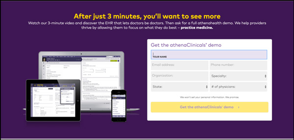
Before we talk about the form, let’s discuss the major problem with the CTAs on this page and I’ll give you a second to guess exactly what it is…
…
…
…
There are two competing CTAs! Do you want me to watch a 3-minute video or do you want me to get started? Make a decision and stick to it!
Okay, now let’s talk about the form. Why do I need to give you seven fields worth of information in order to watch your promotional video? If I’ll truly want to see more after three minutes, let me see the damn video!
Trust: 15
Athena Health is a well enough known company where they can rely on their branding to instill trust in the visitor, and when you have a well-known brand you don’t have to rely on trust seals as much as “the little guy (or gal).”
Despite them missing some key trust indicators it will likely not hurt the page.
Visual Hierarchy: 23
The page looks just fine; it’s on brand, simplistic, and focused.
Landing Page Grade: D (67)
Overall, what hurt this landing page was the depiction of the offer and the form. Athena has enough brand recognition and budget to create a well trusted and beautifully designed page.
However, if they don’t clean up their jargon and provide more value before they ask for a metric butt ton of information, then this page will remain subpar.
Landing Page

OpenTable Landing Page Review
Offer: 23
All in all the offer is pretty clear and compelling… except for the headline.
The headline tells me nothing about the service and relies on the sub-headline to do all the work. This is the most common problem on any landing page! Your headline is one of the most read pieces of copy on your page; make sure it isn’t vague.
Form/CTA: 10
This page really struggled in two areas and this is one of them.
The form is asking for too much information without making any promises. The headline doesn’t tell me what to expect or why you need all of my information.
It is 100% acceptable to ask for detailed information, but that is only acceptable if you are providing enough value to justify it! Just set some expectations and tell me what I’ll receive, when I’ll receive it, and what the heck you’re doing with my information.
(SIDE NOTE: I already have a family, I don’t want to join yours so stop asking.)
Trust: 12
Here is the second area of struggle on the page.
Like Athena, OpenTable is 100% relying on their brand to build trust. That’s not a good thing! Sure the brand is big, but smaller restaurants may be hesitant to work with them because they are used to their “old ways.”
I’ve met plenty of restaurant owners who avoided Yelp, OpenTable, and other newfangled tech like the plague. This page would never reach a key demographic, the small business owner, if they don’t attempt to build any trust.
Visual Hierarchy: 20
This page looks great. Like really great. The use of imagery, coloration, and the reliance on the long form scroll is a solid move to get people to interact with the page and consume the content.
Landing Page Grade: D (65)
This page is all beauty and no substance! Opentable was looking to rely on their design and brand to entice restaurant owners to sign up for… something… without attempting to build trust.
They need to hone in on the offer, set expectations, and use testimonials and other trust factors to convince people to take an action.
Landing Page
Control4 Landing Page Review
Offer: 25
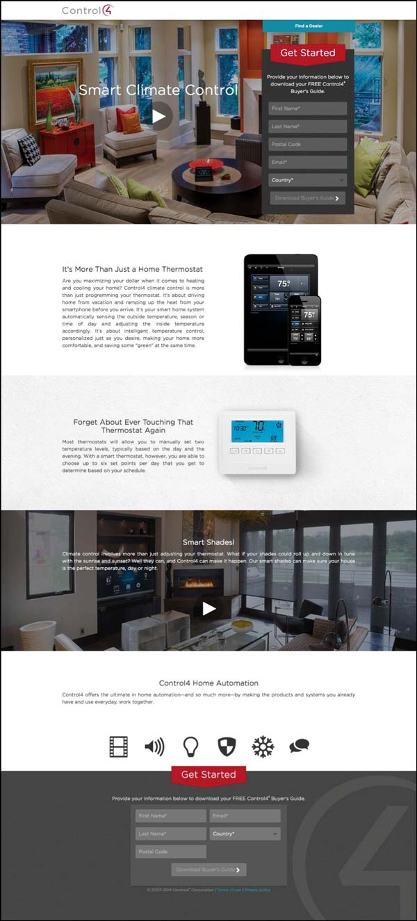
It took a total of three words to completely describe what this product does, great work. The short headline with the supportive background video was a great way to turn visitors into active participants and really see the benefit of the product immediately.
As you scroll further down the page you get more information about what differentiates the product, some key benefits, and another video showcasing the features.
Form/CTA: 25
The form tells you exactly what you’re getting with the headline and actually has an appropriate number of form fields for a buyer’s guide. In this screenshot, it looks like the CTA isn’t standing out, but that’s because it doesn’t “pop” until you fill out all of the form fields, which is SMART.
The form stands out enough to draw attention and the button stands out enough when it’s ready to be clicked, great work!
Trust: 15
This is the third example in this batch that really wavered on trust!
They do provide a privacy policy link, but they don’t try to show any testimonials, clients, or anything. Unlike the previous two brands, this could actually hurt this product since they aren’t an “everyday” brand.
Visual Hierarchy: 20
This page looks good and follows a natural flow. However, I’m a little worried about the false bottom above the fold, but the video might be enough to get people to convert. That said, the rest of the page is easy on the eyes and makes sense.
Landing Page Grade: B (85)
Overall, this page is a solid landing page that should perform well.
If they up the trust factor with more testimonials and social proof, they’d have a real winner!
Landing Page
Unbounce Landing Page Review
Offer: 27
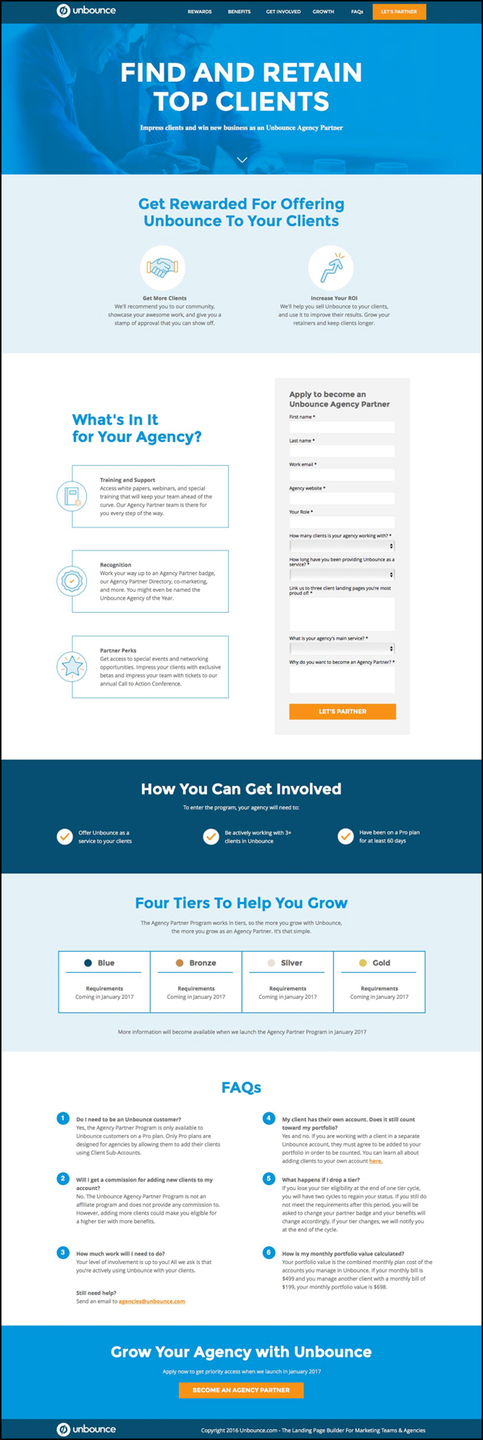
This page shined in the offer department. The headline explains clearly what the page is about and what’s in it for the visitor. The subsequent content explained more about the program, the perks, the requirements, and further explained with a detailed FAQ section.
Form/CTA: 22
So, this one would have been a perfect score had the form been seen immediately or there was a CTA button instead of that downward arrow. However, to save myself from some trouble if Oli Gardner sees this I have an adjusted score for this!
Oli has presented plenty of times that forms in “Zone 2” or the zone below the fold don’t necessarily hurt conversion rates. However, the page does use visual queues to get the visitor to scroll down the page where they will see this massive form.
When it comes to form size, the length makes total sense. This is an attractive offer for an agency who wants to partner up with Unbounce resulting in high intent. That level of intent makes the offer consistent with the number of fields.
Trust: 13
Unbounce is banking on their brand to carry this page for this [very] specific target market. The only people who would be interested in this page are marketing agencies who have a solid customer base and use Unbounce.
Since this is such a niche market, the power of the Unbounce brand doesn’t really require extraneous trust seals on the page… in fact, it might clutter the page up and cause further confusion.
Visual Hierarchy: 20
This is a great looking page that entices you to scroll and learn more without overtly hitting you over the head with what to do next. I’d also argue that this page had the best statement of value of the bunch.
Landing Page Grade: B (82); Adjusted Score for context: A (97)
Unbounce is a landing page creation tool, if they had bad looking landing pages then they’d likely be out of business. As always, this is a great page made by the team and is the type of landing page any marketer could learn from.
It is much easier to be a critic than a practitioner, so please take these tips and actually implement them on your own page rather than just praising the beautiful pages and pointing and laughing at the ugly pages.
(NOTE: The Audit works best in Adobe Acrobat)
July 2016
Let’s see how these landing pages stack up against the audit…
Here’s what you’ll see:
- A home offer evaluation offer from Trulia…
- An ebook offer for ways to improve security from Microsoft…
- An application opt-in page to become a driver with Lyft…
- An Agency Partner sign-up page from Unbounce…
Landing Page
Trulia Landing Page Review
Offer: 21.8 Points
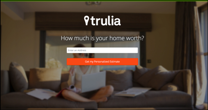
The offer on this page is about as clear as it gets. The desired end result of the visitor is to find out what their home is worth, and this uses very direct copy to set expectations and activate the audience.
Since we aren’t looking at referring ads here, I automatically give this a 4 and will for all other pages (they shouldn’t be penalized because we don’t have ad creative to compare the pages to).
Trulia lost some points on relevance.
I understand that they are leveraging their brand recognition and the copy to show the visitor that the site is about buying/selling property. However, the end result isn’t depicted and the background image is more or less a generic placeholder.
I touched upon the visualization a bit when I discussed relevance, but there is no visualization of the product or service on the page.
Again, this is likely due to brand recognition since people equate Trulia with real estate.
Form: 26.6
This entire page is the start to their form, so it’s easy to see why they got a 4 for visualization.
On the surface, it looks like they are severely underutilizing form fields when compared to the value they are providing. However, when you click-through you are brought to a longer form that is an appropriate length for the perceived value.
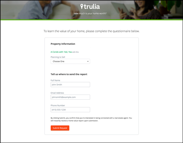
I raved about the headline on the page already when I discussed the offer and since this page is just one big form my praise stands.
The CTA is one of the main focal points of the page. It stands out with its bold colors and doesn’t use generic copy, which better primes the prospect to click.
Trust: 11.6
This is a really slick design, despite it being so minimalistic.
Trulia used the mega image background to create a better overall aesthetic (a blank white page with a form on it wouldn’t have the same success).
Since all three of these pages are from major brands you’ll notice that they don’t spend a lot of time trying to build trust… the weight of their brand does that for them. Based on my rubric they will lose points here, but this score is subsidized by the name recognition.
On this page, they didn’t tell you what they’d do with your information, why you should work with Trulia over Redfin (or other competition), or even share testimonials from happy Trulia users. They went minimalistic on the design and hoped their branding would take care of the rest.
Since this has been their control (with some slight variations in form fields numbers) since 2014, it’s safe to say they have seen success from this page.
Visual Hierarchy: 18.3
In terms of visuals, Trulia did a good job working around a singular theme and hyper-focusing on the key sections of the page. The fact that they didn’t use any other supporting imagery cost them a point, but overall the visuals are focused and work toward the page goals.
Landing Page Grade: C (78)
This is a very simple landing page that relied heavily on brand recognition. When you have simple pages like this, you don’t have time to inform or persuade, which could hurt their overall conversions if people are deciding to sell their property on Trulia or their competition.
Landing Page
Microsoft Landing Page Review
Offer: 13.3
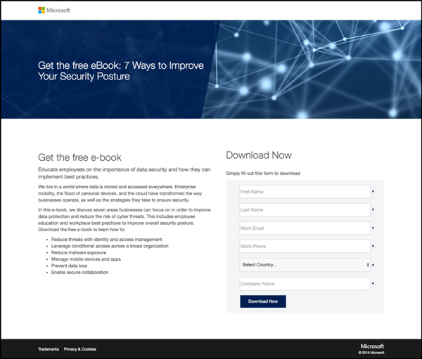
First and foremost, I want to say that an ebook is a terrible way to capture leads. Books sound time-consuming and aren’t immediately useful/valuable. Busy professionals likely don’t have time to go through that book and it is just adding more to their “to-do” list! 
Further, the offer isn’t all that clear! It’s an ebook, but I’m only going to have seven takeaways? Seven takeaways sounds more like a blog post, not an ebook! So the offer is muddled and is also not attractive.
I might be overly critical because I’m not their target audience, but there has to be a better way to articulate this offer and make it seem immediately applicable and thus more relevant to the consumer’s needs.
Form: 11.6
This form cuts me deep (if you watch the Facebook Live video… watch to see how I react to this one!).
Yes, the form is visible but that’s really the only thing it has going for it! They are asking for WAY too much information for a convoluted offer. They are asking for 6 pieces of information and one of these pieces is a high friction form field: the phone number.
Furthermore, they shouldn’t have to ask for the country if they have the phone number, a country code can take care of that for you! If you can gather information from things like GEO-IP or have form fields that can answer the question: remove the extraneous field!
The CTA stands out, but it is in an awkward position.
Trust: 10
Just like Trulia’s page, this page is banking on its brand authority. However, since they are asking for some high friction fields, the prospect might be a little curious as to what they are going to do with that information!
Visual Hierarchy: 11.6
This is the perfect example of a Frankenpage. I realize that the team is likely stuck with a particular approved template and have to make due with that. I understand that, but this page has no logical flow to it.
Key copy areas are just identical headlines, it’s difficult to read the copy, and they don’t use any visual depictions of the deliverable (what the heck is that background image?!).
Landing Page Grade: F (47)
Sorry to say, but Microsoft had the worst page of this lot.
Remember, landing pages need to be more than just a storage place for headlines and filler copy, they need to follow a central theme that inspires the visitor to take an action through clear offers, clever persuasion (copy and visual), solid usability and reduced friction.
Landing Page

Lyft Landing Page Review
Offer: 26.6
Lyft did a great job depicting their offer. They also used a secondary form to let visitors who weren’t sure if they wanted to drive for them see what they could potentially make each week.
This is a great way to get an “on the fence” visitor to become an active page user and interested in making the main conversion action.
They clearly speak to a desired end result: “Make 35/Hour” and use supporting content to drive this offer home.
Form: 25
This form really stands out on the page. I can’t help but look at this thing!
They are definitely asking for an appropriate number of form fields. What’s funny is they ask for the same number of form fields as Microsoft and they are actually offering to PAY the person who fills out the form!
Further down the page, they reiterate their CTA. This is a great practice because you don’t want your visitor to go looking for the CTA when they are finally convinced to convert.
Trust: 20
Lyft did rely on their brand, but they also used below the fold content to educate and convince the visitor. There is some opportunity for Lyft to improve the page. They could have testimonials from drivers to further persuade the visitor.
Visual Hierarchy: 20
This page just looks good and follows a very logical flow and each content section compliments its neighboring sections. There is a natural anchoring of the main content area above the fold (used with bright coloration).
Landing Page Grade: A (92)
This was the best page of the three I looked at today, so great work, Lyft! 
I know this page is flashier than most, but I want to make it clear it isn’t the flashy page that always wins. They used solid design tactics but it was born out of solid page structure.
(NOTE: Want DigitalMarketer’s proven 8-Step Optimization Process for turning existing traffic into more leads and more sales? Get our Optimization & Testing Specialist training and certification. Learn more now.)
July 2015
Editor’s note: the pages by Shopify, Square, Fiverr, ExtraSpace Storage, Hootsuite, & ResumeHelp were all critiqued based off of the rubric below, pre-15-Point Landing Page Audit methodology.
Take a gander, and don’t let the difference in rubric numbers deter you from the valuable takeaways in these evaluations!
In the first installment of landing page critiques, you’ll get…
- A trial offer to join and set your store up on Shopify…
- A long form landing page showing all there is to offer from Square…
- A sign-up page featuring content and a front-and-center CTA from Fiverr…
- A geo-targeting heavy sales page from ExtraSpace Storage…
- The best of the bunch — a call for increased social skills from Hootsuite…
- A landing page geared towards helping professionals build their resume online from ResumeHelper…
16-20 = A
11-15 = B
16 – 10 = C
11-15 = D
6 – 10 = F
≤5 = L
Landing Page
Shopify Landing Page Review
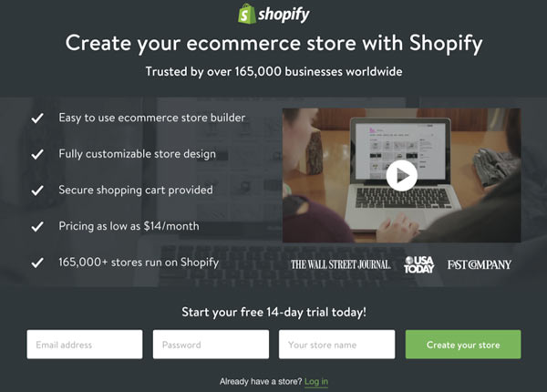
Shopify has a pretty slick page and this is definitely a layout that should be emulated (with a few tweaks).
Here are my grades for this page…
Offer: 4
The offer is 100% clear “Create your ecommerce store with Shopify.” It meets a direct need for any company looking to sell products online. The offer is also consistent with the ad that was clicked to get to this page.
However, I would like to see more content focused on the simplicity since the ad’s content almost exclusively promoted that benefit.
The one low point on this offer is the 14-day trial. They aren’t accentuating that part of the offer, and I’m curious how well a 14-day trial converts.
When someone starts an online business, things come up. Sometimes 14-days might not be enough to truly evaluate the product. Ideally, I’d love to see them test the trial offer and try to give it more visibility on the page.
Form: 2
I have never been a fan of the horizontal form, generally, it breaks the user flow. We are conditioned to scroll down on websites, so making the most important part of your website counter-intuitive from a usability standpoint can depress conversions.
Furthermore, the form doesn’t take center stage here. It is more or less the “belt” of the page, which is generally reserved for trust indicators and testimonials.
Trust: 3
I love that they said, “Trusted by over 165,000 business worldwide” and then they reiterate that fact in the bullet copy. This is a HUGE selling point and they keep it top of mind. Shopify is also a well-known brand, so keeping their logo front and center definitely helps build trust.
Where the page’s trust falls shorts are their icons below the video. I don’t know if these are “As seen in” logos or “Used by” logos. Since they are three publications, I assume that it is the former. This ambiguity could be cleared up with a simple line of text.
Visual Hierarchy: 3
Overall, this page has a coloration issue, from a visual hierarchy perspective. Every element looks as if they are all of equal importance, which clearly they are not. The form doesn’t stand out and the trial portion of the offer is marginalized.
The page does a great job highlighting the content, but again the content is only what dictates the value, the converting action must stand out too.
What is done really well is the ratio of links to converting action. There are three links on the page: the form, the header image, and the login link. You want to keep your link to converting action ratio as close to 1-1 as possible.
Landing Page Grade: B
Landing Page

Square Landing Page Review
Square went with the long form landing page, and that makes sense for their product. Let’s see how this page stacks up!
Offer: 2
Similar to Shopify, this landing page has their offer front and center with a compelling headline “Start Selling Today.” Other than the placement of the headline and first action point, the offer isn’t all that compelling.
The ad talks about a free reader, but that is only mentioned once as link text for their product video. Needless to say, there isn’t a whole lot of follow-up from the ad offer to the landing page offer.
Form: 3
This page is all about the click-through, whether it be via self-segmentation or clicks on the primary CTA. I love the CTA on the button, using “Get” has historically increased conversions on buttons and saying “started” frames that this is the start of a process that might take a little bit of time.
When you click the “Get Started” button you are brought to this form:
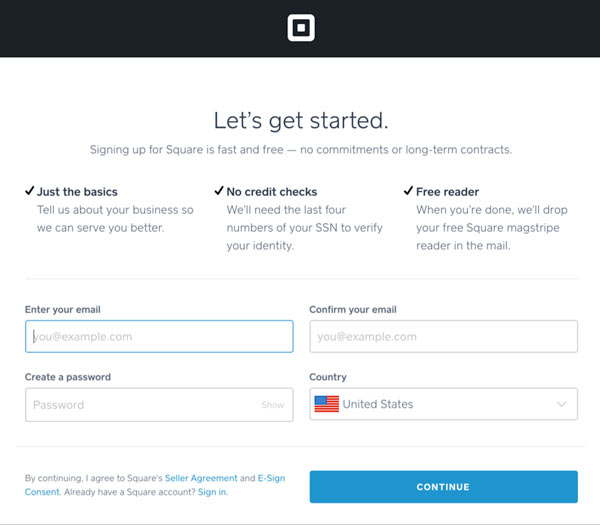
This is a clean form, but the two-column form may cause some confusion. On top of this issue, I am not sure just how many steps it will take to complete this process. The copy on the button tells me there are more steps, but I would like to know how many steps I need to take up front.
Trust: 2
Square is a well-known brand, so using their logo and brand reach they are able to increase trust immediately.
The only other trust indicator is at the bottom of the page where they say “Join the millions of businesses signed on with Square.”
Visual Hierarchy: 4
The page has a wonderful layout that highlights the most important areas using visual queues. Since Square is multifaceted, the page utilizes self-segmentation to get visitors to the most relevant page.
Even though I like to keep the primary CTA to link ratio as close to 1:1 as possible, there are always some exceptions. As a click-through landing page, the wide ratio here isn’t a major problem, because the content they promote moves prospects into more refined segments.
Landing Page Grade: B
Landing Page

Fiverr Landing Page Review
Fiverr decided to push more content below the fold but also has the primary CTA front and center on the page.
Offer: 0
Similar to the last two examples, Fiverr keeps the main CTA front and center with a simple headline and sub-headline. What’s unfortunate is I don’t know exactly what I’m getting when I give them my email address. I know I can get some kind of project done at an “Unbelievable” value, but that’s about it.
Simply put, the page lacks SPECIFICITY and VALUE. What’s worse is that the offer in the advertisement isn’t reiterated on the page. Instead of telling us we can get jobs done starting at $5, we are met with ambiguity.
Form: 4
Steal this layout! If you have a one form field form, try this basic inline form. It has [almost] everything you need in a good form. It has a headline, sub-headline, evident form field, and a clean CTA.
The only thing that’s missing is some kind of privacy reassurance – if they had included one, this form would be perfect.
Trust: 1
There’s really no trust indicators at all on this page. What’s worse is there is no mention of a privacy policy when you enter your information.
Fiverr is clearly depending on their brand and their service count (made evident when they say “Millions of services” and “Over 3 million services”).
Visual Hierarchy: 5
This page looks good. Fiverr reiterates the CTA for people who continue to scroll, so the conversion action is always front and center.
I think what I loved the most was the use of face; the woman’s eyes are looking directly at the form. This type of visual queue prompts the user to look at the form next and is a nice trick to try on your own pages.
Fair warning: If you are too egregious with your efforts visitors will see through this and it might have the opposite effect.
Landing Page Grade: C
NOTE: This is just the landing page grade – it is a slick landing page. The offer is just awful – a slick landing page will never fix a bad offer!
ExtraSpace Storage
Landing Page
ExtraSpace Landing Page Review
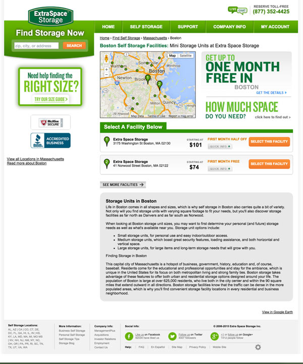
ExtraSpace Storage takes a different approach on their landing page – they used geo-targeting in their ad and on their landing page to provide a more personalized experience. This is not your standard “dedicated” landing page, but the product page you’d expect to see while navigating the site.
For sites like ExtraSpace and most ecommerce sites, this tactic works well. Most dedicated pages are focused on a single product or offering – when you have a person searching for something at the category level, you need to provide them with categorical information.
Let’s get to the grades…
Offer: 4
Free storage for a month? I’ll take it! Thankfully the ad and landing page had a congruent offer, well for the most part. I’m not seeing those 15% savings, so that could be a sticking point.
That said, you clearly know what you are getting – a mini storage pace in your city at an initial discount. Unlike the other pages we’ve looked at, this page has the actual price on the page for the respective units – so that is also a plus from the offer perspective.
Form: 2
This is a click-through landing page, so let’s click and get a closer look at the form…
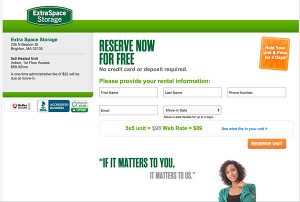
The form page leaves something to be desired. I like that they display your storage location – but how they do this feels awkward. This page also suffers from business porn, which is an unnecessary distraction on this page (the “If It Matters To You, It Matters To Us” quote and image.)
The form includes trust seals, makes it clear you don’t need your credit card, and requires minimal information. Similar to other critiques, the multi-column form isn’t the best way to go from a usability standpoint – especially if there are multiple rows.
Trust: 4
The page has a nice set of trust indicators, provides live chat, a phone number, and wants to help with space selection size. This is a trustworthy page.
They lost a point because of the form and lack of proof. The trust indicators on the form were just placed on the left-hand side and could be strategically placed a little better. Also, ExtraSpace is banking on these seals getting the job done – sometimes a well-placed testimonial about the service or facility will make all the difference.
Visual Hierarchy: 2
Since this is a category page and not a dedicated landing page, the visual hierarchy suffers. There are a lot of links, top bar navigation, and a ton of distractions.
That said, the page does a good job highlighting the CTA buttons – but the unique offer kind of blends in with the rest of the page.
Landing Page Grade: B
NOTE: This is not a traditional landing page – but this is a layout you’d expect to see when people search from a “category” level.
Landing Page
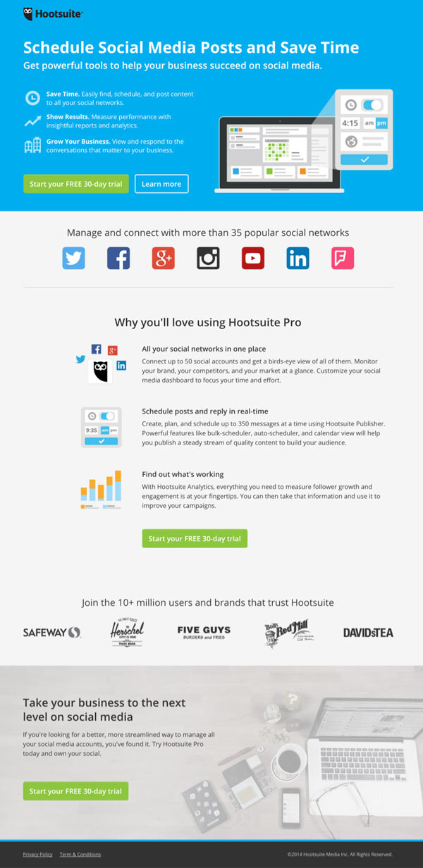
Hootsuite Landing Page Review
Spoiler Alert: This is the best page on the list. Check out the breakdown to find out why.
Offer: 5
The ad content is reflected right in the headline! This is the only page so far that has pulled this off. If you are running any PPC campaigns, make sure your ad content is congruent with your landing page content!
The offer is clear and enticing. Hootsuite uses a 30-day trial and has a clear CTA button. What’s better is that Hootsuite keeps the offer top of mind by repeating it in different sections as a user scrolls down.
Form: 5
This is a click-through landing page, so the form is on the next page. The form is your standard order form and it looks great!
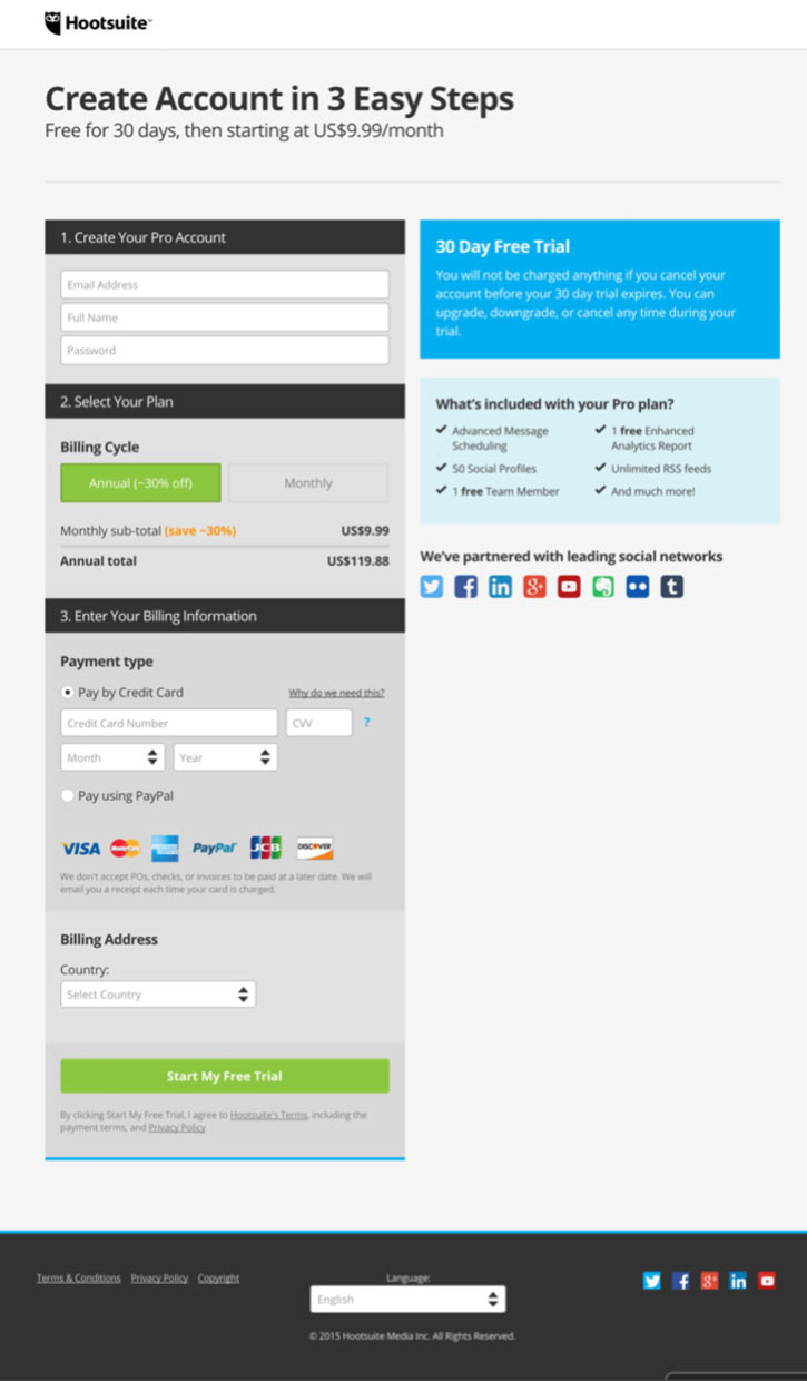
This is the only form, so far, that is single column. The headline sets the time commitment, and the right-hand content reassures the customer about their current purchase.
There is potential for sticker shock here, but Hootsuite handles this well. They prompt the visitor with a price in the subheadline and give different payment options in the form.
Trust: 4
I’ve been a little too excited about this page, so let’s start with the negatives here. This checkout form doesn’t use any trust indicators at all. They have a text guarantee about the trial period, and that’s about it.
However, the landing page itself has a lot of social proof and leverages Hootsuite’s brand. By sharing the user count and prominent brands there is clear social proof at work on the page.
Visual Hierarchy: 5
I’m just going to say it – I hate ghost buttons.
However, I was pleasantly surprised with how Hootsuite used the ghost button. Generally, people use text links as the secondary CTA on a landing page, but the ghost button is an amazing way to show that it’s associated CTA is secondary to the main CTA.
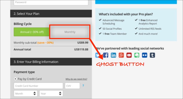
The CTA stands out and use inclusive language. Even better, it is reiterated throughout the page, so visitors always have the chance to move to the next stage in the funnel.
The primary CTA to alternative link ratio is very good on this page. There are three instances of the primary CTA and three instances of alternative CTAs. That maintains the 1:1 ratio on the page!
Landing Page Grade: A
Landing Page
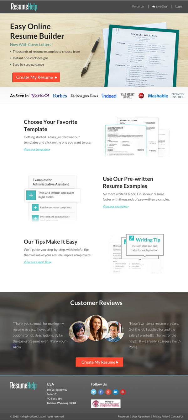
ResumeHelp Landing Page Review
Okay, so a lot of the pages I’ve shared were larger brands. The last two are smaller brands – do they have what it takes to pass the landing page inspection?
Offer: 1
I think my biggest pet peeve is that the ad says this thing is free, but they don’t mention it ONCE on the page! That should be right in the headline to keep a consistent message from ad to landing page. All of the other content in the ad is shared in the bullets, so why omit the key conversion booster that is “free.”
I know that this will help me build a resume, but I don’t know what it will cost or if these resume templates are even relevant to me. The page just lacks that “value” punch that could take it to the next level.
Form: 5
When they say “Create Your Resume” they aren’t kidding. This goes directly into their resume building wizard.
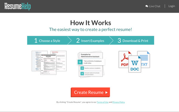
At Constant Contact they found that getting people to start creating their email campaign first instead of doing the banal task of importing their user list first increased conversions and customer retention. This landing page moves you from the promotion right into the thick of it without giving one piece of information up.
This was a pleasant surprise and if the team at ResumeHelp really wants to boost conversions, this feature shouldn’t be a surprise at all. Likely you need to create an account after you finish your resume, but by that point they’ve provided value in advance and people will just hand over that information.
Trust: 2
This page utilizes some top tier brands to help build social proof. That’s really the best use of trust indicators on the page.
The testimonials below the fold might as well be anonymous, they just have a first name and the images clearly aren’t of the people making the testimonials. Visitors will see through testimonials that look fishy – so, if you’re going to have a testimonial, make sure you can attribute to someone real!
Visual Hierarchy: 2
The page, overall, looks good. The CTA stands out and there are multiple links that support the primary CTA. What’s odd is where people end up when they click the in-line links. It brings someone directly to the wizard, even though the text CTA is saying something completely different.
Landing Page Grade: D
What really hurt this page was the CTAs that say one thing but lead to another, that there is no display of true value on the page, and that they don’t properly prime the user for the awesome experience of going through the wizard without giving up information.
The 15-page audit is a great starting point for your own page evaluation… so, get started so your page doesn’t end up on with a failing grade on my next list.
Happy Optimizing!
(NOTE: Want DigitalMarketer’s proven 8-Step Optimization Process for turning existing traffic into more leads and more sales? Get our Optimization & Testing Specialist training and certification. Learn more now.)


