Is your ecommerce site set up for consumers who know very little about your products?
I recently shopped for a bicycle safety light for a relative who commutes to work by bicycle in an urban area. I was searching for blinking lights that attach to the rider or the bike as I’ve noticed how those lights stand out to motorists. But I don’t know much about this product category.
Photos Alone
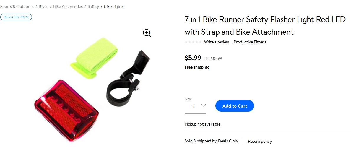
When I search on Google for “bicycle safety light,” an ad from Walmart.com catches my eye. It’s called “7 in 1 Bike Runner Safety Flasher Light Red LED with Strap and Bike Attachment.”
Its thumbnail takes me to a product page featuring a photo that shows three components. One must be the light, another the strap, and the third the bike attachment.
However, the listing contains no verbal product description. Although I’m intrigued and think this might be what I’m looking for, I have no idea what “7 in 1” might refer to, how this product functions for a cyclist, where the attachment goes on the bike, what kind of batteries (if any) are needed, and whether the strap is designed to go on an arm or leg. This product is woefully unexplained.

Walmart.com’s listing for a bicycle safety light set does not include a description or any details.
Words Help and Hurt
Back to the Google results, I click an organic listing for the “Cycling Lights” category page of Performance Bicycle. Many of the options in that category show photos of an isolated product where it’s not obvious how the light functions and where to attach it.
Will product descriptions clue me in?
Clicking on an item called “Axiom Corona Bike Light Combo,” I find a product photo that, like the Walmart listing, shows static components without providing their size or placement in use. Here, though, extensive bullet points describe product features in detail, along with a summary paragraph for each of the components.
One informative bullet point says “7 Modes: Low/Medium/High/Flash 1/Flash 2/Flash 3/Daytime,” which is relatively clear. It’s also helpful to know that you can “place the light virtually anywhere on your bike or person” and “added side visibility keeps you even safer on the road.”
At the very bottom of the listing, though, is a yellow triangle with an exclamation mark inside and the text “WARNING: Prop65 Cancer and Reproductive Harm.” This unexplained notice is so alarming that I’m out of there. I’m not going to purchase a gift that might sabotage someone’s health or reproductive capacity!

“Warning: Prop65 Cancer and Reproductive Harm” is an unexplained notice at the bottom of a listing for a safety light.
Shopper’s Guide
Turning again to the Google search results for “bicycle safety light,” I spot a shopper’s guide from outdoor retailer REI titled “How to Choose Lights for Your Bike.” This seems relevant to my gift search.
The guide states, “When shopping for bike lights, you first need to ask yourself this: Do you want to see or be seen? Or both?”
Logically, this excellent organizing principle should lead to a sorting of products into those three categories. Additionally, from a merchandising perspective, the shopper should be able to click directly to the products that correspond respectively to “want to see,” “want to be seen,” and “both.”
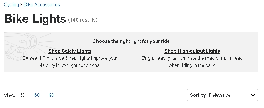
However, the shopper’s guide links to REI’s products only generally via a clickable box that reads “Shop Bike Lights.” In turn, that leads to a page that offers to sort the options into “safety lights” (to be seen) and “high-output lights” (to see). Now I have a much better concept of what I’m looking for in my gift.

REI’s shopper’s guide on bicycle lights links to a page that enables you to “shop safety lights” or “shop high-output lights.”
Interestingly, the REI site includes a warning similar to the one on PerformanceBikes.com. The bottom of a product listing stated, “Important WARNING for California residents,” which linked to a popup with the yellow warning triangle I saw earlier and this text: “WARNING Cancer and Reproductive Harm – www.P65Warnings.ca.gov.”
Now at least I had some context for the warning, although after clicking to the state of California’s site I was still, um, in the dark about what in a bicycle light is harmful. Is it the battery? A chemical? Environmental disposal dangers? None of this was explained by REI or the state of California.
No Guidance
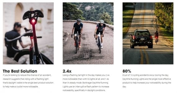
Lastly, returning to my Google search, I checked out TrekBikes.com. A page for its safety light offerings explained that “all existing research indicates that the single best way for a cyclist to increase the likelihood of being seen by a driver is to use a flashing light that’s daylight visible.”
The page described and illustrated the features that make “Bontrager Daytime Running Lights” unique and superior to other options. This was persuasive and made me want to consider these products.

TrekBikes.com introduces its bicycle safety lights with “why this” text, along with illustrations showing the lights in use.
From each of the 16 bike lights or sets shown at the bottom of this page, I was able to click to a robust product listing that included photos on a bicycle and how to charge it from your laptop. The product page also included reviews from bicycle magazines, worldwide customer reviews, and stores near me that likely had the product in stock. Again, this was helpful as far as it went.
What I did not find at this site, though, was general guidance, such as “If you’re commuting in heavy traffic in a northern climate, get X, but Y is a better choice if you’re riding on winding country roads.” Going through the 16 product listings one by one required much more effort, which I was unwilling to do. Had the site invited me to call or start a chat session to help with my product selection, it might have won my gift dollars.
Lessons from This Shopper’s Journey
- Winning a prominent spot on Google search results won’t help much if you have uninformative product listings.
- Photos that show just the product are not necessarily beneficial.
- If government regulations require warnings, explain them.
- Consider having a shopper’s guide, but then link directly to the product categories or types that it defines.
- Consider “Best for…” blurbs or comparison charts to help shoppers choose the most appropriate product.
- Explicitly inviting shoppers to email, chat, or call for advice can help.