In real estate, the axiom is location, location, location. It’s first and foremost. The number one consideration.
For your digital efforts – email, web pages, eCommerce platforms – an argument could be made for a few different ones: search engine optimization (SEO), the user experience (UX), conversion rate optimization (CRO), or perhaps something else entirely.
Ask five experts and you’ll probably end up with five different answers. But what’s really the end goal? Why are you doing whatever it is you’re doing?
Conversion, conversion, conversion.
Whether that means signing up, downloading, opting in, subscribing, or purchasing, you want your target to do something. Ultimately, everything else should be assisting that one objective.
With apologies to Meghan Trainor, I’m going to suggest it’s all about that CRO. SEO is obviously necessary, but traffic alone is meaningless. And the UX? A happy and satisfied user is imperative, but try paying your rent with one.
So, at the risk of drawing the wrath of the SEO and UX camps, they both fall under the CRO umbrella (they’re all very, very important, though). But – and this is a big but – it’s a massive mistake to believe that SEO and/or UX alone will do much for your CVR.
Start with the end in mind. You need to focus on specific ways to improve your conversion rate.
CRO: An Uphill Battle
Consider this: a couple of years ago, 80% left a site without doing anything. No conversion. That figure is up to 96% in 2017. The global average CVR of online shoppers early this year was 2.48%. Those stats are a bit scary.
The good news? With numbers like that, things can only get better. It just takes time, effort, and a systematic, active approach.
But don’t fall victim to these traps, pitfalls, and mistakes.
Your Mistake: Focusing On the Wrong Things
Quick question: would you rather have something beautiful, or something functional? Would you rather be clever, or understood?
I’ll be blunt…beautiful things are nice, but functional things are essential. And that goes double for your email marketing, website, eCommerce portal, or app.
And clever? Don’t get me started. Clever headlines and subject lines don’t mean a thing if no one clicks or opens them. Consumers want to know what it’s about immediately. They don’t want to have to guess or click or open before finding out (and most won’t anyway).
Be functional. Be clear. Full stop.
Now, that doesn’t mean you can’t have a good looking website. Nor should your headline be boring and the first dull thing that pops into your head. Quite the contrary. But if you’re putting beauty over function and cleverness over clarity, you’re doing it wrong.
A breathtaking site that’s confusing and awkward to navigate but bursting with clever puns, wordplay, and double entendres may win you fans, but few or no conversions. Which do you want?
Do this instead…
Put your customers first. Consider their wants and needs. Use every available data source – analytics (Kissmetrics goes much deeper than Google…just sayin’), industry studies, surveys, polls, etc. – to identify and create detailed buyer personas. Then, create a site for them.
But don’t stop there. Once you have it where you think it should be, have others take it out for a spin. Try an impartial and third-party service like UserTesting to get invaluable video of real people using your site. Where did it fail them? Take that insight and tweak.
Next, turn to the old standby: A/B testing. You’d be surprised by the big results you can get from tiny changes. Use a testing tool like Optimizely or Visual Website Optimizer to confirm your theories about colors, placement, copy, design, images, and more.
One site saw a conversion lift of 304% simply by moving the CTA button from above-the-fold to below it.
Don’t make it look pretty. Make it practical.
Having said that, a cheap, outdated design with grainy stock photos isn’t going to cut it, either. People won’t trust it – or you – and if they don’t believe you’re trustworthy, they won’t convert. Keep your design clean and modern, and use high quality images of your products and people.
Finally, always opt for clear – Get Your Free Trial – over clever – Click or I Kill This Puppy.
Your Mistake: You’re Targeting Just One Platform
Desktop. Tablet. Mobile. Which one is most important?
It’s a trick question. You’ve no doubt heard a lot about the increasing role of mobile devices when it comes to the online world. Chances are virtually everyone around you is staring at their smartphone screen.
Google announced a change to its algorithm in mid-2015 that made mobile-readiness a ranking factor. Since then, more people access the internet on a mobile device than a desktop computer.
Like any good webmaster, you’ve dutifully checked the mobile-friendly tool and made sure your pages passed the mobile test. Kudos.
But the desktop is not dead. Far from it.
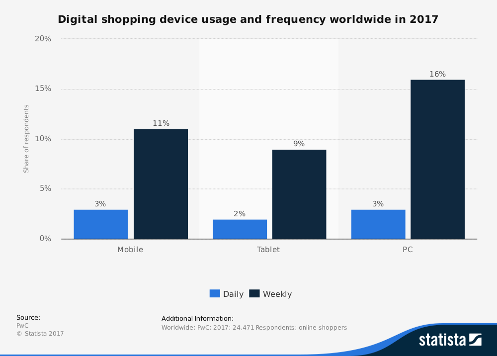
More people shop weekly online using their desktop than a mobile phone, and the same number shop daily using both.
Traditional desktop computers still boast a higher conversion rate than both tablets and mobile phones. In fact, desktops had a CVR that was more than 3x higher than smartphones for American shoppers in 2016 (3.55% vs 1.15% respectively).
Mobile at the expense of desktop? Bad idea.
So how about desktop over mobile?
We’ve already mentioned that more people head online using a mobile device than desktop computers, so you’d be waving goodbye to a huge chunk of potential.
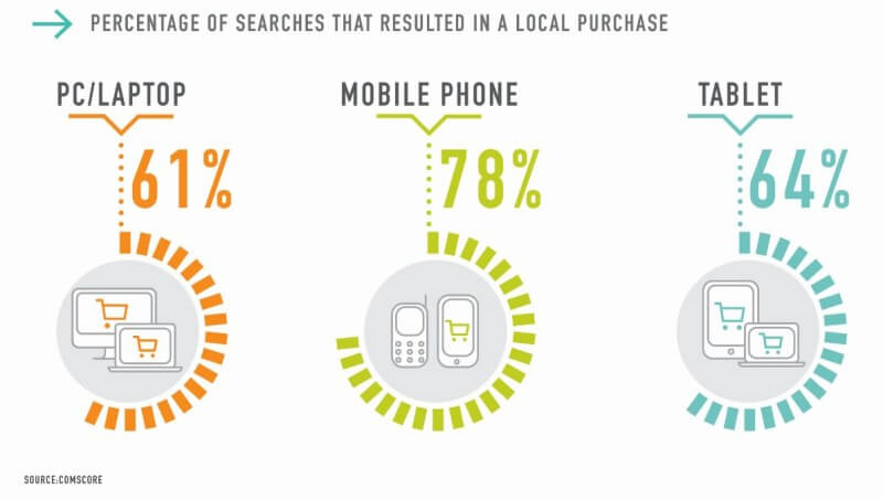
And when it comes to your local market, you’re missing out if your platform isn’t mobile-ready. More local searches result in a purchase when made on a smartphone than those made on a desktop (78% vs 61% respectively).
Finally, 59% of smartphone users expect a website to be mobile-friendly and feel frustrated when it’s not. They’ll leave and likely never return.
No mobile? No way.
Do this instead…
The solution should be obvious. Desktop or mobile? You need both. And tablets, too. Create a website or portal that looks and functions equally well on all three, and you’re ahead of the curve.
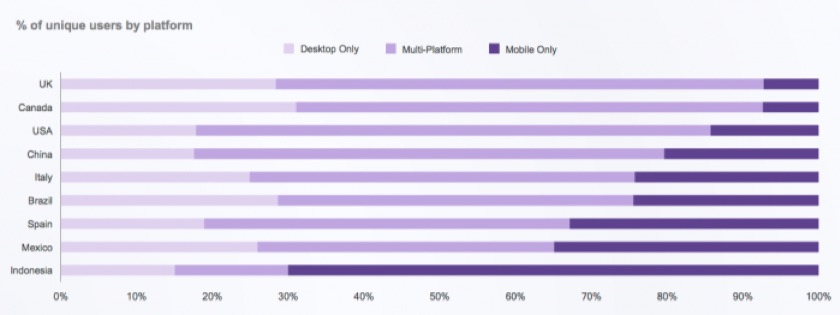
In big markets like the United States, Canada, China, and the United Kingdom, the vast majority are multi-platform people.
Try a tool like Screenfly or WhatIsMyScreenResolution to see for yourself. Is everything legible? Are the buttons and links spread out and big enough to be easily tapped on a touchscreen? Do you use more scrolling than clicking?
Google recommends you use a responsive site design rather than dynamic content or a separate mobile URL. And it’s best to follow their advice. Of course, there’s a lot more to mobile optimization, but this is enough to get you started.
The key takeaway: Don’t sacrifice one for the other. Design and optimize for desktop, tablet, and mobile, and watch that CVR head north.
Your Mistake: You Don’t Care About Speed
This can’t get any simpler: speed matters. For your customers and the search engines. So be fast.
As you beef your site up with tools, HD images, videos, and more, your speed suffers. If you believe that a practical, responsive site and good products are enough, you’re wrong. Why?
Because if your page takes too long to load, they’ll leave before even experiencing any of that.
Nearly half of web users expect a page to load in under 2 seconds, and 79% won’t return to a site with performance issues like slow load times.
As much as 83% of users expect a page to load in under 3 seconds, and a 1 second improvement in your load time can produce a 7% increase in conversions. That’s right.
The godfather of eCommerce – Amazon – experiences a 1% loss in revenue for every 100ms delay…that’s just one-tenth of a second.
Do this instead…
Care about speed and load time. A lot. Actively work to make your pages faster and more streamlined.
Google suggests that your site take no more than 2-3 seconds to load. At most. How do you measure up?
There are other mistakes that negatively affect your CVR: you give up too easily (solution: retargeting, cart abandonment emails, etc.), no social proof (solution: add social proof), weak call-to-action (solution: make it active, make it clear, test, and optimize), and more.
Check out some of the great tutorials by Neil Patel, Glide, Kissmetrics, and HubSpot if you want to dig deeper and go further. In the meantime, find and fix these three mistakes to shift your CRO into overdrive.
Because online, it’s conversion, conversion, conversion.
About the Author: Daniel Kohn is the CEO and co-founder of SmartMail, a company that helps E-commerce stores and online retailers increase sales, average order value, and lifetime customer value through email. Download SmartMail’s 4 highest converting email templates to help jumpstart your E-commerce email marketing program.


