Every website needs an “about” page. This is where visitors meet the company and learn why it’s in business. An about page instills trust.
An effective about page is more than just a few sentences. It should include images and video, as well as credentials such as experience, background, and academic training. While the page may not receive a high percentage of the site’s traffic, the people who view it are trying to get answers.
Answer 6 Questions
Who are you? Shoppers want to know exactly who they are supporting. Is it a Fortune 500 company or a small business? Including information about the geographic location adds a special touch, especially for stores located in smaller communities.
Why are you in business? Some companies address a specific need, while others want to provide items at more competitive prices. If you created custom products as part of a mission, explain that, too.
Who am I supporting? Stock photos of customer service agents do not belong on any ecommerce site. They’re impersonal. Chances are shoppers have seen that same agent “working” for many other companies. Instead, include pictures of all staff — executive and entry-level — to show how your store supports real people and families.
Use photos in actual workspaces so they won’t be confused with stock images.
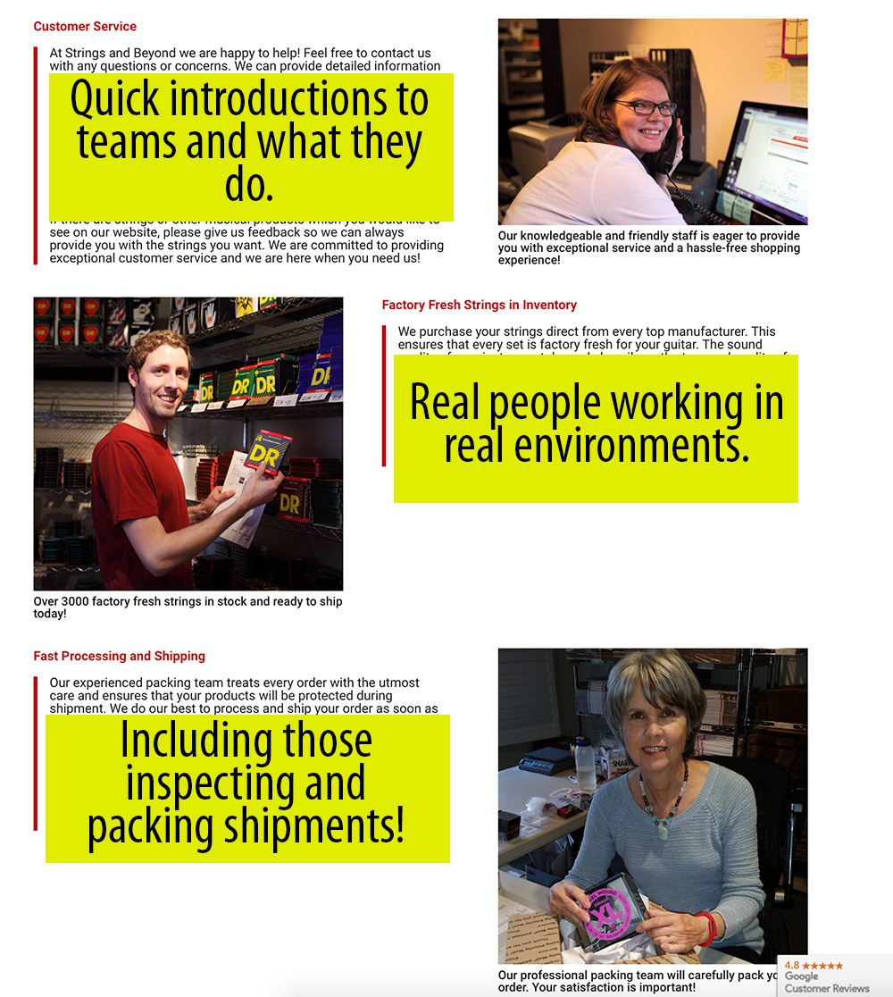
The about page at Strings and Beyond (for musical instruments) features the staff at work.
What causes do you support? Shoppers like to know how money is used to help others. Some are more apt to spend more with a company if it supports worthy causes. If allowed, be sure to include logos of supported organizations and links to their websites.
How do you conduct business? This is where you convey honesty and build trust. Explain the company’s goals and its promise to deliver a meaningful experience.
Have you received awards or recognition? Be sure to list recognition and awards. Include official logos or digital certificates when possible.
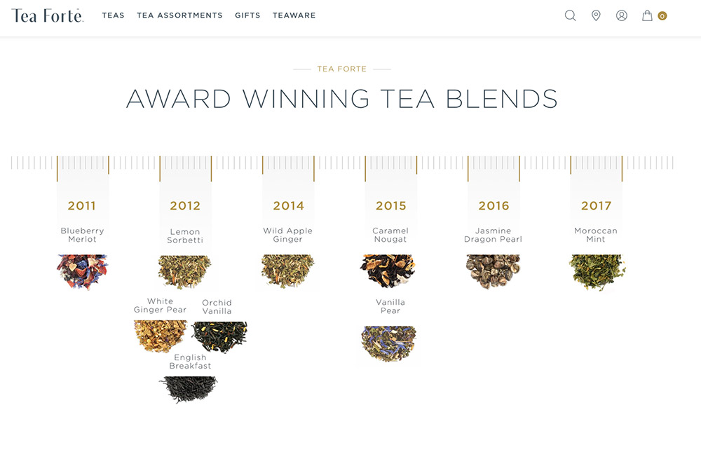
Tea Forte showcases its award-winning teas with a timeline.
While answering questions, focus on key milestones, goals and the people behind-the-scenes.
What to Include
Personal stories. Many companies were founded to fix or overcome a problem. Two Blind Brothers, for example, was launched to help cure blindness and donates its profit to that cause. A video features the founders who share their story and the company’s mission.
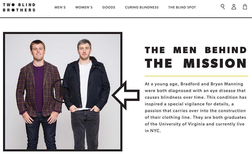
Two Blind Brothers relies on personal stories to sell its unique line of clothing.
—
Team member spotlights. Shoppers are curious about the leaders of a company. But they also want to support a company that treats its staff like family. The about page is a good place to show off the people who make it all work — from customer service agents to warehouse workers.
Crutchfield, the electronics retailer, features its employees — “real people” — in pictures and video. And in most cases, it’s the staff and not the executives who explain what the company is all about.
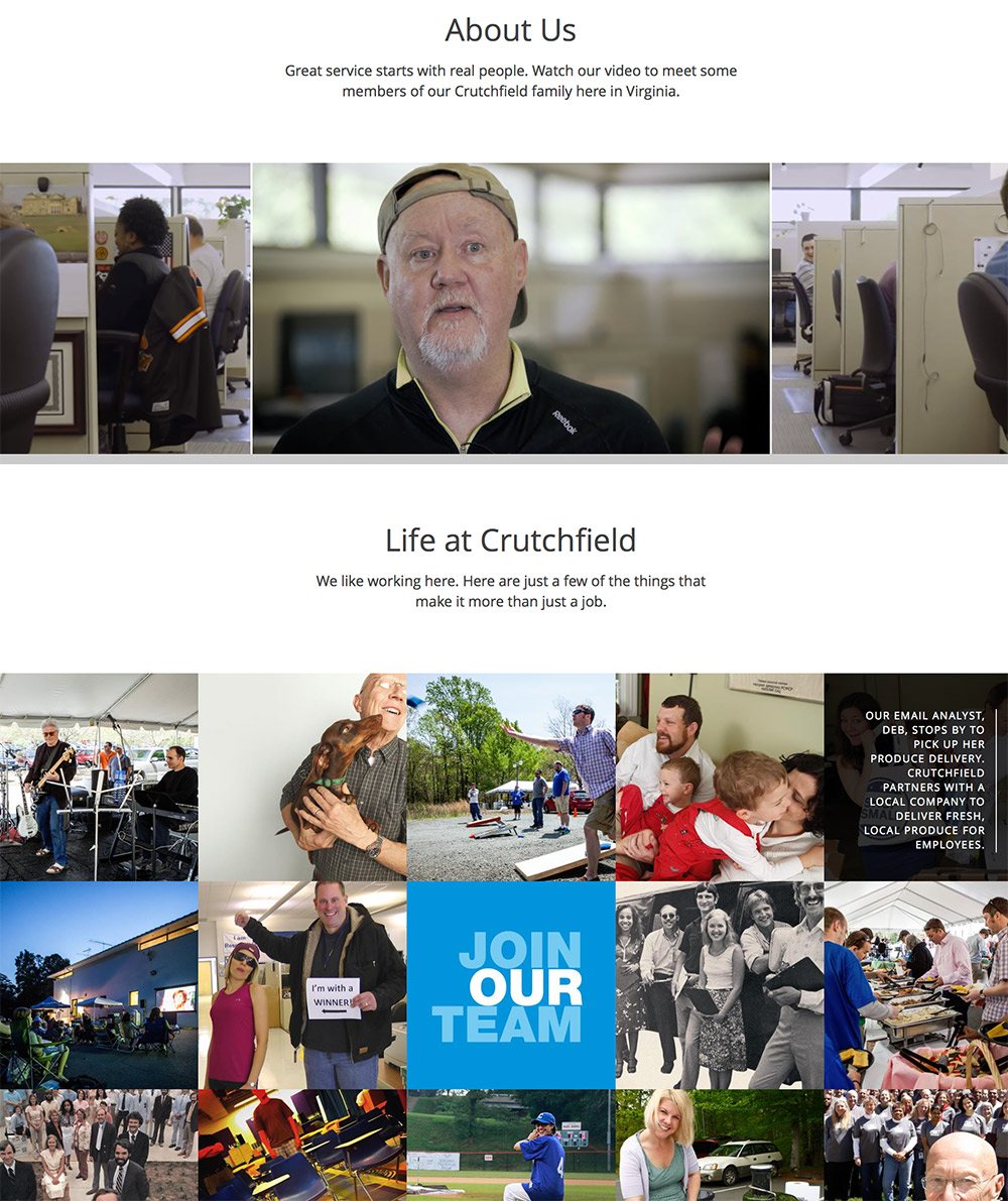
Crutchfield uses its biggest asset — the people who work there — to market the company.
—
Company timeline. A graphical timeline of milestones reinforces longevity and credibility. Keep the highlights short and sweet, but consider including more details in a link or a hover-over display. Pictures work well, too.
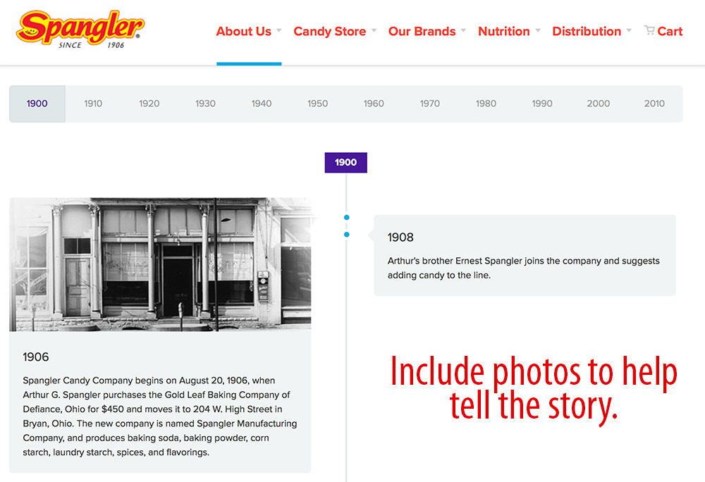
The timeline at Spangler’s Candy Company includes historical photos. This lends credibility to the company’s history.
No Hype
While the about page is the place to tout your company, it’s also about connecting with shoppers. Inject personality and color to make this vital page part of the shopping experience and not an afterthought. The about page in not the place to hype products. If you create a connection with visitors, the site’s navigation will take care of the rest.