The Fitbit Versa 2 was announced only a month ago and already its biggest competitor is trying to take it down. Alongside the Apple Watch Series 5, Apple cut the price of the Series 3 to $199, a near-30 percent drop over the prior year’s price. But more importantly, it means you can buy an Apple Watch for the same price as Fitbit’s latest smartwatch—99 cents less if you’re being technical.
Of course, there’s one big difference between the two wearables: one’s two years old. Even though Apple Watch Series 3 can be updated to the newest version of watchOS (minus a couple watch faces), the fact remains that it was made in 2017. So, is an old Apple Watch worth as much as a brand-new Fitbit?
Apple Watch Series 3 vs. Fitbit Versa 2: Design
Unlike wearables from Fossil, LG, Huawei, and pretty much every Wear OS watch, both the Apple Watch and Fitbit Versa 2 are square rather than circular. The Versa’s 1.34-inch display is significantly smaller than the smaller Apple Watch’s 1.5-inch screen and dwarfed by the larger 1.7-inch one, mostly due to the Apple Watch’s slightly tall shape.
But where even the 38mm Apple Watch might seem too big for some wrists, the Fitbit Versa 2 is the closest to one-size-fits-all that I’ve tested. While the bezels around the screen are much thicker and more visible than they are on the Apple Watch, the two watches look extremely similar from a distance.
And up close, they don’t look all that different, either. There’s no denying the Apple Watch’s weight and craftsmanship make it feel like more of a luxury device, but the tapered design of the Versa 2 gives it a slimmer feel, despite being only slightly thinner (11.2mm vs 11.4mm). Colorwise, the two watches are very similar as well, with gray, silver, and gold options.
Winner: Apple Watch
Apple Watch Series 3 vs. Fitbit Versa 2: Display
The display on the Fitbit Versa 2 has switched from LCD to OLED, bringing it up to speed with the Apple Watch. It’s also centered now, thanks to the elimination of the Fitbit logo, and from a distance, the two watches are virtually indistinguishable, with deep, rich blacks and crisp, vibrant colors.
The two screens differ the most when you’re not actively using them. The Versa 2 has an option for an always-on display, while the Apple Watch Series 3 will fade to black once you lower your wrist. The always-on options are limited to rudimentary clock faces, but they make a big difference in usability. You can see the time at a glance without raising your wrist or tapping it and waiting for the screen to light up. The new Series 5 Apple Watch has a bigger screen, rounded corners, and an always-on option, but you’ll need to pay twice as much to get it.
Winner: Fitbit Versa 2
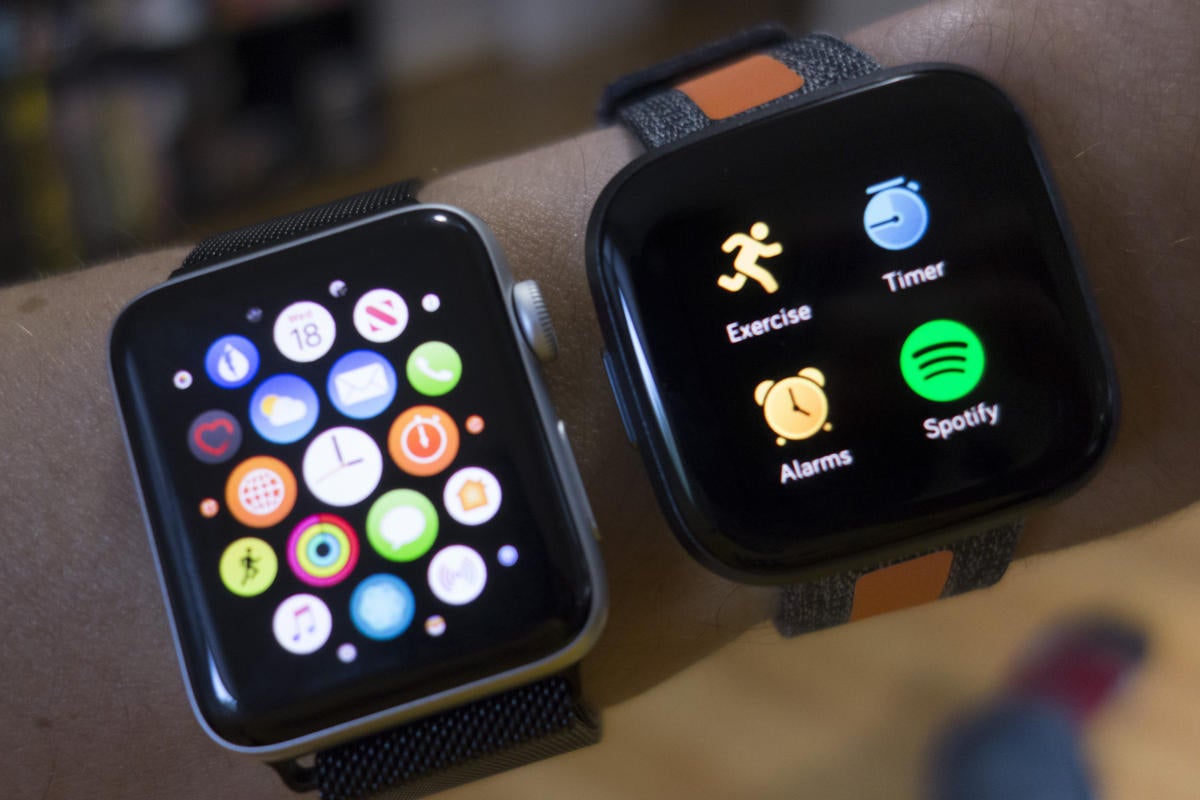 Michael Simon/IDG
There are a lot more apps on the Apple Watch Series 3 (left) than there are on the Fitbit Versa 2.
Apple Watch Series 3 vs. Fitbit Versa 2: OS, faces, and apps
Apps are central to both the watchOS and Fitbit OS experience, but the approach is very different. On the Apple Watch, apps are rich and interactive, but on the Versa, they’re extremely minimal and often limited to a single page or action.
There are also far fewer available on the Versa. While many popular options are available—including Spotify, Starbucks, and Uber—there are only about 100 in total. Contrast that with the tens of thousands that are available in the watchOS App Store and you’ll find there’s a huge gulf between them. Furthermore, you’ll need to use your phone every time you want to install an app on the Versa, while Apple has brought an on-watch App Store to the Apple Watch with watchOS 6.
Navigation differs between the two watches, most notably when it comes to the hardware buttons. The Apple Watch has a Digital Crown—which is used for back, scrolling, to select an app, and to wake the screen—while the Versa’s sole button is used to turn the screen on and off, and to go back. The Apple Watch also has a secondary button for opening the recent apps screen. Even the placement is different: The Versa’s button is on the left, while the Apple Watch’s is on the right.
You can choose between a variety of watch faces on either watch, with Fitbit offering many more thanks to the ability for third-party developers to join in. However, many of them are junky, and on the Apple Watch, every face is high-quality and customizable. You can also switch between them right on the Apple Watch, while the Versa relies on the phone app to make changes.
Both OSes use a dark mode that’s extremely friendly on the eyes—especially against the true blacks of the OLED screens—but Apple’s apps are a little easier to navigate either as a list or the classic honeycomb pattern. Since only four apps fit on the Versa screen at a time, you’ll need to do lots of swiping if you have a couple dozen installed.
Fitbit’s biggest advantage is the dashboard of stats that appears when you swipe up from the bottom of the screen. There you’ll find a customizable collection of your relevant data without needing to jump into an app or set a specific clock face. Apple lets you access stats too, but you’ll mostly need to head over to Activity or another app to see them.
Winner: Apple Watch
Apple Watch Series 3 vs. Fitbit Versa 2: Assistant
Fitbit made a splash this year with the inclusion of Amazon Alexa on the Versa 2, giving it a degree of parity with Google Assistant on Wear OS watches and Siri on Apple Watch. Ultimately, however, it pales in comparison to a true assistant.
For starters, the only way to summon Alexa is to press and hold the side button, unlike the Apple Watch, which has raise-to-speak and “Hey Siri” support. It’s also a hair slower to respond than Siri, and the whole process feels more like using an app than a fully integrated on-watch assistant.
While Alexa is nice to have at your disposal when you want to ask a question or run a routine, it’s nowhere near as useful as Siri on the Apple Watch. You can’t get directions or ask it to play a song. You can’t launch an app or search the web. Alexa will interact with Fitbit’s exercise apps to start a workout or check statistics, but you’ll need to use the Fitbit skill, which adds another step. All in all, it’s less convenient than it could be.
Winner: Apple Watch
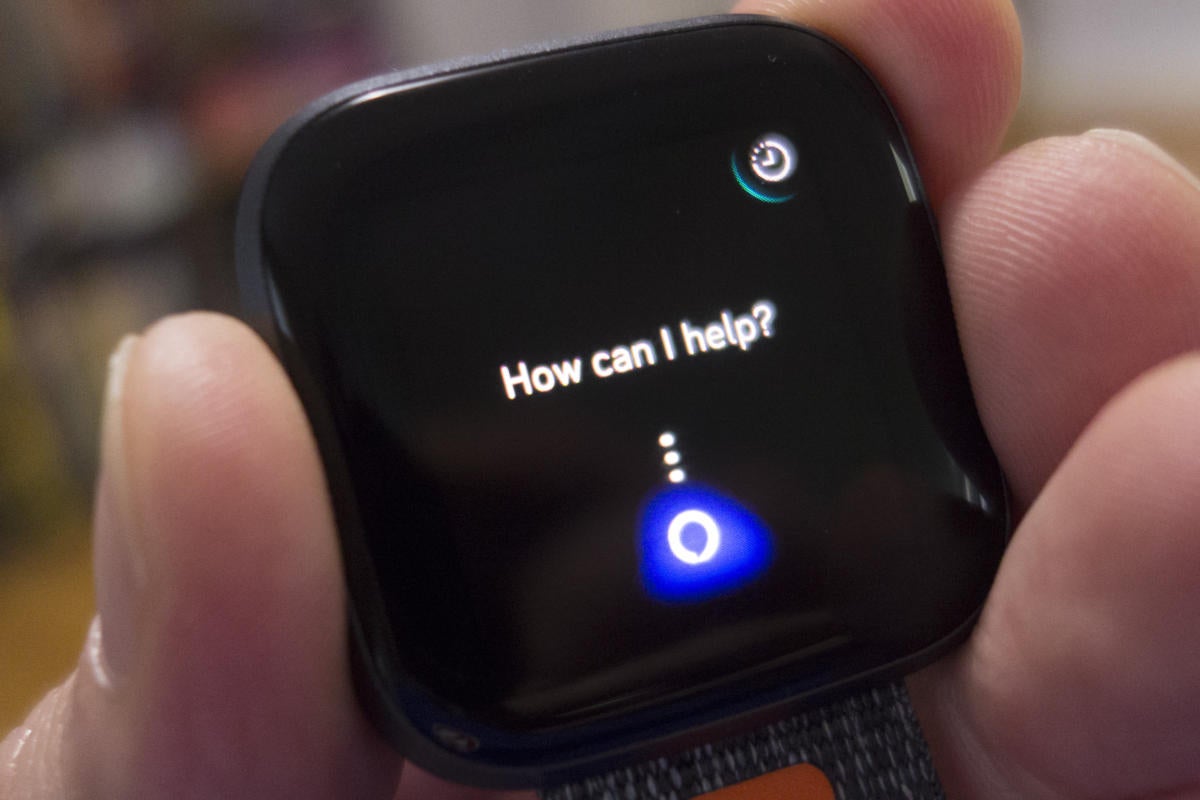 Michael Simon/IDG
Alexa on the Fitbit Versa 2 feels like more of an app than an integrated assistant.
Apple Watch Series 3 vs. Fitbit Versa 2: Connectivity and sensors
For less than $200, both the Apple Watch Series 3 and the Fitbit Versa 2 offer a solid array of sensors, including an altimeter, accelerometer, NFC, haptic vibration engine, Wi-Fi, a built-in microphone, and, of course, an optical heart-rate monitor. They’re also both water resistant up to 50 meters.
But there are some key differences. Most notably, the Apple Watch has a built-in GPS sensor while the Versa relies on your phone for location tracking. The Versa 2, on the other hand, has a Relative SpO2 sensor built into the heart-rate monitor for tracking oxygen levels in the blood.
While the Apple Watch is powered by a homegrown S3 processor, Fitbit doesn’t divulge the processor that’s inside its smartwatches. Most likely it’s a slightly faster Cortex-M than the one that powered the original Versa. At any rate, it’s plenty capable.
Winner: Apple Watch
Apple Watch Series 3 vs. Fitbit Versa 2: Bands
It’s well known that Apple sells a variety of leather, loop, and nylon bands for its watch that can be easily swapped out via a button on the underside of the body. While the pin-based swapping mechanism for the Versa 2 isn’t quite as simple as the Apple Watch’s mechanism, it’s plenty easy to change bands. And Fitbit similarly sells a variety of straps for the Versa 2. You can choose between leather, metal, and woven varieties for slightly less than Apple charges. However, there are plenty of cheap third-party options for both devices.
Winner: Tie
Apple Watch Series 3 vs. Fitbit Versa 2: Sleep tracking
Next to fitness, Fitbit’s sleep tracking is one of the Versa 2’s best selling points, and flat-out crushes Apple Watch out of the box, mainly because Apple doesn’t have a native sleep tracker on any of its watches. But even if it did, it would almost surely be limited to the latest model due to the pedestrian 18-hour battery life on the Series 3.
There are third-party apps such as Sleep Watch and Pillow that measure the time and quality of your sleep, but without multi-day battery life, you’ll need to either charge it before you go to bed or in the morning to ensure it lasts through the day and night. Plus, without a native Apple app, you won’t get anything near the integration and stats that the Versa 2 offers, including Sleep Stages, and a nightly Sleep Score to get a full picture of your rest.
Winner: Fitbit Versa 2
Apple Watch Series 3 vs. Fitbit Versa 2: Battery
Battery life represents the single biggest difference between these two watches, and will probably be the thing that sways people away from the Apple Watch. There’s no other way to say it: The Versa 2 lasts more than five times as long.
The Versa 2 is rated for five days-plus of battery life, and in my testing I had no problem hitting five days. And that’s five full days with overnight sleep tracking. Even with the always-on display switched on, the Versa 2 will still get three days of battery life.
Apple, on the other hand, promises the Apple Watch will last 18 hours in normal use. There’s nothing wrong with that rating, and if anything it’s a little conservative. But it’s still nowhere near the Versa 2’s three- to five-day battery life.
Winner: Fitbit Versa 2
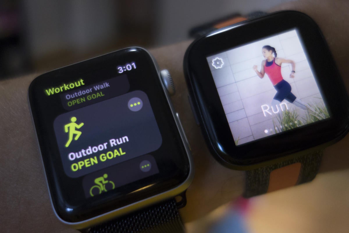 Michael Simon/IDG
You won’t miss a workout with the Apple Watch Series 3 (left) or the Fitbit Versa 2.
Apple Watch Series 3 vs. Fitbit Versa 2: Health and fitness
Health and fitness is at the center of both platforms, and as such, they each automatically track steps, stairs, heart-rate, and movement throughout the day. And they can both remind you to stand and breathe each hour. For most people, that will be enough, but there are plenty of features for serious health and fitness buffs too.
Both watches have an optional auto workout detector, but Fitbit’s is more specialized. While the Apple Watch can detect a general workout and record it, the Versa 2 will automatically record select exercises, including swimming and running. The Versa also includes on-screen workouts as well as integration with Fitbit Premium, a new subscription service that offers feedback, motivation, and personalized routines to keep you on track toward your goals.
While Apple Watch Series 3 doesn’t include the newer health features such as the ECG sensor and fall detection, it will monitor noise levels to protect your hearing and send you alerts if your heart rate is too high or too low. Both also offer period tracking, although the Apple Watch lets women input symptoms and timing directly on the device. With the Versa, everything is done in the app and synced back to the watch.
Unfortunately, while Fitbit tracks your heart rate all day, it doesn’t have a system in place to let you know if your pulse has dipped or risen unexpectedly. In an otherwise close competition, the Apple Watch gains an edge here, even if it’s a feature you hope never to use.
Winner: Apple Watch
Apple Watch Series 3 vs. Fitbit Versa 2: Music
Apple Music subscribers can access playlists and their music library right on their wrist using the Music app, and you can sync or stream podcasts using the Podcasts app. The Versa 2 offers Deezer and Pandora apps for subscribers of those services, but most users will need to use a PC to transfer music onto their watch.
Apple also lets you store music on your watch and features an array of third-party apps, including Shazam, Pandora, Overcast, and SoundHorn. Spotify subscribers will be able to remotely control what’s playing on their phones using either watch, but there’s no syncing or downloading available. Since the Versa 2 doesn’t have a built-in speaker and the Apple Watch’s is only used for Siri and calls, you’ll need to connect a set of Bluetooth headphones to hear the music playing on your watch.
Winner: Apple Watch
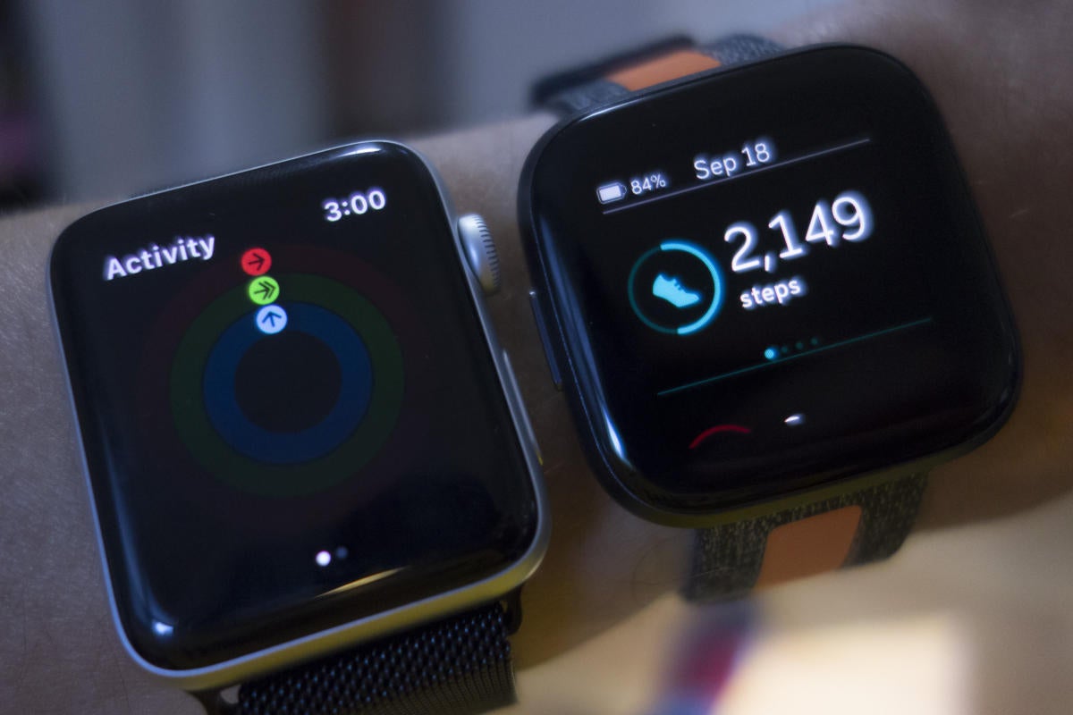 Michael Simon/IDG
The Apple Watch Series 3 (left) and Fitbit Versa 2 both do an excellent job with tracking your movements.
Apple Watch Series 3 vs. Fitbit Versa 2: Security
Either watch will lock down your screen as soon as it’s removed from your wrist by making you enter a 4-digit passcode when you put it on again. Apple enables this feature by default during setup, but on the Fitbit, you’ll need to flip on Device Lock in app settings.
Winner: Tie
Apple Watch Series 3 vs. Fitbit Versa 2: Compatibility
Of course, these categories are meaningless if you have an Android phone. The Apple Watch both requires and only works with an iPhone, while the Versa 2 works across both platforms, as well as Windows 10 PCs.
Winner: Fitbit Versa 2
 Doug Duvall/IDG
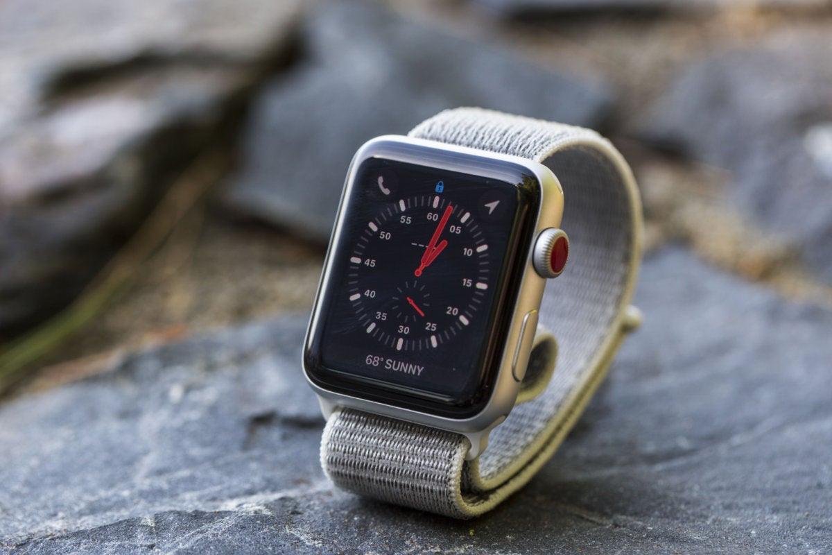
The Apple Watch, even one from 2017, is just too good to beat.
Apple Watch Series 3 vs. Fitbit Versa 2: Conclusion
It’s pretty amazing to think that a two-year old smartwatch can match up with—let along beat—one that was released only a couple weeks ago. But that’s what we have here. Just two weeks ago, the $279 Apple Watch Series 3 was a tough recommendation over the $200 Versa 2, but with a 30 percent price cut, it’s hard not to recommend it.
With the exception of battery life and sleep tracking, the Apple Watch Series 3 is far and away the better buy, value, and all-around device.