A call to action (CTA) is just a fancy marketing term for a button that entices the user to take a desirable action, taking them further down the conversion funnel
Have you ever signed up for an online subscription service (Netflix, Spotify, you name it) or downloaded a free resource from somewhere?

Well, your “action” was the result of an effective call to action. These seemingly straightforward buttons are an integral part of a marketer’s toolkit. They can make or break your conversion game, and be the difference between converting a lead and losing a potential client.
A well-crafted call to action is a boon for both parties.
For the business
You can convince people who visit your site or read your emails to do something fruitful, like buying a product, downloading a gated resource, consuming more of your content, or sharing a piece of content on social media. It’ll increase the user’s interaction with your website and perhaps keep them coming back for more. In exchange, you can get their contact details and gain a new lead.
For the users
They’ll know exactly what they have to do next after going through your content. If there is no CTA, they’ll probably just leave (and forget) your website without performing any specific task beneficial to them or your business. Besides, don’t you want them to take a souvenir that adds some value to their lives and helps them remember you in a good light?
According to Small Business Trends, around 70% of small businesses don’t have CTAs on their websites. If you are a part of this majority, it’s time you upgrade your website and conversions by learning the fundamentals of creating a good call to action.
Creating high converting CTAs is not rocket science, but it does take a bit of testing and basic psychology to get right.
How to write a powerful call to action?
You could just design a button labeled “Sign Up”, “Buy Now”, or “Click Here” and call it a day. Sure, it gets the message across, but think about how many times you’ve seen such buttons and actually clicked to perform what they ask of you.
People don’t like simply being “commanded” to do something. They want an incentive to click, an answer to “what’s in it for me?”. Moreover, a good call to action creates a sense of urgency in the reader’s mind without sounding pushy.
To write a compelling CTA, the first thing you need to do is define your goal. Do you want to:
- Get more newsletter subscriptions?
- Increase reader retention?
- Get more people to share your content?
- Boost sales?
In short, a clear answer to the question “What do I want my audience to do next?” is a must.
Now, once you start the creative process of writing a CTA, keep the following best practices in mind.
Write actionable copy
Use strong verbs and phrases that clearly guide the user to take a specific action. Don’t be vague.
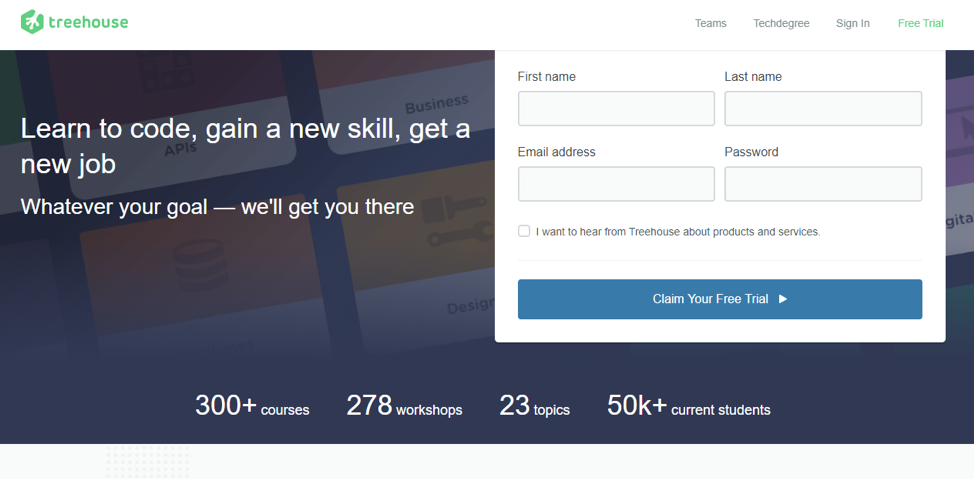
Design a striking design
Your CTA button should stand out from the rest of the page. Using a contrasting colour with relatively larger fonts would do the trick. Aim to match the colour of the button with your business’s logo, the rest of the page being contrasted.
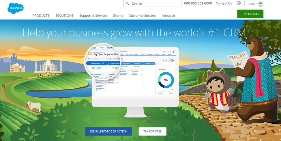
Additionally, using subtle animations on hover and design effects such as button shadow (3D effect) are also good ideas.
Keep it succinct
Don’t write complete sentences inside a button. Instead, use short phrases no longer than five words.
Incite a sense of urgency
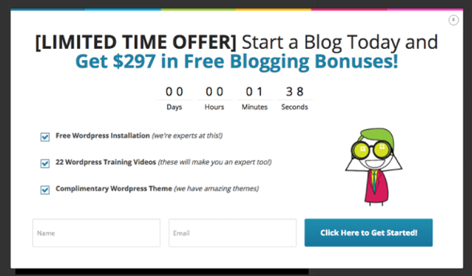
If applicable, develop a sense of urgency and trigger a fear of missing out (FOMO) in the reader’s mind by writing phrases like “Only X Spots Remaining” or a countdown timer showing that the offer will expire soon.
Show a sense of humor
Don’t shy away from being witty. People appreciate wordplay, and puns have persuasive powers. But don’t just take my word for it, give it a try.
Get personal
Let the reader feel like they call the shots.
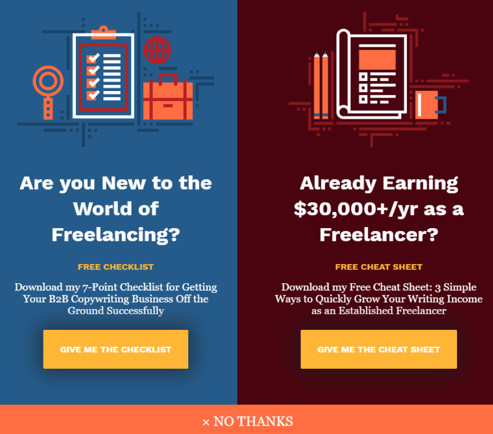
Use the first-person narrative by writing something on the lines of “Give Me the Free Guide”, the negative response (in case of a popup) being something like “No, Thanks. I’m the Expert”.
Avoid friction words
Words like “Buy” and “Submit” give an impression to the reader that they have to give something up. Obviously, they would be hesitant when directly asked to part with their money or email address. Better to avoid such words and use low-friction alternatives such as “Get” and “Reveal”.
Give reassurance
Again, if applicable, let the reader know that they have nothing to lose in completing the action. For example, they can cancel the subscription anytime or get a full refund if they’re not satisfied with the product. Phrases like “No Credit Card Required” and “Cancel Anytime” can convince readers on the edge to take the plunge.
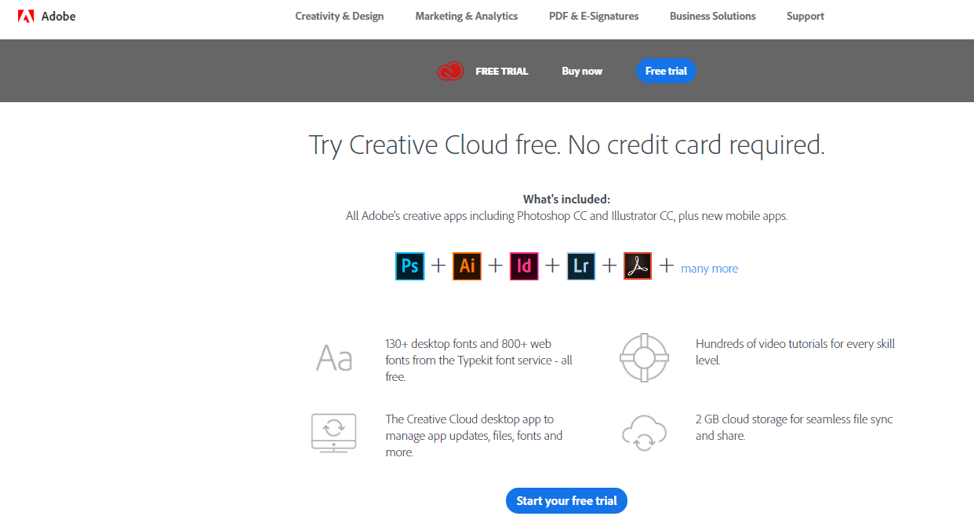
Follow these eight dos and don’ts to craft an irresistible call to action your audience can’t refuse.
Where to place a call to action?
If all your website content is purposeful – which it should be – then call to actions are useful in many places. CTAs are the point of transition from storytelling to copywriting, which typically go hand in hand.
Let us look at four of the most common places where CTAs are ordinarily placed.
At the end of a blog post
This is the perfect spot to get the readers to subscribe to your newsletter. As they read your post from top to bottom (or so it seems), it is only logical to assume that they’d be interested in receiving exclusive content from you straight in their inbox.
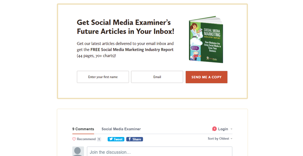
Furthermore, CTAs can take the form of hyperlinks with anchor text and labeled “Related Reading”, inviting the readers to continue reading more content on your blog. You can also place social sharing buttons (along with “Click to Tweet” CTAs sprinkled judiciously) and ask the reader to share the post with their friends.
A combination of all the three is totally feasible and sensible.
In exit-intent popups
Exit-intent popups are a popular tactic to engage users who are about to leave your site by collecting their email addresses in exchange for a free, tempting resource. After all, the money is in the list.
At the end of email newsletters
CTAs play a vital role in email marketing. Newsletters and promotional emails are almost always ended with an intriguing call to action. You should do the same in your newsletters too, as it works well.
Some example use cases would be asking the readers to:
- Take advantage of a limited-time sale or discount
- Check out a new product catalog
- Download a free e-book
In the sidebar
Another favorable spot to place your CTA is in the sidebar. The advantage being it’ll be super conspicuous and won’t go unnoticed.
A word on split testing
The most irresistible of CTAs can be, well, resisted by the audience. That’s because while data and psychological hacks help, at the end of the day, this is a somewhat subjective matter. What works for one website may not work for you.
Your best bet is to A/B test different CTAs, and over a period of time, decide which works best for your website.
