There are crucial things that go behind the making of a gorgeous website. One of these is color. Selecting the best fonts and best colors for websites is always a challenging task.
Where fonts increase the readability, colors are the most crucial aspect of a design. Selecting the right color scheme is something that every artist and designer puts a great deal of thought into. The color scheme of your design is capable of making or breaking the project.
Importance of Color Scheme for Your Website?
Color serves as
the most potent psychological tool for gaining the audience’s attention. It can
be used as a call-to-action for the website.
Color helps in
processing and storing images more efficacious than black and white images. The
contrast creates a mental appeal when coherent with your business theme.
This helps with
brand recognition and prompts the visitors to your site to take action.
A right color
combination can make the website more memorable and also provokes emotional stimulation.
When a website is
colorful, it makes the experience enjoyable and pleasant for the visitor. Wrong
color schemes can make UX irritating.
A pleasant
experience, in turn, leads to higher conversion rates. Apart from a
well-designed user-interface, the right contrasted color scheme will help a
visitor to navigate through the site content quickly and easily.
Good color combinations can also prove to be useful when it comes to developing content hierarchy or focusing on call-to-action or critical information.
Here are 20 Best Colors for Websites
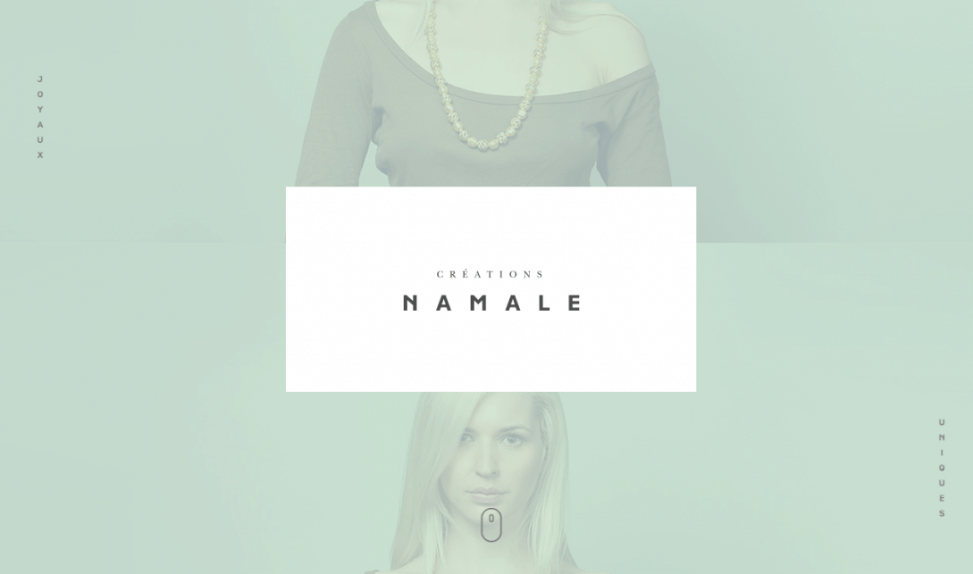
#1 Soft Tones
Soft tones are in
trend, and as the name suggests, the colors are classy and quiet. It is the
ideal choice if your brand belongs to the fashion or jewelry industry. This
simple tone is capable of working wonders.
The tones work
with each other and make the jewelry or fashion content on the page stand out.
However, the layout is as important as the color scheme. Usually, these kinds
of websites have minimal text.
Instead of
cramming several products on a single page, the site takes on the approach of
only one at a time. An excellent example of such a website is Creations
Namale.

Colors Codes: #c5d5cb, #9fa8a3, #e3e0cf
#2 Balanced and Colorful
Cool and warm
hues are one of the best color combinations. The combination has a soothing
effect on the visitor. From an earthy terracotta to bluish-green, this color
scheme is quite attractive.
It is suitable
for modern and youthful designs. It can serve as a sound color palette for
health websites.
Also, minimal text is recommended for such sites to avoid giving it a cluttered look. Active Theory is a site that has made use of such color tones.

Color Codes: #E27D60, #85DCB, #E8A87C, #C38DE, # 41B3A3
#3 Gradient Greens and Blues
Using a gradient
scale, take the simple colors of blue color and then blend it with various
tones. In case your website looks outdated and dull, you can try adding
gradient colors to it.
This will offer a
modern look to your design. The latest site of Stripe is using the color palette.

This is a
software used by internet businesses to process payment. To stay updated with
the latest trend, they have introduced this color scheme to their website and
gave it an appealing look.
Color Codes: #7DF9FF, #0892D0, #23B2EE
#4 Subtle and Succulent Web Color Scheme
When it comes to
designing a website that looks professional and gives a classy and subtle look
at the same time, Subtle and Succulent color scheme is the one to go for.
The mixture of
light, and yet classy color makes this color scheme great for professional
messages and appeal, especially for websites related to accessory design.
In fact, a
visitor tends to check such color schemes out from the top of the web-page down
to the bottom.
Again. an
excellent example of such a website is Creationsnamale’s refined color
scheme.
The design of the
website is very appealing due to its deep colors, yet not too vibrant.

Color Codes: #acb7ae, #acb7ae #acb7ae, #c2b490
#5 Sleek and Modern Pink and Black
If you want to create a website with a modern and sleek design, you can go for jet black and bright. It gives the website a trendy look. Use the soft tone of pink as the background to make the black stand out.
Also, add bright
pink at some subtle locations. Cowboy has made good
use of this color palette.

A majority of the
people tend to use the color pink for targeting female customers. However, if
you take a look at Cowboy, you will notice that there isn’t anything feminine
about it.
It can appeal to
both genders. It is time to throw away the stereotypes and choose this color
combination for your e-commerce website.
Color Codes: #000000, #C39EA0, #FA255E, F8E5E5, #C39EA0
#6 Striking and Simple Electric Blue with Black
It is challenging
to shift your attention when you come across a minimalist design like the one
for this website called Bert. Usually, these kinds of sites have
smoky and dark backgrounds combined with electric blue shades.

This makes the
website look striking and, thus, is a winning color scheme for various service
agencies, consultancies, and solution providers.
Color Codes: #0B0C10, #1F2833, #C5C6C7, #45A29E, #66FCF1
#7 Throwback Red and Orange Tones
2019 has seen a
comeback of retro colors. Several brands are using popular colors from the 80s
and 90s for their website.
However, they
have incorporated a modern twist. Take a look at the homepage of Spotify.

You will notice
that the red and the orange tone has a throwback vibe to it. The warm colors
which give people the nostalgia of their adolescent years and childhood. The
polka dot color of Spotify seems to be inspired by the 90s.
However, the
design is trendy and uses a gradient scale that is very modern for blending
colors.
Keep in mind that
it is necessary to ensure that you have a fair idea of whom you are targeting
using these colors.
Color Codes: #10EE67, #FECB00, # F5B842
#8 Gorgeous Contrast
Sometimes, a
website might not look that attractive with the normal color schemes. The
business or theme that it drives may need something sharper.
This is where
contrast colors can make the website exponentially appealing.
The color
combination consists of two opposite colors like dark and light, giving the
perfect combination of dark background with light and vibrant text or vice
versa.
This makes the
text and the website pop out due to colors, which makes it more noticeable.
For instance, ReputationSquad uses a simple
color palette and design scheme.

Color Codes: #61892F, 86C232, 222629, 474B4F, 6B6E70
#9 Elegant Skin Tones with Elegant Colors
This is a unique
blend of color. Skin tones with elegant colors like ruby and dark imperial blue
are good color schemes for websites that have a nuanced message to relay.
It is reserved
but approachable and sophisticated but fun.
These are the
types of grey-area messages which are efficaciously sent with an appealing
combination. ChordSurfer has made good
use of these color tones.

Color Codes: #EFC7B7, #BAB2B5, #EEE2DC, #123C69, #AC3B61
#10 Soft Grey and Yellow with Vibrant Deep Green
Take a look at the website of the QED Group. It offers services to individuals, as well as companies for improving organizational developments with the application of behavioral economics and psychology.

It can be said
that the business model of QED is unique. Along these lines, they have used
some of the modern color tones on the website.
If you take a
look at the home page, you will notice that the color scheme is a little busier
than the ones which have been mentioned previously. However, they have put up
pretty well with this design.
Generally, people
feel that green, yellow, and purple tones might be hard on your eyes. However,
by using grey and lighter tones in the background, they can add bright
contrasting colors.
Color Codes: #dddfd4, #fae596, #3fb0ac, #173e43
#11 Dark Horse
A combination of
dark and earthy tones like grey, slate, and silver, popping out with brighter
tones of yellow gives a great visual appeal to the website. Every text looks
clear with simplistic fonts across dark backgrounds.
It makes the web-design
appear sleek and modern. Check out the website of IndianScouts. You will notice
a dark, warm and beautiful combination of bright and dark look.

The color is
great for automobile and mechanical website.
Color Codes: #feda6a, #feda6a, #feda6a, #feda6a
#12 Precious Metals
The use of
metallic tones over white background not only looks elegant and sharp but also
brings put a royal and premium look to the website.
This is something
that has been put to use by KAE.
The company not
only has used the brilliant color scheme on the website, but also on their
stationery and other products.
If you want to
give an expensive and elite look to the website, this color scheme can do that
easily.

This color scheme
is mainly based on a white background with the use of metallic color shades for
text.
Color Codes: #bd8c7d, #bd8c7d, #8e8e90, #49494b
#13 Audacious Yellow Against Dark Grey
Vivid yellow and
Portland orange against dark grey screams for attention. Your audience will
immediately notice what you have to say on the website. This color combination
is full of energy.
Thus, it is just
perfect if you want to get a bold and contemporary look. ASSIKO is a website
dedicated to festivals and parties. The color scheme sits perfectly with the
design.

Color Codes: #FF652F, #272727, #747474, #FFE400, #14A76C
#14 Loads of Red with Muted Tones
When you check
out the color schemes that we have discussed till now, you will notice that the
most popular color is red. This is because red is the most potent but
challenging color to use when it comes to a website.
Psychologically,
it is the most appealing color. That is why you will always see it associated
with big-ticket brands like KFC or McDonalds.
One of the most
useful applications of this color is to use it against a pop of colors. Another
good way is to pair it up with some muted colors such as grey and sand brown.
Five/Four has made use of
these tones. As a matter of fact, a significant portion of the website uses
red, and it is successful because they have used muted tones for the remaining
parts of the website.

In case, they
would have paired red with light blue, bright orange. It might have been too
much for the visitors to take. Softer colors go perfectly with red. However, if
you are using these tones, you should avoid going overboard with the color. Use
it wisely.
Color Codes: #5A7670, #B89F5D, #FA292A
#15 Futuristic Primaries and Pastels
When it comes to
selecting a color scheme for websites, it is better to follow the footsteps of
those who have enough experience. There is no need for reinventing the wheel.
One such example is Anton & Irene.

This is a
professional designing company based in New York. They specialize in digital
products and design. The website has a very trendy and modern color palette.
One good thing about it is the futuristic feel which comes right out.
You will notice
that the site uses more colors than the websites which have been discussed
previously. In case you want an artistic touch for your website, you need to
use different combinations of light blue, purple, grey, orange, and yellow.
Color Code: #bccbde, #c2dde6, #431c5d, #e6e9f0, #cdd422
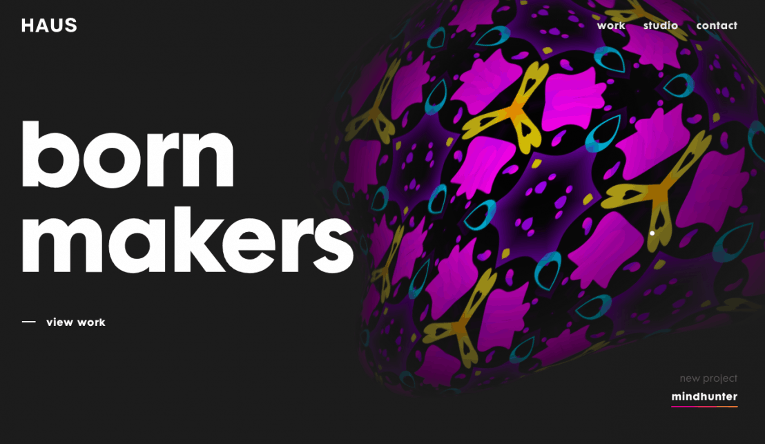
#16 Dynamic and Texturized Dark Tones
Charcoal, dark
sienna, and a burst of pale red will give your website a color scheme that is a
much have for futuristically and elegantly designed websites.
The color combination
is quite versatile and can be used for various projects with ranges from
editorial content to modern-looking corporate reports. One good example of the
use of this color palette is HAUS.

Color Codes: #2F4454, #DA7B93, #2E151B, #376E6F, 1C3334
#17 Black on Black
You will notice
that black is a standard color across many websites. However, it is used
sparingly. It is generally used for text and numbers as the background or the
primary color.
However, this
does not mean that you will not be able to use black more abundantly for the
color scheme of your website, particularly when you are using different tones
of black.
If you want to
check out how it looks, the homepage of JY BH can be a good
example. When you combine various shades of black, you will have a gradient
effect, which you will also notice in some of the early examples on our list.

The gradient
black color palette offers the site a mysterious look. JY BH sells luxury
accessories and garments for women, as well as men. This color scheme has been
popular for several years and continues to be a common choice.
Color Codes: #151516, #090A0A, #151617
#18 Energetic and Clean Blue Tones
If you check out
the Avoconseil website, you
will notice that the shades of violet and blue is particularly pleasing to the
eye. It can evoke peace and energy at the same time. Sky blue and blueberry
have been combined with amethyst.
They trigger
psychological attraction and decrease the bounce rate instantly.

This gives the
site a refreshing and attractive look. It is suitable for all designs that are
aiming to create positive emotions.
Color Codes: 56809, #84CEEB, #8860Do, #C1C8E4, #5AB9EA
#19 Fun and Youthful Tones of Yellow and Mauve
The colorful and
playful scheme of yellow, mauve and blue can give a vibrant and youthful look
to a website. It can be an excellent choice for shopping websites that are
looking to be trendy and attract a younger audience.
A good example is
the website of famous musician Pharrell Williams.

You will notice
that it has a white background, which makes the vibrant hues like tangerine,
bright turquoise, dark orchid, and yellow stick out. It projects a happy and
youth-filled emotion full of stories and experiences.
Color Codes: #A64AC9, #FFB48F, #FCCD04, #17E9E0, F5E6CC
#20 Flat Design Color
In case you are
not aware of the phrase term flat design. You might have seen such websites
before with no gradients, drops, or slope. These kinds of sites do not have a
three-dimensional element.
Take a look at
the flat-designed website of Render. Flat design
colors are generally quite super saturated and bright or super dark. Render
provides video production and editing services, and its website provides a
direct and sharp feel of professionalism.

They provide an
immediate seriousness to your business persona. The user notices feelings of
diligence as your website portrays a standard industrial tone.
Color Codes: #00887A, #FFFFF, #D3E3FC, #FFCCBC, #777A6F7
With so many
options, it is time for you to ditch the old and dull color you have been
using. It is necessary to use modern color schemes, which can affect website
sales today.
Selecting the
right color palette for the website shouldn’t be difficult. If you have to
update the website colors to make it look modern, trendy, and unique, you can
make use of any colors which we have mentioned above.
As a matter of
fact, you can use some of the exact color codes which have been provided.
However, when you
are selecting the color, you need to take the demographics of the website into
account. Also, consider the emotions and personality of the target audience and
the number of colors you would like to use.