Color tends to trip a lot of “non-designers” up. It can lead to confusion, doubt and, often, poor color combinations.
Besides causing jarring color pairings, poor color choice can make your marketing less effective. (Up to 90 percent of people make decisions based on color alone!)
This is especially true of email sign up forms. To get people to complete your forms, they need to notice them first. And color plays a big role in whether or not visitors see a form on your site.
But here’s the good news: You can easily avoid sign up form color mistakes. With a basic understanding of how colors relate, a design novice can create beautiful color combinations that catch people’s attention.
In this post, I’ll teach you three color theories you can use to choose sign up form colors. Plus, I’ll explain how your brand colors affect the design choices you make. While I’ll be applying the color theories in this post to sign up forms, you can use them for other things too (like your emails, for example!).
Analogous colors provide an easy-to-implement aesthetic
Analogous colors are those that are adjacent on the color wheel. Depending on how many color segments you break the wheel into, this could be blue, green and yellow or even three shades of any one color

This makes the color picking process a little easier. If you find one color you like, you can quickly identify the other two colors you should use just by looking at adjacent colors on the color wheel.
Here’s an example of what an analogous shade approach using three shades of green would look like:

And here’s another example of an analogous family using shades of yellow and green:

If you’re not sure how to find analogous colors, you can use the free tool Adobe Color CC to easily identify them.
Complimentary color schemes feel like smooth jazz
If you’d like to make your forms more interesting, consider a complimentary color arrangement.
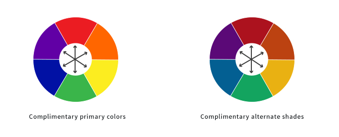
Complimentary colors are those that are on opposite sides of the color wheel. For instance, blue and orange, green and red or purple and yellow.

These pairings make for beautiful arrangements, especially when moving away from the primary colors. They are visually appealing and add visual contrast. (We’ll talk about that below.)
Here are some (non-primary) examples of how this could look on a signup form:


To find complementary colors, you can use the same tool I recommended for finding analogous colors: Adobe Color CC.
Contrast silently screams to your audience “Look at me!”
Life would be pretty boring without contrast in it. We’d be stuck in a bland world with limited exposure to life-giving diversity.
When the principle of contrast is applied to sign up forms, your visitors pay attention to what you want them to. This is powerful, as it can lead to something as simple, yet important, as more people noticing your call-to-action button and clicking on it.
There are two ways to utilize contrast in sign up forms:
1. Contrast between the form and the site itself
The idea here is to make the signup form’s background a highly contrasted color from the site itself. This draws the eye to the form naturally. Here’s an example of what that could look like:

2. Contrast within the form
Once you have their attention on your form, your visitor should know exactly what they need to do next – complete the form! To make this more likely, both the form fields and the button should be very noticeable. Contrast has a lot to do with this.
Notice how this form example below uses contrasting shades of black, yellow and white to draw the eye to the form, the fields and the button all at once:

And if you chose to use complimentary colors, this is a great opportunity to make your button and form background both compliment each other yet contrast. There’s no quicker way to say “click here” than with color!
But what about my brand?
That’s a great question! When it comes to applying these concepts to an existing brand aesthetic, there may be hesitation or misunderstanding on how the two can coexist.
If you already have established brand colors, no fear! The most complex and the simplest brand color schemes can apply these principles. How? By accepting that sometimes you’ll need to break free of a brand color to choose the right colors.
Or, you may realize that a new color should be added to your brand to adapt to the way your site is growing and changing.
Picture a brand as a person. Over time people change. There’s nothing inherently wrong with that. I don’t wear the same styles today that I did five or 10 years ago, but people still know who I am.
In the same way, your brand should also be flexible enough to weather time. Adding a new color on your site outside of your brand standards document might just begin a new, better era for your business.
If you’d like to use new colors that work with your brand colors but you’re not sure how to choose them, try Coolors. With Coolors, you can add your brand colors to a palette and the tool will choose colors that work with them.
Unlock the designer within
Whether you’re struggling to get your first sign up form created or performing your hundredth split test, try using some of these principles today. I hope they unlock the designer in you and help you design beautiful, converting forms.
Want to learn how to turn ordinary sign up forms into extraordinary ones that convert more visitors into subscribers? Join our free video course “Email List Growth Blueprint.”

