3 Keys to creating a really effective call to action
The call to action, or CTA, is the darling of the digital scene, a must-have for marketers in every webpage or piece of content. But don’t be distracted by their trendiness; CTAs are far from new…
A CTA is simply another way to express an age-old marketing question: “What do we want our target audience to do?” In turn, CTAs are only the latest iteration of the many techniques used to transform customers from strangers into friends.
While we’ve been making CTAs for centuries, that doesn’t mean they are a walk in the park. Many business owners and brand designers trip up when they try to turn their beautifully crafted websites into tools that actually drive action. In some scenarios, their CTAs will be hidden or completely nonexistent. Others are prominent, but they intimidate visitors, presenting hurdles to jump over.
The common roadblocks to great CTAs
There are many challenges you’ll discover when trying to put a good CTA together.
The first obvious one is this crucial question: “What do you want people to do?” Simply articulating the goals of a CTA is a challenge that businesses often stumble over. Others focus way too much on the creative aspect of a CTA, forgetting that every CTA should be a tiny cog in a larger strategy.
In addition, some marketers view CTAs as great pop songs — they come from a flash of inspiration and are catchy and addictive. This kind of thinking can lead to the worst kind of CTAs, ones that trick the visitor with too-good-to-be-true bait and then fail to follow through with anything of value.
What business leaders and marketing managers need to learn is that some of the best CTAs are quiet and unassuming. They speak sympathetically to visitors and get them to engage by understanding their unique needs.
In fact, research shows that it’s not the visual oomph of a CTA that holds the most swaying power — it’s the anchor text. According to a study by HubSpot, between 47 and 93 percent of leads come from the anchor text alone.
With this in mind, a CTA is only as great as the strategy behind it. It doesn’t matter if your CTA looks like a glitter ball with Ryan Reynolds’ face plastered on it. If it’s not whispering a compelling, personal message to your prospective user, it will flop.
3 steps to creating unique and effective CTAs
The above are just some of the roadblocks getting in the way of your CTA success. Next are three steps to start crafting CTAs that actually speak to your customers. They revolve around the clear actions of know, plan, and do.
1. Know: Become an encyclopedia about your customers
The best CTAs effectively tap into needs, desires, and behaviours. As a result, they might appear to read consumers’ minds. This doesn’t happen by chance, though. You can only get such precision by taking the time to learn everything possible about your customers. Do this by asking questions like these: What fills their days? What worries them? Where do they hang out online? When’s a good time to talk to them?
At Membership Corporation of America, we map predictive indicators using competition, past successful examples, and customer experiences. Filling the CTA process with information and insights. This helps us understand what will make a successful CTA in each specific situation.
It’s all about being able to pinpoint what customers need and how your product fulfils that need.
Now, you can’t create a need in your customers, but you can help them perceive needs they already have and then gently nudge them toward a great solution.
2. Plan: Engineer long-term yeses
You can roll out CTA after CTA and see who bites, but the best results happen when you have a strategy in place. Begin with a set of goals based on everything you’ve learned in step one, and then map out a series of CTAs that provide rewarding stepping stones that bring customers into a closer relationship with your brand.
One strategy won’t suit every business. Sometimes, it will make sense to cultivate a niche audience slowly and deliberately, nurturing consumers into saying “yes” when the time is right. For other products, it might make more sense to attract consumers quickly and shoot straight to monetization. Both strategies have merit, but the “yes” only happens if you plan thoughtfully.
3. Do: Design a CTA that matches your visitors
Once you’re armed with insight into your customers’ needs and you’ve crafted a strategy for the future, you’re ready to hire a talented design team or turn your amazing content creator loose.
It’s important to hire someone you trust to create the CTA. He or she needs to understand what your business is going for and be able to step easily into your visitors’ shoes. Yes, these team members should love design and get excited about a gorgeous image, but they also must get just as excited about the content marketing strategy that makes a great CTA work.
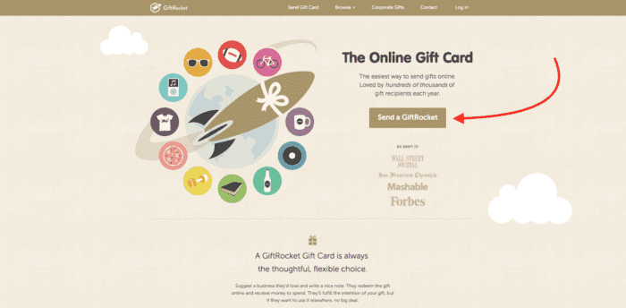
Take a look at this example of a great CTA crafted by GiftRocket. It found success because it was developed by using large amounts of visitor insights, and it carefully fits into GiftRocket’s long-term brand strategy.
This goes to show that simple design and great colours are just the icings on the CTA cake.

The secret to creating a great CTA isn’t really a secret at all. There’s no magic to it. Contrary to popular belief, the flashiest, most eye-catching CTAs might not appeal to the needs and desires of your visitors. However, what ends up getting that unique consumer to say “yes” to your brand is a mixture of research, strategy, and design — all three dependent on one another.

