March 29, 2018
How often are you taking into consideration what you’re offering users throughout their entire experience with your brand? This begins with the ad you’re paying to serve all the way through to the post-click experience. Is this experience seamless?
For those of you that missed our webinar at the beginning of the month on Post-Click Tips for Seamless Conversions, I’ll be walking you through just a couple of the examples we discussed. If these examples peak your interest or you’d like to hear more about how to create a seamless experience, visit the link above to view the webinar on-demand.
Pre- to Post-Click Experience
Because I am expecting a baby any day, do not be surprised that these advertisements are, in fact, for baby products. I chose to discuss examples I’ve come across in the last couple of months to show my own personal experiences.
Honest Co.
One of my favorite examples that I always come back to is the following advertisement from the Honest Company. I’m a regular subscriber so you can understand why this might be a favorite but in addition, their ad to landing page experience offers both positive and negative aspects worth highlighting.
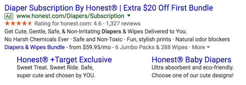
One important thing to be mindful of is why a user may be clicking on your ad. In this instance, it may be the offer present in the headline: $20 Off First Bundle. Check out how Honest reinforces this offer on their landing page below.
![]()
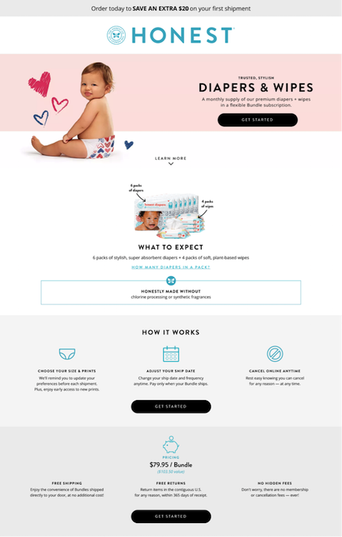
Another aspect that I routinely bring up is consistency. Not only should your message remain the same, but you should be utilizing the same language as well – same language requires less cognitive load from our users and they’re more likely to remember and retain something if it’s repeated in the same manner. Honest advertises “6 jumbo packs & 288 wipes” in their ad but present the following imagery and messaging on the landing page:
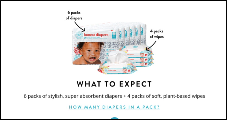
6 packs of diapers and 4 packs of wipes – you may not notice anything wrong and I wouldn’t say it’s “wrong” by any means. However, it could create unnecessary and unexpected questions from our users. Does 4 packs of wipes = 288 wipes? Is there a difference between a regular pack of diapers and a jumbo pack?
The last thing we’ll mention with Honest’s pre- to post-click experience and probably the most important relates to the price – one of the most important pieces of information for our users. Notice that the ad highlights a price point of $59.95/mo. On the contrary, take a look at the price point highlighted on the landing page:
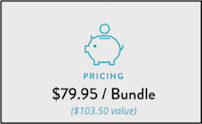
Now, to be honest (no pun intended), I’ve gone through this example three different times and this is the first time I’m realizing why there’s a difference in the price. The ad is taking into consideration the $20 off your first bundle while the landing page is displaying the month-to-month price of the bundle. If users, like me, don’t make this connection, this could cause enough hesitation in the purchase process to lose a potential customer.
Carseat Canopy
The second example I would like to spend some time analyzing today is a Facebook advertisement by Carseat Canopy… or Canopy Couture, I can’t be 100% sure – we’ll get to that in a minute. The aspects of this ad that I will critique are as follows:
- Brand recognition
- Offer reinforcement + Intent
- New ad creative (or lack thereof)
- Post-click experience
Check out the advertisement below followed by the landing page – keep in mind how our intent changes from our first example. When we were given an ad for Honest diapers, we were searching Google for a diaper subscription. However, in this instance, we’re browsing Facebook and we’re presented with an advertisement from Carseat Canopy within our feed.
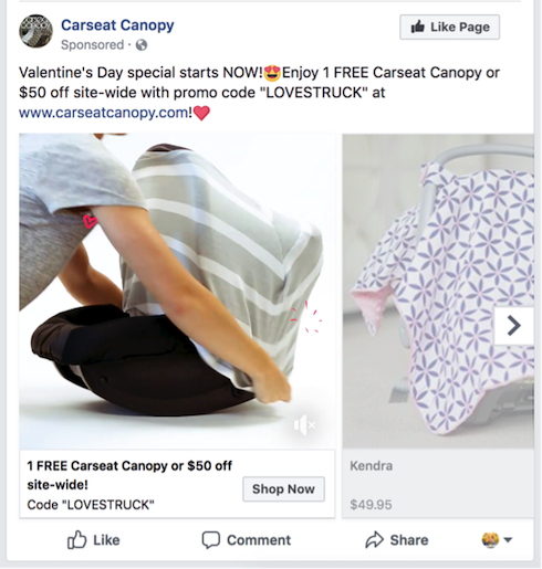
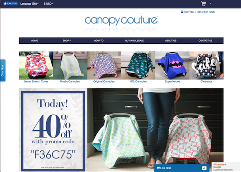
This brings me to my first point. Is it Carseat Canopy? Or is it Canopy Couture? This is probably the most important thing to understand – who is the brand you’re purchasing from? Many times I was second-guessing myself, thinking I was grabbing the wrong screenshots when creating this example. I’d seen this ad often, very aware of the brand Carseat Canopy but had never actually pursued the website or offer. Therefore, Canopy Couture was an entirely new name to me.
Secondly, check out the offer in the ad. Also, remember the intent I was talking about? If I’m just browsing Facebook with no intent to purchase, the offer that stands out to me is most likely the free carseat canopy. However, when visiting the landing page, I’m presented with two offers, neither of which is for that free canopy.

Without this offer reinforcement, it’s very likely the user will make their way back to Facebook and now you’ve lost out on a potential customer.
In relation, let’s briefly revisit the ad creative:

Notice this was a Valentine’s Day special. I was receiving this advertisement well into March. I’d already been confused by the brand, let down by the lack of offer reinforcement, and now it’s the middle of March and I’m still receiving the same Valentine’s Day offer.
Lastly, and probably the most frustrating thing we’ll talk about today is the post-click experience. Lets say there was a potential customer who is dedicated to getting a free carseat canopy. We’ll walk through the steps they would need to take in order to successfully take advantage of this offer.
1. Because the offer isn’t reinforced on the landing page, users will need to revisit the Facebook advertisement to grab the coupon code. Code: LOVESTRUCK
2. Next, users will need to take the code presented in the ad and test it out once they get to the site and have added a canopy to their cart.
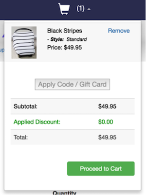
This is great, we’re able to add the coupon code with the simple cart drop-down in the top right-hand corner. We don’t even have to visit the cart page.
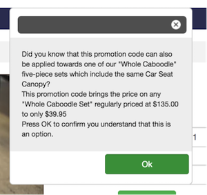
Not okay. After applying the code, we’re presented with a pop-up letting me know the code can be used for another promotion. Great, but I just want my free carseat canopy. *Exit pop-up*
3. After successfully entering the coupon code, users will navigate to the shopping cart to complete their purchase.
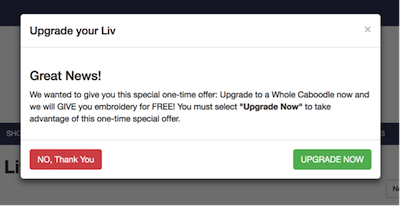
Boom. Another pop-up. Another offer. Remember, we didn’t have intent to purchase anything because we were simply browsing Facebook – therefore, I still am only interested in my free carseat canopy. *Exit pop-up*
4. Users will then proceed to the shopping cart after exiting the previous pop-up.
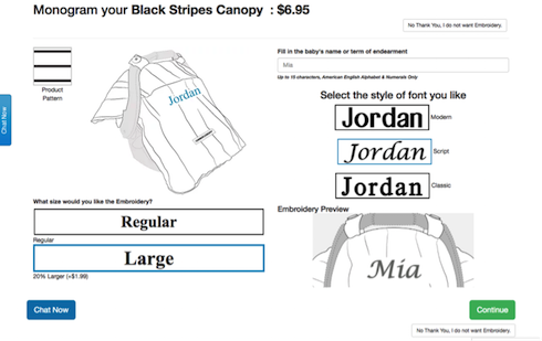
Or will they? Not without being presented with another offer. I didn’t get any further in my journey with Carseat Canopy and I can’t expect many potential customers do either. The experience has presented many interruptions and at this stage, it’s unclear where to click if we’re uninterested in this offer. Hint: it’s not the green button…or the blue button.
Are you frustrated yet? Well, that wasn’t my intention. I’m hoping I’ve provided you with just two examples of why it’s important to consider the entire experience your users have with your brand.
Final Thoughts
I hope these examples have provided a good foundation and understanding for things your users may notice as they interact with your brand. Even smaller things that may seem irrelevant to us have the potential to cause friction and interfere with the post-click experience.
To see even more examples like the one’s I’ve discussed today and learn tips on how to ensure this pre- to post-click experience is seamless, check out our on-demand webinar from earlier this month! I’d love to see examples you’ve encountered – this is a topic that absolutely intrigues me. Reach out on twitter @samantha__kerr with any questions, feedback, or examples of your own!