You might have heard of these things called page builder plugins. Okay, of course you have! They are all the craze right now. But here’s the thing; which one is best? Today we make it clear by comparing Divi Builder, Beaver Builder and Elementor.
“Why those three specifically?” – you ask. First off, yes, there is a lot more options waiting for you out there in the page builder realm. There’s WPBakery Page Builder, SiteOrigin Page Builder, Brizy, and probably another dozen of other tools that remain under the radar. So why dismiss them all and focus only on Divi Builder, Beaver Builder, and Elementor?
The answer is simple; they are the big three. They’re the most popular page builder plugins in the market, with the most prominent teams behind them, and probably the most “developer hours” invested in building them.
What this translates to is simple. While the other, more niche builders might have single features here and there that make them interesting, “the whole package” is something you’ll only get with either of the big three: Divi Builder, Beaver Builder or Elementor.
But which is best? Let’s find out!
This comparison focuses on a handful of important aspects:
- Ease of use. That’s the whole selling point, isn’t it? In other words, if I knew code I wouldn’t need a builder in the first place.
- Content modules available. Text blocks, image blocks, buttons, etc. Let’s compare which of the big three comes on top here and offers the most.
- The out-the-box templates. Building pages from scratch is fun … if you have the time. If not, templates come in handy. Good builders should offer those.
- Load times! Does your website load slower with a builder plugin enabled? Let’s check.
- What happens when you deactivate the plugin. Some builders handle this well – meaning, the pages remain looking okay-ish. Some aren’t as graceful.
- The price. Obviously. Plus how to make a decision. 🤔
Let’s get down to business:
Divi Builder, Beaver Builder, Elementor compared
First, the basics! As you may already know, under the hood, Divi Builder, Beaver Builder, and Elementor are WordPress plugins.
The main perk that all three have to offer is that they make it real easy to create custom-looking page structures and posts. I’m talking about the kinds of designs that go way above what your theme allows you to do. You can create landing pages, custom about pages, sales pages, anything really.
- Divi Builder is a premium-only plugin. There’s no free version available.
- Both Elementor and Beaver Builder subscribe to the freemium model – as in, there’s a free version plus you can pay a small fee to get more features.
Let’s look into the nitty-gritty in just a sec, but first, here’s a quick summary table if you’re in a hurry:
| Divi Builder | Beaver Builder | Elementor | |
|---|---|---|---|
| Price | $89, $249 | free, $99, $199, $399 | free, $49, $99, $199 |
| Ease of use | 4 / 5 | 4.8 / 5 | 5 / 5 |
| Content modules | ~45 | ~30 | ~60 |
| Page templates | ~370 | ~30 | ~140 |
| Load time impact | +27% | +37% | +28% |
| When you deactivate | A mess of shortcodes | Good page structure remains | Good page structure remains |
| OVERALL | #3 | #2 | #1 |
The full comparison:
1. Ease of use
First, the installation itself. No surprises here. Divi Builder, Beaver Builder, and Elementor all install like any other WordPress plugin.
Beginner’s note: Here’s how to install a plugin.
Once you’re done with the installation, all three builders are ready to use right away. That being said, they all do come with their separate settings pages in the WordPress dashboard. However, you don’t actually need to go into those settings in order to begin using the builder. All options are … optional.
Extra points here go to Beaver Builder, which has a special onboarding panel, meant to get you up to speed with the builder and its most essential elements.
Here’s more on how easy to use each builder is:
1.1. Beaver Builder
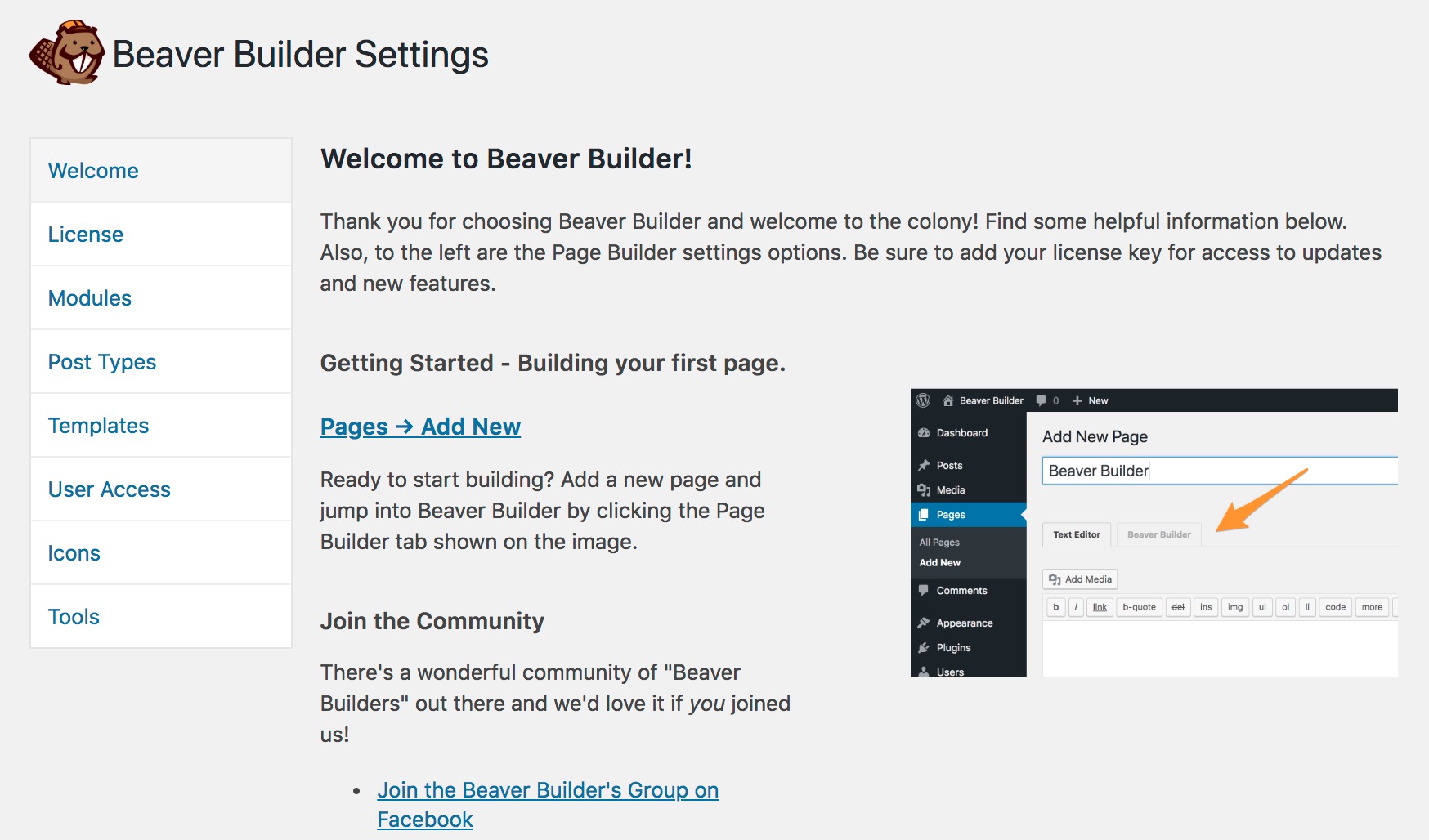
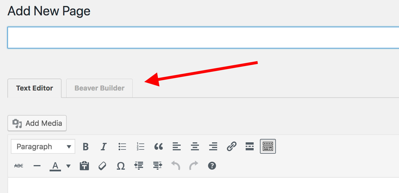
To get started with Beaver Builder, go to Pages → Add New. You’ll see a new section there:
Once you click it, the custom Beaver Builder UI will launch and you will be able to start working with the plugin.
The one difficulty you’ll face here is that you might be limited by the canvas area that your theme lets you work within. In other words, if there’s no full-screen page template available with your theme then you won’t be able to build complete full-screen designs. Beaver Builder doesn’t come with any such blank template out the box.
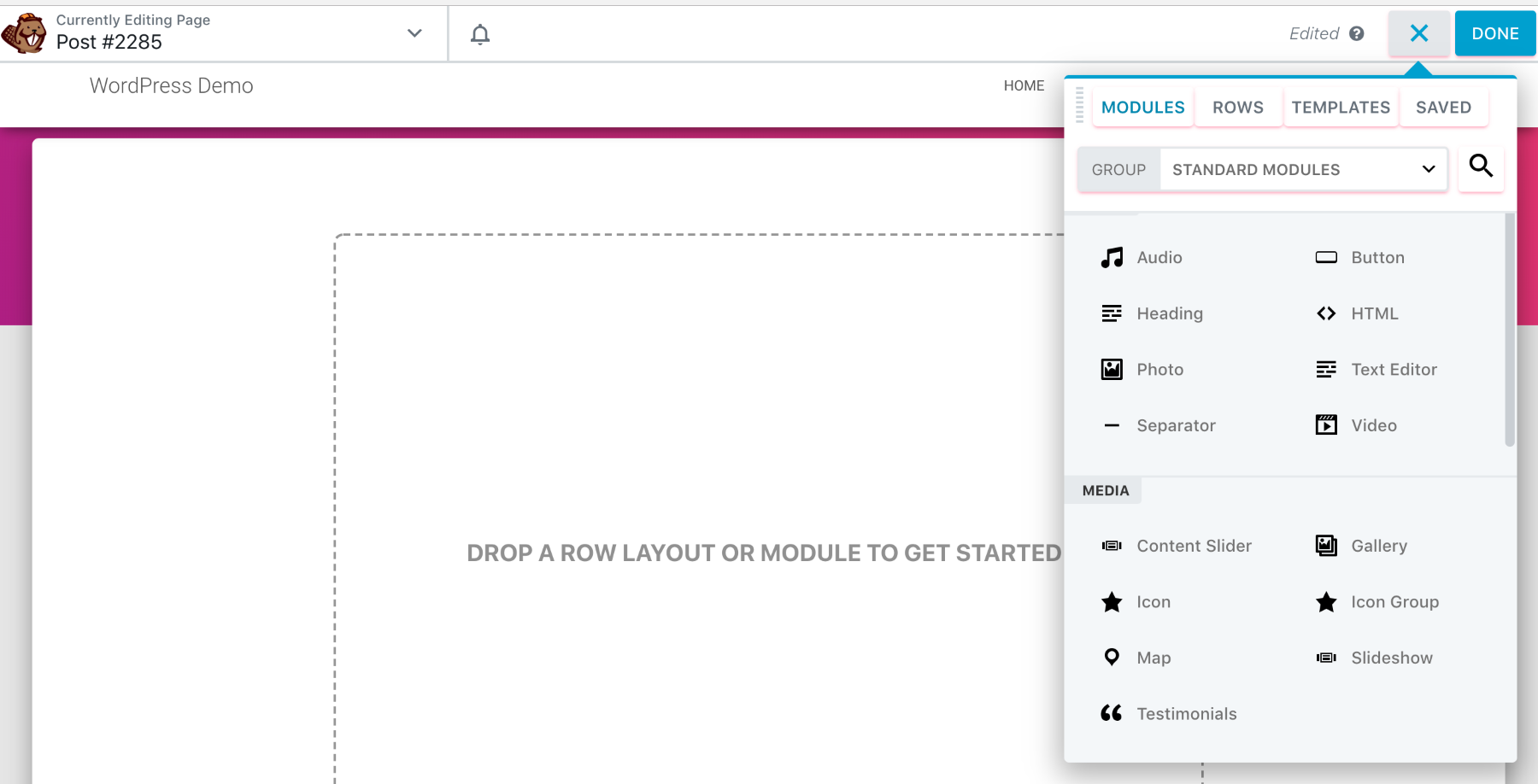
Setting that issue aside, Beaver Builder provides you with a very intuitive experience overall. You get to drag elements from the sidebar, drop them onto the main canvas, and then realign and customize them freely.
Whenever you want to put a new block on the page, just click the “+” that’s in the top right corner of the screen and then select your element.
That “+” button is also how you can add new rows or even whole ready-made templates and use those as your starting point.
Whenever you click on any element on the page, you’ll see a popup with the available options and settings for that element. Apart from that, you can edit all text content by clicking a block and typing right there.
Overall, Beaver Builder is very intuitive. Since you are looking at an actual live preview of the page you’re working on, it’s very clear what you should do and how to achieve your desired effect.
If you want to learn more about Beaver Builder and its pros and cons, check out our Beaver Builder review.
1.2. Divi Builder
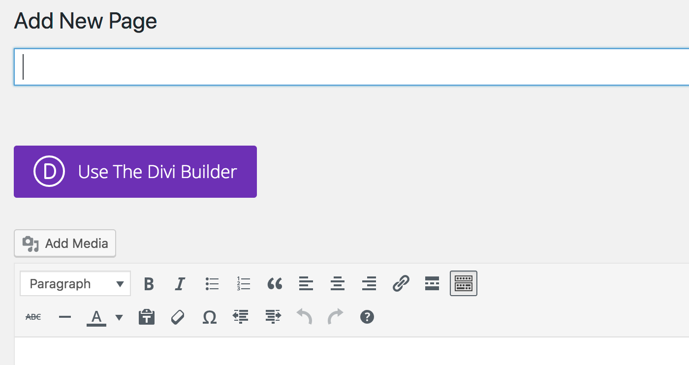
To get started with Divi Builder, go to Pages → Add New. There’s a juicy new button there:
Clicking on it will launch Divi Builder … but only half way, so to speak.
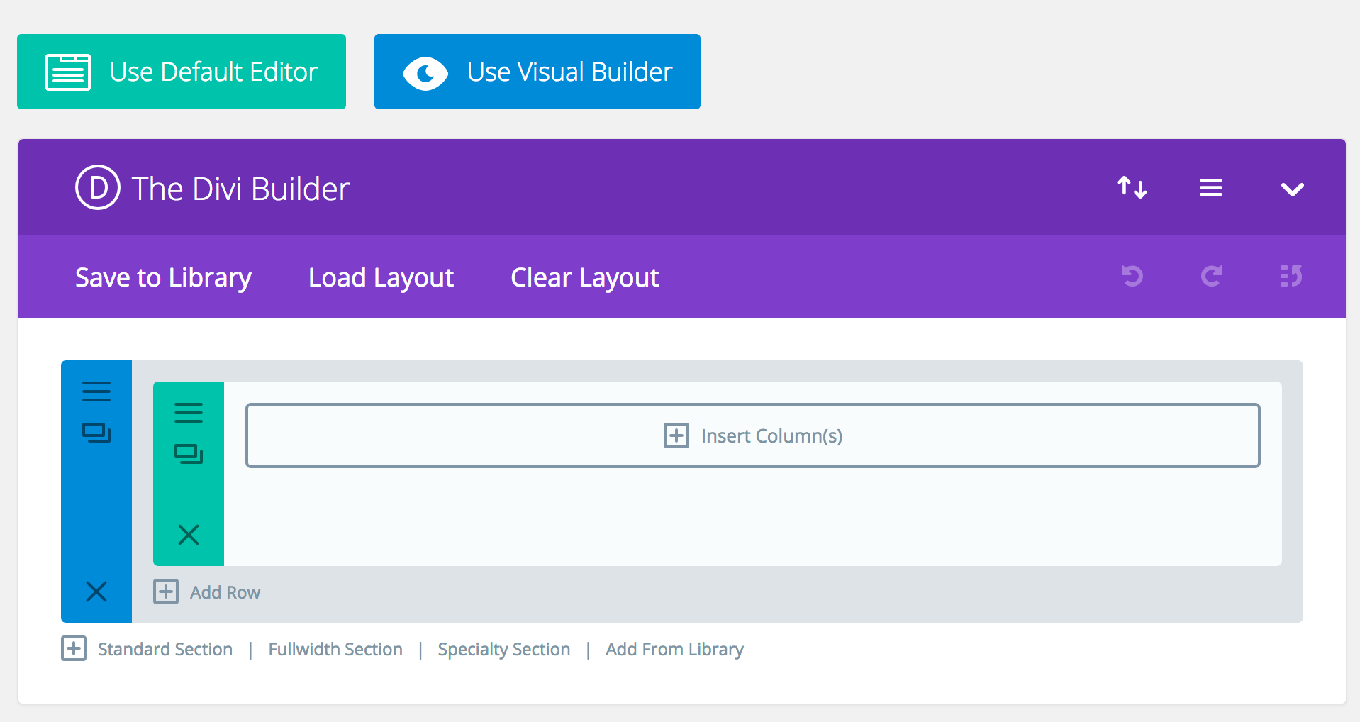
Here’s what I mean; when you click the button, you’ll see this:
It’s only “kind of” a useful page building experience. What you’re seeing is somewhat a mid-way interface, if that makes sense. While it does replace the standard WordPress UI and allow you to put various page blocks one after the other, you don’t actually see the final result of your work.
I guess this way of working can be useful if you’re dealing with a very long and complicated page and you just want to see things at a bird’s eye view. However, for your everyday page creation needs, you’re better off using the “full” Divi Builder experience.
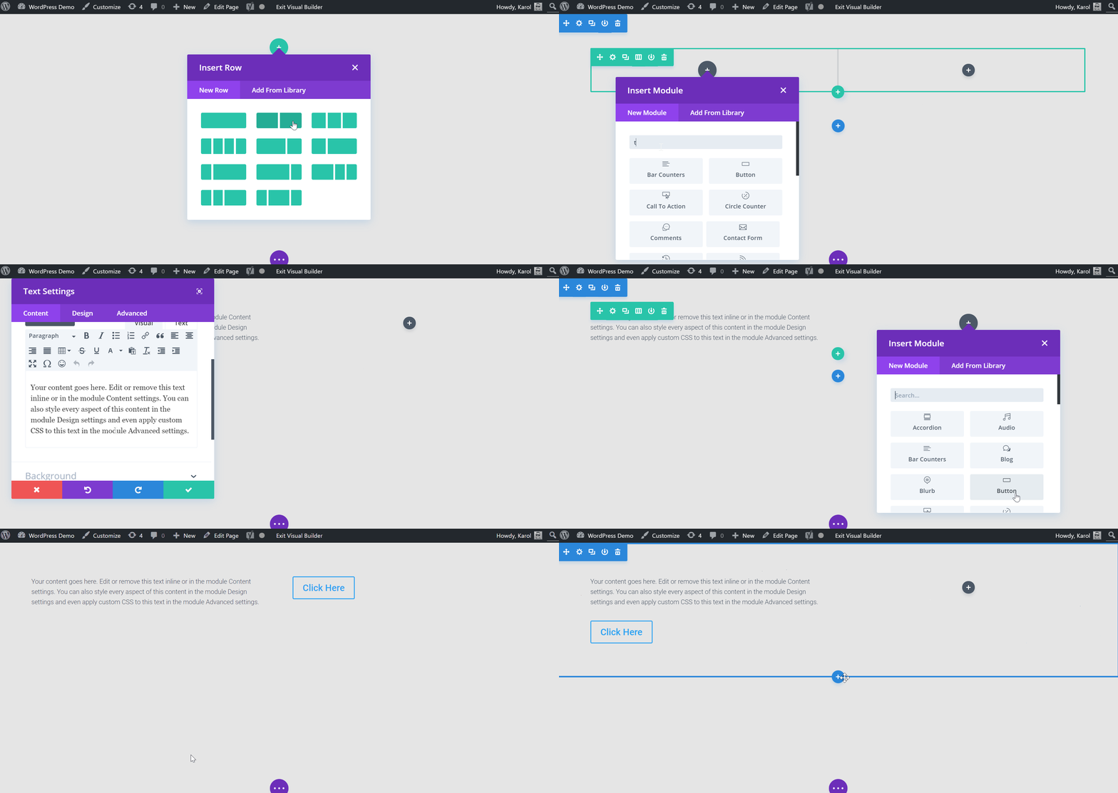
To get that, click on the Use Visual Builder button. This will redirect you to a completely new panel that’s fully what-you-see-is-what-you-get.
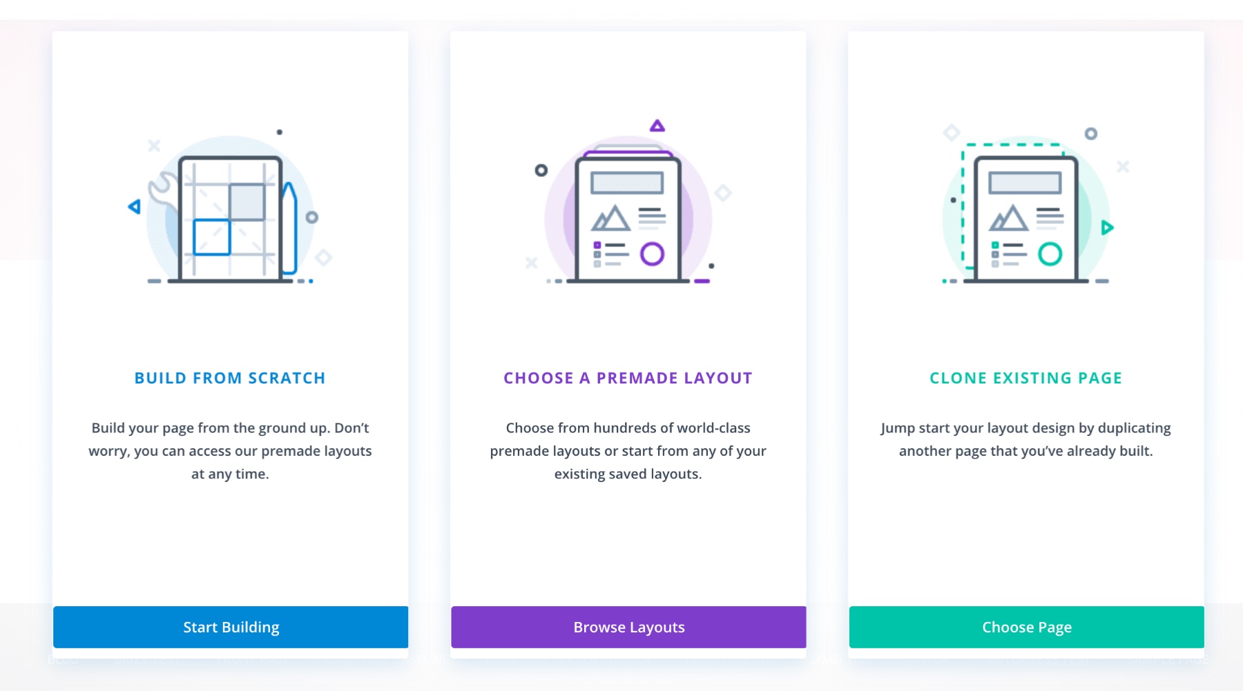
Right up front, the way the Divi Builder interface is constructed, you’re being guided through the steps needed to build a good-looking page.
First, Divi Builder gives you three choices: build from scratch, choose a premade layout, clone existing page. This is a friendly helper and will improve your first interaction with the builder.
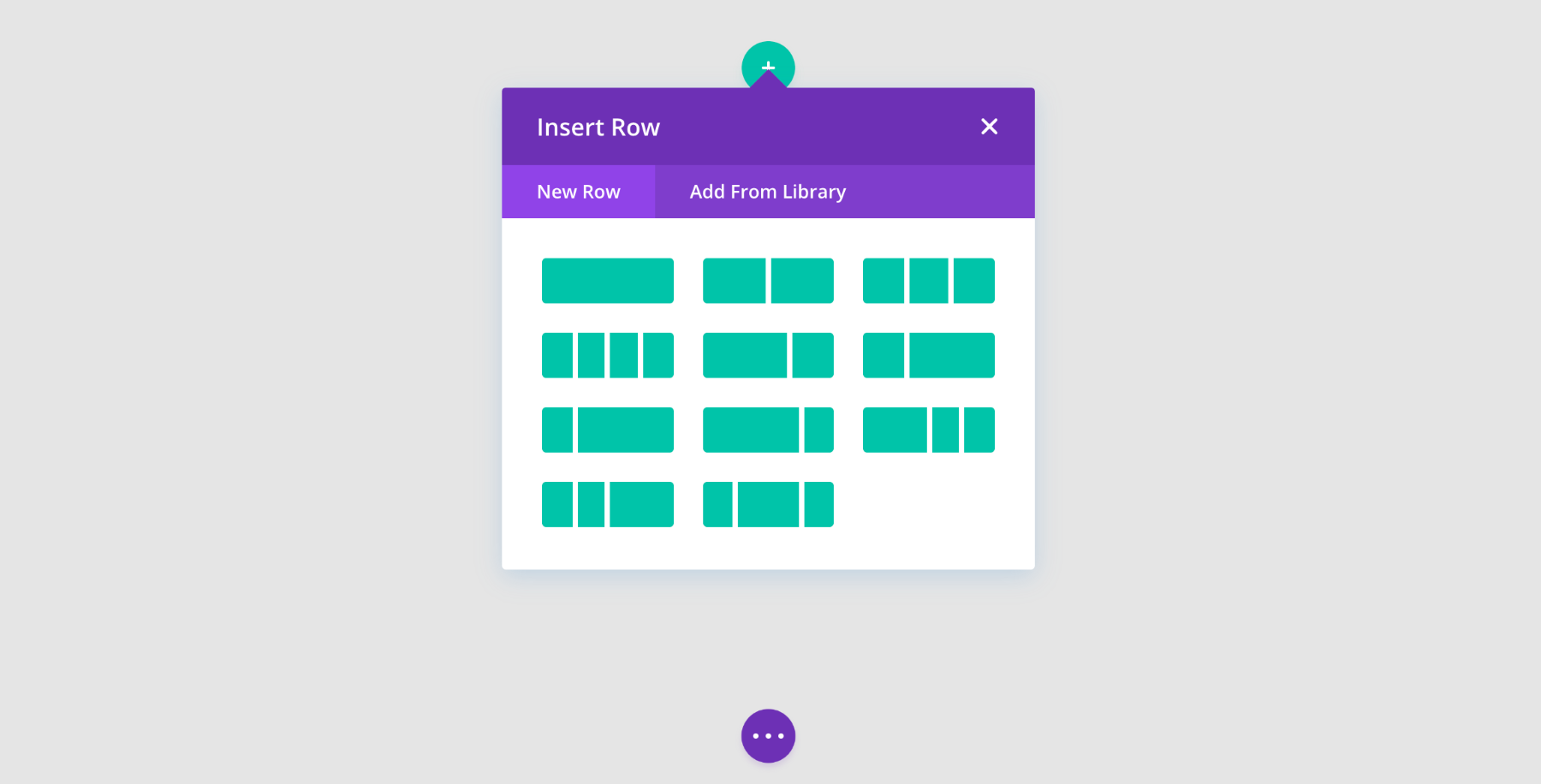
If you’re working on a page from scratch, you get to pick what sort of row you want to put on the page, and then what modules you want to include inside that row.
This is all nearly as easy to comprehend as in Beaver Builder. Of course, I do realize that much of this comes down to personal preference, but the UI of Divi Builder seems to be a tiny bit more confusing.
Here’s what I mean, check out this screenshot:
What you see there are three separate “+” buttons, and each one does a different thing. One is for sections, the other one for rows, and the last one for content modules.
(Note: To build any Divi Builder page, you first need to create sections, then put rows in those sections, and finally put individual content elements within the rows.)
When it comes to the editing of the content itself, though, it’s all very intuitive. Just click on whatever element you want to edit, and do what you want to do, be it typing or adjusting other parameters.
Overall, Divi Builder is easy to use on an everyday basis, but a tad bit more difficult to get going with at first.
Similar to the Beaver Builder situation, if your theme doesn’t come with any “blank” page template then you won’t be able to build a true full-screen layout with Divi Builder. Divi Builder itself doesn’t come with any such page template, so you are limited by your theme’s available working canvas.
(Out of the builders here, only Elementor comes with its own blank page template.)
If you want to learn more about Divi Builder and its pros and cons, check out our Divi Builder review.
1.3. Elementor
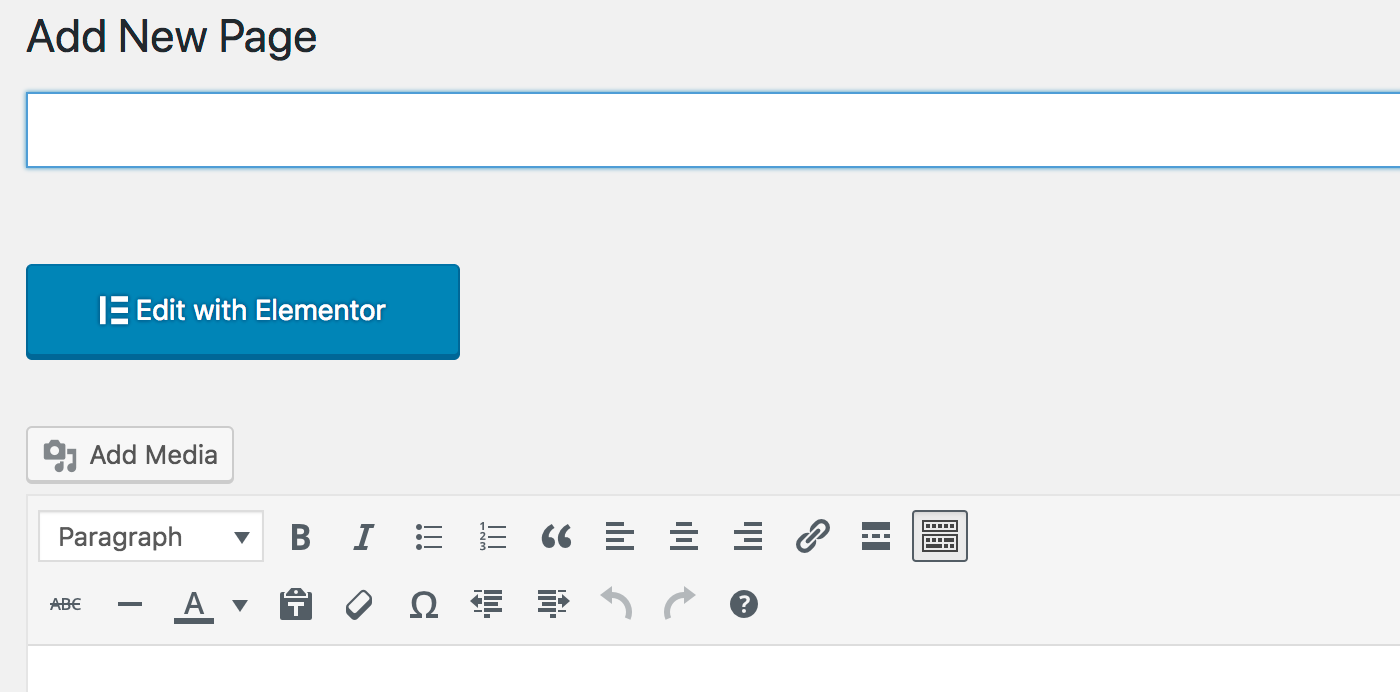
The way you build with Elementor is by going to Pages → Add New and then clicking on the big “Edit with Elementor” button.
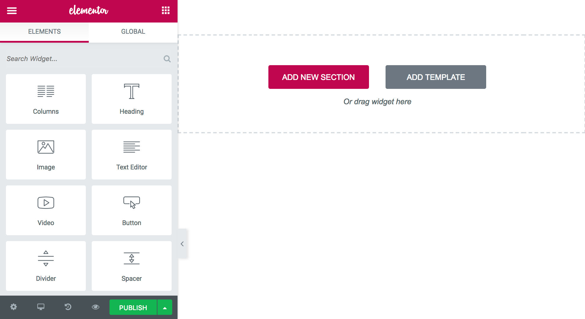
Once you do that, you will be redirected to the custom Elementor UI.
While both Divi Builder and Beaver Builder opt for “just in case” UI – where you need to click on “something” in order to see the available options or content modules, Elementor shows you everything right up front inside a classic sidebar-canvas layout.
The only two buttons visible in the center suggest in a precise manner what sort of actions you can take to get started: either “add new section” or “add template.”
Building your layout by hand is very intuitive. When you click on the main “add new section” button, you will be presented with a handful of common structures based on the number of columns you want. Once you choose that, you can start dragging in content modules.
Here’s your workflow with Elementor:
- Drag a content module you like and put it where you need it.
- Click on that module and adjust it by going through its individual settings tabs: Content, Style, Advanced.
The Content tab of a module handles everything that is related to what sits within/inside that given content element. If it’s a headline you’re dealing with, you can adjust the text there. If it’s an image block, you can change the image itself. Etc.
The Style tab is where you can adjust every little detail regarding your module’s appearance. Think colors, widths, sizes, etc.
Finally, Advanced is for margins, padding settings, borders, responsive design behaviors, custom CSS, and anything else that didn’t find its place in the other tabs.
The Content-Style-Advanced structure becomes really intuitive and easy to grasp after a short while since you can easily anticipate where to find a specific setting possibly.
Last but not least, Elementor gives you a what-you-see-is-what-you-get editing experience and in-line editing (for instance, with Text blocks, there’s no need to go into the Content tab, you can simply start typing away after clicking on the module itself).
Overall, Elementor is my favorite player here in terms of ease of use. Though, it and Beaver Builder are very close.
If you want to learn more about Elementor and its pros and cons, check out our Elementor review.
2. Content modules included
Not everyone would agree, but I say that a builder’s power lies in its abundance of content modules – well-designed content modules, that is.
At the end of the day, the main reason we use builders is to be able to construct pages that go above the standard text+images combo. It just makes sense that the more content elements we get the happier we are with a given builder.
Here’s what’s available with Divi Builder, Beaver Builder, and Elementor. First, the modules that you can find in all three:
- Accordion
- Audio Player / SoundCloud
- Button
- Call to Action Block
- Contact Form
- Counter
- Divider
- Email Optin / Subscribe Form
- Gallery
- HTML / Code
- Image
- Map
- Posts
- Price Table
- Sliders
- Tabs
- Testimonial
- Text
- Video
- WooCommerce Products
And now the more notable of the unique modules from builder to builder:
| Elementor | Divi Builder | Beaver Builder | |
|---|---|---|---|
| Alert | ✅ | ||
| Animated Headline | ✅ | ||
| Author Box | ✅ | ||
| Blockquote | ✅ | ||
| Breadcrumbs | ✅ | ||
| Comments | ✅ | ✅ | |
| Countdown | ✅ | ✅ | |
| Facebook Button, Comments, Embed, Page | ✅ | ||
| Flip Box | ✅ | ||
| Heading | ✅ | ✅ | |
| Icon | ✅ | ✅ | |
| Icon Box / Blurb | ✅ | ✅ | |
| Icon Group | ✅ | ||
| Image box | ✅ | ||
| Login | ✅ | ✅ | |
| Nav Menu | ✅ | ✅ | |
| Person | ✅ | ||
| Portfolio | ✅ | ✅ | |
| Post Carousel | ✅ | ||
| Post Navigation | ✅ | ✅ | |
| Price List | ✅ | ||
| Progress Bar / Bar Counters | ✅ | ✅ | |
| Search | ✅ | ✅ | |
| Share Buttons | ✅ | ✅ | |
| Sidebar | ✅ | ✅ | ✅ |
| Social Icons | ✅ | ✅ | |
| Spacer | ✅ | ||
| Toggle | ✅ | ✅ | |
| WordPress Widget | ✅ | ✅ |
As you can see, Elementor offers the most here. At the time of writing, Elementor gives you ~60 content modules, compared to ~45 from Divi Builder and ~30 from Beaver Builder.
Shockingly, Divi Builder doesn’t offer any content block for standard headings. As in, if you simply want to be able to put some text inside a header tag (like <h2>), you’ll need to do that via the Text module.
Moreover, there doesn’t seem to be an easy way of adding standard WordPress widgets to your Divi Builder creations. With both Elementor and Beaver Builder, you can simply select from any of your current widgets and add them like any other content module anywhere on the canvas.
That being said, the built-in content elements are only half the story. Each plugin has its own community of developers and a nice range of add-on plugins that deliver additional content modules. Just go to WordPress.org and look for plugins that say “Elementor” or “Beaver” anywhere in the name. There are loads of them!
Elementor’s community is particularly lively (there are themes and plugins built to work with Elementor specifically).
What all this means is that even if a builder doesn’t have a certain module that you need, you still should be able to get it from a third-party add-on plugin.
At the end of the day, though, Elementor wins the content modules battle!
3. Page templates available
Having templates as part of an already easy-to-use builder plugin almost sounds like cheating.
Templates can be incredibly helpful if you don’t have the time to build your page from scratch or if you just want to adapt an existing design by changing this or that.
All three builders have templates, which is great news! Though, not all of them are equal. Here’s what’s up:
3.1. Divi Builder
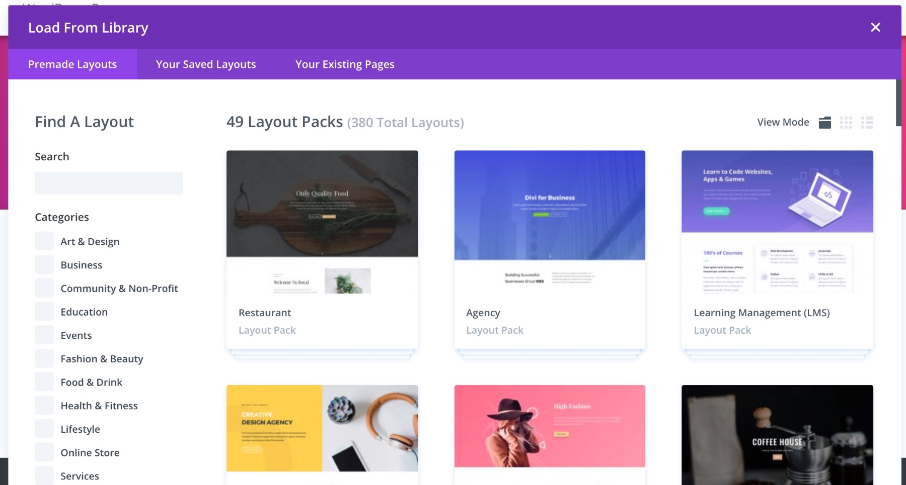
Divi Builder offers an incredible abundance of templates. At the time of writing, you get to choose from 373 total layouts!
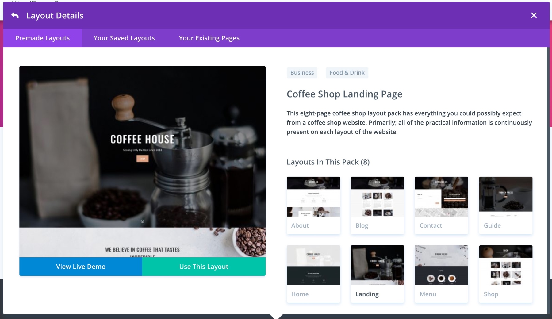
Those layouts come grouped in 48 layout packs (purpose-based; for example, there’s a restaurant pack, a coffee shop pack, an agency pack, and so on).
Then, when you enter any of the packs, you’ll see all the layouts nicely presented inside a grid. The fact that the layouts are not all lumped together means that making a decision as to which one to use is much more user friendly.
I have to admit, organizing the templates into packs is a great idea. Everything within the pack is part of the same design concept. This means that as long as you create pages based on a single pack, you can be sure that everything is going to fit together well. Apart from the packs, all templates are also categorized, which is a more general way of grouping them somehow.
When it comes to the quality of the templates themselves, they’re truly top-notch. All the designs are modern, optimized, and nice looking. You won’t find any yesteryear designs here.
3.2. Beaver Builder
With Beaver Builder, you certainly don’t get as many template as with Divi Builder. There’s around 30 in total, which is kind of “a lot” but also kind of “not enough” if I’m honest.
Also, the categorization is much more limited, but that’s understandable (after all, how many categories can you create for 30 items, right?).
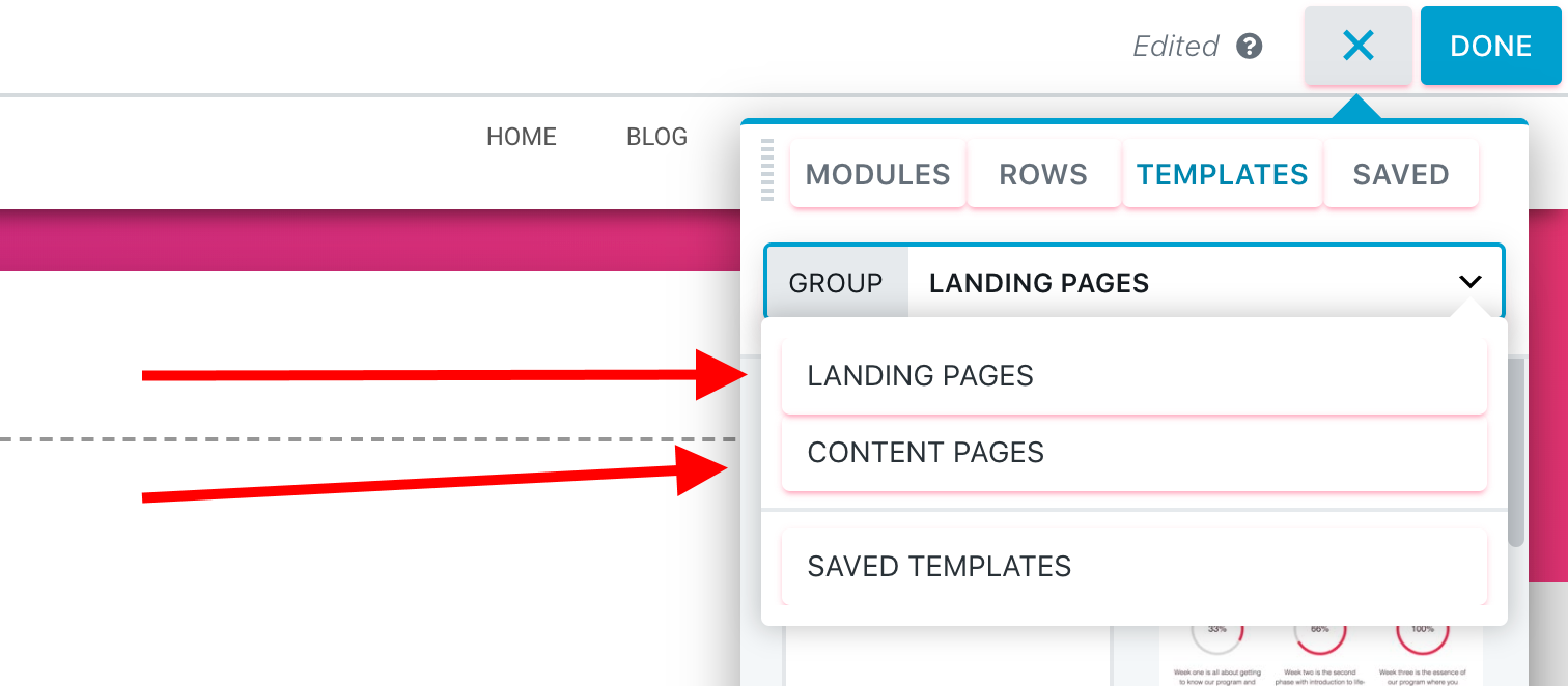
There are two main groupings of templates with Beaver Builder: landing pages and content pages.
There’s no thematic categorization per se – as in, “arts & design,” “business,” “tech,” etc.
The landing page templates are diverse and opt for different types of presentation, but overall, they do require you to do the bulk of the work regarding customization and making the page yours.
Overall, Beaver Builder surely has some nice-looking templates, but just too few of them. So if the “import-and-done” is the approach to page building that you’re the most interested in, Beaver Builder is not for you.
3.3. Elementor
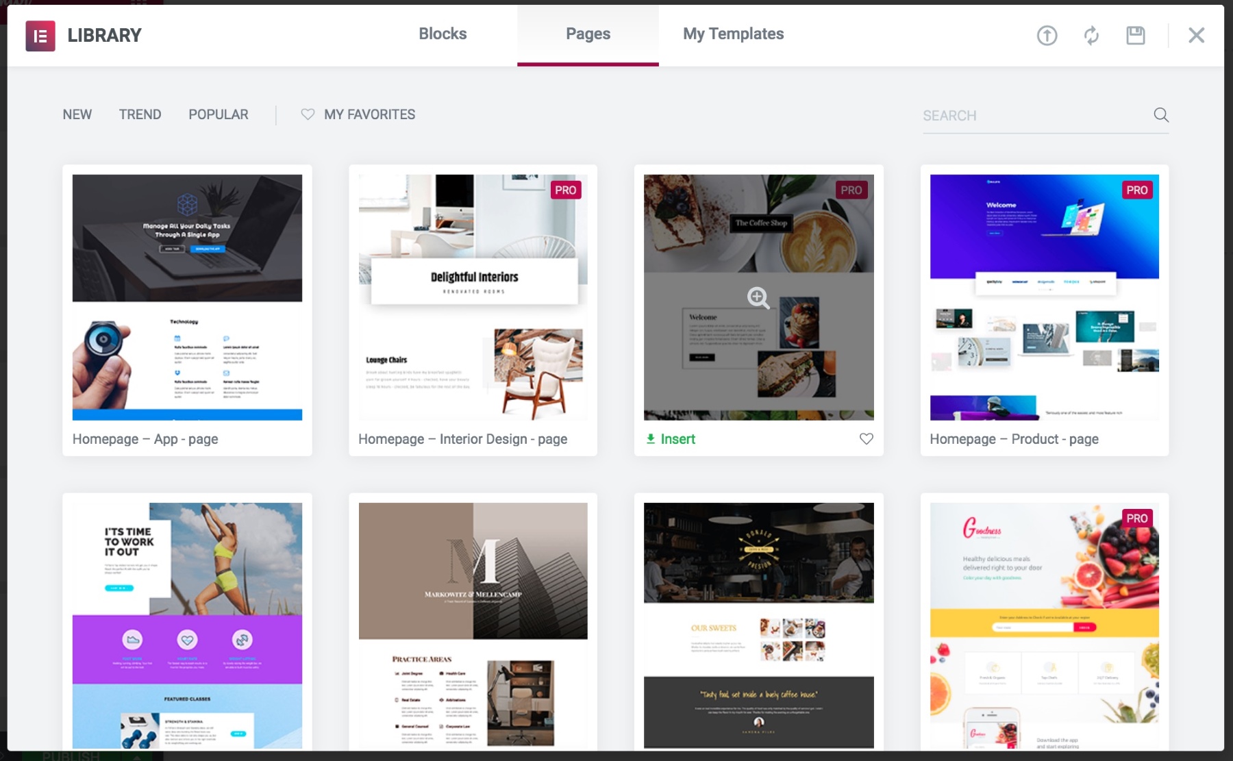
Elementor delivers around 140 page templates out the box.
This is a lovely set by any standards. However, there are a couple of issues with it compared to what you get from Divi Builder.
Chiefly, browsing through those templates is more difficult. You do get a search bar, which makes things somewhat manageable. However, all templates are still placed together in one central area, with no grouping based on the category/purpose.
Also, not all purposes/niches have the same number of templates. For example, if I look for “hotel” I get three templates to choose from. For “fitness” that’s just one.
Lastly, not all of the templates seem to be of the same visual quality. There’s a handful of yesteryear designs, which you won’t choose anyway.
Where Elementor does earn extra points is that apart from complete page templates, it also offers you “blocks.” Those consist of a handful of individual content elements pieced together for a nice effect.
This library is much better. You get blocks for 404 pages, contact areas, FAQ, hero sections, and much more. In my opinion, this set is where you should actually go instead of adapting the full-page templates.
At the end of the day, Divi Builder wins this part of the battle. It not only has the largest number of templates, but they’re also better looking.
4. Impact on load time
Loading speeds and overall performance is often one of the first questions people ask regarding page builders. So let’s do a test:
I’ve built roughly the same design using each of the builders and then tested them for performance with Pingdom. The site was rocking the same WordPress theme for all tests. Here’s what I found:
* A page with all the same content, but no builder.
** Compared to baseline.
| Baseline * | Elementor | Divi Builder | Beaver Builder | |
|---|---|---|---|---|
| Performance Grade | 88 | 88 | 88 | 85 |
| Load Time ** | —- | +28% | +27% | +37% |
| Page Size | 1.5 MB | 1.7 MB | 1.7 MB | 1.7 MB |
| Requests | 21 | 37 | 29 | 26 |
As you can see, the results are pretty much the same for all three builders. There are slightly more requests from Elementor, but that’s about it.
The interesting part of the test is comparing the results to the baseline page. That page loads roughly 30% quicker than the builders and is 200kB smaller, with less requests as well. Still those numbers aren’t brutal. And this is kind of expected, actually.
The bulk of your page’s load time is going to be consumed by the performance of the server itself (first) and the media files you have on the page (second). The actual impact of the builder is small in comparison to this. And I do assume you will be having quite a lot of media files on your pages, otherwise why would you need a builder in the first place…
Overall, there’s no winner when it comes to performance. All three builders are okay.
5. What happens when you deactivate?
This is another lively question in the page builder discussion. Basically, no matter which of the builders you use, your pages are going to look pretty nice for as long as you have that builder enabled.
But what happens if you ever decide to deactivate the plugin for one reason or the other? Will your content get messed up?
In short, yes. Of course, it will.
But the scale to which it gets messed up varies from builder to builder.
Let’s start with the good: Elementor and Beaver Builder.
Both these builders handle plugin deactivation with grace. What you’re left with is a nice clean page, with all the elements still there and using the traditional HTML document syntax – your texts are in <p>, headings in <h>, etc. In other words, it’s all very readable.
For example, when I deactivate Beaver Builder, I still get a nice readable page structure:
The same happens with Elementor.
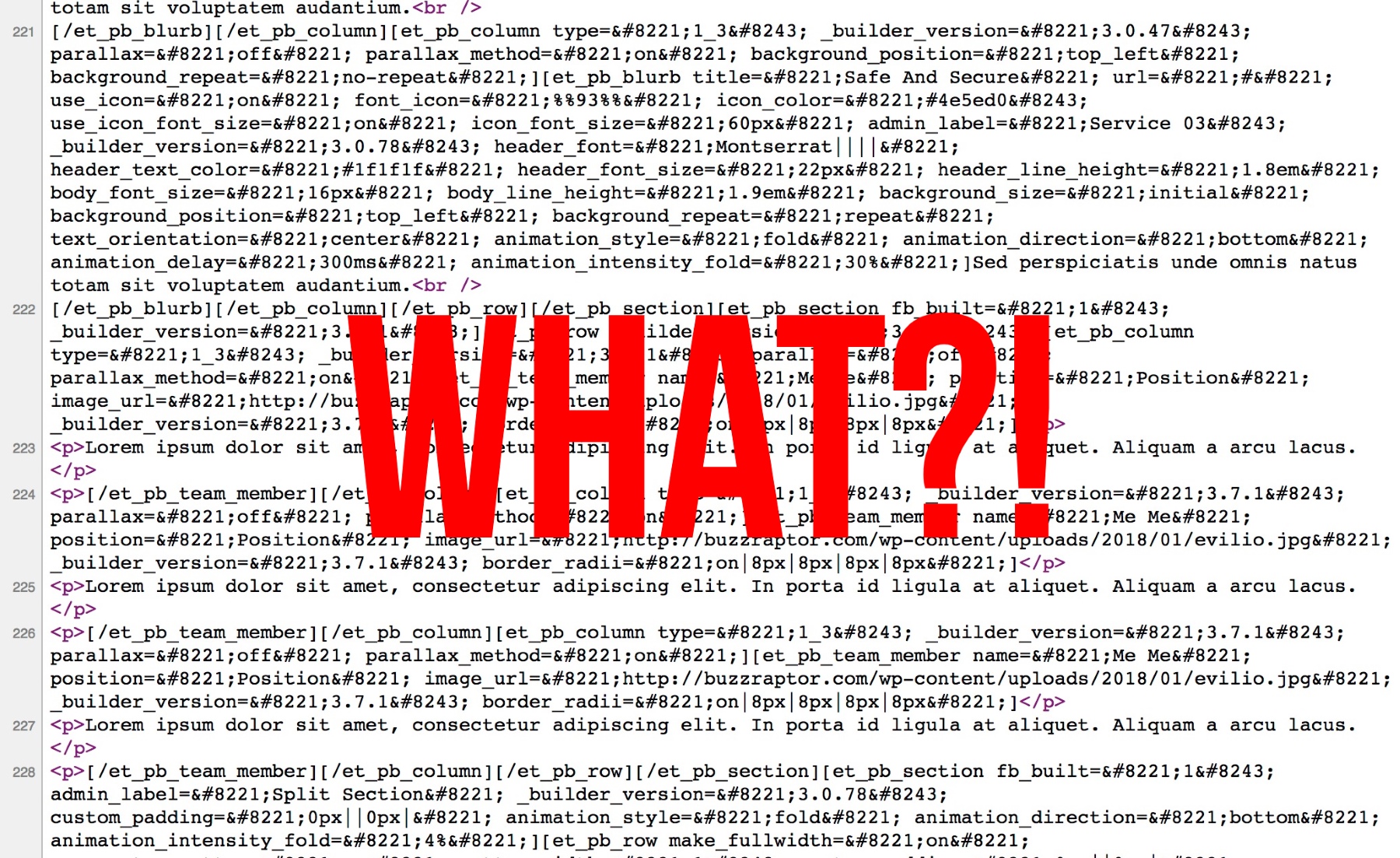
Divi Builder, however, is a different story. If you deactivate it, your pages become completely unreadable. All you see is a mess of shortcodes:
Elementor and Beaver Builder take this round.
6. Prices compared – which is the best deal?
The pricing dilemma isn’t an easy one. Each of these builder plugins has its own distinct model.
6.1. Elementor
- There’s a free plan
- “Personal” 1-site license – $49 / year
- “Business” 3-site license – $99 / year
- “Unlimited” license – $199 / year
6.2. Beaver Builder
- There’s a free plan
- “Standard” unlimited sites – $99 / year
- “Pro” – everything in “Standard” plus Beaver Builder Theme, multisite – $199 / year
- “Agency” – everything in “Pro” plus white labeling – $399 / year
6.3. Divi Builder
- $89 / year for the whole Elegant Themes library (including all their plugins and themes)
- $249 one-time payment for lifetime access
No clear winner, but there are some scenarios here that make some builders a better deal than the others:
- If you want to get the most features at the lowest price + additional perks, you should go with Divi. Their simple yearly license at $89 is unbeatable. You not only get the Divi Builder plugin, but also the Divi theme and all the other themes and plugins developed by the company. And you get to use them on unlimited sites.
- If you want a free solution, get Elementor. It offers the most features free of charge. In comparison, Beaver Builder only gives you a handful of content modules in the free version (and no templates, no import/export).
- If you want to use a builder just on one site, you’ll probably be the happiest with Elementor again. You can get it for just $49. No features are limited.
For me, personally, Elementor has the most appealing pricing model. You can test most of Elementor for free, and then upgrade to PRO if need be. Or, you can stay with the free version of Elementor for good.
When it comes to the features and ease of use, Elementor is also my no.1 choice. Whenever working with Elementor, I have this impression that the tool is actively trying to show me everything I really need to see right away, while hiding away the less important stuff. Overall, I found it much more pleasant to work with than either Beaver Builder or Divi Builder.
Albeit, things like how much you enjoy a given UI or a tool’s workflow come down to your personal preference, so keep that in mind when making your decision.
Here’s what I would do if I were you:
- Start with Elementor – the free version, since I believe it’s the one you’ll most likely enjoy. Upgrade to PRO at any time if you need it.
- Don’t like that? Okay, check out Beaver Builder Lite, and then go premium if you like the plugin.
- Don’t like that either? Invest in Divi. There’s a 30-day money back guarantee, so you don’t need to worry about losing your money anyway.
Here’s a quick-look summary table to help you grasp all the different parameters of each builder in one view:
| Divi Builder | Beaver Builder | Elementor | |
|---|---|---|---|
| Price | $89, $249 | free, $99, $199, $399 | free, $49, $99, $199 |
| Ease of use | 4 / 5 | 4.8 / 5 | 5 / 5 |
| Content modules | ~45 | ~30 | ~60 |
| Page templates | ~370 | ~30 | ~140 |
| Load time impact | +27% | +37% | +28% |
| When you deactivate | A mess of shortcodes | Good page structure remains | Good page structure remains |
| OVERALL | #3 | #2 | #1 |
What’s your favorite here? Divi Builder, Beaver Builder or Elementor?

