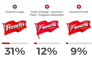
Which elements of the logos of well-known food products do consumers remember? If the font, color, and other design details of logos are changed, do people notice?
To find out, Kitchen Cabinet Kings conducted a study involving 8,000 Americans. The researchers redesigned popular household logos and created four alternative variations of each to compare with the brand’s real logo.
For each logo, 1,000 people were surveyed to see whether they recognized when color, design, and font elements were altered.
Below, key findings for some of the popular logos examined.
Chicken of the Sea
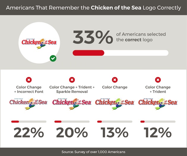
One-third of respondents picked the correct Chicken of the Sea logo out of the various options.
Some 22% of respondents picked an option with an altered color and font; some 20% picked an option with an altered color and design.
Membership is required to access the full version of this how-to marketing article … don’t worry though, it’s FREE!

Ayaz Nanji is an independent digital strategist and a co-founder of ICW Content, a marketing agency specializing in content creation for brands and businesses. He is also a research writer for MarketingProfs. He has worked for Google/YouTube, the Travel Channel, AOL, and the New York Times.
LinkedIn: Ayaz Nanji
Twitter: @ayaznanji

