Being part of the blog team at Yoast I spend much time writing, correcting and editing content in the editor. Of course, I’ve heard about Gutenberg (it’s quite the thing here at Yoast) and glanced over it, but I didn’t take the time to do much with it myself. When the Gut Guys asked me if I would like to feature in one of their videos I couldn’t escape it anymore, I had to start testing Gutenberg for real! So I did. As Marieke already wrote about using Gutenberg as a writer, I’d like to share my experiences with using Gutenberg as an editor.
Gutenberg?
In case you’ve missed it: the content editor in WordPress is going to get a complete overhaul. Instead of just a big blank field where you type your text, with some options to format it on top of your screen, it’s going to transform into smaller blocks. You can select a block to have a particular appearance, for instance, a paragraph, a heading or an image. And you can move these blocks around or duplicate them. In the sidebar, you’ll have more options to do all kinds of things with your content. That’s it in a tiny nutshell, if you want to know more, read Edwin’s highly informative piece on what Gutenberg is exactly.
Start the test!
You can already install the Gutenberg plugin and already use Gutenberg on a (test) site to see how it works. Another option, if you want to get acquainted with Gutenberg, is to go to testgutenberg.com and create and edit some content right there in your browser. Not all functionalities work as they should there, but it’ll surely give you an impression.
First impression
I have to admit I was a bit hesitant to use Gutenberg in the beginning. I guess it’s just hard to let go of what you’re used to and start learning something new. Moreover, in my previous job, I’ve worked with the Oracle ATG CMS which works with blocks as well, and that CMS has a very steep learning curve. On the other hand, that experience also made me already see the advantages of using blocks with pieces of content, instead of one big field.
But starting out I was pleasantly surprised! This didn’t feel that different at all. OK, I had to click around a bit to find the functionalities I was looking for, but that was to be expected. It felt quite intuitive to me. I happily clicked around adding, moving and editing blocks and jotted down what I noticed. I tried to test things I often do as an editor, like copying content people shared with me in Google docs, edit a bit of HTML somewhere, search for a certain paragraph, move them, change a heading or adding a conclusion to a text. Here are my findings:
Copy content from Google Docs
Copying content from Google Docs to the classic WordPress editor can be a hassle. But with Gutenberg, it’s much easier. You copy it from your doc and paste it right into the editor. To my surprise, this gave an excellent result. No weird span tags, the headings where correct, paragraphs transferred correctly, and the links were still in place. Nice! I didn’t discover any flaws at all. For me, this is an enormous improvement, as it is not that easy in the classic editor. Of course, I’m aware there are workarounds for issues with it in the current editor, but how wonderful if we wouldn’t need those!
Switch a block to HTML in Gutenberg
If you want to edit a piece of content in HTML you can click on the three dots in the upper right corner of a block and switch to HTML:

This feature made me so happy! We’ve got some pretty lengthy articles here at Yoast, especially our cornerstone articles, and the time I’ve spent to find exactly that sentence or paragraph that I wanted to edit… I think this feature will make me work much more efficiently.
Search for a paragraph and move it
In Gutenberg, you can find a table of contents in the sidebar when you click on the information icon above your article. I didn’t really expect to find it there – perhaps some ‘structure-like’ icon would make more sense – but I like the fact this table of content exists. I can click on a heading and jump to that part of the copy directly.
If one of our authors has written a long article, this comes in handy! When editing a text, I sometimes search for a paragraph because I’d like to change it a bit, add something or move it to another location to improve the flow. In that case, I can just drag and drop a block and move it to another location. You can also use the upward or downward arrow on the left side of the block to move a block up or down. Not sure if I would use that much though.
Placing the mouse correctly to make the hand icon appear to move the block can be a bit of a struggle. I also noticed that if I’d like to move two blocks together, for instance, a paragraph and a header, you’d have to move them separately. At least I didn’t achieve to select and move them together.
Headings and anchors in Gutenberg
Headings are essential for your users and SEO. They guide the reader, show the structure of your text and should mention the most important (sub)topics of it. In my daily work, I notice that sometimes writers get enthusiastic and start writing a lot of paragraphs after one single subheading. In that case, the readability analysis of Yoast SEO will throw off this notice:

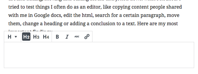
So I’ll have to add some subheadings to improve the readability of the copy, which is easy with Gutenberg. Just click on the plus or hit enter where you want the additional heading to be. It will be an H2 by default — which I like — but you can quickly change it to an H3 or H4 if you want.

Select the right heading for a block
Ok, this might not be the hardest thing to do in the classic editor either – especially if you know you can use ## before the heading and hit enter to create an H2 – but not everyone knows these kinds of tricks.

Easily create an HTML anchor to link to a heading
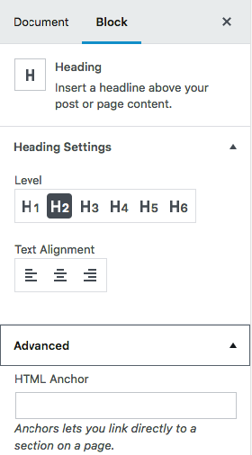
And what I like most… there is a way to add an HTML anchor to your heading without having to switch to HTML! Click on Advanced on the Block tab in the sidebar, and the option will unfold.
Just add the text you want, let’s say ‘example’, and you can link directly to this heading from everywhere by adding #example to the URL of the page! No need to add id=’example’ in the HTML of your copy. Awesome, right?
Duplicate and share blocks
Reusing a useful piece of content you’ve already created is music to every web editor’s ears. In Gutenberg, you can duplicate a block (create an exact copy of it in your article), or you can share it. If you share it, you can use it again on another post or page. It’s one of the few things I sometimes actually miss from Oracle ATG, a feeling I don’t get very often 😉
“But what about duplicate content?” I hear you think. Of course, you should reuse blocks sensibly and be aware of not duplicating or recreating entire pages. This could confuse Google which page to show in the search results.
But sometimes you’ve created a nice-looking layout which you’d like to reuse. Or you’ve written a small piece of copy you’d like to add in multiple articles. With the shared block function, you won’t have to type it over and over again or copy and paste it all. I can imagine we could use this to link to our cornerstones at the end of a post, or if we want to add a short notification to a certain set of posts. And I’m sure much more great use cases will come up!
Adding images to the content
As an editor, quite often we add illustrations and screenshots to a blog post. I tried to add some using Gutenberg and it’s easy. Just hit enter, click on the plus and upload the image you want to add. What I liked immediately is that you can write a caption below the image right away. Good captions can help the reader to understand what the image is about. Just seeing this option might trigger the writer to add one, which could increase the reader’s understanding of the copy. In the sidebar, you can add an alt text too, which is great.
I got a little less enthusiastic though when I tried to select and scale the image. When I selected it, it selected the paragraph below it too. This might be caused by the fact that I aligned the image left or right, but I think it shouldn’t happen anyway. The scaling functionality appeared to be off a bit too. It only seemed to scale properly when I moved the mouse vertically, not horizontally, which took me a while to find out. This probably still needs some work.
No issues?
Until so far this has been a fairly positive article. What about the downsides? To be honest, I didn’t encounter much inconvenience working with the editor yet. What I found a bit odd is that the plus only appears after you hit enter after a paragraph. For me, it would make sense if it would be there and you could click it after you’ve finished your sentence. But that’s just a minor thing. Apart from that, the image editing functionality requires some finetuning, as I explained. But that’s about it!
Go and try it out too!
I’ve had a very positive experience working with Gutenberg and got more excited along the way! But I can only judge it as an author or editor on our blog. Of course, there are much more roles and technical implications that don’t directly affect me in my work. That’s why I’m curious how other people experience using this editor. So I’d say, don’t be scared and go for it! Use Gutenberg and try to do with it what you usually do. And please share your findings in the comments below!
Read more: ‘Gutenberg: Concepts for integrating with Yoast SEO’ »