Online sellers have spent a great deal of time implementing features that support cross-device shopping. This includes researching and tweaking their websites to accommodate various screen sizes, browsers, and connectivity.
But there’s another key mobile design feature: the thumb zone. A term coined by mobile interface expert Steven Hoober, the thumb zone is “the most comfortable area for touch with one-handed use.”
Is your online store missing out on sales because of restrictive navigation and calls to action that are difficult to reach? In this post, I’ll explain why the thumb zone is so important and how you can better accommodate the broadest number of smartphone users.
Thumb Zone Explained
Understanding the thumb zone is key to providing a better user experience, to help shoppers finalize purchases. No matter how you hold your phone, there is a natural method of swiping, tapping, and navigating. By some estimates, roughly half of the 169-million smartphone users in the U.S. favor one-handed operation.
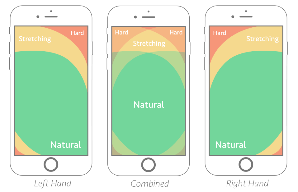
The natural zone varies based on the dominant hand and whether both hands are used.

Keeping calls to action and important links in the natural zone supports one-handed operation. Image: Smashing Magazine.
The graphic above doesn’t take into account the size of the smartphone. Users of larger devices — such as the iPhone Plus series — will have more difficulty, as larger formats have more restrictions. Note, below, that the shape of the thumb zone shifts when supporting the smartphone with a pinky finger,
The larger the device, the more likely the user cannot easily reach the top of the web page. Image: A List Apart.
Addressing the Issue
The good news is that none of the adjustments made to accommodate the thumb zone should affect the overall usability of the mobile site. It should, instead, increase the usability score and encourage more conversions. When analyzing potential changes, be sure to:
- Focus on the bottom center when placing calls to action and static menus. People use smartphones differently than desktops. It’s natural for users to look in the same area that their thumb occupies.
- Place add-to-cart buttons (along with attributes and quantity boxes) below the product image, not above. It’s far easier for users to scroll below an image than to stretch the thumb to reach above one. Ideally, though, the image and call to action should appear above the scroll line.
In this example from Chewy, a pet supply store, the Add to Cart button is easily reachable, regardless of the way the shopper holds his phone.
- Increase the size of some links. Minimally-sized text and icons can be difficult to tap during one-handed operation.
- Provide ample space between hyperlinked elements. The thumb is the largest digit. It’s typically not as agile as our other fingers, making it easy to tap the wrong icon or text link when one is close to the other.
- Place a fixed menu along the bottom of the screen. This helps shoppers quickly navigate to the most important pages and sections, such as categories, search, and checkout. Position the most important menu items in the center.
A fixed menu at the bottom of the screen makes for easy access to all-important areas.
- Provide enough non-linked content. This can be static graphics, text, or whitespace. The goal is to avoid flooding pages with links. Help users scroll without accidentally tapping a linked object.
Study Actions Closely
Analyze the site both before and after changes.
Google Analytics can break down actions and conversions by desktop, tablet, and mobile. To see how products perform on smartphones, go to Conversions > Product Performance and set the Secondary Dimension to Users > Device Category. You can filter the view further by clicking advanced search and setting the Device Category to “mobile.”
Google Analytics can report how well products perform on mobile.
Alternatively, use Google Analytics to analyze user behavior on various pages. Review, especially, bounce rates and exits from product pages. Go to Behavior > Site Content > All Pages. Then set the Secondary Dimension to Users > Device Category.
Heat maps can also provide good insight by showing where visitors are tapping and scrolling while on the mobile site. Note that not all heat map tools track touch devices. Some are designed solely for tracking mouse clicks on a desktop.