What does your email font say about your brand?
No email marketer EVER says, “I am happy with my email design and the ROI it brings.” Because the day you say so, you stop being successful. From start to eternity (and even beyond) email marketers are in constant search for something new to delight their subscribers.
Right from experimenting with an embedded video to including certain interactive elements, email marketers are looking for the next best thing. But in the quest for finding the “next best thing”, most email marketers oversee the potential of experimenting with colors and fonts or say typography in emails.
How Fonts Can Affect Email Engagement – An Analysis
An email is made up of basically a header image, email copy, and footer. So in short, a combination (and appropriate placement) of colors, text, and images make an email interesting. While colors are based on the brand personality, even the fonts you choose in your emails play a role in conveying a specific emotion.
In the above two logos, there’s a reason behind choosing the fonts. The font styling portrays what the brand wishes to communicate. Evian uses Arial to highlight ‘clean’ and ‘pure’ whereas The New York Times uses Ye Old English in the logo and Times New Roman in the body copy to reflect authority and reliability.
Do you know that even the fonts you use can affect the performance of your email? People have an attention span of less than 8 seconds and it can be the difference between your subscriber clicking the CTA and them moving on to the next email.
A study was conducted to find the relation between a font and the time taken to read a paragraph written in that font. It was concluded that readers tend to take more time (around 86% longer) reading fancy fonts (Brush script) than simple fonts (Arial). Also, the willingness to read the exercise dropped when the font used was comparatively difficult to read. This is equally effective in email too.
Preferences within Fonts in Email
Even though the study in the previous section states that people prefer simple fonts over fancy ones, not all simple fonts were created equal. Based on a specific font belonging to serif or sans-serif font category, people have specific preferences. Moreover, certain fonts’ performance also depends on certain factors like:
- Medium i.e. Print or Digital Medium
- Font style i.e. Headline, Sub-heading or body copy
- Screen resolution of the display device (for digital medium)
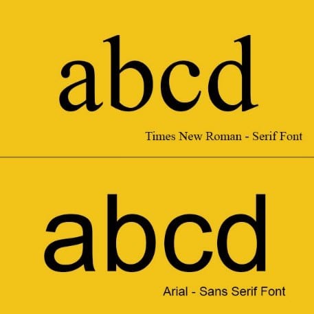
Fonts that have small flourishes and embellishments in their characters are categorized as Serif fonts and those void of such ‘adornments’ are categorized as Sans serif.
In a study conducted by Dr. Ralph F. Wilson, he checked the readability and legibility of different fonts and also the use of different fonts for creating visual hierarchy.He put forth Times New Roman 12pt vs Arial 12pt and concluded that 68% of the test subjects preferred Sans Serif to Serif font while reading a paragraph.
He put forth Times New Roman 12pt vs Arial 12pt and concluded that 68% of the test subjects preferred Sans Serif to Serif font while reading a paragraph.
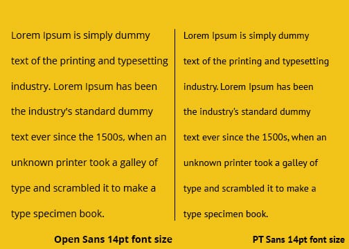
Moreover, when Arial and Verdana, both of which are sans-serif fonts were pitched against each other, people preferred Verdana for body copy and Arial was suggested suitable for Headlines.
How to Choose Fonts for Your Email
Before we move on to learning how to include custom fonts in emails, it is important to analyze how many of your subscribers shall be able to view the custom fonts. Thankfully, out of the top 10 widely-used email clients, those mentioned below support custom fonts. The non-supporting email clients render the email copy in the system font based on the device.
You must be wondering as to how an email client renders a custom font in the email? Basically, the email client looks for the specified primary font in the device used to view the email. If the specified font is not installed in the device, it moves on to the fallback font.
So, if you have specified Aquatico, Garamond, and Open Sans in your email code, the email client shall check whether Aquatico is installed in the device and move on to render the email copy in Garamond if Aquatica is not found. Now Apple devices don’t have Garamond installed by default, so it shall render the final fallback i.e. Open sans.
So the best way to choose a font for email is to first select your fallback font and based on it, select your primary font.
Why Choose Fallback Font First for your Email?
The visual impact of a font is based on few aspects of the implemented typography. Let’s have a look at these:
Font Family: There are innumerable fonts available globally. Font family is basically based on the styling that each character in a font possesses. Arial, Tahoma & Times new Roman are examples of font families.
Font Category: Email Fonts belong to two major categories i.e. Serif and Sans-serif. Fonts of these two categories are only used for email copy as they have a wide range of fallback options in them.
Kerning: The space between two characters/ letters is called kerning. This is important as it dictates the number of characters that can be accommodated in a single line. If the fallback font doesn’t have enough kerning as compared to the primary font, there is a chance that the paragraph length may decrease.
Aspect Ratio: It is important that the primary font and fallback fonts have the same aspect ratio (i.e. same height and width) else there is a chance that the line spacing might be disturbed.
How Typography in Email Changes with Industry: Real-world Examples
Beauty and Personal Care
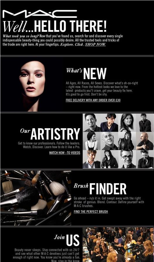
In an industry where the brand’s personality is expected to be stylish and confident, the emails too must reflect the same characteristics. So most of the beauty and personal care brands use the sans serif fonts or calligraphy style font family. Moreover, the font colors used are monochromatic (single color) throughout, either in synergy or contrasting to the background as observed in the below two examples.
Banking & Financial
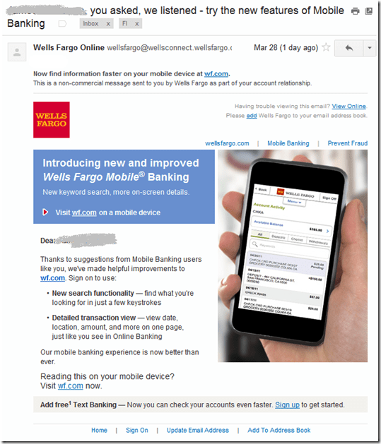
Banking and Financial companies mean business (pun intended), and so mostly resort to use sans-serif fonts for email copy and serif for heading (if needed).
Fashion Retail
Similar to the beauty industry, the brands in fashion retail also send emails that are a sight to see. It is the only industry which can be as flamboyant as it wants and so you can find different kind of fancy fonts in different colors being used in header images, in conjunction to sans-serif fonts for email copy.
Travel & Hospitality
One word that is associated and comes to most people’s mind when they hear Travel and Hospitality is “Vacation”. So most of the travel emails feature sans-serifs in pastel or pure white font colors that give a relaxing feeling.
Wrapping Up
Whether you are sending a welcome email, transactional email, or a sales promotion email, playing with the fonts of your email can help you gain better insights on your customer behavior. Have you experimented with typography in your emails? We’d love to hear your experiences here.


 Thanks to Kevin George for sharing their advice and opinions in this post. Kevin is the Head of Marketing at