Most product descriptions include a section of bullet points — a succession of quick facts. It makes information easy for the eye and brain to scan. Shoppers either run their gaze down the lines or take them all in at a glance, matching up the details with what they’re hunting or hoping for.
Bullets are an efficient format.

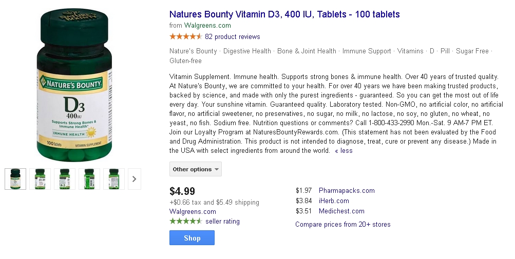
This product description on Amazon for vitamin tablets is in paragraph form, making it hard to pick out important points.
—

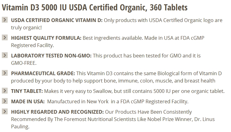
This vitamin D product description uses a bullet format. It’s much easier to take in information from this listing. Source: Amazon.
Still, bullet points can be crafted clumsily or well. They can read smoothly or represent an obstacle. They can captivate the reader or prompt yawns.
After you’ve created a draft of the points you want to set forth, use the tips below to make your bullet points as readable, clear, and tempting as possible.
Make Bullets Readable
Because of their white space and formatting, bullet points are already eye catching and easier to understand than paragraphs. However, several guiding principles help make bullet points even more readable.
According to a study from Nielsen Norman Group, a user-experience consulting firm, people pay more attention to what’s at the beginning of any section of information than the end. What’s in the middle of a bullet gets the least attention. Therefore, front-load bullet points by placing the most important word or concept first.
Before: With stringent lab testing, quality is guaranteed.
After: Guaranteed quality from stringent lab testing.
Before: Made in the U.S., sourced from organically raised sheep’s wool.
After: U.S.-made from the wool of organically raised sheep.
In addition, the longer your bullet extends, the more you can make a difference by prefacing each point with a summary in boldface, as in the following screenshot.

This listing from Bronson Nutritionals is easy to scan because each bullet point begins with a boldface summary of two to five words.
Finally, each bullet point should use no more than two lines. Keep your punctuation consistent, with all bullets either ending in a period or not, for example. Avoid sub-bullets, which add unnecessary visual complication. Do not use too many bullets — no more than seven.
Do not number bullet points. It implies a logical or chronological sequence rather than just a list.
Make Bullets Clear
Your bullet points should help shoppers understand what’s distinctive about the product and why that might matter to them. There will likely be specialized terminology within the bullets, so make sure to briefly explain industry jargon to unfamiliar shoppers.
A handy method for making technical points clearer is to ask yourself “so what?” each time you use them.
The following bullets are for Zappos’s Freewaters Tall Boy Trainer Knit shoes. Note how well they help readers comprehend why they should care about a “knit upper,” “seamless design,” “pillow insole,” “midsole,” or “rubber sole.”
- “Engineered knit upper features open knit zoned breathability.”
- “Seamless design offers an instant soft fit.”
- “Super pillow insole is ergonomic and supportive with great rebound.”
- “Tall Boy midsole for maximalist cushioning.”
- “Rubber sole offers grip, flex, and durability.”
Never tease the shopper by citing an unspecified “secret ingredient” or by claiming, without saying why, that the item could save lives, for example.
Make Bullets Tempting
The leaner your bullet points, the greater their impact. Get rid of every extra word. Omit article adjectives and filler verbs.
Also, avoid exclamation points. They make it seem like you’re trying to whip up reader interest.
Zero in on the interests of your audience, without losing the details. Include not only the dry, cold facts about the product, but also the “what for” — how the item fits into a lifestyle or enables the user to do something.
On ThinkGeek.com, for instance, a bullet point for a Brute Squad mug states, “Holds your coffee or tea and reminds you of your favorite movie.” A description on BestBuy.com for a Garmin GPS device says, “You can set up three alternate routes so you’re prepared to take advantage of the road ahead.”
How does the product solve problems? For example, PotteryBarn.com, in its description of an armchair, indicates how the materials prevent nuisances that are endemic to outdoor furniture:
- “Woven from durable synthetic Ecolene® that replicates the look and feel of wicker, but is remarkably resistant to sun, rain, heat and cold.”
- “Seat cushion core of resilient QuickDry® foam is designed for fast water drainage and air circulation.”
Finally, if you can infuse bullet points with your company’s personality, all the better. Word choices and style can heighten rapport with your audience, as well as boost word-of-mouth by making product descriptions fun to read.

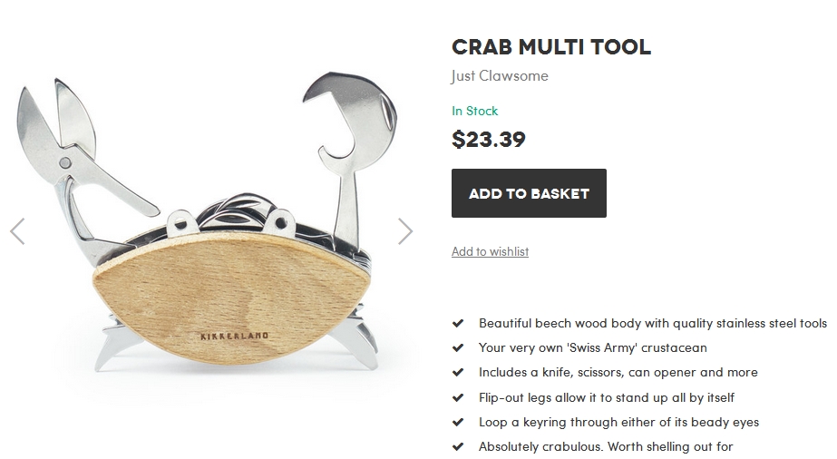
Puns and creativity abound in the description of a crab-themed multi-function tool on Firebox.com, such as “Just Clawsome,” “beady eyes,” and “Absolutely crabulous.”
