Mobile has finally overtaken the web and Google has announced that they’re going to be making some important changes to reflect this. Mobile-first indexing is going to reward websites that make mobile their priority with strong search rankings and the traffic that goes with them. And not just on mobile, but across all search.
That means if your site isn’t optimized for mobile-first indexing, your traffic will suffer.
Today I’m going to teach you everything you need to know about mobile-first indexing and how you can make sure that your site is ready to rank well in Google’s new algorithm.
But first, let’s take a look at why this is so important.
Mobile Is King Now
Ten years ago, the first smartphones hit the market and it quickly became apparent that this technology was going to be a game changer. People have been spending more and more time online over the years, and the mobile device has rapidly leaped to the head of the line for this purpose.
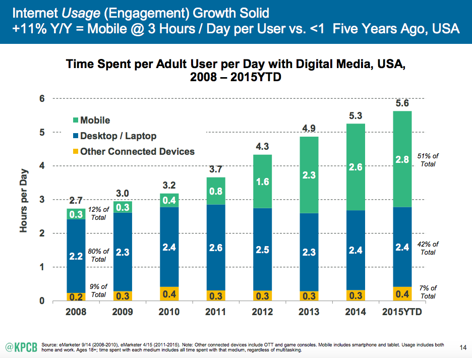
As far back as 2013, 3 out of 5 web searches were conducted on a mobile device:

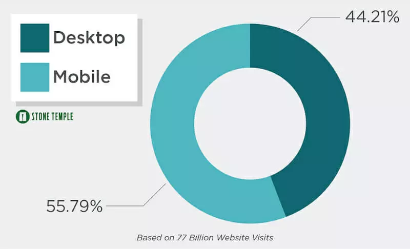
Fast forward a few more years to 2018 and mobile makes up more than half of website traffic:
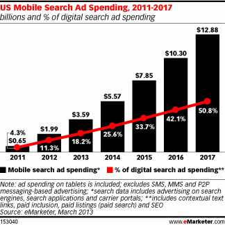
This isn’t a surprise to most people. Major brands and small businesses alike have been recognizing the trend for years as the percentage of digital search ad spend has nearly quadrupled in the past 6 years—from just 4.3% to 50.8%.
Seeing these trends, it should be no surprise that Google has now updated its algorithms to prioritize the mobile experience. That’s where most of its users operate and where most of is search revenue is generated.
Related Content: 15 Thought-Provoking Statistics about Mobile Commerce [Infographic]
So What Is Mobile-First Indexing?
Until now, Google has always indexed the desktop version of websites to determine search ranking. But that’s all changing.
In 2016, Google announced that they had plans to shift their algorithm to crawl the mobile versions of sites instead. In fact, in most cases, they won’t even look at the desktop version of your site at all.
If your mobile site isn’t up to their standards, you could be in big trouble because Google has already started rolling this out for some users and plans to add more until everyone has moved over.
What Does Mobile-First Indexing Mean For Your Traffic?
If you have a mobile-responsive website that displays the same content across both desktop and web, you have nothing to worry about.

In this case, your mobile and desktop sites are literally the same site. So the only difference is that Google will be crawling it with its Smartphone Googlebot, which views your site as an android phone user.
You should do a quick QA to make sure that all your content is accessible and easy to navigate on the mobile version. Run through the checklist below, but most things should be in order already.
If you’re using Dynamic Serving, you should pay closer attention because you may be serving different content across different version of your site:

Learn More: Is It Better to Create a Mobile Website or a Mobile App? [podcast]
There’s nothing wrong with using dynamic serving, as long as you display the same content in both cases (different formatting is fine). Google has said that if your site delivers the same content in across both platforms, you shouldn’t see much of a change in your search rankings. If anything, you may get a little boost as companies not following best practices take a hit.
However, if you have a completely independent mobile site, such as one hosted on a different sub-domain, you need to pay extra attention to this update because your site is at the most risk for being penalized.
In addition to changing which content will be crawled, mobile-first indexing will also weight the remaining ranking signals heavily, if not completely, on mobile.
While there isn’t an official list from Google, Search Engine Journal has compiled a list of mobile ranking factors reported in a number of studies:
Positive Factors:
- Site Speed
- AMP (Accelerated Mobile Pages)
- Unordered Lists
- Images
- Keywords and Related Phrases
- Social Signals
- Local Search Optimization
Negative Factors:
- Flash
- Technical Errors
- Intrusive Interstitials (more on this later)
- Small Font
- Small Touch Elements
- Keywords in External Links
You’ll notice a common trend:
- Things that create a positive user experience (fast loading, quality images) will improve your rank.
- Things that hurt user experience (errors, hard to click buttons) will lower your rank.
I won’t get into all the details of mobile SEO today, but you should review these factors and fully test your site as a mobile user. Make sure it’s pleasant and easy to use.
How To Make Sure Your Site Is Ready For Mobile-First Indexing
Tip #1: Use a Mobile-Friendly Design
I already mentioned this above, so I won’t beat it to death. But make sure that your site is responsive. Think of content like water, conforming to and taking on the shape of whichever receptacle it is in.
The critical element here is that the same content is available on both mobile and desktop. Only the form should be updated to improve mobile user experience.
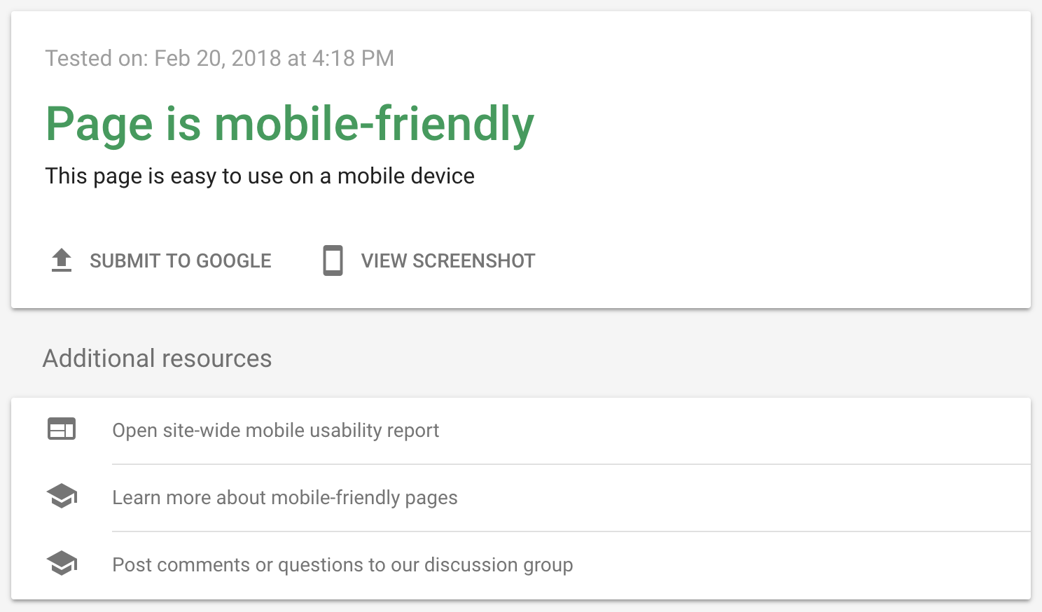
You can test your site using Google’s free Mobile-Friendly Test tool:
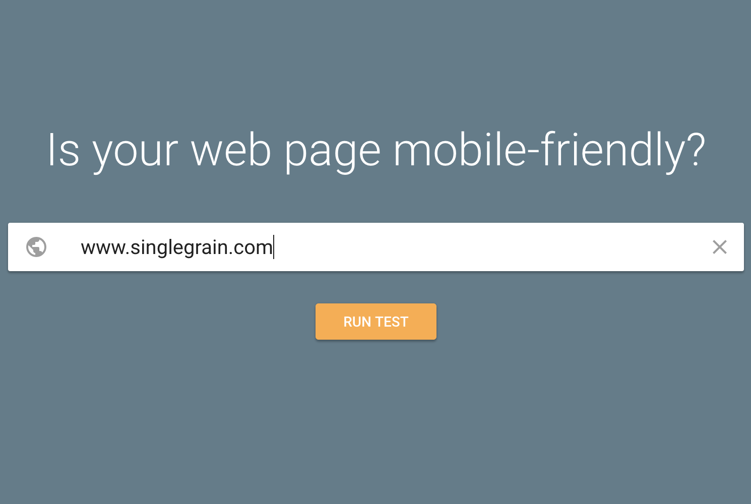
Here’s our results. Yay!
Related Content: 14 Ways to Kickstart Your Mobile Email Marketing Campaign
Tip #2: Serve the Same Content on Your Mobile Site
Google doesn’t say much about its algorithms, but they have said this repeatedly:
Make sure you serve the same content across your mobile and desktop sites. That means articles, the same links, and the same features.
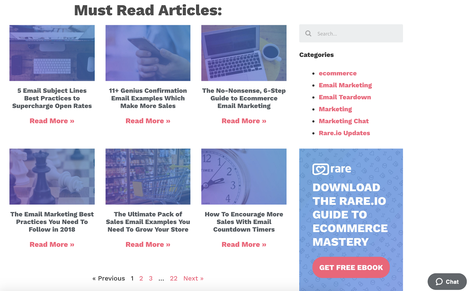
The e-mail marketing blog at Rare.io does this very well. Take a look at their desktop site:
And their mobile site:

Notice how they include the same exact content as well as features like chat support. The only difference is that they’ve molded the content to fit the device format, so on mobile they’ve stacked the articles and changed the chat support to a simple icon. They even include that sidebar information below the list of articles so nothing is missing:

And the same rules apply, of course. Great content, high-quality images and video, features that visitors want, and awesome value.
Tip #3: Have a Site that Performs Well and Loads Fast
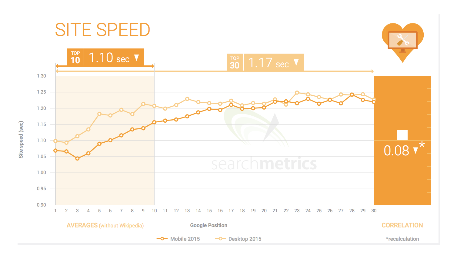
To comply with mobile-first, you need to ensure that your site loads fast. Searchmetrics found that the pages in Google’s top ten search results are those that load in less than 1.10 seconds. That’s even faster than desktop!
If you’re using a responsive site, the load speeds should be similar. But if you use a dedicated subdomain (such as m.facebook.com), you should run extra tests and consider adding more dedicated servers if your load times are lagging.
In addition to adding more server capacity, here are a few things you can do to improve your site’s load time:
- Minimize redirects
- Load above-the-fold content before below-the-fold-content
- Put JS at the bottom and CSS at the top of HTML files
- Optimize and minify CSS and JS files (use these tools)
- Use gzip compression to reduce file size
- Compress images
- Reduce amount of flash content on your site
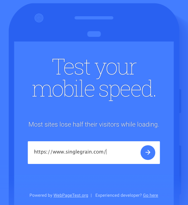
You can test your page load speed with this free tool:
Related Content: How to Produce Paid Facebook Video Ads for Mobile Like a Pro
Tip #4: Serve the Same Structured Markup
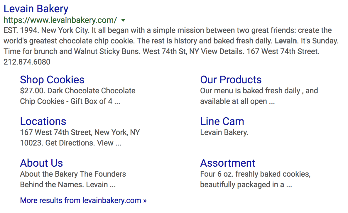
Your structured markup contains important information about your site, such as page titles, content descriptions, contact information, and more. Google uses it to properly sort and rank your site as well as provide more information to users in the results:
With responsive design, you won’t have two separate markups. But with Dynamic-serving sites or distinct mobile sites the actual HTML of your pages changes:
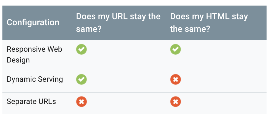
If you don’t update the markup on your mobile site, Google may lose this critical information and penalize your site. Even if they don’t, searchers won’t be able to find the same valuable information about you when they search which could hurt your business in other ways (like decreased visits or sales).
Note: if you have a responsive site, you can skip this and the next two sections. Continue to the last check.
Here’s how to make sure your markup is consistent…
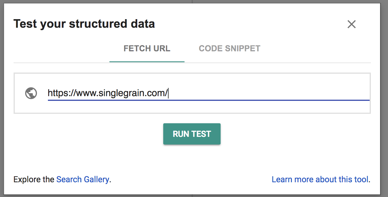
a) Grab the markup for your desktop page here:
b) Copy the response:
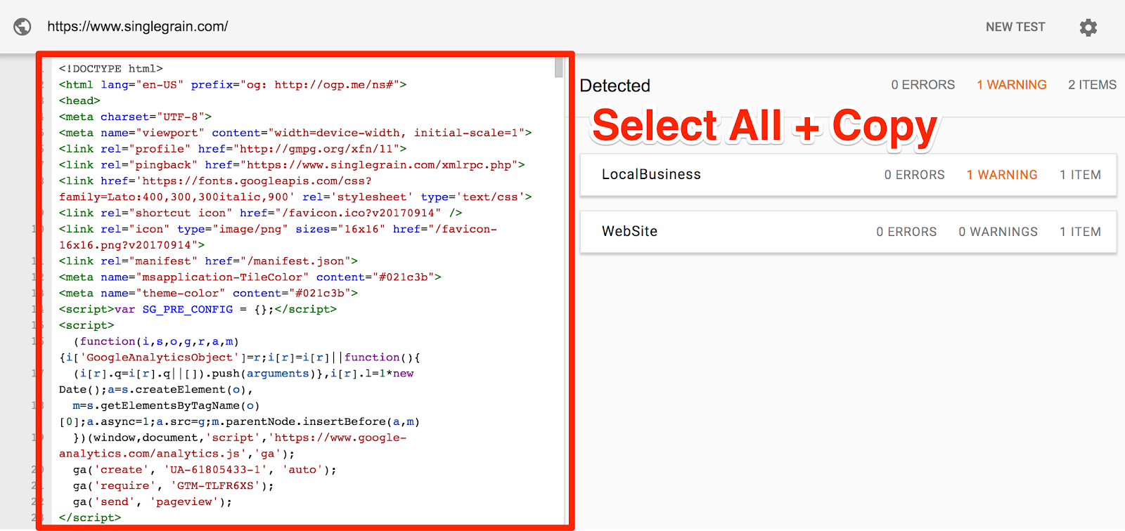 Note: if you have a lot of warnings or errors, this would be a great time to address those! (There was nothing to worry about here.)
c) Go to Diffchecker and paste the result on one side:
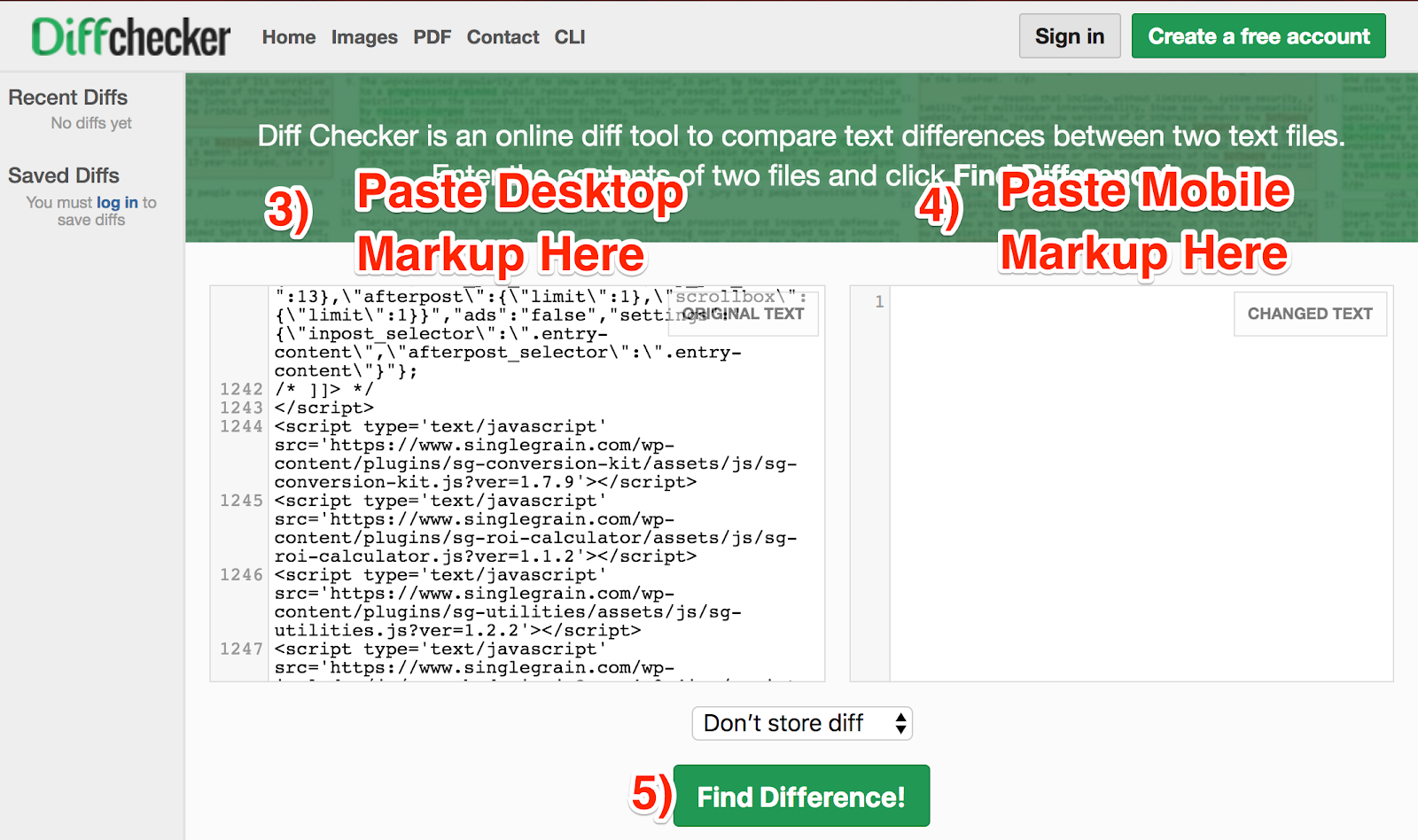
d) Do the same for your mobile site.
e) Click “Find Differences!”
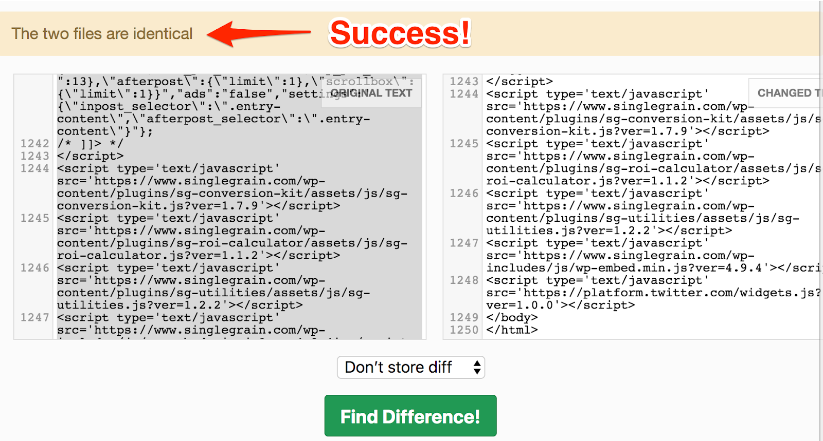
Great! We’re good. If you find any differences here, you should check to see which information is more accurate and update them to match.
Tip #5: Make Sure the Servers Hosting Your Site Are Ready to Handle the Increased Crawl Rate
A side effect of mobile-first indexing is that Google will start crawling your mobile site much more frequently. If you have a lot of web pages, this might put extra strain on your hosting which will slow the page down for your visitors. Google says they do their best to avoid degrading site performance, but ultimately it’s hard to judge from a distance.
This one isn’t super actionable, as adding extra hosting capacity can be costly if you don’t need it. But you should monitor your mobile speeds closely as Google rolls this out and pay special attention to customer complaints about load speeds.
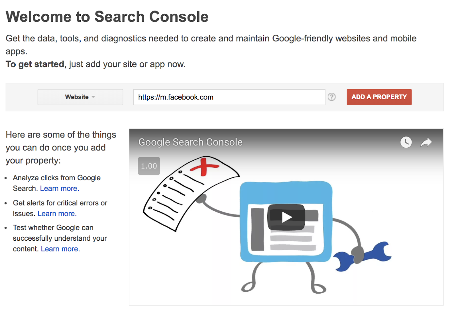
Tip #6: Verify Your Mobile Site in Search Console
This tip is quick and easy – but ignoring it can cause your site to be improperly categorized or even missed by Google. Yikes!
If you haven’t already, just head over to Google Search Console and either add a new site or verify your existing site if it’s already been added.
You can find more detailed instructions on verification here. There are a few options, depending on your situation.
Related Content: Marketer’s Guide to Mobile App Advertising
Tip #7: Don’t Serve Incomplete or Buggy Mobile Sites
Google has said that if they can’t find a mobile site for your domain, they will continue to index the desktop version without an explicit penalty – for now.
They specifically caution webmasters:
“…keep in mind that a functional desktop-oriented site can be better than a broken or incomplete mobile version of the site. It’s better for you to build up your mobile site and launch it when ready.”
–Doantam Phan, Google Product Manager
If your company has a half-baked or slow-loading mobile site, you should take it down immediately. It wasn’t an issue in the past because Google relied primarily on your desktop site to compile its search index. If your mobile site was glitchy or broken, it may have hurt you in other ways, but your index was safe.
That is no longer the case:
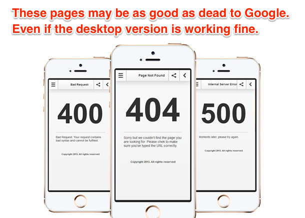
Google understands that this is a major change for some sites and is giving them plenty of time to update.
If you only have a desktop website, Google will still index it – but from a mobile perspective. So if your desktop site is annoying to use on a phone, it will suffer. So don’t wait to get that mobile site in order! #MobileFirstIndexing Click To Tweet
Conclusion
Google’s team has said that their goal is to have as little effect on search ranking as possible. They simply want to keep up with the global Internet trends and prepare their product for the future. But that means they’re expecting you to update your website for the future as well. They’re rolling this out gradually and subtly so you won’t see a jump overnight. But it is happening.
If you don’t take the time to make sure your site is optimized for mobile-first indexing, you start to see your traffic drop over the coming months and years. Don’t let that happen to you!
Make sure that:
- Your site is mobile responsive and loads quickly
- You serve the same high-quality content in a way that’s easy to access and consume
- Your structured markup is consistent and accurate.
- You’re prepared for the increased crawling and mobile traffic you’ll be receiving, especially if you have a dedicated mobile subdomain
- You verify your site in Search Console.
- You don’t serve a buggy or incomplete mobile site!
If you follow these tips and start updating your mobile site now, you’ll not only survive the coming changes, but you’ll have the edge on those who waited until it was too late!