January 31, 2018
In the world of expertise, where you focus on honing your skills in one facet of digital marketing, sometimes you’re required to perform outside of that facet. Digital marketing is an environment affected by a myriad of variables both controllable and erratic. We can be insanely brilliant PPC gurus but when it comes to optimizing the post-click experience CRO can become a sphere of confusion which can lead to over reliance on best practices.
Earlier in my PPC Hero tenure, I shed light on My Experience With Landing Page Best Practices And The Failures That Ensued. Today I will illuminate a few instances in which we violated CRO best practices and it was an utter success.
Example #1: Social Media Has a Time and Place
This specific client sells essential oils which is a market that is engulfed in education and opinion. This innately pairs with social media creating a very large avenue for traffic to the main website along with a strong lean on social proof. Much of this client’s traffic enters via Facebook and much of that traffic is referred via word-of-mouth. So Facebook is important to this brand right? Yes. So opportunities to connect a user’s Facebook experience with his/her website experience should also be quite prevalent in order to remain relevant and congruent right? Not necessarily.
We wanted to give the homepage an uplift; enable it to be the gateway and avenue into the site that it really should be. We started this process via existence testing because if we can’t tell what IS vital to the homepage, we may ignorantly eradicate a heavy hitting element.
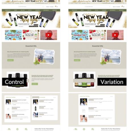
Combining data from behavior maps and Google Analytics, we learned that the element at the bottom of the homepage showcasing this brand’s Facebook presence was not driving action and not being seen by the majority of users experiencing the homepage. Furthermore, it splits the column with an element showcasing the brand’s blog. This element, on the same lateral plane as the Facebook element received significant attention and successfully drives purchase behavior.
The variation in this A/B test removed the Facebook element and enlarged and centered the blog element as seen below. Note that both of these elements only appear on the desktop and tablet version of the site.

The variation lifted both purchase rate (8.79%) and revenue per user (28.08%). Even more interesting, when we split these metrics by device we see a more substantial lift in purchase rate on tablet (20.08% vs. 6.26%) but a rather similar lift between the two devices in revenue per user (desktop: 28.96%, tablet: 25.16%).
In essence, we removed a distraction and nullified a rabbit trail that was pulling people off the site, out of the purchase mindset, and straight out of the funnel. Social sharing is lovely, but it’s also a spiral into distraction that should be limited to a page where it cannot rip your users away from their purchase; like the thank you page.
Example #2: Video Should Not be Placed Willy Nilly
This client is a hospital whose main online focus is brand awareness and overall education/information dispersal. They had recently acquired video testimonials showcasing real patients and their experiences with each of the primary lines on service. Social proof is crucial right? Yes. Video social proof carries more validity than written testimonials correct? Typically, yes. So video testimonials should be placed as high on the page as possible right? Not necessarily.
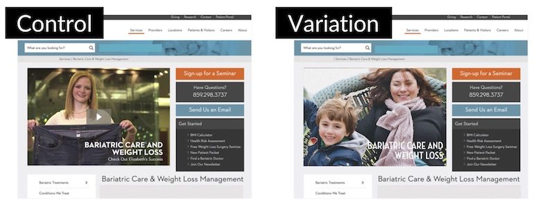
Based on 30-day data after the video was originally placed in the hero image and in-line with the content much further down the page, we discovered that a very small proportion of overall traffic was engaging with the video in either location. So we wondered is it the video? Or the placement of the video?
The variation tested an image replacing the video in the hero image but kept the in-line video in its place.

While we don’t see traditional conversions on this specific page focusing on brand awareness and information dispersal, there are conversion options to sign up for a seminar to learn more about this service line or contact the facility to learn more. The variation created a lift in both of these actions (Sign Up for a Seminar: 84.71% and Contact Us: 214.29%). The in-line video saw a 135.71% lift in engagement with the removal of the hero image video.
Users didn’t necessarily want to hear about this patient’s story until they had digested or at least scanned the content preceding the video that incorporated facts and figures with basic essential information. Ensure that your users are exposed to persuasive content only once they have had the opportunity to peruse the pertinent content.
Example #3: Contact Forms Don’t Have a Place Where They “Belong”
Last, but certainly not least, this client is a preschool franchise offering many different avenues of conversion both high and low in the funnel. Perhaps the most classic of these avenues is the “Contact Us” avenue.
So this one is probably one of the most common best practices I’ve been taught or seen floating about the CRO advice sphere. Forms on a two-column page should always be on the right-hand side of the page, right? Because we read left to right and it makes sense to put content on the left and the conversion option that follows on the right, correct? No. No. And no.
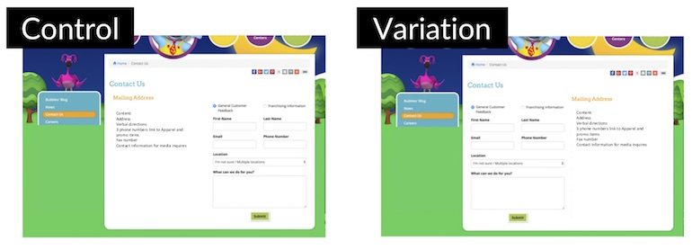
Context matters folks. This form is accessed via a sticky “Contact Us” call-to-action in the top navigation. Thus, by arriving to this page the user has already indicated their intent to contact you. If you have a seamless or convenient option to do so, such as a form, why is it necessary to expose the user to a phone number, address, or any other content before that form?
In order to increase the perceived availability of the form on this page, we swapped it with the content on the page as seen below.

The variation drastically increased form completions by 154.81% without significantly impacting any of the other avenues of conversion. If your users have already indicated what they want (“Yeah, I’ll go to this new page because that’s what I’d like to do now.”) give them a lighted and blatant path to that action. Don’t place best practices in the way.
Final Thoughts
Listening to data and your users and inevitably violating best practices can be highly beneficial. As a reminder, best practices can and frequently do fail. Continue to be the expert that you are and deliver all-around value to each piece of work you create by taking the time to listen to your users when you really need to optimize that post-click experience.
All in all, your users are more valuable than best practices.