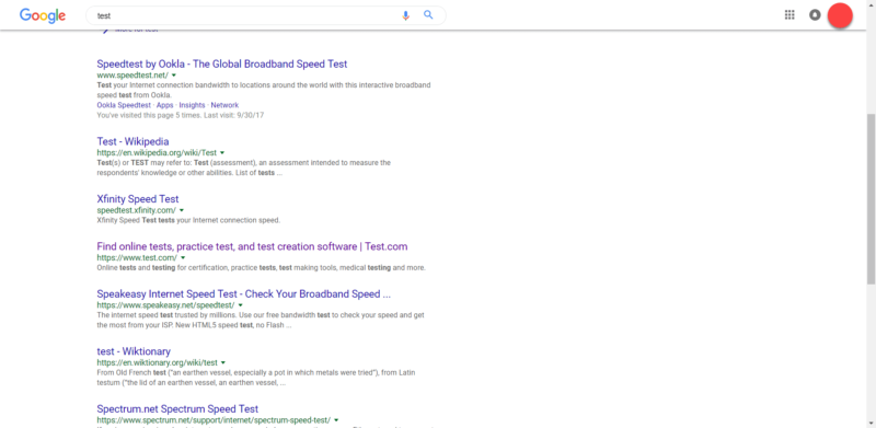
Google has confirmed with Search Engine Land that it is testing new user interface for the core search results pages. This new test features a rounded search bar at the top, a smaller Google logo, and, most noticeably, the search bar header sticks to the top as a user scrolls through the results.
This was first spotted in a Reddit thread and Google confirmed this is one of its many tests. A Google spokesperson said, “We’re always experimenting with new ways to improve the Search experience for our users.”
Here is another screen shot from the Reddit thread:
Google is frequently testing user interfaces but this test involves the most drastic changes in the core search product that we have seen in a long time.


