Google Image Search for desktop is testing a user interface and design that makes it more aligned with the mobile image search layout that launched back in March of this year. The desktop version in this test shows the tiled image layout in this white interface, it also shows the titles and URLs beneath each image search result snippet.
Here is a screen shot of the test, which I grabbed from a Google support forum:
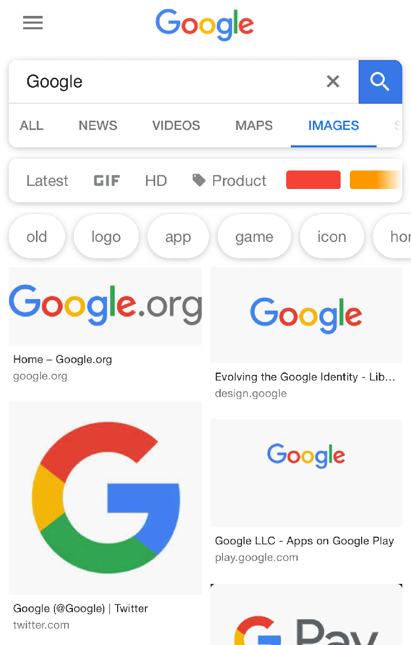
This brings it more in line with the mobile version of the image search results on Google. Here is a screen shot from my iPhone this morning:

Here is what the current design looks like, without the tiled design and titles and URLs:
Google is often testing new user interfaces, but it does make sense that it would align the desktop and mobile interfaces for image search.


