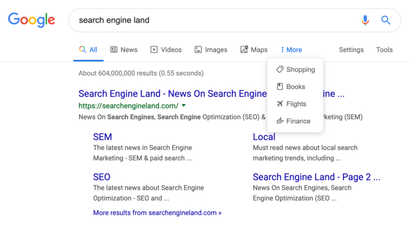
After a few months of testing it now appears Google has started rolling out the new search bar with icons. Instead of just using text to show the various search categories or verticals for news, video, images, maps, shopping and so on – Google is showing icons that represent those categories as well.
Screen shot. Here is a screen shot from Chrome on a Mac. Note, I tested this on numerous browsers and operating systems, both signed in and signed out of Google. I was able to replicate this in every single test I’ve tried.
Before screen shot: Here is what search bar looked like before:
Rolling out. Google has confirmed with Search Engine Land that this is now rolling out to searchers today. Throughout the day we have seen numerous reports from readers that they are seeing the new Google search bar. Now we are able to see this consistently on all browsers we are testing it on.
Going back in time. Google had icons next to these search filters back in 2010 on desktop and 2011 on mobile. But in 2011 Google removed the icons from the desktop version. Google has made many changes to their top bar over the years, much of which you can find in our user interfaces archives.
Why we care. Any change to the user interface of one of the most used web sites in the world will be noticed. Will it impact search marketers or SEOs? As we said before, this change will probably not impact us much but it does give a new fresh look to the Google search results page.


