Over the past month or so, Google has been testing how sitelinks show up on brand queries on desktop search results.
The test is on enhanced sitelinks, which include a line of description copy with each link and appear only on brand queries on desktop. Typically, these appear in two columns below the ad as shown in this “Patagonia” example.
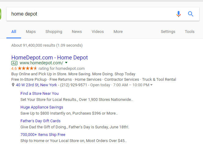
 Google is now testing a list format for enhanced sitelinks. The link font is smaller, but taken together, the list of four enhanced sitelinks takes up more real estate than the column format.
Erik Hamilton, search supervisor at Good Apple Digital spotted this example of the test on a search for “Home Depot” last month.
This week, Frederik Hyldig, head of PPC at s360, spotted the same treatment on a search for “Nike” in Denmark.
The list brings the desktop format more in line with mobile, where sitelinks on brand results typically show in a list, though without the enhanced description copy.
I find the list format easier to scan than the two columns. If other users respond the same way and click-through rates improve over the columns, we can expect to see this test roll out.


