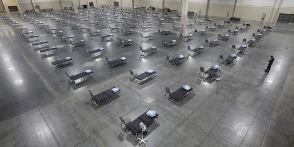
We all know by now that flattening the curve is one of the most important things we can do to mitigate the devastation of the coronavirus pandemic. China and Italy provided a grim picture of what happens when you’re unsuccessful: overwhelmed hospitals are forced to choose which patients receive life-saving resources, overworked doctors are more likely to get sick, and the death rate, by consequence, increases dramatically.
Many hospitals in the US are about to face the same fate. The University of Washington’s Institute for Health Metrics and Evaluation (IHME) produces daily projections on the pandemic’s strain to the US healthcare system over the following four months. It uses the latest data on every state’s intensive care unit (ICU) and hospital bed capacity as well as its social distancing policies, including school closures, stay-at-home orders, non-essential business closures, and travel limitations. The impact of social distancing is modeled using data on how the virus responded to such measures elsewhere.
Below, we have charted how many times each state’s maximum projected need for ICU beds will exceed its available capacity. You can see that Connecticut, Massachusetts, New Jersey, New York, and Rhode Island will be the most overwhelmed. Fortunately, other states that continue social distancing as they are should avoid the worst fates.
IHME also projects the number of Covid-related deaths in every state, based on the assumption that each will continue their social distancing policies through the forecasting period. The chart below clearly shows how projected ICU bed shortages will also have a greater impact on projected deaths than the state’s overall population. California, for example, has the largest state population but a projected surplus in ICU beds; its projected death count is subsequently much lower than Massachusetts or New Jersey, which each have only a fraction of the population.
Keep in mind these graphics represent a snapshot in time. They were created using projections pulled on April 5. That means they will still change over time as states implement new measures to flatten their respective curves or increase their capacity.
By no means do these projections also mean that the social distancing measures already implemented have been for naught. Without them, the charts could have looked far worse. The forecasts also serve as an important lesson about how to more aggressively respond once the second wave of the virus hits the US as it has started to in countries like China and Singapore.
