We continue our series of comprehensive guide articles for those wishing to start a blog. In the previous series, I have already talked about how to start a blog and this website also includes other advice on how to create a successful blog. You already know how to choose a CMS platform, domain and hosting provider, and many more useful tips. Today I will share with you the best blog web design tips.
Web design is more than the sum of its parts. It’s known that only a few seconds are enough for people to form an idea of any object, and your blog is no exception. Whether he likes it or not, to stay or leave – this is the meaning of the first impression.
The first impression depends on many factors:
- the structure of the page (layout),
- colors,
- indentation,
- symmetry,
- amount of text,
- fonts, and much more.
Search engines analyze the behavior of visitors to determine if your site meets the needs of the target audience. If people follow the links from the results but leave the page quickly, it means that the website does not give them the necessary information. For search engines, this is a signal to lower the rating of the resource.
Thus, poor design has a direct impact on the drop in positions in search engines. Also, it is the first reason why website promotion will not be sufficient.
In this article, you will find learn how to pick a theme following web design trends. Let’s have a look at 21 tips on the blogging topic of web design with great examples.
Best Blog Web design Tips
- Decide what specifics your site will have
- K.I.S.S.
- When choosing a template, pay attention not only to the visual parameters
- Easy to customize
- Parallax effect
- Geometric shapes and patterns
- Pay attention to the reviews and find out about support
- Full-screen video
- Good web design is easy to use
- Juicy graphics and images
- Good web design is technically flawless
- Studio minimalist photos
- Good web design is fully responsive
- Flashy colors
- Good web design is SEO optimized
- Search function
- Good web design is target group-oriented
- Typography
- Loading time
- Take your time and do not be greedy
- Look at the bigger picture
Nowadays, many users use ready-to-use templates to create any website. On the web, you can find tons of web design templates at any taste. The question is how to choose the right WordPress Blog theme.
So, the solution to this issue should be approached very responsibly. To avoid mistakes, I suggest following these tips. As examples, I provided beautiful blogs from the site Webdesign Inspiration Gallery and ready-made WordPress themes.
Decide what specifics your site will have
Ignoring site specifics is one of the most common mistakes. But each site has its specialties. If this is an online store website, then the emphasis should be on goods, and the general background should not distract from the choice. The Buy or Order button should be in the visitor’s access area, and the image quality should always be the best. As for the blog, there are already other requirements. The site design should make a good impression, attract a visitor, and be useful with its articles and topics.
Everyone who will choose a template for their site should be aware of the specialization of the website. That is why it is worth selecting templates carefully so that their use is appropriate. No matter how good your chosen template is, but if it is not appropriate in this market niche, you should not use it for your site.
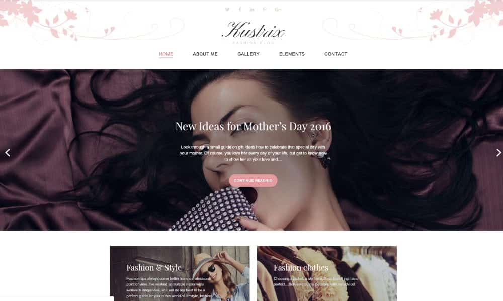
For example, if you want to tell about fashion and clothing, use the perfect suited WordPress theme as Kustrix.
Details
K.I.S.S.
This is the abbreviation of “Keep it simple, stupid”, although other interpretations can also be found on the net. However, the word “simple” occurs in every variant, and that is exactly what web design is about.
It is easy to try to offer more and more options on your website. Be it many products on the niche website, many links in a blog, or the like. But that overwhelms the users and often a “too much” deterred rather than it helps. This also applies to forms; for example, the send rate increases if there are fewer input fields in the form.
So, don’t overload your website, but concentrate on the essential content and what visitors are looking for. The great example is Sand and Such.

When choosing a template, pay attention not only to the visual parameters
Deciding on the best template is not the easiest thing, because you always want to choose the one that you liked visually. However, the template should be chosen wisely. You should be aware of what your site is for, and soberly evaluate the template for the site visitor.
It means you should ask yourself how convenient it will be for potential customers on your site. To make it easier to choose, write down the entire list of requirements, and then proceed to view the templates, selecting those that will most closely match the list of requirements. Take your time to make the final decision. Weigh the pros and cons. Choose the option that you like more than others. At the same time, it should include many positions from your list of requirements.
This tip, I will always repeat.
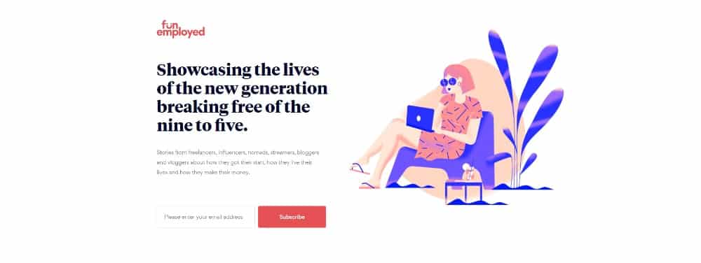
Don’t forget about white space!
White space is a significant point in web design, which often distinguishes the beginner from the expert.
It is tempting to use every free space to incorporate content, links, photos, or whatever. Empty areas are felt to be wasteful for many website users. But that is not the case. White Space is a design element that ensures that everything looks tidier and brighter for readers.
It also helps to highlight other relevant content in your blog. So, let your website breathe.
A great example of using white space is the Fun Employed blog.
Easy to customize
The template must be easy to configure and be multifunctional.
Someone will say that this is not a recommendation or a hint at all since everything is already obvious. Beginners in the field of web design think that if the template is easily customizable, then it is incomplete. Someone claims that having a lot of features annoys users.
All these are just statements by inexperienced users. It is a large number of possibilities that give the necessary freedom and the desired result.
24.Storycle is a multipurpose template for blog and news portal with lots of skins.

Details
Parallax effect
The parallax effect was previously practically not used in the design of web resources.
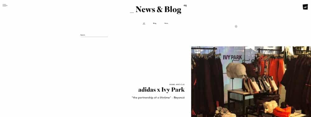
But in the era of progressiveness, when VR technologies have already begun to show their capabilities in full, not using parallax on the site is comparable to a crime. Indeed, such a feature as moving the background and the main elements at different speeds will be a real find for trendy website designs. Be sure that every visitor will pay attention to this and consider this effect as a very cool image component of the resource.
You can take a look at the parallax effect at the site below.
Geometric shapes and patterns
This trend is relatively recent. It originated in 2016, was developed in 2017, and will continue to gain momentum in popularity in 2020. Mixing various geometric shapes can give excellent results. The right selection of patterns and shapes will help create a holistic and attractive composition that is very much appreciated by the web user. And, even though 2D technology is gradually losing ground, giving way to 3D, such techniques can significantly refresh the design concept, making it modern and very interesting.

Pay attention to the reviews and find out about support
I have already mentioned that finding online templates for creating a site is not a big problem today. However, it is worth remembering that not all models are technically advanced, which means that they are not of high quality. And there are a lot of such low-quality products on the network.
Therefore, pay attention to developers if you want to have a working site. Get feedback from other customers about product quality and creator technical support. It will also help you choose the best template. And one more thing.
Even the best templates can show one or another disadvantage, so support for developers will be beneficial.
Full-screen video
Background videos make the site design unusual, modern, which increases the visitor’s involvement and increase blog traffic. Secondly, the video may show relevant information. In this case, the user does not need to scroll down the page to find the information he is interested in.
A trick with full-length videos as the main background appeared a long time ago.
It was already famous.
Because of the inability to support mobile devices and a lot of weight, it led to a decrease in the speed of loading the site. But the performance of the gadgets and the technical optimization capabilities again returned the video as the main background in the system. This means that they can still take a leading position in the development of design in 2020.
By the way, video can be a great addition to a flat design. Use it as a screensaver, and it will complement the design with a fresh image like it National Geographic does.

Details
Good web design is easy to use
The web design should structure the content of the page meaningfully and make navigation easier for visitors. You can usually find the logo in the upper left corner of the page and the navigation menu in the top area. The so-called hero shot (with the key message) is generally found in the middle.
The user-friendliness of a page is not only determined by the layout. Other graphic elements, such as typography and color palette, are just as important for a successful homepage. Both elements should be selected in line with the overarching corporate identity of your blog.
It is also essential to choose the correct font size and to maximize the contrast between text and background. Since the eyesight of the users and the quality of the monitors fluctuate significantly, the difference between text and background color should be as transparent as possible.
A good example is this restaurant blog. Everything is beautiful and bright.
Juicy graphics and images
Familiar and standard photos on the site become boring.
Sophisticated consumers need something new, exciting, unusual, and extraordinary. Graphics come to the rescue. Especially when it is ultra-bright and colorful, creating an emphasis on itself. See for yourself how such graphics attract attention and motivate the visitor to further action. Take a look at the Reddit blog to make sure that it is cool.
If the bright graphics are not adjacent to the theme of the site, then photos or images will help. But they must be juicy and high quality.

Details
Good web design is technically flawless
When it comes to good web design, it’s not just about aesthetics. Good web design is not only beautiful, but it is also technically perfect. 404 errors, in particular, should be avoided, and loading times should be short.
WordPress, in particular, is susceptible to 404 errors. They occur when pages are deleted or renamed. Well-designed error pages motivate the visitor to find what they are looking for again.
A few elements that can contribute to this:
- A clear and simple structure,
- a clear listing of the category pages
- and a search function
It is just as essential to enable fast loading times. The average visitor switches back to Google search after only 3 seconds of page loading. This makes it clear that on the technical level, flawless functionalities are important prerequisites for good web design and positive user experience.
Studio minimalist photos
Try to replace vivid and multi-element photographs on your website with high-quality images, which depict only one element that displays the idea and concept of your blog. This will focus the visitor’s attention and not allow him to be distracted.
Today, these pictures are in trend. And thanks to its effect, they will remain in it for a long time.
An elegant rejection of all unnecessary will leave more space for what is essential. This is your content. Whether it is a photo, text, or video, the free space surrounding them will favorably highlight them and focus the reader’s attention on them.
Take a look at the Cereal blog how amazing all those minimalistic photos are.

Details
Good web design is fully responsive
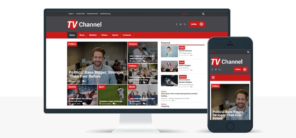
Responsive web design enables the layout of a website to be designed so flexible that it allows uniform user-friendliness on the computer desktop, tablet, and smartphone, and the user can entirely and immediately record the content.
At a time when the smartphone has become a constant companion for many people, responsive web design is an indispensable prerequisite for any modern website. Using this technology, content, and navigation elements, as well as the structural structure of the website automatically adapts to the screen resolution of the mobile device.
Flashy colors
No one will ever be able to forbid you to use bright colors in the design of your site if they emphasize the general idea. Colors convey emotions, and emotions – the most important thing for the user. At the sight of rich and screaming flowers, correctly chosen to each other, your target audience will appreciate your courage by staying on the site and continuing to use it.
The return of gradients has marked in recent years. It is expected that they will again enter the trends of web design, having changed in 2020. Saturated colors combined with a variety of textures will be added to the palette. Gradients in the updated version will use two-color effects.

Good web design is SEO optimized
Responsive web design not only contributes to user-friendliness but is also an important ranking factor. Google considers the responsive implementation of a website as a ranking criterion. Statistics show that the number of mobile searches has doubled annually, while requests from desktop computers have been decreasing since 2013.
An important factor for Google when evaluating a website is whether the main content is immediately visible (i.e., without scrolling) and whether the design of a page is helpful for the user. Content, white space, navigation menu – all basic elements of a website should be positioned so that the first-time visitor can understand what this blog is about in a few seconds.
4News theme is a modern theme with an SEO-optimized code to help you to increase blog traffic.

Search function
Many people underestimate the search function on their website or blog. But many users are looking for something specific and cannot find it via navigation or, for example, the sidebar.
Epicurious website likes to use the search function, and therefore it is placed prominently. This way, it is seen immediately, and you don’t have to search for it first. 🙂

Details
Good web design is target group-oriented
For the next web design tip for your blog, you should answer the question. Who are the visitors to my website?
There are hardly any fast rules that say what good web design should look like. Whether minimalist or vintage – the main thing is that the web design appeals to the right target group. That is why it is necessary to deal with the target group determination and blog research in the first step.
Essential characteristics, such as age, gender, and technical skills, should be considered first. For example, older people often no longer see optimally. For this reason, it is advisable not to choose a font size that is too small.
They are also more interested in seriousness and valuable content than in the design of a page. Younger people, on the other hand, place more value on high-quality design and a modern look and feel.
Looking at the travel blog On The Road, you understand right away for whom it will be interesting.

Typography
The content is the king, but you should not underestimate the impact of typography as part of the web design. Successful typography ensures that users can read a lot more and absorb information better.
The font size, for example, is always the subject of much discussion. There is no perfect size, but in many cases, the font size is chosen too small.
The most popular fonts for a blog post are:
- Libre Franklin.
- Alegreya Sans.
- Rubik.
- Spectral.
- Lora.
- Gentium Basic.
- Arvo.
- Fira Sans.
Also, other factors such as the font, color, etc. also affect the reading experience. Therefore, you should test and optimize the font on different devices.

Loading time
Since mobile use continues to increase, and Google itself has launched the Mobile First approach, you should take care of your loading time.
Apart from the fact that Google has now introduced loading time as a ranking criterion, it is above all the users who react very negatively to loading times that are too long. The bounce rate increases, and you lose cash.
It is not that difficult to improve the loading time. It starts with image optimization and extends to techniques such as caching. For example, there are several useful plugins for WordPress.
But I would recommend using lightweight WordPress themes as Monstroid2. This Theme has tons of good feedback and many skins as well.

Take your time and do not be greedy
Those who buy templates expect a lot from them at once. But to get the necessary returns from them, they need to invest not only money but also energy and time. Of course, free templates do not require payment, but they have the flip side of the coin, which is often very bad.
For example, poor product quality or lack of support. No one says that you should not pay attention to them. You just have to be more careful and careful with them.
But the statement “the more expensive, the better” does not always work. Choosing among personal website templates do not focus on finances and take your time with a choice.
I am almost sure that creating such a blog as Ian Fleming took a lot of time and patience to create such a beauty.

Details
Look at the bigger picture
There are, of course, a certain number of sites that are developed for the soul. But still, a higher number of websites are created for commercial purposes, or to disseminate information, or to provide services, etc.
Choosing a template, you should always look to the future and take into account the prospects. Otherwise, you can easily fall into the trap. Choose a template, taking into account the general situation, and remember that the template is only a small part of a larger project.
For example, you are a novice restaurant critic, so create a blog so as not to miss customers. Finding the right templates for your market niche is no problem. But look further and choose the one that suits your style and preference more.
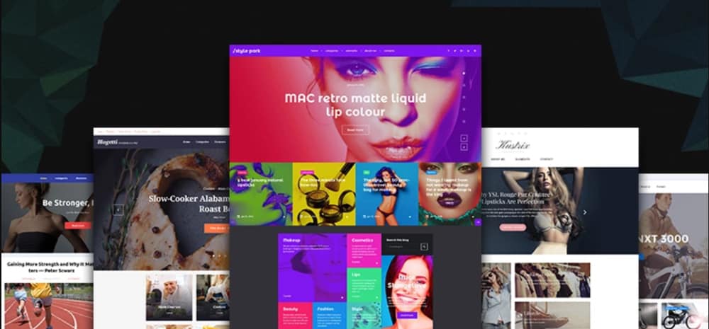
For instance, this bundle offers you five themes under GPL 3 license and 24/7 support, which can be very useful in the future.
Wrapping Up
I hope that my blog web design tips will not scare away those who want to buy a template for their site, but will be useful in choosing and will help you find the best option for you. Take your time and think it over. Then the template you select will undoubtedly be the best solution for your site.

Although it is generally accepted that good web design is technically flawless and can be navigated smoothly, no other specific properties can be firmly defined. However, the focus is on the user. Good web design is user-friendly and targets group-oriented design. It should be a design that meets the needs and expectations of users.
If you still have questions related to how to start a blog or how to choose a Blog theme, write in the comments.
