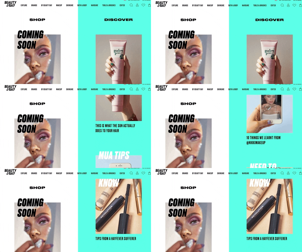
Beauty Bay, the independent online beauty retailer, has recently revamped its website in a bid to become a ‘digital-first’ brand.
The move comes in conjunction with wider changes in the brand’s culture and identity, based on market research Beauty Bay undertook in 2018. Ahead of changes made in the US last year, Retail Times reports that the brand discovered that its consumer base was much younger than it had anticipated, while core influences on purchasing decisions were also uncovered.
So, how does Beauty Bay’s new site (which was recently rolled out in the UK) reflect this? Here’s an overview of some notable features, and the impact on UX.
Shop/Discover
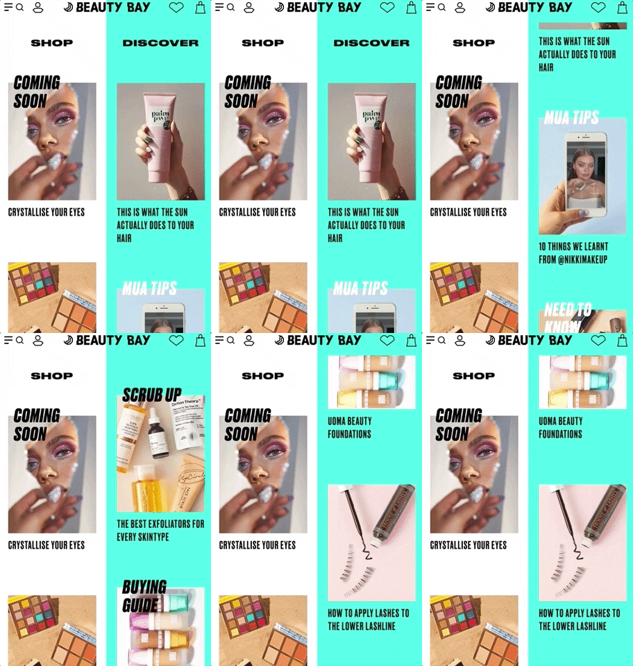
Beauty Bay’s new website has a distinctive design, with the separation of commerce and content being one of the most notable features. The homepage is laid out in two columns – one for ‘Shop’ and one for ‘Discover’ – which allows users to scroll either one independently, effectively choosing between browsing products or exploring written articles and video.
This creates a fluid and appealing user experience, with the bold and colourful design serving as a point of difference for Beauty Bay, particularly in comparison to other retailers in the online beauty space (such as FeelUnique).
While it might sound counterintuitive to separate content and commerce so obviously, the two sections are still cleverly intertwined, with category pages including links to content and vice versa. This means that users are always nudged towards products, and ensures that returning or checked-out customers have a reason to continue exploring the site.
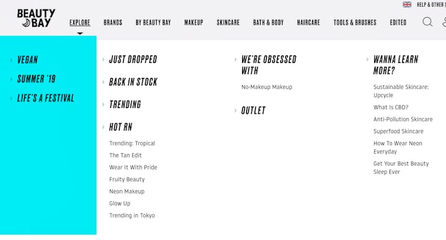
The homepage navigation is easy to use, too, with its ‘Explore’ section being particularly good at guiding users who are unsure what they want from the site. It is similarly helpful to have a dedicated section for ‘By Beauty Bay’, which separates the brand’s own products from other well-known beauty brands.
Influencer appeal
Another aspect of Beauty Bay’s redesign is the inclusion of better quality product photography, which gives users more of an idea of the look and feel of packaging and product design.
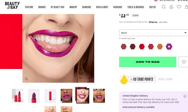
This might not necessarily be vital or have much of an impact on conversion. After all, even the most detailed photograph won’t provide an indication of how a make-up or skincare product will look or feel on an individual. However, the photography certainly contributes to the overall quality of the user experience, and helps to draw in users while browsing product pages.
One thing that definitely could help with nudging users towards a purchase, however, is influencer content. Beauty Bay has partnered with a number of well-known influencers in the beauty space, posting content on the influencers’ social media channels as well as its own.
This content is also nicely integrated within Beauty Bay’s site, particularly on ‘trending’ pages which group products into niche categories such as ‘tropical’ or ‘pride’.
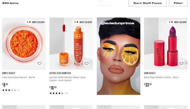
By placing influencer photos next to the products customers could use to recreate the look, the site naturally prompts discovery and interest. This kind of content also appeals to Beauty Bay’s younger consumers, who are likely to be more aware of and engaged with influencers.
Authoritative content
While many online beauty retailers create digital content – often designed to offer secondary value (such as tips and advice on products) – Beauty Bay’s ‘Edited’ content stands out for a few reasons. First, there’s the fact that it is highly promoted throughout the site, with almost as much emphasis placed on it as on the brand’s commerce vertical.
Secondly, the scope and variety of the content itself is decent, including a great mix of both product-focused content as well as wider themes of beauty and lifestyle.
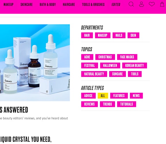
Lastly, the design of ‘Edited’ aligns with the site’s shop, meaning that there’s no friction or overarching difference in user experience between the two. For example, sidebar buttons help to guide users through the site, breaking down content into departments, topics, and types, with buttons ranging from ‘tutorials’ to ‘trends’.
As well as providing users with direction, this navigation is designed to keep users on the site for as long as possible, piquing their interest in further content.
It’s worth mentioning Beauty Bay’s social media channels in this context, too, as the brand is adept at drawing users into the site with amusing and engaging posts on Twitter and Facebook in particular.
Hay fever got you GOOD this year? ????????
These are the pollen-proof products we swear by ????♀️☀????https://t.co/mdCPhlxehc pic.twitter.com/bQDftx07cz
— BEAUTY BAY (@beautybay) August 6, 2019
Vegan-friendly beauty
According to research from The Vegan Society, sales of vegan beauty products grew 38% in the UK in 2018, with 56% of Brits now adopting ‘vegan buying behaviours’ such as only purchasing cruelty-free and vegan products.
Other research mirrors this, with Mintel reporting that vegan beauty launches have more than doubled over the past five years, growing 175% from July 2013 to June 2018.
It’s been suggested that Generation Z is spearheading this behaviour, with younger generations increasingly seeking out ethical beauty. With its new website now including a dedicated section for vegan beauty – said to include 1,500 products – Beauty Bay is clearly targeting this type of ethically-conscious consumer.
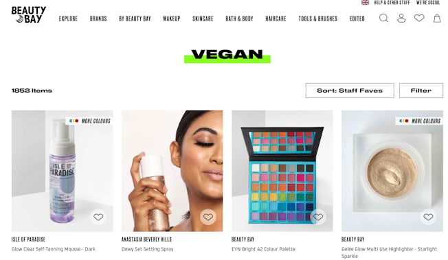
Similarly, in addition to capitalising on search interest in the topic, Beauty Bay’s expansion in this area is another sign that the brand is placing a bigger focus on younger consumers, as well as wider trends within the industry.
Mobile optimisation
A final and important thing to mention is that Beauty Bay’s new site is entirely mobile optimised, with the split-screen homepage design staying consistent with the one found on desktop.
This shows Beauty Bay’s dedication to aligning UX, creating a seamless experience for consumers on all devices. This is especially important considering the path to purchase is now more complex than ever, with beauty consumers in particular researching and browsing products through a range of channels.
Pleasingly, the mobile checkout experience is also swift and seamless, with some surprisingly good features included here, such as an intuitive address search bar and multiple payment options including Klarna.
In conclusion…
Overall, Beauty Bay’s new website reflects the brand’s promise of being ‘digital-first’. With integrated influencer and social media content, coupled with a bold and unique split screen design, it certainly stands out among the wider online beauty market.
