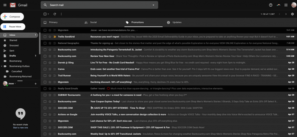
Dark Mode is taking the digital world by storm. It’s made its way into just about every app, browser, and device—and the inbox is no exception.
Last year, Gmail, Outlook, iOS Mail, and others announced support for Dark Mode. Inevitably, Dark Mode will become more common in the inbox. With so many users opting to use Dark Mode, it’s critical your emails still look great in this new environment.
Because Dark Mode doesn’t just influence your user’s experience (which is extremely important)—it has a direct impact on your deliverability.
As we discuss in great depth in our 2020 Email Deliverability Guide, the most important factor to your sender reputation (and thus your deliverability) is recipient engagement. And if Dark Mode optimization (or lack thereof) is affecting the way recipients engage with your emails, then you better believe it’ll impact your delivery rates.
However, you are still in control of your delivery. Below, we’ll help you understand more about Dark Mode for email and how you can improve your deliverability with a few optimizations.
What is Dark Mode for email?
Dark Mode for email is exactly what it sounds like: Dark Mode in your inbox.
Dark Mode’s color scheme uses light-colored text and icons on top of a dark background. The dark design reduces the light emitted by screens while maintaining the contrasting colors essential for readability. While the jury’s still out on Dark Mode’s actual benefits, users still love it because they believe it:
- Saves the device’s energy
- Relieves eye strain
- Reduces screen glare
How dark mode can improve your deliverability
When a user configures their inbox in Dark Mode and receives an email not optimized for Dark Mode, a couple of things can happen depending on the inbox and email:
- The inbox may automatically adjust your email to be compatible with Dark Mode. This can get messy and invert colors to the point where the email is no longer legible.
- Nothing will happen. Some inboxes only allow users to change their UI to Dark Mode, but it doesn’t have any impact on how the actual emails render.
- Your email will appear with its original light rendering, causing a poor user experience in contrast to the Dark Mode UI. Imagine the user laying in bed at night reading their emails to suddenly be blasted in the face with bright light from your non-optimized email.
Imagine how your recipients might react to these negative inbox experiences. They might:
- Mark your message as spam
- Unsubscribe from your email list
- Stop opening future emails from you
- Delete your messages without opening them
Your deliverability is tied to recipient engagement signals like these. When inbox providers see these red flags, they may begin filtering your future email into the spam folder or completely blocking your messages.
However, if you design Dark-Mode-friendly emails that drive opens, clicks, and forwards, you’ll boost your sender reputation. When inbox providers notice these types of positive engagement, they’ll know your messages are wanted, increasing the likelihood they end up in the inbox.
4 tips to optimize emails for Dark Mode

Now that you know how Dark Mode can affect your deliverability, it’s time to take action. The following 4 tips will help optimize your emails for Dark Mode:
1. Test your email designs
Before you go crazy trying innovative tactics, test your email in both a light and dark setting. You may find that your email already renders adequately in both modes. However, because different inbox providers render Dark Mode preferences in various ways, you’ll need to make sure you test your emails in different inboxes across clients, devices, and browsers.
Learn how you can send flawless emails every time in our Email Testing Walkthrough and Examples post.
2. Use transparent images
Transparent images allow the background-color to stay consistent with the design. A transparent image doesn’t have a white background, meaning your image’s background will be the default background of whatever environment it lives in. This helps prevent your email’s images from becoming white boxes on a black background. A quick way to check if an image’s background is white or transparent is by looking for the light gray and white checkerboard background in your files—that background indicates the image’s background is transparent.
3. Optimize your logos
If you’re using a transparent image for your logo, and your logo is black, you’ll need to add a white stroke to the black font to improve its readability. If you don’t, the logo could almost (or entirely) disappear.
4. Experiment with plain-text emails
This doesn’t really “fix” the issue, but it’s a good excuse to try a different email approach. Whether you’re sending marketing or transactional emails, sometimes a plain-text message does the job better than a polished, HTML-heavy email.
If your recipient’s using Dark Mode, then a plain-text email will simply render with light text on a dark background—simple as that.
Dark Mode isn’t the only thing impacting your deliverability
As you can see, there’s a lot of factors that determine your deliverability—Dark Mode is just one of them.
To learn more about how to improve your deliverability, download our brand new 2020 Deliverability Guide. It’s chockfull of new updates, best practices, and expert advice from our team of email aficionados. If you want more of your messages to reach the inbox, this is a must-have resource in 2020.
