I know a lot about hotels.
I’ve stayed in a hotel between 110 and 150 nights per year for 15 consecutive years.
Some have been great. Others, markedly less so.
But what I love about hotels is that they are endlessly fascinating laboratories into customer experience choices. You see, nothing is random in a hotel. Every hanger, light switch, and pointless bedside telephone was placed there after much mulling by several groups of people.
We talk about customer experience a lot in business, even right here at Convince & Convert. But I think we tend to overcomplicate it. Customer experience (CX) is simply “how we make our customers feel.” These collected feelings are crucial to the success of any hotel brand, because ultimately, it’s just a bed in a room.
The explosion of hotel brands in the past 5-10 years is breathtaking. Like ABInBev pushing dozens of variants of Bud Light on the marketplace, the major hotel players (Marriott, Starwood (now combined), Hilton, Hyatt, and IHG) keep spinning off new brand children to appeal to tighter and tighter market niches.
There are several “design-focused” hotel brands that deliver a customer experience/feeling of sleeping in a modern art museum.
There are several “Millennial-focused” hotel brands that deliver a customer experience/feeling of sleeping in your college dorm, if everyone in your dorm was cool, and liked craft beer.
All of these brands make CX choices that produce signals. Each of these signals is intended to call out to the guest…”You are in the RIGHT place. You are with your tribe. You are the kind of person that appreciates a good de Kooning knock-off on the wall above your bed. And thus, you have made a wise choice, weary traveler.”
The Millennial hotel brands like Moxy and Aloft don’t bother me too much. They are set up for maximum in-room flexibility, with furniture that slides around, nice couches (because research suggests that younger Americans eschew working at a lame desk), grab-and-go food options, etc.
The design hotels are a different story. In theory, I should love them. I’m a fairly creative person, and pretend to be a knowledgeable aesthete even though I’m from a tiny town in the desert of Arizona. These should be my people, and my hotel brands.
However, in practice, they frustrate and disappoint me consistently because these brands’ champion the “vibe” over the “functionality” and that creates what I call WTFCX (“What the F*ck Customer Experience).
If You Have to Explain Your CX It’s Not Good CX
Eleven years ago, I started my first blog. (Before I even started this blog, which recently celebrated its 10th birthday.) My blog was on Tumblr, and was called “Why So Complicated?” Like many Tumblr tomes, it was a simple, photo-based premise. Each time I visited a hotel, I would post a picture of the shower controls. I began this adventure when I was forced to actually call down to the front desk for instructions.
I am a fairly sharp individual. I’m not very DIY, and certainly not a plumber. But, if after significant scrutiny I cannot fathom how to make water appear, that’s an overly complex system.
I abandoned “Why So Complicated” after a year or so, and had forgotten all about it. Until last week.

WTFCX Returns
In the great Venn diagram of hotel brand CX choices, “fancy hotel” and “design hotel” intersect in the loo.
Shower controls in design hotels are typically “minimalistic” and therefore difficult to decipher. After all, only plebes need hot and cold labeled. Fancy hotels go the exact opposite way, while producing the same result. “Look at this opulence! Can you believe how many gilded handles and pipes we have installed for your unabashed comfort!”
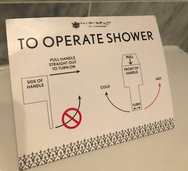
I recently stayed at a fancy hotel in Florida. A quick glance into the shower became a double-take, as there seemed to be a surplus of knobs and options. I flashed back to my long-ago call to the front desk for a shower step-by-step. But upon further review this time I found … A-HA! A TREASURE MAP!
That’s right, this hotel had SO MUCH TROUBLE with guests not being able to figure out the shower that they produced an infographic of instructions.
Yes, it is reasonable for you to be thinking at this very moment, “Why didn’t they just change the shower controls?” I suspect this is another in an endless line of customer experience decisions made based on short-term budget thinking, rather than intermediate and long-term customer satisfaction.
I present for you here the actual treasure map:
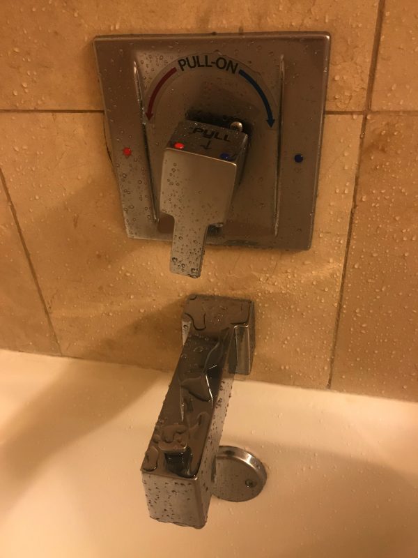
Again, I’m not super mechanical or anything, but the Treasure Map wasn’t particularly helpful, especially when I was confronted with the ACTUAL SHOWER CONTROLS:
If you’re paying close attention – as I was once I alternated between being scalded and frozen – you’ll note that even with the map, the controls also include on-fixture diagrams and help docs.
WTFCX Treats Symptoms, Not the Disease
I think it’s safe to say that if you need a sign, plus printed instructions on the valve to operate the shower, the shower itself is a customer experience dilemma.
What this hotel has tried to do is fix a root CX problem by making an infographic. That’s prioritizing symptom over disease, and is a hallmark of WTFCX.
You may not have something as egregious as this in your business, but I’ll bet you have something in the vicinity. Something that everyone in the company KNOWS is a challenge for customers, but you keep doing it anyway. And instead of fixing it, you try to fudge it. You make your own treasure map, and hope that finger in the dike holds.
You know better.

