Have you ever tried to take apart a high-end file cabinet?
We’re talking about the kind built with such thoughtful design that it makes a room look like the “after” shot on an HG-TV home makeover show…instead of the dingy unfinished basement “before” shot.
If you have, you know that taking apart a cabinet like this one is no easy feat.
You have to pull out the drawers, crawl inside, and poke and prod all afternoon.
After 3 hours of guessing, you might give up. Or you might press on until you finally crack the code on how it’s built–and then marvel at its brilliance.
You either walk away defeated. Or you finish your project and exclaim that the designer behind it is actually a genius.
What does high-end furniture have to do with your SaaS app?
You may have built the best, most genius, most user-friendly app that completely blows all of the other apps out of the water.
But if you hide your app’s brilliant usability behind opaque instructions, you might lose your new users before they even have a chance to get started.
How do you bring your app into the light? You need to get rid of the “hidden work” in your onboarding emails.
Hidden work is the work you unintentionally create for your new users when you send them onboarding emails that don’t give enough information for readers to do what you’re asking them to do.
Onboarding emails that eliminate hidden work are the difference between new users giving up on your app–and declaring that it’s actually genius.
If you’re already sending triggered emails to free trial users based on who they are and how they use your app, great. If you want anyone to actually stick with you, your onboarding emails need to clear a path from your new users’ inbox to the task you’re asking them to accomplish. Any resistance you add decreases the likelihood your new users will engage with your app both now–and every time you ask them to do something in the future.
According to a study published by Nobuhiro Hagura, Patrick Haggard, and Jörn Diedrichsen out of University College London, we decide whether we’re going to do something based on whether the task at hand seems easy AND based on whether we’ve faced resistance when we’ve performed similar tasks in the past.
“…we demonstrate that the motor cost involved in responding to a visual classification task is integrated into the perceptual decision process. Our everyday perceptual decisions seem to be solely based on the incoming sensory input. They may be, however, influenced by the preceding history of physical cost of responding to such input. The cost of our own actions, learned through the life-long experience of interacting with the environment, may partly define how we make perceptual decisions of our surroundings.“
What does this mean for you?
It means that if the first few interactions new users have with your app feel like work, you’re risking two unwanted outcomes:
- Your user decides to do nothing today.
- The next time they see your name in their inbox, they might already be programmed to think that your app = work, and so they decide to do nothing again.
Eliminating Hidden Work: The 3 Questions Your Onboarding Emails Need to Answer for Your Readers
No matter what you do, you can’t reduce the amount of new user work to zero–nor should you.
In fact, Nir Eyal’s summary of research on habit formation suggests that the work customers invest upfront in learning to use a new tool increases the likelihood that using it will become a habit over time. When we invest our time or other resources in something, we value it more and are therefore less likely to walk away from it. Behavioral psychologists and economists call this “the endowment effect“.
That’s why your goal isn’t to eliminate all work from learning to use a new app. Instead, you need to make sure you’re eliminating the hidden work that you create when you don’t give your readers the ability and motivation to act. According to BJ Fogg’s Behavioral Model, ability and motivation are 2 of the 3 ingredients your new user needs to complete a task. The third is a trigger.
Your email tool sends the trigger. Your email copy provides the ability and motivation.
To make sure you have all 3 ingredients in your onboarding strategy, your email copy needs to answer these 3 questions for your new users.
Question #1: “Where do I do this?”
Imagine you’re lost in the middle of the woods. You meet a fellow hiker and ask where the closest shelter is. He replies, “Oh you just go find the trail and follow it. It’s simple!”
Only you don’t know whether you should head north or west. You don’t know if it’s a 10 minute walk or a 2 day trek.
If you’re stuck in the woods, you keep going because….you’re lost in the woods! But if you’re learning a new app, you might give up. You might try a competitor’s tool instead. You might decide that learning the app is more work than the problem the app solves.
Your new users can and will give up when things get difficult. That’s why you need to provide a crystal clear path forward for your new user to complete the task at hand. You can do this by joining the conversation happening in their head.
Your reader is asking, “Where do I do this?”
Your onboarding emails need to say, “Go here to do this.”
This means actually linking to the in-app page where users can do the thing you’re asking them to do.
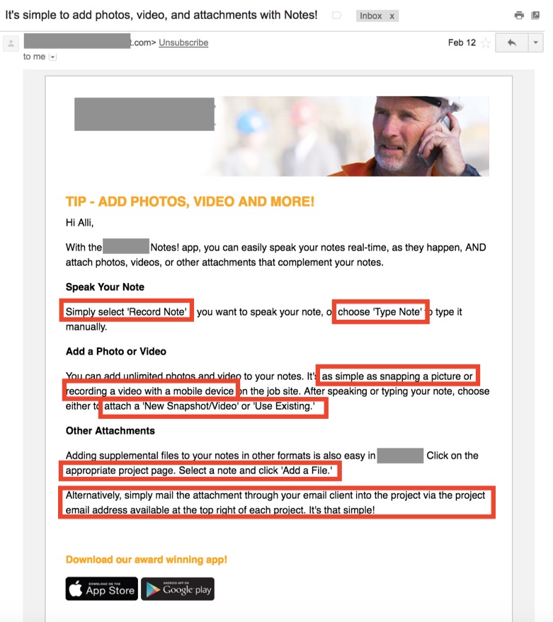
Unfortunately, onboarding emails frequently fall short of this goal. Take a look at this email:
This email asks its readers to do at least 8 things in at least 3 places (it’s hard to tell for sure), but there is not a single link or screenshot to make it easy for readers to do anything at all. When you force a reader to figure out where to go next, you create work. When you create work, you create enough resistance for users to give up and do nothing.
The Fix: Point your reader to their next click
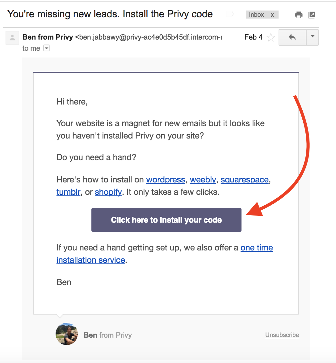
When I began but didn’t finish the signup process for a free trial of Privy, I got this email.
Instead of telling me all the different things that I’ll be able to do with Privy, this email is focused exclusively on getting me to complete the setup process–and it shows me exactly where to click in this email to make that happen.
The button is clearly labeled and centrally positioned. If I’m unsure how to install Privy code on my site, I can click the link that matches my platform and get more instructions.
Question #2: “How do I do this?”
The new Customer Engagement Automation tool (CEA) from Kissmetrics gives you the analytics to help you figure out what people are doing and whether they might need help–but analytics alone don’t close sales. It’s up to you to combine analytics with copywriting to send emails that make it easy for readers to do what you’re asking them to do.
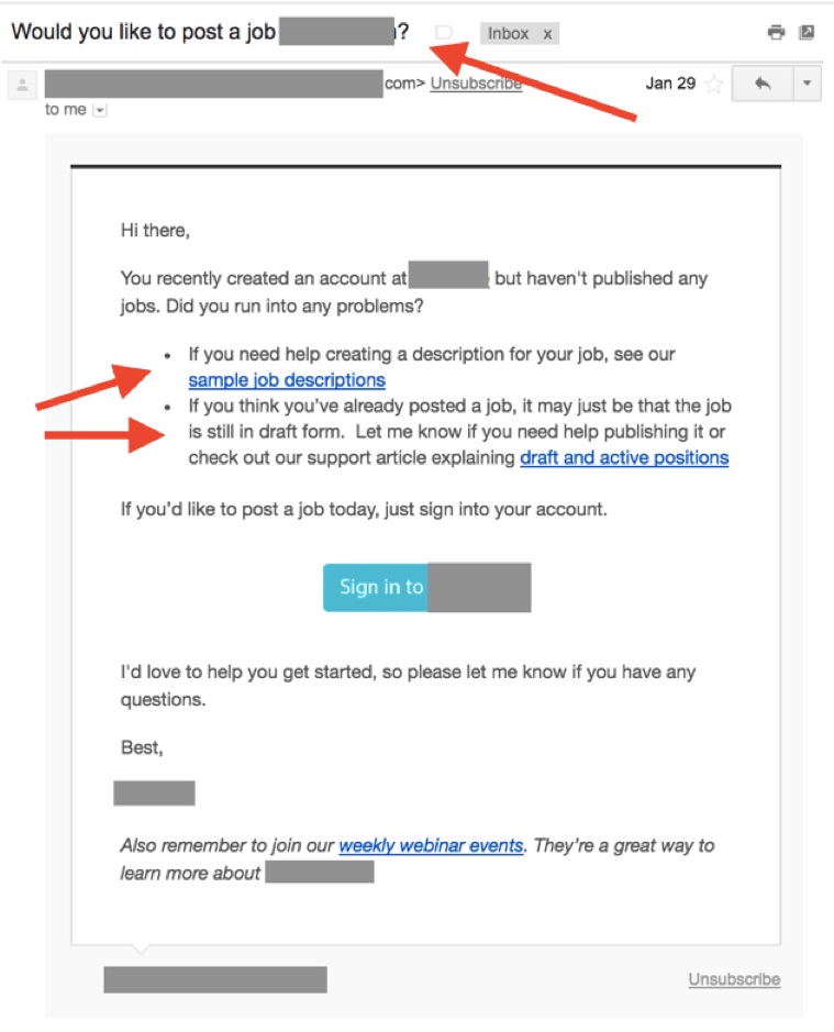
When I signed up for a job posting app, I got an email with the subject line: “Would you like to post a job on [platform name redacted]?” Unfortunately, I opened it and saw that there were no instructions on how to actually post a job.
Sure, it might be helpful to show me how to write job descriptions, but writing job descriptions and posting job descriptions are not the same thing.
Maybe one day I might need help making my post public instead of a draft, but that’s not the messaging I need to hear before I’ve actually posed the job description.
Since I still haven’t posted a job I need someone to show me how to do that first.
The Answer: Provide all of the info on HOW to complete tasks in the email (or one clear click away)
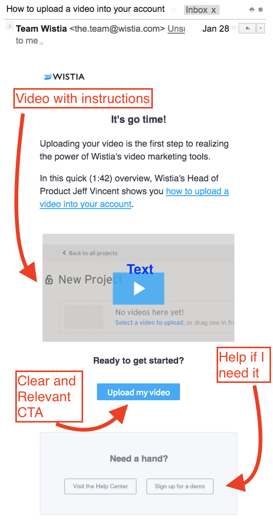
One of my all-time favorite examples is this email from video hosting and analytics company Wistia.
It’s a powerful tool, but you can’t do anything with it until you upload your first video. Fittingly, this onboarding email doesn’t say, “Hey, having trouble getting the analytics on your videos?” before I’ve uploaded my first video.
Instead, it says: Here is step 1. Just do step 1. Here’s a link to do it, here’s a video that will show you how to do it, and here are some links for support if you need it.
Just how powerful is eliminating the hidden work of figuring out how to do something? When the team behind Copyhackers and Airstory rewrote Wistia’s onboarding emails, they generated a 350% lift in paid conversions for Wistia.
Question #3: “Why should I bother?”
Someone at book club last week brought up webinars. The conversation went like this:
Friend 1: I had to do this webinar for work.
Friend 2: Uuuuugh webinars. I hate them so much.
Friend 3: Oh I love webinars! I love chatting in the margins. I love the buzz.
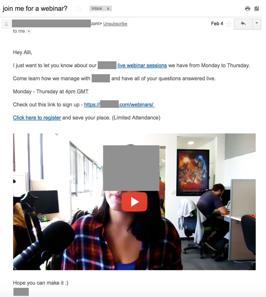
You can offer training through webinars, help articles, live demos, on-demand demos, or support videos. But whatever support medium you choose, you’re guaranteed to choose a medium that feels like “work” to some of your new users.
If your new user isn’t signing in because they don’t know how to use your app and the only support you offer them is with webinar invitations, then you’re asking them to do work–and increasing the likelihood they’ll bail.
You might have really great stuff in your webinars! But if you don’t explain what’s in it for your reader, it feels like work. And if it feels like all work and no gain, your best prospects won’t do it.
The Fix: Focus on the outcome, not the delivery
The truth is that a webinar is a big commitment and you won’t keep everyone. 60, 30, or even 20 minutes is a lot of time to give up. But even small amounts of time and seemingly small asks can be just as inconvenient to your readers without the right context.
To overcome the objections that your readers will inevitably have to taking you up on your offer of support or the small task you ask them to do, your email copy shouldn’t position the medium or the task you’re asking users to complete as the benefit.
Instead, you should answer one of the biggest questions on your readers’ minds:
You want your readers to attend a webinar? So what? What’s in it for them?
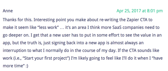
You want your new users to start a project? Why should they bother?
Your support channels are like your app’s features: your customers care way less about them than you do. They’re much more interested in the benefits of your app and your support. If you want your prospects to respond to your webinar invitation or to do anything else in your app, stress benefits, not features.
How? Focus on the outcomes your readers can expect as a result of taking you up on your invitation.
Here’s an example from Sumo that positions a webinar as a must-attend event:
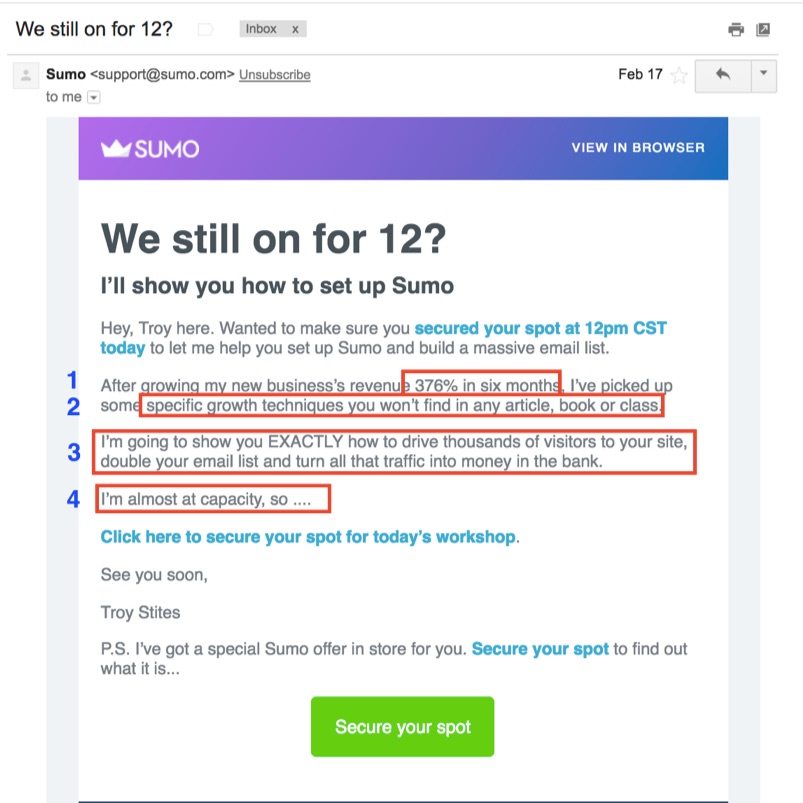
In this email, the value is the information on how to grow your business–the webinar is merely the delivery mechanism.
Why Eliminating “Work Words” Isn’t Enough
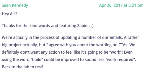
I’ll be honest: I planned on writing this post to be all about “work words” as a follow-up piece to an earlier Kissmetrics post that kicked off this discussion. I thought it would be a great idea to have a list of “work words” for product marketers to avoid in their CTAs.
But it wasn’t long after I started researching and writing this article that I realized a piece on “work words” in CTAs wouldn’t be enough. So much of the “hidden work” in SaaS apps happens before the CTA–which mean that’s where the biggest opportunities to improve engagement are hiding.
While you can and should use language in your CTAs that doesn’t suggest work, that’s only a starting point.
To keep your new users engaged, your onboarding email copy must answer your reader’s questions about where, how, and why they should do what you’re asking them to do.
About the Author: Alli Blum helps SaaS apps build messages that get customers. Want to make sure your emails don’t create hidden work for your prospects? Click to get her copywriting checklist for high-converting SaaS onboarding emails.
