If you take the time to churn through the various brand updates that pop up in your Facebok feed, you’ll quickly notice that some look more professional than others. This isn’t necessarily down to the content. On Facebook, formatting counts for quite a bit.
Facebook is all about design. The feed is structured to encourage users to click on items in the newsfeed, so it stands to reason that by increasing the opportunities to click, you’ll also be able to increase traffic to your page.
Here’s a quick guide to adding embedded buttons to your posts to give them that professional sheen…
1: First, fire up Facebook and head to https://business.facebook.com/adsmanager
If you haven’t set up an advertising account you’ll need to do this first. Follow the step-by-step instructions listed at: https://www.facebook.com/business
(don’t panic, it won’t cost you anything).
2: Hit the ‘Business Manager’ dropdown and click
‘page posts’
3: Click on ‘Create Post’
4: Add your post details
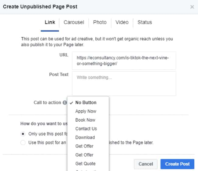
You’ll see this pop-up window:
Fill it in as follows:
- URL: Add the URL of your post, along with any tracking code.
- Post Text: This will appear above your post when published.
- Call To Action: Click here to choose which embed button you’d like to use: Shop Now, Learn More, Sign Up, Book Now, Download, etc.

5: Create post
Hit the ‘Create post button’ at the bottom of the form and you’ll see your new post appear at the top of the ads posts list.
6: Schedule and publish
Now select your post and ‘actions’ dropdown, where you can choose to publish straight away, or schedule ahead.
7: All done
Head over to your company Facebook page and you’re done. The post will appear on your page complete with shiny CTA button:
One final note on this. Putting together posts this way means you won’t be able to tag people or pages in the body text. If you want to do this, you’ll need to publish your post, then go to your page and edit the text to add tags.
Now, let’s address the inevitable question…
What’s the point?
Users viewing your post now have far more opportunities to click on it. All of the elements highlighted above are clickable.
Here’s how traffic from our Facebook page changed when we began formatting posts this way, way back in 2014:
Making images more clickable this way increases the likelihood that users will visit your page. Of course, making sure they see quality content when they arrive is up to you…
13 creative call-to-action examples and reasons why they work