As we wrap up the holiday season, we often see e-commerce sales start to take a dive as customers fall into a post-holiday slump. However, today I would like to focus on how to boost those post-holiday sales with a few conversion rate optimization tips.

Conversion Rate Optimization for E-commerce
As conversion rate optimizers, we may think it’s pretty easy to list out important elements of high-converting landing pages:
- Unique selling propositions
- Features and benefits
- Hero images
- Social proof
- Call-to-action
What types of pages come to mind when you think of these landing page elements? For me, it’s lead generation. When creating PPC landing pages, it seems much more simple to optimize a lead generation landing page than to optimize an e-commerce experience. Why is this? Think about it – most lead generation landing pages have one thing to offer, one thing they’re trying to sell. It’s an easier, less overwhelming task to focus on selling one product or service as opposed to selling hundreds or thousands of products.
Similarly, if you’re doing PPC advertising for a lead generation client, it’s a much easier task to create and utilize dedicated landing pages to sell your offer. E-commerce clients typically don’t have this advantage. Instead, we have an entire e-commerce website at our disposal and we have to determine the best place, within this website, to send our PPC audience.
So how do we optimize our e-commerce experience? Where should we begin? My goal is to introduce you to new optimization opportunities for your e-commerce clients or websites by focusing on where to test within your website in addition to the types of elements that can and could be tested. We’ll wrap by walking through a few examples of past e-commerce tests that our team has run and why we believed these were important.
Where should I test?
As mentioned earlier, testing on an e-commerce website proves to be more challenging and can be much more overwhelming because of the simple fact that we have an entire website at our disposal vs. a single landing page. How do we determine where our testing will be most effective when the following pages are all open to testing?
- Home page
- Category pages
- Product pages
- About page
- Shopping Cart
- Checkout
The key is to approach conversion rate optimization the same way you would for a lead generation client. It’s all about the research. There are many blogs posts that go in depth about the research that should be going into your conversion rate optimization program in order to personalize your testing for your users. Research, specifically diving into analytics and understanding your user behavior, will help you determine where the most effective testing should be done.
From a high level, let’s talk about where we might see the most value in testing on an e-commerce website. The first place I look for red flags, usability issues, big wins, or initial optimizations is always the shopping cart and the checkout process. To me, I need to ensure that the process is as easy and as seamless as possible. If they’ve made it this far into the funnel or buying process, we need to make it easy for them to complete the final steps. Next, I take a step back in the buying process and look for opportunities on the product pages. However, this mentality isn’t always the right approach.
Instead, you need to determine where your audience is coming from, which pages they’re most likely to come in contact with upon entrance to your brand, and what’s the smartest decision for you, your customers, and they’re buying journey. This is why research is one of the most important steps in conversion rate optimization. The other important piece in determining where to test is knowing what you should test. What is it that your customers need to know? What’s going to convince your users to make that purchase?
What should I test?
I’d like to revisit the landing page elements that were mentioned earlier:
- Unique selling propositions
- Features and benefits
- Hero images
- Social proof
- Call-to-action
Although it may be easier to optimize a single landing page and ensure these elements are present on that landing page, we still need to ensure these are present in our e-commerce experience as well. Our process or strategies may just look a little different.
I’d like to walk through few different examples of previous winning e-commerce tests. Some of these tests will fit perfectly into one of the 5 elements we’ve listed, some will not. Remember, it’s all about doing the research and understanding how you need to optimize the buying journey.
Features and Benefits
For e-commerce sites, there are many opportunities to highlight features and benefits. The easiest and most common place to do this is on the product page – customers need to understand the details of the product before they make that purchase so often times we deliver a bullet-point list of product details or features.
Less emphasized and less consistent are benefits regarding shipping, sales, return policies, etc. However, these, often times, are selling points or even up-sells like the following example:
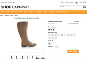
To encourage higher order values, we emphasized ‘Free Shipping’ language on Shoe Carnival’s product pages. The messaging reads: “Free Shipping On Orders Over $75. We tested adding this message in two different locations, seeing positive results by simply adding regardless of where it was located. However, adding the language above the product image resulted in an 8.6% lift in purchase rate and a 14.3% lift in revenue per visitor.
Another strategy we tested with shoe carnival was highlighting the amount users would be saving with their purchase. Often times you’ll notice the original price crossed out in order to emphasize the discounted price but it’s not as common to see the actual savings.
While Shoe Carnival was already calling out the savings, we tested bringing emphasis to this by changing the color as seen below:
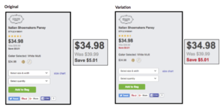
Simply drawing attention to the amount of money a customer will save increased mobile conversion rate by 14.89% and revenue per visitor by 3.70%.
Creating an Easy Shopping Experience
I mentioned some of these tests wouldn’t fit nicely into one of the 5 elements we have spoken about. The last couple of examples I’d like to run through today were huge wins for our testing program. We discovered these opportunities through the research! The data showed us that this e-commerce website was chalk full of inventory, which can be extremely overwhelming to users. The goal of these tests was to reduce the time and effort it took users to find the products they were searching for in order to increase conversion rates, revenue, and improve the overall online shopping experience.
With a website full of inventory, you might imagine that a search bar might be incredibly useful to these users. We thought so too so we needed to dig into the data to determine how the search bar was currently being used. What did we find? Less than 10% of users were actually utilizing the search bar, but those who did search converted at over 300x that of users who did not. Our goal? We needed to draw more attention and increase this search bar utilization. See our control and test variation below:
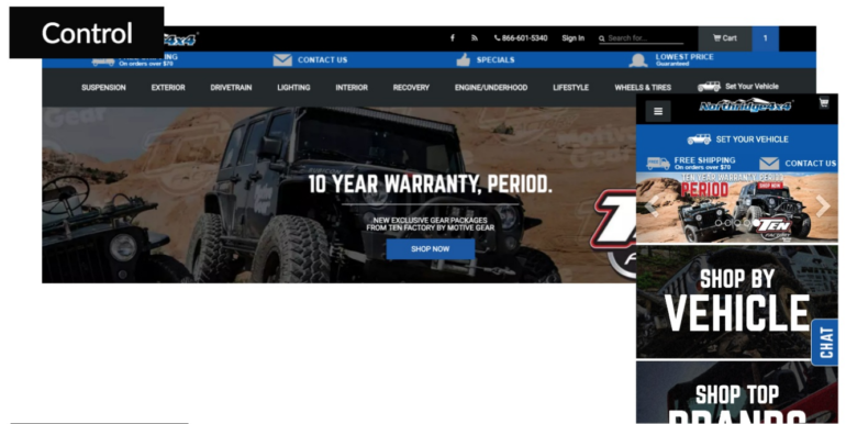
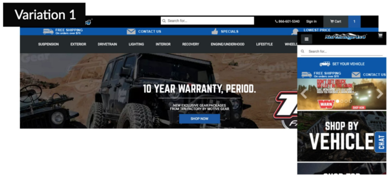
Notice we tested this strategy on both desktop and mobile. Our mobile test was a little bit different because the search bar was actually buried behind the hamburger menu. On the contrary, on desktop devices, the search bar was present on every page but it blended into not only the navigation itself but also the black background. Therefore, we moved the desktop search bar to the center and allowed it to stand off of the black background and we moved the mobile search bar out from behind the hamburger menu so it was present on every mobile page.
The results? Our desktop traffic saw an increase in conversion rate of 12.85% and our mobile traffic saw an increase of 5.85%. Now, in theory, we would have loved to also have data surrounding revenue and search bar utilization but unfortunately, we didn’t quite have access to this data at the time of this test.
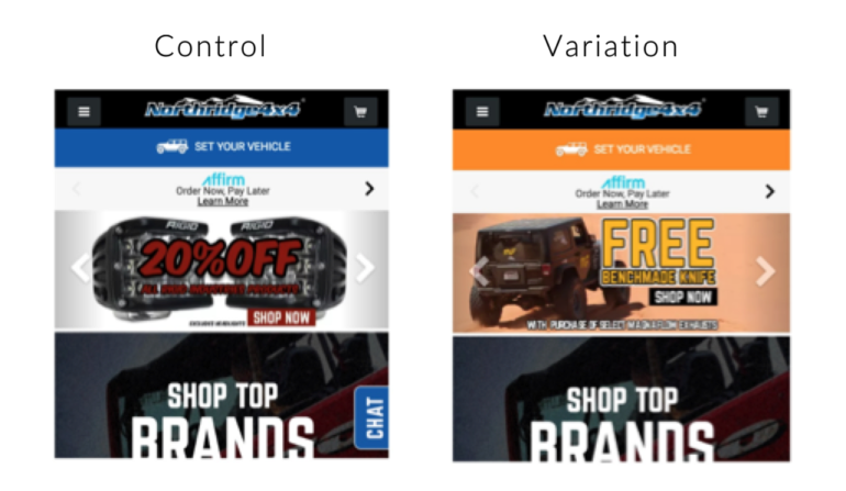
Keeping along the same theme, we took this idea a step further. We wanted to continue improving that shopping experience, ensuring users were finding the exact product they needed. This client has what we will call a “Set Your Vehicle Tool” located on every page of their site – essentially, users can filter down their search results to their specific car so that they can be 100% sure the part they have found will actually fit their car. Genius! Another way to create a faster, easier shopping experience and limit the number of products that a customer sees. Now we need to determine how to increase the utilization of this tool. Below you’ll see the control and variation of this test for both desktop and mobile devices.
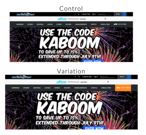
Did it work? Tremendously! And we had access to more metrics, adding even more weight to these results. Our desktop conversion rate increased by 17.55% and revenue saw a lift of 48.76%. For e-commerce specifically, these lifts are incredible! Not only did we see direct results to the end-goal, we also witnessed improvements in average session duration of 7.46%, pages per session of 6.42%, and exit rate of 5.89%.
Similarly, our mobile conversion rate increased by 32.20% and revenue saw a lift of 74.57%! We also saw improvements in average time on page of 10.17%, average session duration of 8.24% and bounce rate of 4.83%. As you can see from our metrics, the ease of the shopping experience is so much more important for our mobile customers because they are in a different, more distracted mindset than our desktop users. By making what may seem like a minor change, we’re able to drastically improve their buying experience.
Final Thoughts
Don’t let the post-holiday blues get you down – or your sales! Keep in mind the 5 landing page elements mentioned above. Let those elements guide your research and optimization efforts for a better customer shopping experience and watch post-holiday sales soar.
Have you been overwhelmed when being tasked with testing on an e-commerce site? I’d love to hear your thoughts and feedback and know I’m not the only one! Reach out to me @samantha__kerr and let’s chat!