Running a successful event can be stressful, especially when you have so much to coordinate, including the agenda, the venue, and the speakers
Email event invitations, however, shouldn’t be stressful.
If you’re struggling when deciding what to include in your email event invitation, consider what you’d like to see in an invite — probably information about the agenda, venue, and speakers, right?
Answering the questions your audience will have about your event is a great place to start when writing an email invitation. The rest comes easily, as long as you consider good look at design, inclusive language, and personalization depending on your recipients.
Event invitation emails are helpful because they inspire interest for the event, makes emails personalized, streamlines the process of messaging.
If you’re looking for ideas about how to write an amazing event invitation, keep reading.
How to Write an Email Invitation For an Event
Remember, not all event invitations need to be snazzy, high-budget, high-time investment productions. In fact, effective email invitations can be made in about 20 minutes.
Use this section as a base-level cheat sheet for ideas to implement in your next email campaign.
Before you hit “Schedule,” or “Send,” think about if you can answer the “So what?” question audiences will ask after seeing your invitation in their inbox.
To create a stellar email invite, you have to make sure it’s personalized to the reader, instills curiosity, and effectively communicates what the event will entail.
1. Answer the 5 “W’s”.
First thing’s first, tell your audience what’s happening. In school, some of us learned about the 5 W’s — who, what, when, where, and why.
This is a good rule of thumb when writing an email invite. If you can point to your email and identify all five, you’re off to a great start.
Take this email, for example:
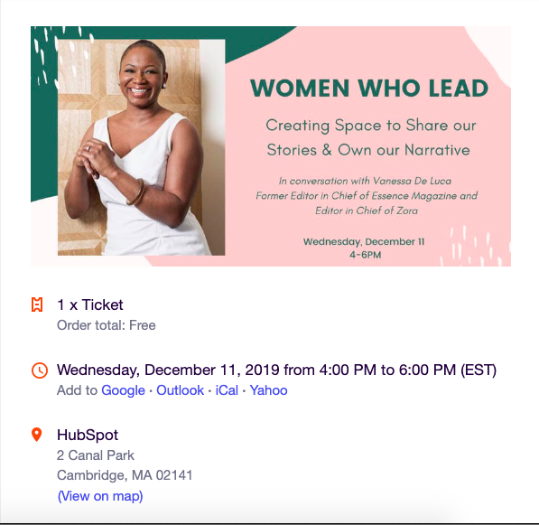
This is a wonderful event email because it answers the five questions:
Who: Vanessa De Luca
What: A seminar called “Women Who Lead”
When: December 11th, 4-6 PM
Where: HubSpot
Why: To have a conversation that emphasizes creating space for women to share and own their narratives.
By reading this email, I wouldn’t have any follow-up questions about event logistics. I know exactly when and where I need to be, and what the event will be about. Notice how this email isn’t the flashiest or most animated, but it gets the job done and still has personality.
2. Remember that less is more.
You need to cover all your bases in email invites, but remember not to crowd your email with details. If you find yourself struggling to fit the time of the event in your email, you probably have too much other information.
You don’t want to make it confusing to read, which might turns readers away from your event. I wouldn’t want to attend an event that comes with a poorly organized email — since I’d assume the event could be poorly organized, as well.
To consider the “less is more” sentiment, take a look at this email from Starbucks about their Happy Hour, which are special times where Starbucks Rewards members can enjoy specialty drinks at lower prices:
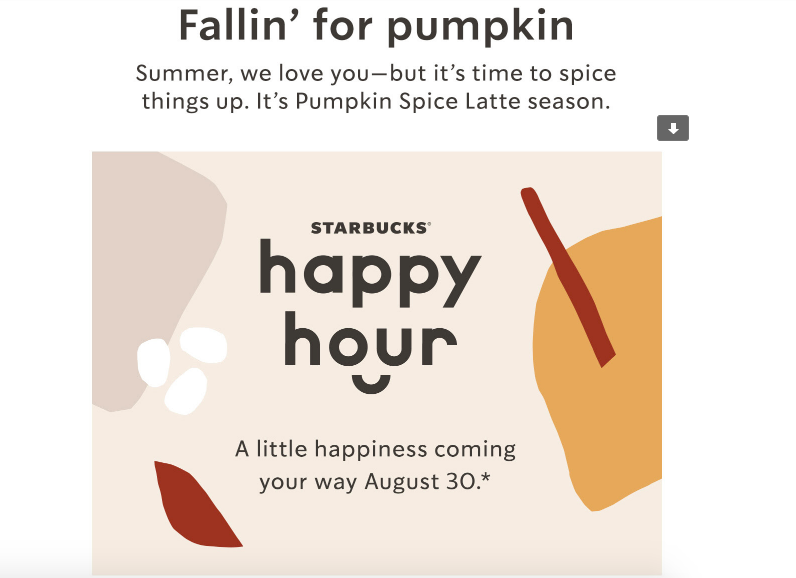
This email still answers all base questions without needing paragraphs to explain. So if your event is a recurring one or something low-key, forego the extra words and set up the email as more of a reminder to RSVP.
3. Don’t forget a CTA.
I’m not sure what we were doing before adding calls-to-action (CTAs) to event invitation emails, but it’s a good thing we’re not in that world anymore. Take this sample email I made using HubSpot’s email software:
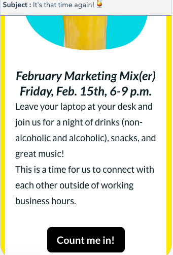
As a consumer who forgets nearly everything that’s not on her calendar, I need a CTA that automatically adds an event to my calendar. Additionally, it makes it easy to RSVP, since all it takes is a click of a button
As a marketer who cares about click-to-open-rates and tracking those who clicked on the CTA, it means being able to measure those results in a content management system to think about ways to improve for the next event email.
Including a CTA is a win for both sides — as a marketer, it gives you metrics to track click-through rates, and consumers will appreciate the delightful user experience.
4. Make the design enjoyable.
Before you finalize your email, think about whether you’d attend the event based solely on the design. If the answer is no, you probably need to put more effort into the aesthetic of your email.
You might be pulling a blank on how to design a beautiful email, and that’s okay. Keep these guidelines in mind:
- Stick with your branding — Start by choosing the colors that match your brand and incorporate them into your email. Colors go a longer way than traditional black and white text.
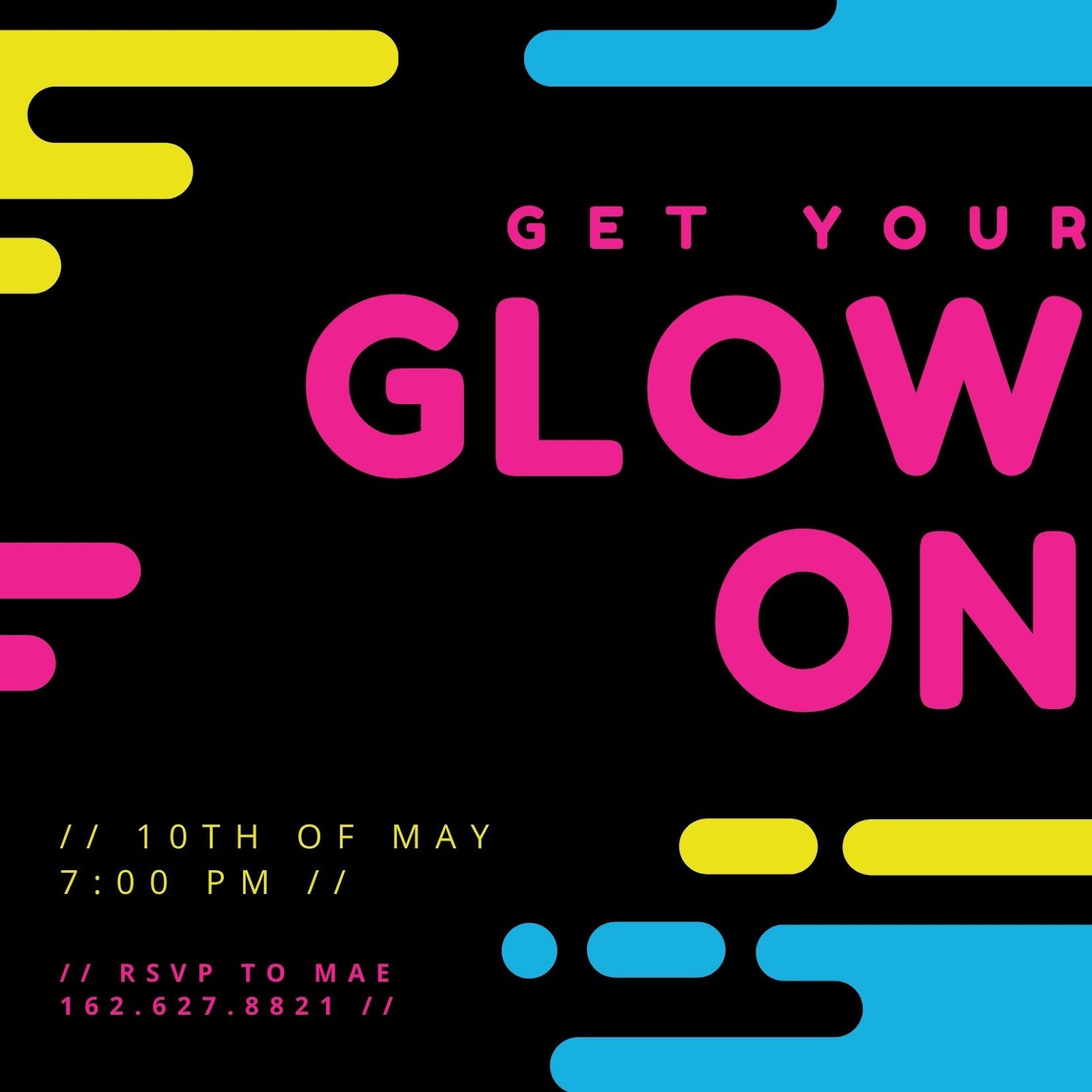
- Choose a template — As someone who knows little about coding and equally as little about design, templates have become a lifesaver. Websites like Canva or Mailchimp have an array of templates you can use to create your email, like this template from Canva:
Source
- Play with simple elements — Simple things, like shapes and sizes, really help an email’s design. Refer to the image above and how it uses circles and cylinders to fill negative space in an interesting way.
Thinking of elements like these can brighten up an email, as well as experimenting with sizes of text. If you’ve found you want to take up more space in your email, make the font sizes bigger and incorporate shapes or designs like stripes running across the header.
5. Consider your language.
Always, always check the language of your email. Think about the vibe your message sends, and if it’s the right one you want to convey. You’re communicating your event details, but you’re also conveying your brand.
Double-check elements like your CTA: Is it more inviting than the standard, “Learn more!” that has become routine in emails? What about your text? Does it drop playful language where applicable?
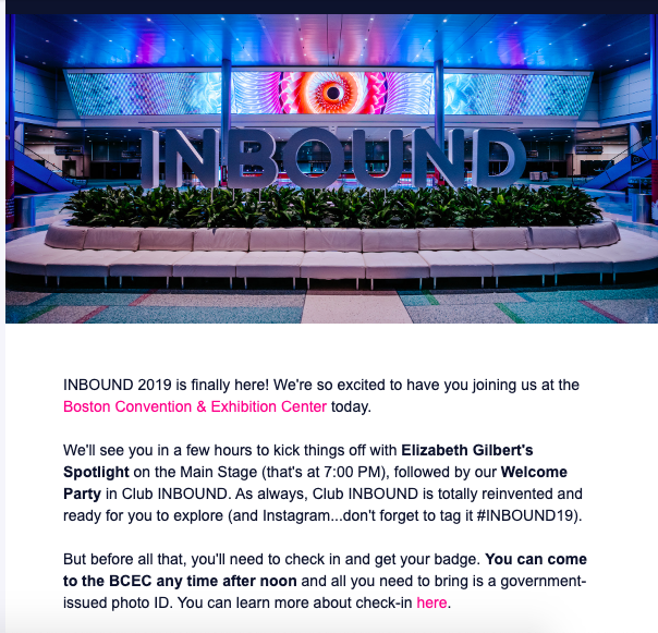
For instance, this INBOUND email is a great example of laid-back language. The language is more conversational than formal.
When you use conversational language, the reader feels more connected to your invite, like you already know them.
6. Think about the details.
When you’re done designing your email, think about little details that will delight your invitees. Have you created a thank you or follow up email? Have you made the subject line something that will captivate subscribers?
Little details like subject lines can be more emotionally engaging to your audience. Ultimately, audiences will be delighted if you show in your invite that you had them in mind. Some people open emails based on the subject line, so it can also make or break your email performance.
If your event location is difficult to find, consider including directions in the bottom of the invite. An event that includes some kind of map or directions in the invite tells me that the sender took people’s commutes into consideration, like this one:
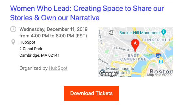
You can include directions by adding a Google Maps screenshot into your email, or using email marketing software to embed a Maps feature into your template.
Your event is set to go off without a hitch, and your email event invitation should, too. If you use online software to create an email, you can pull off a professional, flawless design in less time than you think.
By focusing on the important information, honing in on simple yet effective design elements, and making the language pop, your email invite will set itself apart from others in a way that’s inviting and delightful for readers.
Don’t forget to scroll through your own inbox for inspiration, too!
