Urgency messaging is a great way to raise conversions but is getting an increasingly bad rep
Getting visitors on your site and converting seems to be more difficult than ever. Consumers are indecisive, and, with more choice online than ever before, your website visitors are less likely to hang around.
Creating urgency is one of the best ways to raise ecommerce conversions. In my 16 years in ecommerce, there are few techniques I’ve seen that so reliably raise sales.
Urgency works by overcoming your visitors’ mental hurdles to purchasing from you. Perhaps they’re indecisive, prone to overthinking, or they just want to shop around a bit more. There are so many psychological factors at play that influence whether someone will buy from you.
It is, however, a technique to be used with caution. The problem with urgency messaging is that it can come off as disingenuous or just all round scammy. At best this renders your urgency efforts ineffective, and, at worst, it hurts your brand image, damaging trust and losing potential customers.
Consumers are more suspicious than ever before when it comes to urgency techniques. There have been numerous news stories in recent times about how brands have been accused of misleadingly using urgency techniques, with some possibly facing court action. These stories inevitably filter into public consciousness, putting more pressure on marketers to deliver.
While urgency as a marketing tool is going nowhere, it’s more important than ever to implement it in a genuine, helpful and engaging way. In this article, I’ll run through some of the most effective urgency techniques I’ve seen, with some ideas for how to ensure they’re done well.
1. Social call-outs
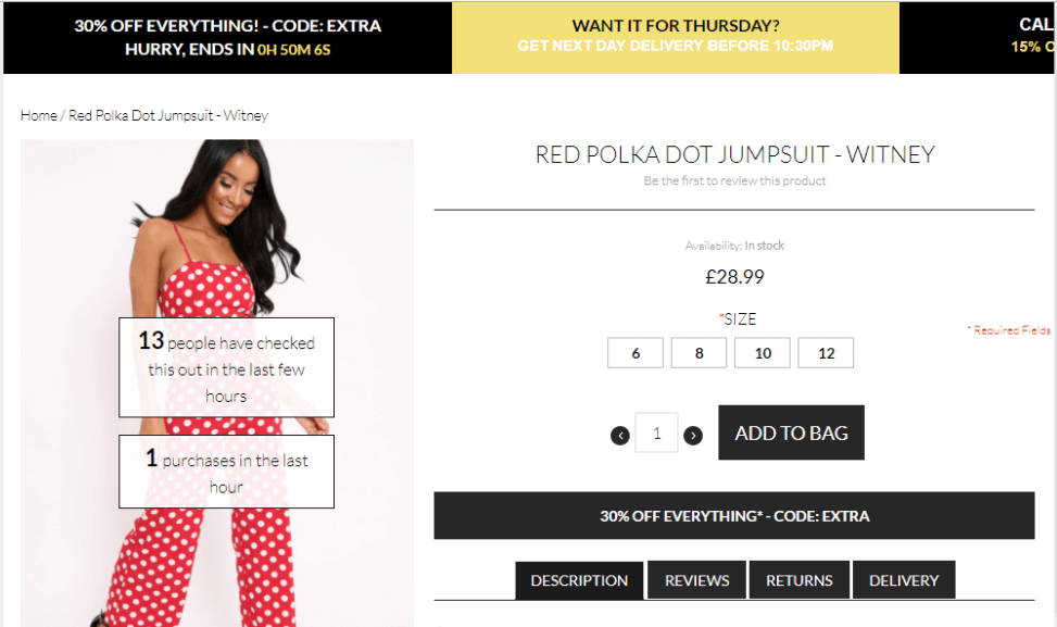
Using call-outs on product pages with stats about other shoppers’ behaviour increases the perceived popularity of a product in real time, as well as activate the fear of missing out. And this, of course, increases urgency – 50 dresses bought today? Wow, other people like this too – I don’t want it to sell out! Rebellious Fashion saw some great results by using these call-ous on their product pages.
Popular products are the most likely to sell out, and showing a product’s popularity is a persuasive technique. However, it doesn’t make sense to show these stats when a product is selling poorly, as it could have the reverse effect. Use a targeting tool to define how many views/purchases need to be reached to trigger a call out message.
As a side note, this also applies to reviews. We wouldn’t advise hiding negative reviews, but if a product has no reviews yet it can trigger a negative feeling unnecessarily – in this case, you can hide the ‘zero stars’ until a review has been given.
2.Scarcity
The fear of missing out is more motivating than the promise of gaining something. Scarcity messaging no doubt plays on this fear factor, but it is also genuinely helpful. We all want to know when products we like are running out, don’t we? Scarcity also increases the desirability of a product – we all know that studies in psychology have shown that things in a short supply are perceived as more appealing than those in an abundance.
Consider using call-outs on product pages, stating how many items are left in stock. But be careful. The trick with scarcity messaging is not to let it be counterproductive. Set parameters for when scarcity messaging is triggered – when a product has, say, fewer than 10 items left. Test to see which numbers are most effective, and try different ways to deliver the message such as slide-in containers used above by fashion retailer, Rebellious.
3. Use urgency-increasing copy – but make sure it matches your brand voice
Your web copy will help considerably in increasing urgency and persuading your visitors to act fast. There are certain words that are known to create urgency: buy now, hurry, only one left, quick, approaching, selling fast. However, it’s important to use a tone of voice that matches your brand.
Sadly, some retailers go all out with a ‘Hurry now!!!’ tone that can often come across as cheap or desperate. This tone of voice just wouldn’t suit a store selling luxury products, for example, and may alter the perception of your brand and products. However, the only way to truly know is to test different versions of the copy to see which converts best.
4. Bring urgency into social product recommendations
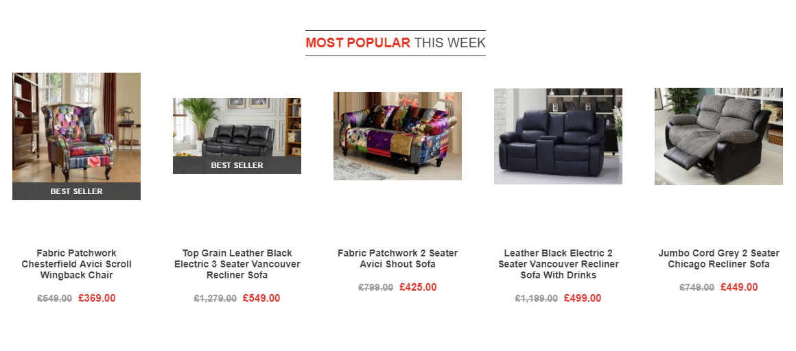
A good way to kickstart browsing on a site is to show best seller recommendations such as these on the Love Sofas homepage. These recommendations let your visitors know which items are popular in your store, and the injection of social proof can increase perceived desirability.
There are various techniques you can use to imply your store is really popular. Showing these bestseller recommendations “from the last hour” gives the impression your store is overflowing with visitors (which it might well be – if so, let it be known!). You can amplify this effect by adding stats to the recommendations showing how many have been sold or viewed that day.
5. Time-limited incentives with countdown timers (but don’t overuse)
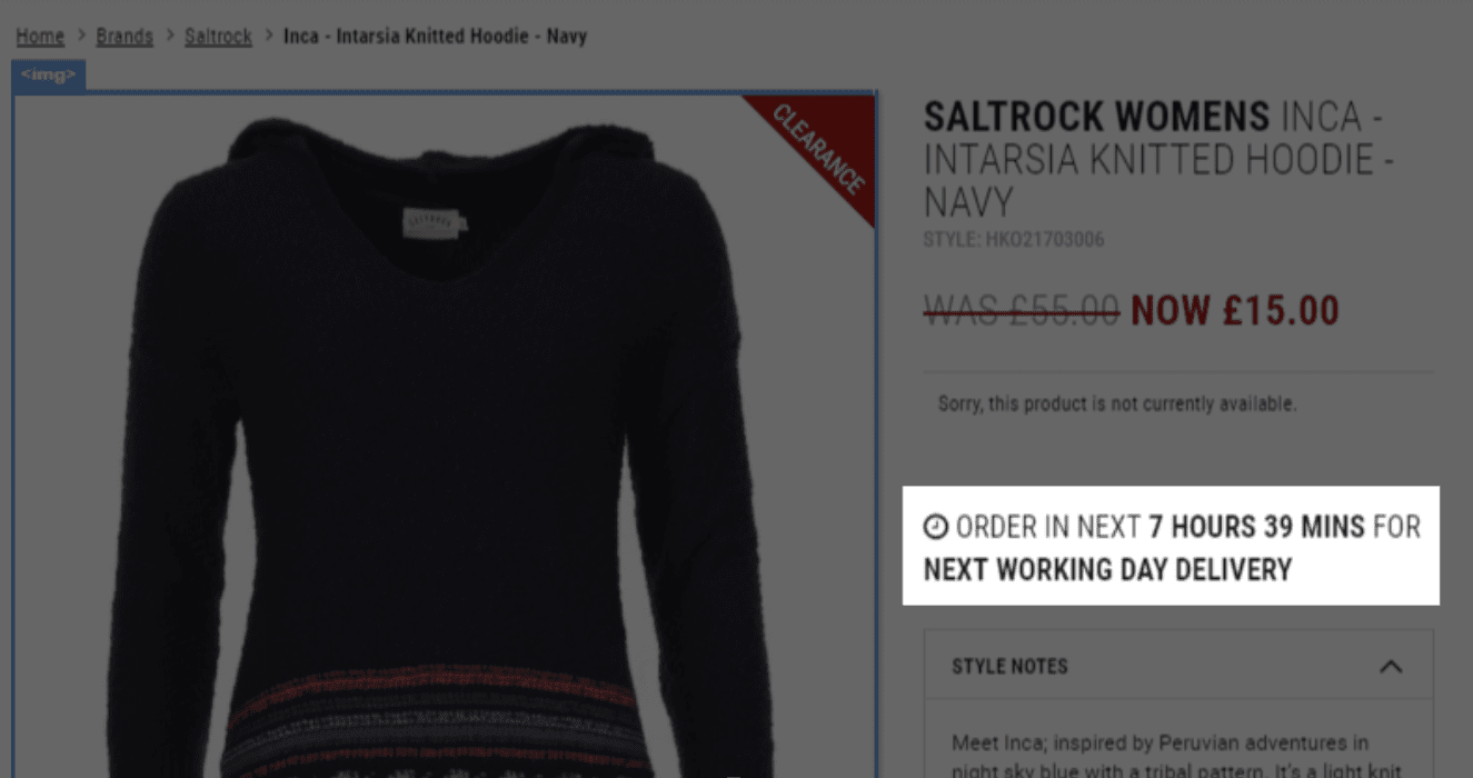
There are few techniques more urgency-inducing than a time-limited sale or offer, with a prominently placed timer ticking the remaining hours or minutes away. They can be used in a number of ways.
Consider:
- X hours left to get free delivery
- X% off an item for the next X hours
- Summer sale ends in X
- Order in the next X hours and get a free gift
One of the issues I see with countdown timers is overuse. Are you using countdown techniques so often that they’re becoming less effective, or that your visitors are reliant on them, or perhaps even questioning the authenticity of them?
Be sure to measure the effectiveness of your countdown methods on your conversion rate over time.
6. Use colours that promote urgency – but make sure to test
We all know that certain colours promote caution and fear – yellow, orange and red being the ones we usually think of. Red is usually the colour we most associate with urgency, and is the colour we most often see adorning shop window signage when a sale is on.
When it comes to colour, it’s worth remembering we’re all wired differently and, thus, react differently. Test different colour variations on your site to see what works best with your audience. If you already use a lot of red in your branding, you might find other colours work better in drawing attention and promoting urgency.
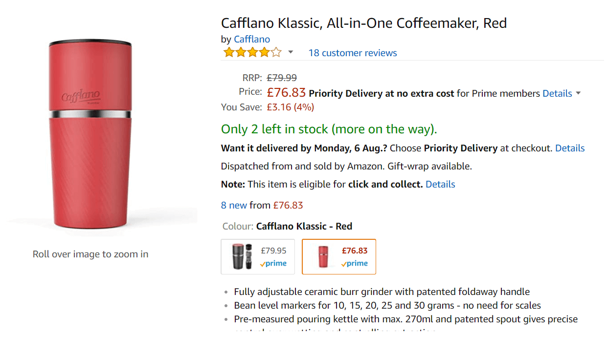
Amazon often uses green in its scarcity messaging, and also assures the customer that more items will be in stock soon. This use of green to promote urgency comes across as genuinely helpful and certainly less aggressive than techniques I‘ve seen employed by others. Red, in this case, is used to draw attention to the lower price.
7. Be Truthful
For many, this will go without saying, but it’s worth pointing out – don’t state anything in your urgency messaging that isn’t true. There’s nothing wrong with implied urgency, but if you’re misleading people, eg. applying a false timescale to a sale, your visitors will soon work this out.
This will then make further urgency efforts redundant, as many shoppers simply won’t believe you. Customers buy from brands they trust, not ones that manipulate their shopping habits through false claims.
Conclusion
To wrap up, urgency messaging works best when it’s used carefully and genuinely, by nudging your customers to overcome mental hurdles and take action quickly. It’s important to be careful to avoid bad practices that might damage your relationship with customers, as well as being wary of making your urgency efforts ineffective through overuse.
Try some of the techniques in this article to see the difference it makes on your site, and as always, make sure you test, test, test!


