The goal of every ecommerce page is to sell. Nevertheless, sometimes you need a page that fits a particular stage of your sales funnel. That’s why landing pages are essential for every ecommerce marketing strategy.
Landing pages seem to be very easy to design, and the market has plenty of intuitive tools that can help you prepare them. On the other hand, it takes some time and knowledge to create a high-converting ecommerce landing page. Read on to find out how to do that.
Let’s define a landing page
A landing page is the first touchpoint for new visitors. It’s a place where marketers direct recipients in their social media, email marketing, Google Ads, and many other types of campaigns. Its goal differs depending on the campaign’s purpose. Also, it’s designed to achieve a certain action from the visitors.
Although some other types of pages can also become a landing page due to their use in a campaign, there are a few specific characteristics of a high-converting ecommerce landing page.
Simply put, landing page traffic is targeted, so it comes from a buyer’s history or other sources of data about customers. Moreover, a landing page needs to have one objective and a clear design. It doesn’t have to be meticulously optimized for search engines because its traffic is generated via different channels. A product page can be entered via search engine page results, third-parties or directly from a browser, it can also be more complex.
It encourages shoppers to buy a product and gives more information about it in a description. A product page can have a section with opinions and recommendations. So, it can educate about the product and the brand, while being designed for visitors interested in shopping.
A landing page has to be dedicated to a certain campaign. The point of creating a landing page specifically for the purpose of a given campaign is that most first time visitors are not ready for purchasing. Therefore it can increase the return on investment when it comes to ad campaigns.
Want to practice while you learn? Take GetResponse Autofunnel for a spin and start selling products through your sales pages in minutes.
The advantages of ecommerce landing pages:
- personalization: you can adjust your copy, visuals, and call-to-actions for the chosen audience. This way your ads can be more effective and you can increase your page click-through rate.
- opportunity for testing: running A/B tests makes sense when you change one element, so that you can easily compare the performance of two (or more) versions of a page. Thanks to controlled traffic generated via paid campaigns, you can analyse which version is more profitable for your company.
- wide range of possibilities: you should also use landing pages when creating campaigns directed to existing customers. By using segmentation you can prepare many customised landing pages with special offers for returning shoppers.
- ease of developing: the process of creating a landing page is much simpler and faster than for “full” websites. It’s also relatively cheap. You can also prepare one template and edit it depending on the details of a given campaign.
- higher conversion: because of a clear objective tailored towards a given segment of customers or characteristics of potential shoppers, it can be more engaging and successful.
8 tips for creating a high-converting ecommerce landing page
Unfortunately, there is no single guide that would fit all online stores. But there are a few tips that every marketer should take into consideration when designing a strategy including the usage of a landing page.
Tip #1: Define your target group
By knowing who are you going to direct your campaign to, you will be able to design a personalised landing page suitable for segments of customers. You can not only personalize special offers and recommendations, but also text and visuals. Depending on demographics and interests you can adjust the communication.
The more you know about your recipients, the better. Use all available sources of knowledge (for example, Google Analytics, Customer Relationship Management systems, social media reports) to get more data and find out more about people you want to get into the next stage of your sales funnel.
For example, ETQ store prepared a specific landing page dedicated to the latest men’s collection.
Tip #2: Choose one objective
Depending on the purpose of a given campaign, an ecommerce landing page should have one goal and a form adjusted to it. There are several types of landing pages, so when focusing on the one you should keep it in mind while designing. You can use several elements that can help you achieve your goal.
For example, if you build a subscribers base for your newsletter, you can use a simple sign-up form on your squeeze page. Customize the call-to-action and labels to make it the most efficient for your audience.

Another idea is to create an ecommerce landing page dedicated to each segment of your existing customers. You can personalize discounts, for example, depending on how many transactions a given shopper has already made.
Tip #3: Get straight to the point
Focus on the goal of a given landing page. Use only one call-to-action so that visitors can be sure what action you expect them to take.
CPJ uses minimalistic design and shows CTA button with simple encouragement “Order Now”.

Minimise distractions, like sliders, pop-ups, chatboxes, too many social media icons, and other links, to draw attention to the main point of the page. These additional elements can be helpful on the home page, but they are not supposed to appear on a landing page. Customers should be able to get all the essential information and perform the action effortlessly.
Tip #4: Use high-quality visuals
It’s an absolute must-have. To attract customers you need to show beautiful images or videos to make your landing page uncluttered and aesthetic. High-quality visuals are extremely important, especially when you present your products because they create the first impression of your website. They represent professionalism and engage potential shoppers. In the end, a picture is worth a thousand words. Let it speak to your advantage.
Abbott combined beautiful nature pictures with products’ packshots and suitable colors.

Tip #5: Build trust
As this might be the first touchpoint for potential customers with your brand, you should first and foremost build up trust. Add a logo of a well known and trusted company that supports your online payments. Consider implementing chosen testimonials and reviews on a product page to add some credibility to your online store.
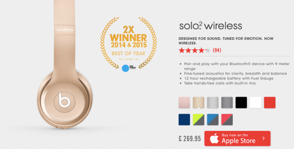
On Beats headphones’ landing page you can not notice information about their award.

Tip #6: Highlight benefits
If you offer any extras, you should inform people about them. To get more shoppers you can offer discounts for returning customers, free shipping or any other benefit. You have the opportunity to attract customers in a few seconds. This is the place to highlight all the advantages of your online store.
Amazon presented all the significant pros of its wedding registry service.

Tip #7: Pay attention to the user experience
A landing page, like every other website, has to be optimized for the best possible user experience. Besides intuitiveness mentioned before (clear CTA) and beautiful visuals, you should check the page’s loading time and make sure it’s created with responsive web design.

Tip #8: Trigger shopping impulses
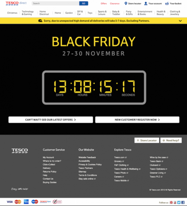
Create urgency to give visitors no time for hesitation. If you offer a special deal for returning customers or any other promotion, you should make it temporary and inform them about it on your landing page. A great way to do so is to place a countdown timer on it. Make your offer irresistible! No worries – online landing page editors (like GetResponse) provide such elements.
Tesco used a countdown which creates excitement. It was followed by two clear CTA buttons.

Think twice
Last but not least. Make sure your landing page links directly to a campaign. If there is no connection between an ad and the link shared with it, you might cause frustration for your customers. Do not deceive and manipulate your recipients with inadequate ad creations to get traffic on your landing page. Remember that your real goal is conversion.
Even if you have an excellent home page and detailed product pages, you still need an ecommerce landing page for your campaigns. To convert more efficiently and increase sales, you should remember about the sales funnel and build a relationship with your potential customers.
By reaching the right target group with accurate content you can increase ROI, CTR and in the end get more customers. Make the buyer’s journey as intuitive and personalised as possible.
Creating a landing page according to the aforementioned tips is not enough to fully succeed. You need to constantly test and optimize landing pages in order to improve the results of your campaigns. The more you find out about your target groups and their preferences, the better landing pages you can provide. Don’t wait any longer – start designing your ecommerce landing page today!

Author: Paweł Ogonowski
Pawel is the co-founder of Growcode, the first conversion rate optimization System as a Service that guarantees revenue growth for B2C online stores. With 10+ years of ecommerce experience, Pawel has been helping companies (e.g., Limango, Virgin Mobile, Eniro, 4F, Showroom, Budapester) leverage data from their online channels to improve user experience that results in higher conversion rates, average order value and customer lifetime value.

