You have to make a lot of decisions when running an email marketing program. What type of email should you send, and when? Is this the best segmentation strategy? What should your subject line be?
Luckily, you can use email A/B testing to take the guesswork out of strategy by basing your decisions on data, not assumptions. By running small, controlled experiments on a single variable at a time, you can compare and contrast results from different copy, timing, layouts, and more.
We’ve written about the basics of A/B testing before, but today we’re zeroing in on A/B testing for email. Running organized tests to see which options convert best is helpful for email specifically because there are so many variables that affect messaging success.
Small changes can have a significant impact, too. For example, WeddingWire saw a 30% increase in open rates when they tested their preview text, and Microsoft tested different email background colors and saw a 325% increase in click-throughs.
Want to start A/B testing your emails? We’ll show you how.
Elements to email A/B testing
What to test
The first step in your A/B testing process is deciding what you want to test. How do you choose where to start? One strategy would be prioritizing the email elements that you know less about, or seem to deliver inconsistent results.
For example, if some emails have much higher or lower open rates, but you aren’t sure why, it could be worth investigating pre-open elements such as subject lines.
Alternatively, you could test elements that correlate with email metrics you want to improve. Want to drive more conversions and click-throughs? Start with your CTA or button copy. Interested in boosting engagement times? Consider your content length and template.
Subject line
A/B testing subject lines is a great place to start experimenting because subject lines are both easy to create, while having an impact on your open rates. Different ways you can A/B test subject lines include:
- Length
- Title case or subject case
- Emojis
- Tone
- Using numbers or percentages for promotions
In addition to testing for higher open rates with your subject line variations, also pay attention to engagement metrics such as CTR. While a “clickbait” subject line may elicit a lot of opens, you still want to attract a relevant audience that clicks through to your website.
You can also try different positioning, as Postmates did in their subject lines below. While both emails were promoting the same campaign, one focused on supporting local restaurants, while the other paid more attention to discounted delivery.
![]()
Preview text
The preview text appears next to the subject line and is another contributing factor to subscriber open rates. There are as many possibilities with preview text as there are with subject lines, in terms of tone, length, and emojis. You can also experiment with different subject lines and preview text combinations.
For example, Marine Layer uses the preview text area to add context about new arrivals. You can use your subject line to catch a reader’s attention, then support it with explanatory preview text.
You can also use your preview text to pique subscriber interest. Add a cliffhanger in the preview text, or allude to what’s inside to increase open rates

Sender email and name
Your “From” field is the final pre-open component you can A/B test. Along with your subject line and preview text, it lets a subscriber know who the message is from and what it’s about.
While it’s a good idea to generally limit the number of sender names you use (so as not to confuse subscribers), you may use different senders for varying email types, such as promotions vs. newsletters.

In the example from Sling TV above, they present the same trial offer from two different email accounts. Their hypothesis could be: Having a first name at the beginning of the “From” field makes a message look more like it came from a friend, not a company.
Content
The pre-open elements, like subject lines, don’t get to have all of the email A/B testing fun! There’s plenty you can play around with inside the message, starting with the content. Here are three elements to work with.
Length
You could ask ten different marketers about their opinion on long vs. short emails and get varying responses, but you won’t know what your audience prefers without testing it. Just make sure that you’re comparing content length between the same types of emails, such as a newsletter.
For example, Email On Acid tested engagement on emails with less than 100 words vs. more than 100 words, and found that shorter emails led to higher CTR for their audience.
Want to see what a long vs. short newsletter could look like? Compare the lengthy Sentiers emails below to the more concise Food 52 copy.
Once you’ve found what works best for one kind of campaign, you can experiment with other messages.
Tone
Another content element to test is your writing tone. Does your audience like clever and casual writing, or do they want no-frills facts? You can also test out writing emails from an anonymous company-wide perspective, or set up your campaigns as if an individual on your team wrote them.
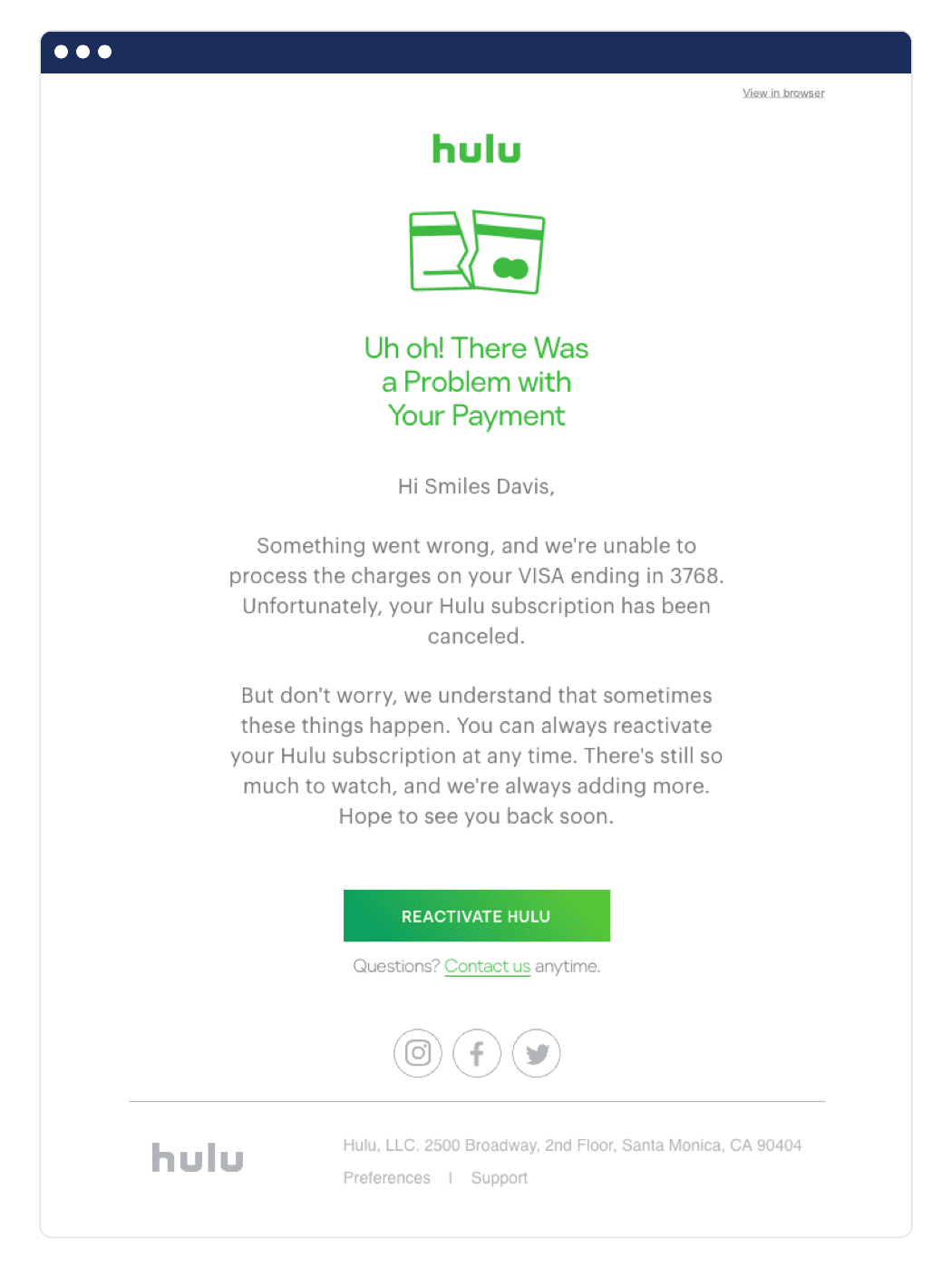
This email from Hulu alerts customers to an issue with their card on file, and that their subscription was canceled. Hulu went with an empathetic tone for this email, noting that “we understand sometimes these things happen.”
If they wanted to A/B test the tone of this email, they could try a more lighthearted version using an “oops!” tone, or an urgent “you’ve lost connection to your favorite shows.”

Personalization tags
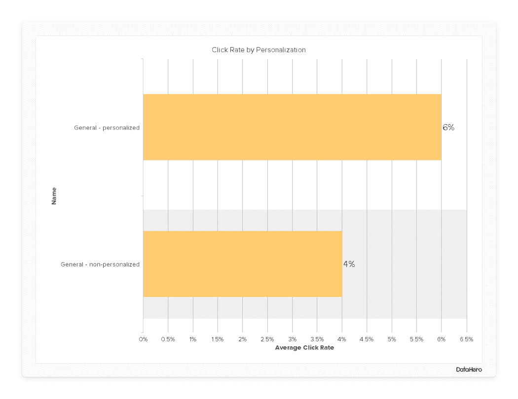
There are many ways to add personalization to your email strategy, but sometimes it pays to keep it simple. We analyzed 8,000 email campaigns and found that messages personalized with a user’s name saw a 50% increase in click-through rates over non-personalized messages.

Design and visuals
MIT researchers found that people can identify images they’ve seen in as little as 13 milliseconds. Why does this matter for email marketers? Well, the design and visuals in your email can make or break an impression really fast. Even before a subscriber has a chance to read your copy, they could form an opinion on your design. Here are some of the design elements you can A/B test in your emails:
- Template layout
- Header design and size
- Fonts
- Pictures vs. animations
- GIFs vs. still images
- Colors
Call to actions
The all-important call to action deserves a spot on this A/B testing list, because it links an email to conversion or engagement. You can experiment between linking to actions within your copy and sticking to separate CTA buttons. CTA button copy, color, size, and placement could also impact click-through rates.
Timing
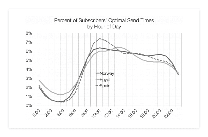
If you have an international audience, then all send times are not created equally. If most of your subscribers are in a single time zone, or ones that are pretty close, then you can A/B test send times across your whole list. If you have sizable segments of subscribers in vastly different time zones, then you should segment users based on location and test send times within each group.
In the graph below, open rates in Egypt peak at 2 PM, as opposed to 11AM in Spain. Therefore your international audience may prefer to receive emails at different times of day.

How to strategize your email A/B test
Develop a hypothesis
Randomly choosing an A/B test may be fun at first, but you could end up wasting precious time if you don’t start with a clear objective. Therefore, you need to start with an idea of what you want to test and what you think will happen.
Include what you’re testing in your hypothesis, what you expect to happen, and why you think that will be the outcome.
It also helps to link your A/B testing to any preexisting goals or initiatives, such as boosting engagement with your newsletter.
Here are some example hypotheses:
- If we add a subscriber’s first name to the subject line, it will increase open rates because seeing their names catches their attention
- If we send an email highlighting our subscriber preference center, then our unsubscribe rate for that segment will decrease because they’ll only receive messages they’re interested in
- If we include two CTA buttons for the ebook in our launch email, then click-through rates will rise because there will be an “ask” after they’ve read copy about different benefits
Choose an audience
After you’ve developed a hypothesis, you need to decide who you’ll send the test to. You’ll get better results with as large an audience as possible, but a particular test may require list segmentation. No matter who you choose to send it to, make sure you’ve been intentional about your choice.
Making sure you can achieve statistical significance is key, and we explore this topic more below.
Set goals
Decide what a successful A/B test means to you, and what goal you’re hoping to meet.
What key metrics will you use? Which direction do you want them to move in and by how much? You should also set a time frame for your A/B test. If you’re testing elements on an email series such as onboarding, you’ll want to give the test time to play out. However, other tests might be one-off campaigns.
Measure results
After the dust on your A/B test has settled, it’s time to measure your results! Some of the metrics you might look at include:
- Open rate
- Click-through rate
- Conversion rate
- Unsubscribe rate
- Engagement time
- Revenue per subscriber
Analyzing email A/B test results
Whichever element of your test had the highest result is automatically the winner, and you should change your entire strategy to match it, right? Well, not quite. When you’re working with A/B tests, you’ll need to calculate statistical significance to make sure your outcomes mean what you think they mean.
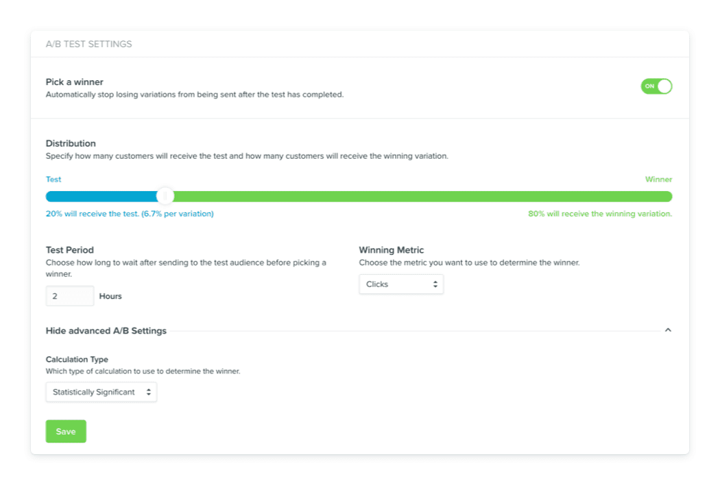
If you use Vero, this step is super simple. Automated email A/B testing automatically calculates the winner in your A/B test, and then sends the winning email to the remainder of your list. You just have to put in your variables, and Vero does all of the hard work for you.

What is statistical significance, and how do you calculate it (if you don’t have Vero)? This calculation simply makes sure that the differences you see are because one option actually outperformed another, and not just because of random chance.
You can learn to calculate statistical significance by hand, but we think you’ll prefer the A/B testing tools we cover below.
Email A/B testing tools to try
If your email service provider or marketing automation platform, like Vero, doesn’t have built-in A/B testing capabilities, you can use a few free or paid tools to make experimenting easier.
The Survey System sample size calculator is a free tool to help you figure out how many subscribers you need to send an A/B test to, for a statistically significant outcome. You can use this tool when you’re trying to determine which segments to send a test to.
After you’ve calculated your sample size, you can use VWO’s free duration calculator to determine how long you should let an A/B test run. The calculator considers your current benchmark, such as conversion rate, the increase you’d like to see, how many variants you’ll have, how many people will see it, and more.
SurveyMonkey has a free and easy-to-use A/B testing significance calculator. To use it to measure your email A/B test, you’ll need to know how many people received each version, and what the conversion or open rate was depending on which metric you’re tracking.
If you want a comprehensive A/B testing tool, VWO is a paid testing platform. With a more advanced tool like this, you can see detailed reports and projections based on your A/B tests across channels.
Best practices for A/B testing emails
If you’re still a little unsure of how to start or improve your email A/B testing, then start small! You can begin with small subject line tests that don’t have significant strategy decisions riding on them to dip your toes in.
Here are some other quick tips for setting your A/B tests up for success:
- Use a sample size that’s as large as possible. If you’re growing your email list or just getting started with A/B testing, use your full list for maximum data.
You can also let an A/B test run for longer if you don’t have many subscribers upfront, though this doesn’t always work well for a newsletter campaign. It works better for automated, triggered, engagement campaigns. Here are some tips on what to do if your list is too small for an A/B test. - Follow data, not your instinct. While you may use your intuition to set up a hypothesis, once the experiment has run, you need to trust the data. This might mean that you’re proven wrong, but as long as you have statistical significance, you have to take the data seriously.
- Test early and often. Email A/B testing isn’t one and done—you’ll never truly stop testing. There are always possible improvements, and your customers are evolving alongside you.
- Keep time-based variables in mind. Each A/B test email you send should only have one changing variable. Don’t test a new subject line, call to action copy, and your sender name in a single pass. If you do, you can’t be sure what change led to the results you see. It’s important to keep in mind, though, that there could be time-based variables out of your control.
For example, some eCommerce companies will naturally see an uptick in sales when consumers get tax refunds. So if you’re running an A/B test during a time with already higher spending activity, your A/B results may not be the same as during a “slow” season. - Always use a control email. You need a control email to compare your test to, or else you risk having inaccurate results. The control email will be the message you’ve already been using, such as your standard welcome email.
Email A/B testing helps you learn about your audience and top-performing strategies in a controlled and data-driven way.
Ready to start running tests? Start a Vero free trial here to make A/B testing easy and automatic.