Obtaining shoppers’ contact information is valuable for ecommerce businesses. It helps to introduce new products and promote existing ones, among other benefits. But consumers are reluctant to provide their email address, or name, or phone number.
There are ways, though, to streamline the process to entice visitors to complete those dreaded online forms.
How to Get More Form Submissions
Ask for only what you need. Yes, we want to personalize the shopping experience. On initial contact, though, an email address alone should be sufficient.
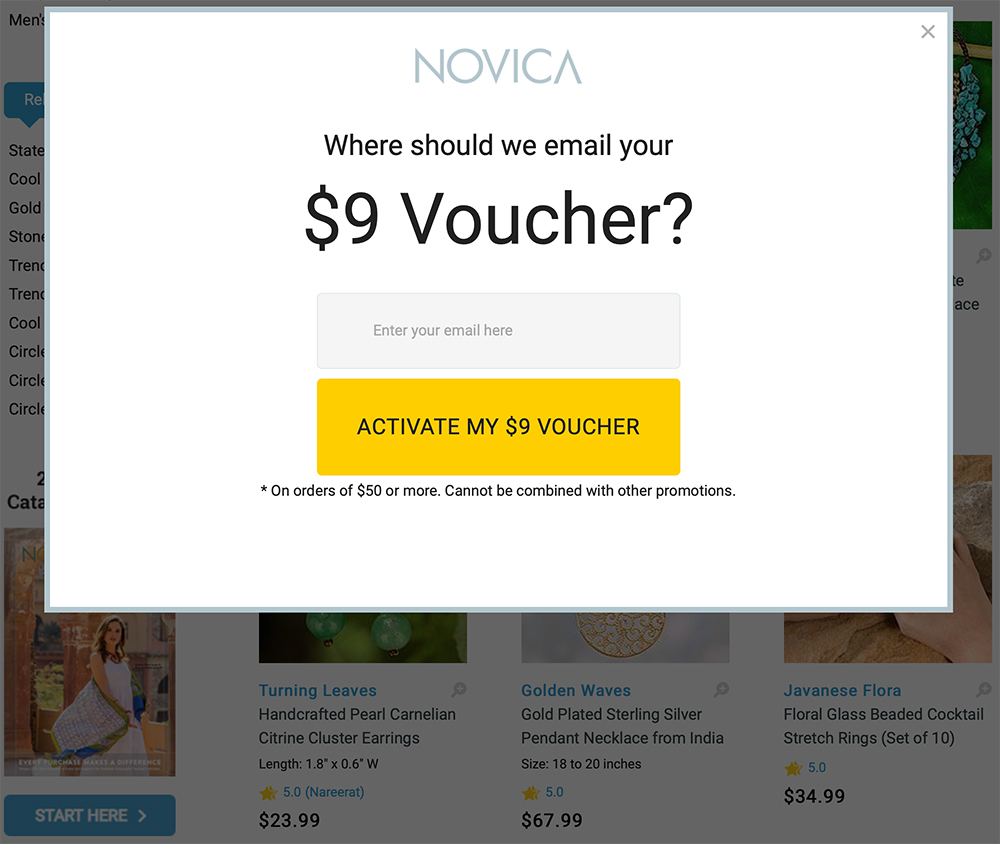
For example, Novica, an artisan marketplace, collects only an email address in exchange for a $9 voucher. During checkout, shoppers provide other information that can personalize subsequent visits. In an age of privacy and data breaches, asking for less makes it clear that you’re not interested in abusing the system.

It doesn’t get any simpler. Enter your email address and receive a voucher.
Explain why you need the information. In the example above, the visitor is trading his email address for a voucher. When asking for more information, explaining why validates the request and instills trust.

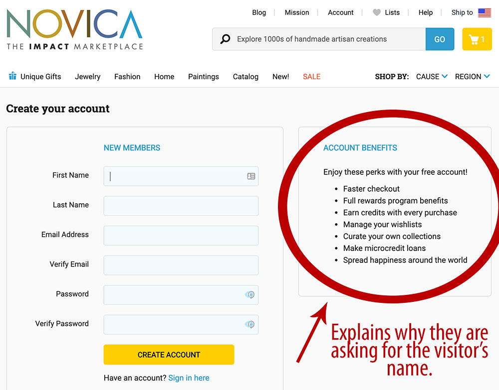
Explaining the benefits shifts from asking for information to shoppers wanting to provide it. Novica’s “Create your account” page contains a separate section for “Account Benefits.”
—

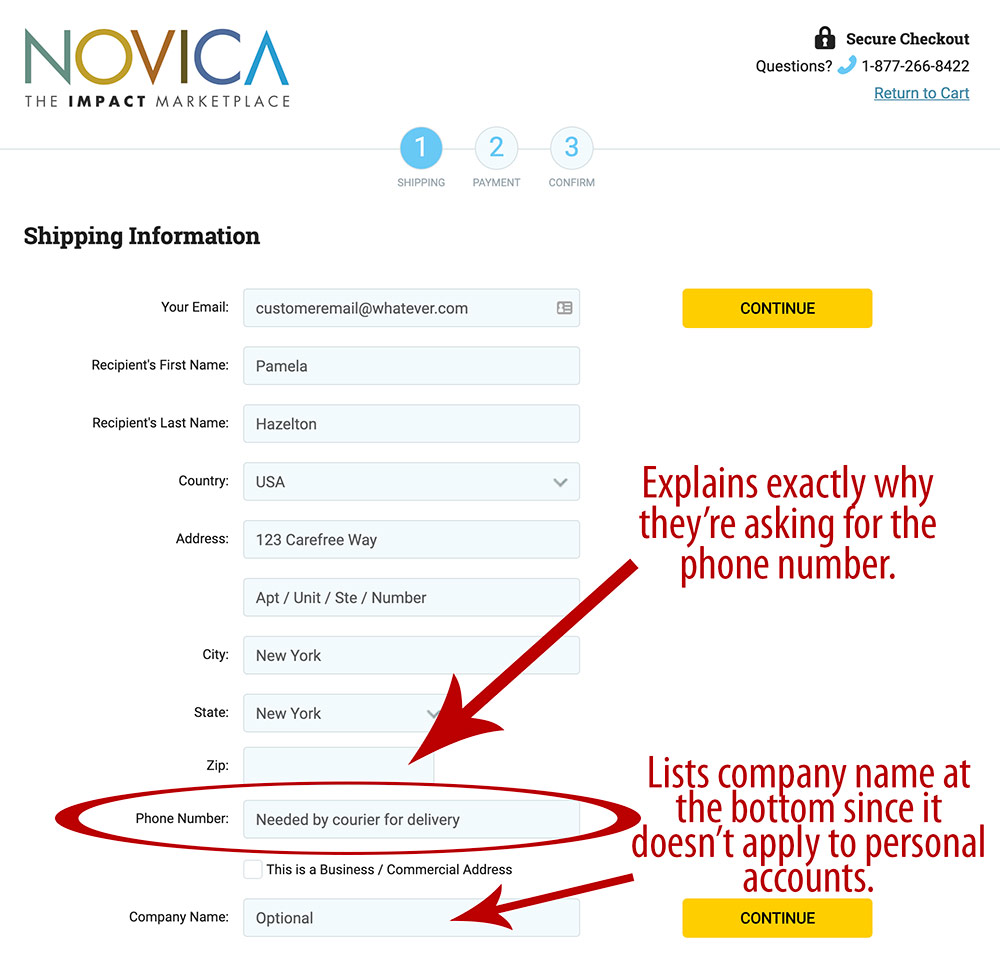
A message at checkout explains why the phone number is necessary — “Needed by courier for delivery.”
Similarly, why do you need a shopper’s full name and email address to initiate a live chat? A simple sentence that explains it’s so you can contact her if the connection is lost is reason enough. Yet so many chat forms don’t mention this.
Contact forms are another common hurdle; many businesses ask for way too much. If a consumer wants to inquire if something is in stock, he shouldn’t have to submit anything other than his email address. For more than an email address, use dynamic forms that display required fields based on user interaction and hides fields that don’t apply.
Assume shoppers don’t use auto-fill. Browser-based auto-fill is a handy feature that automatically completes certain fields such as name, email address, physical address, and card numbers. But many shoppers don’t use auto-fill; they manually complete every form.
According to a Baymard Institute study, a lengthy checkout process is the third most common reason people abandon shopping carts. The study also showed that the average checkout form includes 14.88 input fields!
As an aside, if your site contradicts useful auto-fill functions, fix the problem. Having to type one’s name and address because auto-fill won’t work is even more frustrating.
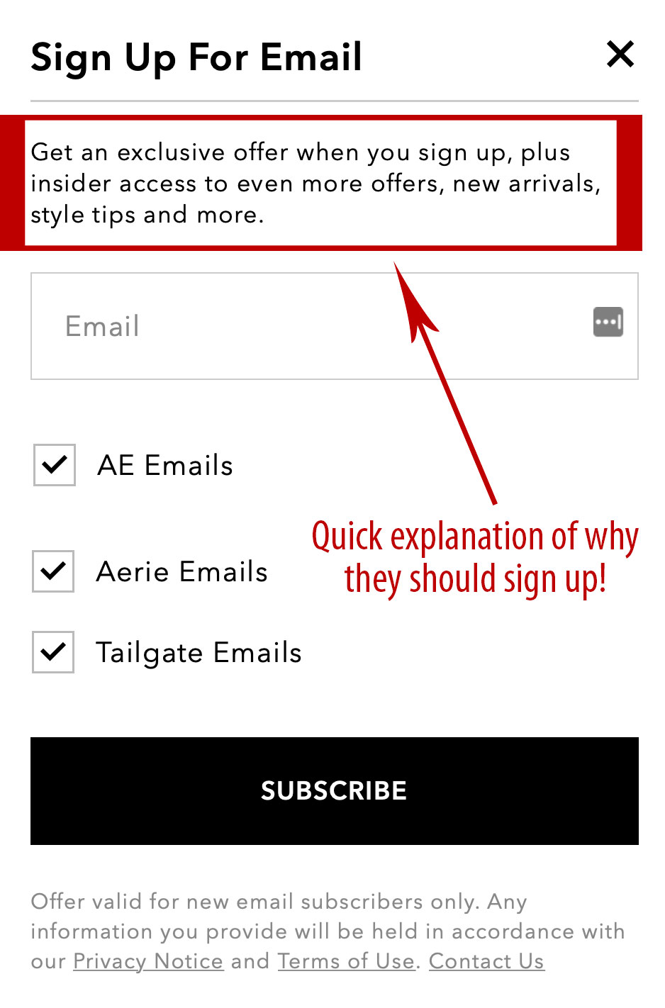
Give them something of value. The best way to get information is to offer something in return. For email newsletter signup forms, explain what consumers will receive. For example, American Eagle Outfitters, an apparel retailer, explains why a shopper should sign up for its email newsletter:
Get an exclusive offer when you sign up, plus insider access to even more offers, new arrivals, style tips, and more.

Subscribers to American Eagle Outfitters’ newsletter receive exclusive offers, early access to new arrivals, and style tips.
If you sell to businesses, follow the same rule. Asking for lots of demographics will likely mean losing valuable leads. Even if you’re providing, say, a downloadable market report, ask for little. Instead, brand content properly and ask for more info on subsequent interactions.
Finally, eliminate distractions on pages and popovers that contain forms. The cleaner the page the better the chance of getting useful submissions. It puts the focus on completing the form.