One key element of a search strategy we often see fail is prioritization.
Whether working client-side or for an agency, being able to prioritize a link-building campaign, a content refresh or a technical fix on a site is essential to ensure you are making the most use of the limited resources you are given.
Within this post we’ll run through a few different ways to show how to highlight opportunity across a keyword set and introduce a keyword difficulty metric you can use to take prioritizing work to the next level.
Individual keyword opportunity
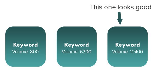
With a basic approach, opportunity can be found by merely completing keyword research, identifying those keywords with the highest search volume and targeting those.
Clustering keywords
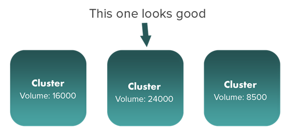
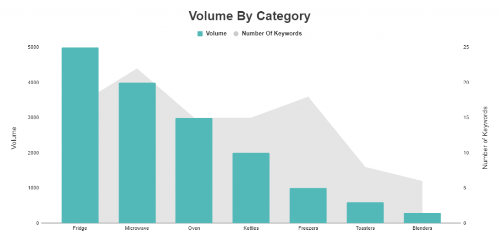
By being a little more advanced, we could try clustering (or grouping) related keywords and then look at the collated volume of each cluster. After you have that information, you can then focus on the category of keywords which attracts the most search volume.
Some different ways of grouping your keywords could be:
- By word operators, e.g. how, what, where, when, why
- By topic, e.g. fridges, microwaves, recipes
- By the intent of the keyword, e.g. transactional (looking to buy) informational (looking for information), navigational (branded keywords, looking to browse a specific site)
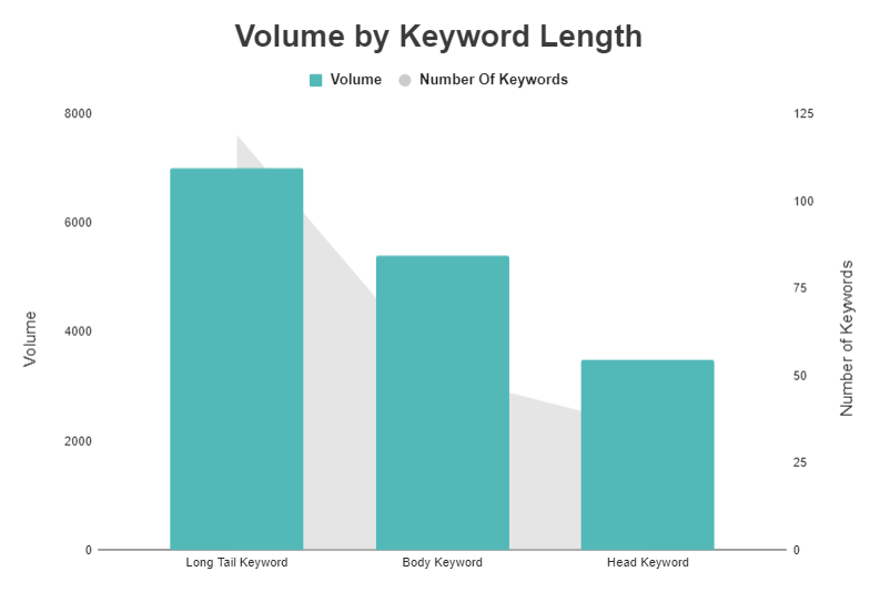
- By the length of the keyword, e.g. head (one word, high volume), body (2-3 words medium to high volume) or long tail (4+ words, low to medium volume).
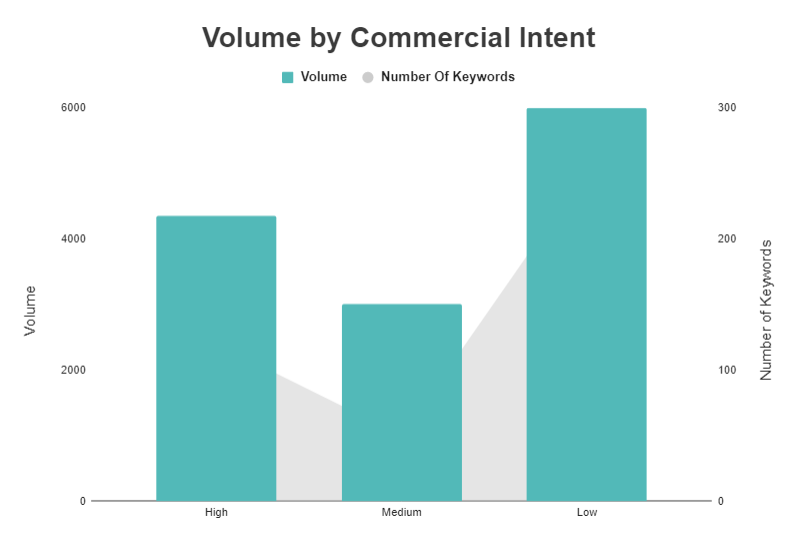
- By how commercial the keyword is. I typically do this based on CPC (cost per click) data and put it into low, medium and high categories. A high CPC means that more people are bidding on the keyword, which usually implies that it converts better and is more commercial.
Introducing Traffic Estimations
If you want to take this a step further, you could look at the incremental traffic to be gained from each keyword. This is based upon your current position, how many times it is searched per month, the estimated click-through rate (CTR) and the maximum traffic you can get from ranking in position one.
To break that down:
You can then assess the incremental traffic in relation to the ways in which you have clustered your keywords, and highlight any gaps in which you can gain traffic.
The graphs for these would like the same as the ones above, except with incremental traffic, max traffic or estimated traffic plotted instead of volume. At this stage, you could even do an analysis of how much market share you have captured for each topic:
Is this really highlighting opportunity?
These methods of highlighting opportunity work, and the latter methods in particular are much better than just looking at search volume in isolation.
However, none of these methods tells you how difficult it is going to be to attain the traffic figures you are highlighting.
Opportunity is defined by the Cambridge English Dictionary as:
‘An occasion or situation that makes it possible to do something that you want to do or have to do, or the possibility of doing something.’
With both methods, we are only really showing where the volume is, we are not saying how possible it is for us to achieve those incremental traffic figures. So, are we truly highlighting opportunity?
This is where we can introduce a keyword difficulty metric so that you can look at address both the opportunity and the difficulty in terms of your traffic figures.
Once you have created such a metric, your opportunity analysis begins to look a bit more like this:
Now, we are no longer just highlighting where the traffic is, we are also showing how difficult it is to get, which means we are now really showing the opportunity.
From the above chart, we can now see that, while fridges have lots of opportunity for additional traffic, it makes far more sense to concentrate on microwaves and kettles as they both still have a large number of searches but the difficulty to rank well for these terms is far lower.
Creating a keyword difficulty metric
Before we begin, here are some features of the keyword difficulty metric:
- It works on a logarithmic scale from 0 – 100
- 75% of the metric is based upon referring domains to the URL, the remaining 25% is based upon domain level referring domains
- When we show the metric by category, a weighted average is taken. The weight is the search volume of each keyword within the category. This means high volume keywords contribute to the difficulty of the category more than the low volume ones.
Rather than going into more detail on how the metric is created, first I’ll run through what you need to do so you can go ahead and start creating it yourself. Use our template from the next section and if you want to learn more about its creation , skip ahead to the end of the article.
To start building this metric, you will first need to do some data collection. You will need to find:
- The top 10 results for each keyword you have from your research
- The number of referring domains to each URL in the top 10
- The number of referring domains to each domain in the top 10
Before we collect these, do some keyword research and enter your results into the keyword difficulty metric template we have created for you. Make sure to click ‘File’, and ‘Make a copy…’ to save your own version of the template.
To start with, just fill out the ‘Keyword Research’ sheet with your list of keywords, categories and search volumes.
Scrape the top 10 results
To get the top 10 results, I have access to our in-house rank tracker at Zazzle Media. You can, however, get this information from various tools such as:
- Simple SERP Scraper
- Serposcope – Open source rank tracker that requires some setup
- A variety of other rank trackers on the market
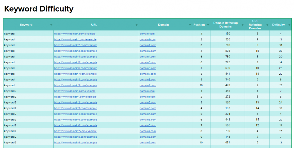
Add the URLs for your top 10 results, along with the associated keyword, into the ‘Keyword Difficulty’ tab of the template. The sheet should now look like this:
Once you have added all this information to your sheet, you need to collect the number of referring domains to both the URL and the domain. To do this, I usually use Majestic and URL Profiler to quickly pull data via the API. Both Majestic and URL Profiler are paid tools, but they are worth spending the money on given the data they provide.
Copy the URLs from your keyword difficulty sheet and paste them into URL Profiler. Select the URL Level Data and Domain Level Data tick boxes for Majestic; you may need to link up to the Majestic API when you do this. After, select ‘Run Profiler’ in the bottom right.
Once you have the export, copy and paste the URL, domain referring domains and URL referring domains over to the ‘Keyword Difficulty URLs’ tab. The ‘Keyword Difficulty’ sheet will now create the difficulty metric for each URL ranking in positions 1 – 10 and will look like the below.
Of course, we want results for each keyword, rather than for each URL ranking in the search result. If you go back to the ‘Keyword Research’ sheet that you originally put all your keywords and data into, you will see that the keyword difficulty metric has been averaged across all sites ranking within the top 10 for that keyword.
Opportunity Charts
Now, when you go into the ‘Category Opportunity’ tab, you will be able to see the ‘volume against keyword difficulty’ charts shown earlier as well as ‘traffic captured vs overall’ and ‘incremental traffic by category’.
Along with these, I have also added a difficulty distribution bubble charts in the ‘Category Difficulty Distribution’ and ‘Keyword Difficulty Distribution’ tabs.
Here is what a category difficulty distribution chart looks like:
Here is a keyword difficulty distribution chart:
When you have inputted your data, you will see actual keywords and categories rather than the dummy data I’ve currently inputted. To give you a bit more of an idea what you can gain from these charts, here are some descriptions of how you should target keywords or categories depending on their location on the chart:
Upper Left: High Difficulty, low opportunity. These are usually not worth the investment in link building activity.
Bottom Left: Low difficulty, low opportunity. We should target some of these keywords, especially the ones in the right side of the bottom left quarter.
Upper Right: High difficulty, high opportunity. It will take a lot of work to rank for these, but we will see a large return in traffic from doing so.
Bottom Right: Low difficulty, high opportunity. We can rank for these keywords with a smaller link building campaign and we will see a high return in traffic.
These charts can be handy if you are struggling to see category opportunity from just analysing the bar and area chart in the ‘Category Opportunity’ tab.
More about the metric
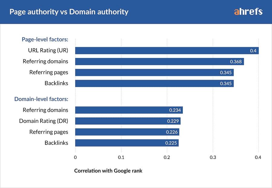
Correlation studies all state near enough the same thing, namely that links to your site are still the most influential factor when it comes to ranking a page. Here is a recent example of this from Ahrefs (which also has its own Keyword Difficulty metric if you don’t mind paying for it):
Because the data says links still correlate the most, it makes sense to base the keyword difficulty metric on this.
The Ahrefs study above states that referring domains correlate with rankings less than referring domains to an individual URL.
Because of this, it also makes sense for our metric to put more weight on the number of referring domains to the URLs, rather than the number of referring domains to each domain on the search result.
Here’s how the difficulty scales for links to the URL (making up 75% of the score):
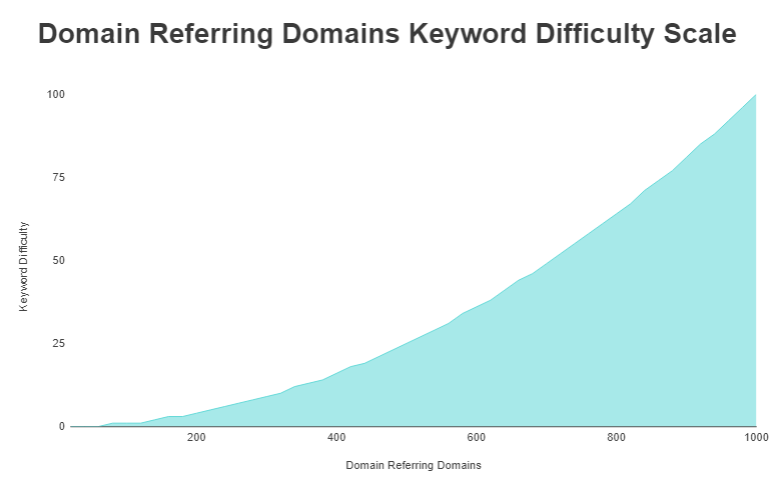
Here is the scale for domains referring domains (making up 25% of the score):
Conclusion
If you’ve read through this and managed to calculate keyword difficulty, you should now be able to increase the quality of your opportunity analysis tenfold and be able to highlight whether or not targeting a topic/niche for traffic is viable for you.
Moving forward, you should be able to target queries and users based upon whether ranking for a term is achievable, not solely on whether or not people are searching for it.
If you have any questions feel free to tweet me at @SamUnderwoodUK.
