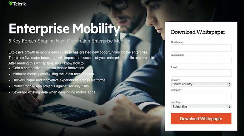
The best lead-generation landing pages are simple, with clear headings, visuals, and explanatory bullets. This example is from Telerik, a software development platform.
B2B products and services are often complex. Closing the sale frequently takes time, with multiple interactions. Landing pages can capture leads and start the conversation.
In this post, I’ll address eight ways to generate the most leads from B2B landing pages.
Optimizing B2B Landing Pages
1. Start with a purpose. The goal for your landing page should influence its messaging, design, and call-to-action. A landing page should have a single purpose. An example is getting prospects to sign up for a free consultation.
Attempting multiple goals with one landing page can be confusing for users and underperform. Make the goal or purpose so clear that there is no room for interpretation. When a user completes the desired action, have a clear path to the end goal of closing the sale.
2. Focus on messaging and content.
- Headline. Make the headline concise, clear, and prominent. It should persuade visitors to take action. Big letters, bold colors, and center-of-the-page placement works best, typically. I’m a proponent of the “2-second test.” Can first-time readers understand it within 2 seconds?
- Offer. The offer should be relevant to your prospects. It should provide enough value to entice them to leave their contact info (which buyers are often reluctant to do).
- Copy. The landing-page copy should reflect your audience’s understanding and intent. Visitors with less knowledge of your products require different copy than experts. You may need multiple versions of your landing page — one for new prospects and another for buyers who are ready to convert. To keep your audience engaged, use bullet points with short, prominent, compelling text. Place longer, in-depth copy lower on the page.
- Visuals. Images can be effective. However, videos on landing pages are often more effective in my experience. Videos can be more engaging and increase time on page, improving conversions. I often lean on suppliers for co-branded videos.
- Calls-to-action. Calls-to-action should be short and direct — e.g., “Get $50 Voucher Today” or “Schedule a Free Audit.”
3. Use a simple layout. Don’t overthink your landing page layout. Keep it simple — a headline, visuals, copy, lead form, and call-to-action. Remember, this is not an entire website; it’s a landing page with one purpose. B2B users want quick explanations and answers.
4. Utilize a landing page builder. The easiest and most affordable way to get started with landing pages is via a third-party platform. There are many tools that facilitate creating, launching, and managing landing pages. Unbounce, Instapage, Landingi, and Leadpages are among the most popular. These providers offer “drag and drop” functionality and integrate with other services, such as MailChimp and Google Analytics.
5. Say “thank you.” Thank the landing-page visitors when they do what you want . Then direct them to the next step. This could be learning more about your company, sharing a case study, inviting them to engage on social media, or simply offering a complimentary cup of coffee via a digital gift card.
6. Target relevant traffic sources. Identify the best sources of traffic to your landing page, those that produce the most conversions. Test each source. Potential sources, in my experience, include:
- Paid. Search, social media, remarketing, and display ads.
- Traditional media, such as print, signage, and radio. Consider a vanity URL to track each option — e.g., “myb2b.com/radio.”
- Email marketing.
- Organic search.
- Word of mouth. A vanity URL can help here, too.
- Existing channels, such as website, social media, public relations, directories, and online communities.
7. Choose key metrics. Focus on practical metrics that inform on traffic and conversions.
- Users. How many people have visited your landing page?
- Traffic source/medium. What source and channel generated your traffic — e.g., “Google/CPC” or “website.com/referral.”
- Abandonment rate. How many people started filling out the form but did not complete it? This metric can indicate problems with form length, ease of use, and types of questions.
- Conversion rate. Track the percentage of visitors that complete the desired action, such as completing a form or downloading an ebook.
- Cost per conversion. How much does each conversion cost? Compare traffic sources in terms of cost per conversion.
- Lead-to-customer rate. How many leads does it take to generate a customer? Leads are not worth much if they are not qualified and do not produce customers.
- Cost per customer. Based on your lead-to-customer rate and cost per conversion, how much does it cost to produce a customer? Use this metric to work backward to determine how much to pay for web traffic.
8. Test and optimize. Use A/B testing to improve the performance of your landing page. Make two versions of your page. Split the traffic between both, and see which one performs better. Making one change at a time. It’s difficult to test multiple changes at one time, as you don’t know which one made a difference. Most landing-page providers make A/B testing simple. Key items to test, in my experience, are the headline, images and videos, call-to-action, copy, and the form (length and questions).