
Lots of bloggers seem to do everything right, yet they don’t see much success.
They write well-structured posts, they pay attention to SEO, they know the ins and outs of their blogging software … but something’s lacking.
That missing “something” can often be personality. It’s the difference between a blog that readers come across and instantly forget … and a blog that makes a connection and an impact.
Does your blog need a bit of extra personalisation? Here’s how ten top bloggers make their blogs stand out:
#1: Include Great Photos, like Caz and Craig from YTravel
Blog: YTravel
Some blogging topics pretty much demand great photos. Travel is one of those (and others include food, craft and fashion blogging).
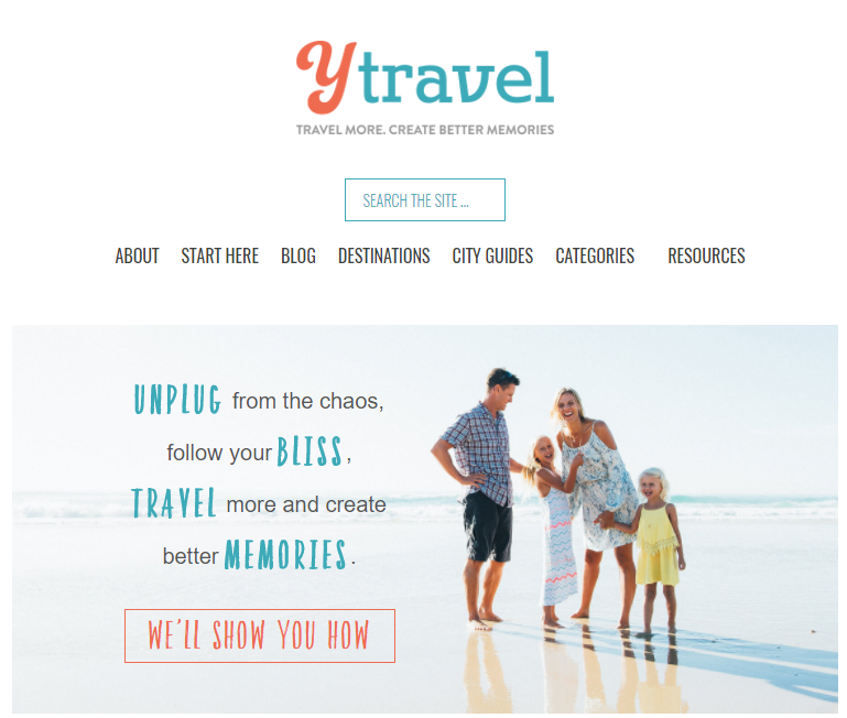
Caz and Craig post gorgeous, smiley photos of their family. Some of these are simple candid snapshots, like in 17 Tips for Flying With Kids to Keep You Calm and Happy, and others are a little more posed, like the photos in Getting Settled in the USA + Where to Next.
Lessons learned:
#2: Add Some Flair, like Pat Flynn from Smart Passive Income
Blog: Smart Passive Income
As soon as you visit Pat’s blog, Smart Passive Income, you see a huge photo of him, plus his signature:

He adds flair in other ways too: his 404 page is inspired by on Back to the Future – his favourite movie, as noted on his bold, eye catching About page.
Lessons learned:
- Don’t be afraid to go big! That might mean a huge photo of yourself, a bold statement, or an About page that’s filled with images.
- Talk about who you are beyond blogging: Pat lists his favourite book, movie and game, and writes about his family on his About page.
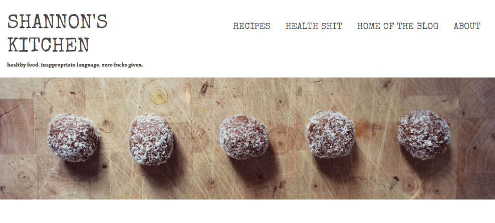
#3: Develop a Strong, Identifiable Tone, like Shannon from Shannon’s Kitchen [language warning]
Blog: Shannon’s Kitchen
Salty language tends to polarise readers: some love it and find it a big part of a blog’s appeal; others will be put off and won’t return. Shannon swears – frequently and enthusiastically – on her blog (even in her tagline and navigation menu):
 Lessons learned:
#4: Get Custom Illustrations, like Ramsey from Blog Tyrant
Blog: Blog Tyrant
As soon as you visit Blog Tyrant, you’ll see Ramsey’s red-shirted avatar: this illustration features in the banner image on the home page, and in the feature images for several of his posts:
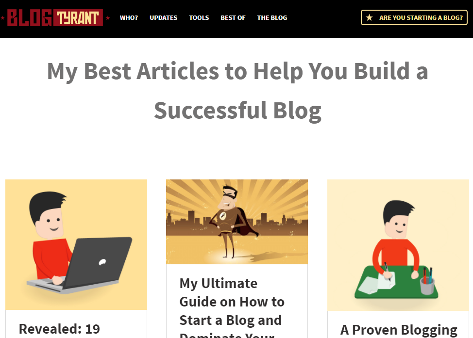
It’s also on the front cover of his free report.
Lessons learned:
- Custom illustrations can create a sense of consistency across your blog. Ramsey’s not the only blogger who uses them in this way: Social Media Examiner have their little jungle explorer in their header and at the start of each post.
- If you’re not comfortable including personal photos, a cartoon version of you can be a great alternative.
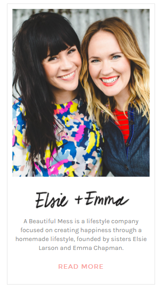
#5: Include an Eye-Catching Sidebar Profile, like Elsie and Emma from A Beautiful Mess
Blog: A Beautiful Mess
New readers may land on any post on your blog … and it can help to give them a quick glimpse into who you are and what you’re all about. Sisters Elsie and Emma do this stylishly with a bright, bold photo and handwritten names in their blog’s sidebar:
Lessons learned:
- An “About me” widget in your sidebar is a great place to create an instant connection with your reader. Include a link to your full About page too.
- Happy, smiley photos of you are always a great draw. Some bloggers include these in the header, but the sidebar is a great alternative.
#6: Be Consistent With Your Branding Across Platforms, like Chris Ducker
Blog: Chris Ducker
Chris Ducker uses the same (smiling) headshot on his About page, Twitter, Facebook and LinkedIn, creating a consistent brand across multiple platforms:
 Lessons learned:
- If you’ve gone to the time and expense of getting a professional headshot done, use it – not just in your banner image, but on social media too.
- You may want to have variations on your headshot, from the same shoot (compare Chris’s front page image with his About page headshot, for instance).
#7: Use Colour to Boost Your Brand, like Jadah Sellner
Blog: Jadah Sellner
When you visit Jadah’s site, your eyes are instantly drawn to her bright, colourful banner:
 The colours of her clothes tie in with the colours of the newsletter sign up: it feels like everything fits together seamlessly. (The tagline above the banner picks up on the same deep pink colour, too.)
Lessons learned:
- Colour matters! Perhaps bright colours aren’t quite right for your blog, but you can still create a similar banner image that takes colours from a photo of you and uses them for text and other elements.
- Use colour consistently across your site: check out Jadah’s contact page for some examples.
#8: Use “I” in Your Content, like James Schramko from SuperFastBusiness
Blog: SuperFastBusiness
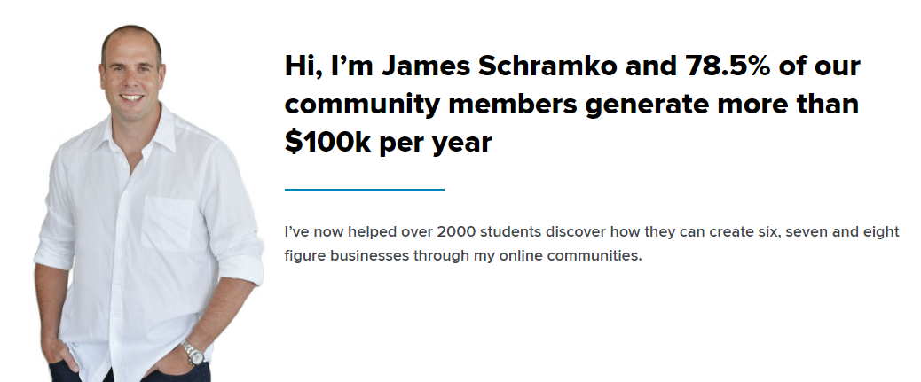
The first words of James’s homepage are a bold “I” statement: instantly, it’s clear what he’s all about and what he does, and – crucially –how he can help the reader.
Lessons learned:
- Don’t be afraid to write in the first person. Some bloggers are reluctant to do this, but using “I” and “you” can help you connect to readers and show your personality.
- Make sure, though, your focus isn’t just on yourself and your own story but on how you can have an impact on readers’ lives.
#9: Have a Tagline that Instantly Lets Readers Know if They’re in the Right Place, like Kelly Exeter
Blog: Kelly Exeter
Taglines can be really tricky to get right, and some bloggers choose not to use them at all. A great tagline, though, is a huge asset: in just a few words, you can tell your ideal readers that your blog is exactly the right place for them.
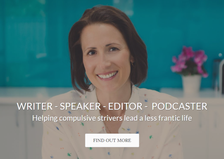
Here’s Kelly’s:
Lessons learned:
- Think about who you serve (“compulsive strivers”) and what your blog will help those people do (“lead a less frantic life”).
- Spend some time honing your tagline, so that it sounds just right – you might want to read it aloud.
#10: Create a “Start Here” Page That Explains What You’re All About, like Emilie Wapnick from Puttylike
Blog: Puttylike
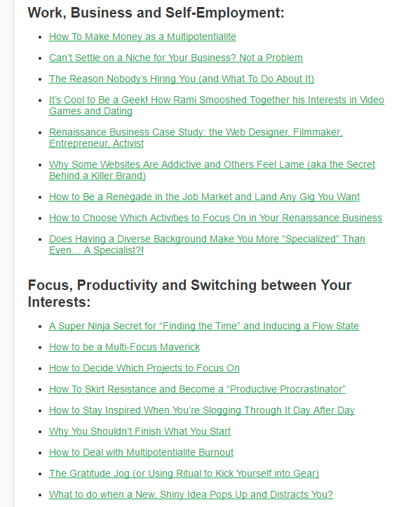
Lots of blogs use a “Start Here” page, but having one is particularly important if – like Emilie – you’ve combined several different passions or strands into one blog. Emilie has different sections on the page to bring together her most popular posts in different categories.
Lessons learned:
- You can blog about more than one topic, but make sure you’re clear about what you cover so that new readers can get a good sense of your scope.
- Bringing together your best posts in one place make it easy to showcase your work and draw in new readers who share your interests.
How are you currently showing your personality on your blog? Did anything resonate with you as you looked at the above examples … and what will you try next?
