At the 2017 Chrome Web Summit Conference, Google introduced the world to the Chrome User Experience Report (CrUX) – a database constructed from multiple samples pulled from real Chrome users’ web browsing experiences. According to Google, the goal was to “capture the full range of external factors that shape and contribute to the final user experience.”
A few short months later, Google updated their PageSpeed Insights tool to score two separate categories: “speed” and “optimization.” The familiar PageSpeed Insights’ grade based on technical issues and Google’s recommended fixes was moved to the Optimization section, while the newly-introduced Page Speed section started labeling webpages as ‘fast,’ ‘average,’ or ‘slow’ based on the median value of one’s First Contentful Paint (FCP) and DOM Content Loaded (DCL).

More importantly, instead of gathering these two performance metrics in a controlled lab setting (as most of webmasters do in real life by accessing the same page from their browsers multiple times to find out some average timings) Google aggregates them based on Real User Monitoring (RUM).
Your Page Speed score is based on data collected from what millions of Chrome users do: how they interact with your pages, how long it takes content to load, what devices they’re using, etc. An ‘unavailable’ speed score means that CrUX doesn’t have enough information about your traffic and data. Keep in mind though that the CrUX database keeps growing constantly, so it’s worth checking back in a while even if your Page Speed score is currently unavailable.
While an update to PageSpeed Insights might not seem particularly earth-shattering (especially if you preferentially use great tools like Pingdom, WebPageTest or even Chrome Dev Tools), it is important to note this shift from “lab data” to “field data.” What this means for SEOs is that how Google evaluates your website might not match your local speed tests — and this shift has the potential to significantly influence your search engine rankings.

In this article, we’ll show you how some local speed tests are showing drastically different results from CrUX performance metrics. We’ll also teach you how to use CrUX’s first-hand data to speed up your site.
The impact of CrUX data on site speed measurements
To see how CrUX data can be different from the data in the “lab” tools, let’s perform local speed tests for two major news publications: USAToday.com and CNN.com.
First, let’s run both home pages (usatoday.com and edition.cnn.com) through WebPageTest with the default settings enabled.


You’ll notice that according to these measurements, the load time for USA Today is nearly four times longer than CNN’s load time (118.711s vs. 16.751s respectively).
Let’s compare this “lab test” data against the CrUX data as calculated by PageSpeed Insights.
You might be surprised to learn that, as far as Google is concerned, USA Today’s home page is considered to be “fast,” while that of CNN is assessed as “slow.”


Why the discrepancy?
All performance data included in CrUX is pulled from real-world conditions, aggregated from millions of actual Chrome users browsing your website (provided, of course, that those users all opt-in to syncing their browsing history and have usage statistic reporting enabled).
How quickly users see the first visual response from your webpage (FCP), and the time it takes for an HTML document to be loaded and parsed by real-world visitors of your site (DCL) both contribute to how fast Google considers your site to be.
In other words, if most of your users have a slow internet connection or use outdated devices, Google may see your website as “slow” — even if you’ve optimized the heck out of it. The flip side is a website that isn’t completely optimized might be considered “fast” if most of your users are local, have access to better devices or if they have faster connections.
This USA Today/CNN example shows us that performance is no longer a “stable” value you can calculate within your dev environment — it now depends heavily on your users. The most accurate way to explore your site’s performance is to rely on RUM data.
And there’s nowhere better to find reliable real-user performance metrics than the database Google is already using: CrUX.
How to access your CrUX data
If it’s been a while since you’ve used PageSpeed Insights and you’re curious how fast Google considers your site to be, then taking a look at your speed score is a good place to start.
Next, it’s time to access your CrUX data. The good news is that all data is publically available on Google BigQuery, which is part of the Google Cloud Platform. This functionality is available for free unless you use it heavily. All you have to do is:
1. Log in to Google Cloud
2. Create a new CrUX project

3. Navigate to the BigQuery console and click ‘Compose Query’

If you want a hands-on look at all the metrics available to you in the project, you can take a look at the table details of the “chrome-ux-report” dataset.
If you examine the way the tables are structured, you’ll notice that CrUX has datasets for each country in addition to an “all” dataset. When you expand those datasets, you’ll see a list of tables that look something like this:

Now, you can run queries and select the data you need with a pretty basic knowledge of SQL.
We’ll start with a basic query that will tell us how many unique origins are available in the dataset as of August 2018 (remember, “origins” are different than “domains”—the HTTP and HTTPS versions of the same domain will have different origins).
To do this, paste the query below into the query editor and click Run Query to execute it:
SELECT count(DISTINCT(origin))
FROM ‘chrome-ux-report.all.201808’

As you can see, as of August 2018, Google has data on about 4.4 million different origins.
Now, if you want to calculate the number of unique domains in Google’s database, we’d use the Standard SQL function NET.HOST instead. This will turn a URL into host:
SELECT count(DISTINCT(NET.HOST(origin)))
FROM ‘chrome-ux-report.all.201808’

It turns out that the number of unique domains is a bit smaller: 4.2 million.
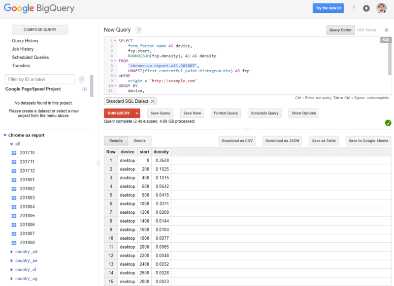
Now we can make more specific queries to solve our challenges. For example, if we wanted to use CrUX data to see how fast your website is for your real-world users, we would execute the following query:
SELECT form_factor.name AS device, fcp.start,
ROUND(SUM(fcp.density), 4) AS density FROM `chrome-ux-report.all.201807’, UNNEST(first_contentful_paint.histogram.bin) AS fcp WHERE origin = ‘http://example.com’ GROUP BY device,
start ORDER BY device,
start

If we were to use this query to examine the distribution from our CNN example above (edition.cnn.com), here’s what we’d see the First Contentful Paint (FCP) metrics are for their users:
Row device start density
1 desktop 0 0.10%
2 desktop 200 1.01%
3 desktop 400 2.47%
4 desktop 600 3.04%
… … … …
This means that on desktop devices 0.1% of all visitors start seeing CNN’s site in under 200 milliseconds; 1.01% see it in under 400 ms, etc. You can get the same results for other devices (phone or tablet), across different countries, etc.
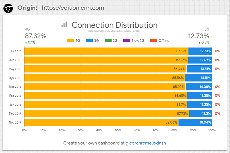
You can even plug this data into your favorite visualization program (Tableau, Google’s Data Studio or even Excel) to get a visual representation of your website performance:

And we can break down those visualizations by country as well:

Just from this sample, we can find a lot of interesting insights. For example, we have quickly and effortlessly learned that more US visitors prefer browsing CNN’s site from desktop devices (53.77%), whereas the rest of the world prefers mobile (40.14% from all over the world).
Even better — we can use CrUX Dashboard templates right inside Data Studio to identify trends and regressions before they negatively affect your site engagement and bottom-line metrics.
Simply go to g.co/chromeuxdash to see how the user experience of an origin changes over time. Set up is relatively straightforward and once you enter an origin, you’ll be able to generate a visualization of data pulled directly from the Chrome UX Report’s community connector.
There are three types of Chrome UX reports, currently available at the Data Studio dashboard:


As you can see, if you know how to use it, then CrUX is a powerful tool for analyzing your site’s speed in a variety of different ways. You can also consider using other types of queries to:
- Compare your site’s performance against competitor sites.
- Analyze site performance across different devices and connection types.
- Measure performance across multiple different countries
- Dig into granular speed metrics like First Paint (FP), First Contentful Paint (FCP), DOM Content Loaded (DCL), onload, and even experimental metrics like First Input Delay.
If you need more help getting started with CrUX, I recommend reviewing Google’s Getting started guide. This introduction will help you learn how to navigate the database so that you can use first-hand insights from your real-world users to speed up your pages.
Conclusion

Unlike PageSpeed Insights, CrUX doesn’t give you a neat checklist of technical issues you can address. You’re off the edge of the map here, but it would be foolish to ignore this valuable data. After all, Real User Measurements have been the gold standard for measuring the performance of web applications for years – and now that they play a role in search rank, they matter more than ever. There’s no better way to gauge exactly how users experience your website.
Of course, you don’t have full control over the devices your visitors are using or their connection speeds, but that doesn’t mean you can’t glean some valuable insights from this data. If you’re a savvy SEO, then you’ll be able to use CrUX data as a benchmark that you can measure against your ongoing optimization efforts. This data will also help you find opportunities for growth, improve the experience for your users and grow your rankings.
Opinions expressed in this article are those of the guest author and not necessarily Search Engine Land. Staff authors are listed here.
