January 25, 2018
As a PPC professional, you hold yourself accountable for developing smart strategies and delivering optimized results. It’s critical to know how your Google AdWords campaigns performed last year and what you can do differently this year to improve. With all the reports available, it should be easy, right?
Sadly, there’s a catch. But Orbiter PPC Data Visualizations can help.
Too often, your data is not really available, but is instead decentralized, buried, or difficult to grasp holistically. Orbiter revolves around your Google Shopping and text ad data to produce interactive visualizations, enabling you to take a global view of your AdWords KPIs, gather actionable insights, and make data-informed decisions — painlessly. That’s what managing big data should feel like.
- View your annual performance in a seasonal heatmap
- Quickly identify strategic wins and areas for improvement
- Highlight emerging trends and surface hidden data
- Interact with data for immediate feedback and learning
Analysis paralysis is so last year.
The Problem with Big Data
There can be a wide disconnect between the way information is made available to us and the ability of our brains to process that information. Simply put, humans are not evolved to easily form mental pictures of 1000-row spreadsheets. Information can be dispersed across multiple screens or tables, nested hierarchically, chopped up by time periods, or all of the above. This convoluted reality makes it challenging or even impossible to get a cohesive, unified picture of what the data can tell us across the year.
Meanwhile, our brains are powerfully optimized for processing visual input, with incredible pattern detection capabilities and a high sensitivity to changes in color, contrast, size, and shape. Don’t waste that power: Orbiter’s data visualizations play to your human strengths by delivering visually-nourishing overviews of critical KPIs. This augments your campaign comprehension by bringing buried or complex data to the surface and producing a digestible, informative outlook.
Seasonal Heatmap: Your Year in Review
Want to see your biggest Google Shopping cost drivers for the past year, learn when they were most active, plus whether or not they were actually efficient? Want to see the results of your marketing efforts during that wonderful Black-Friday-to-Christmas season of merriment and mayhem — for each and every brand? Want to check the impact Apple’s keynote had on your iPhone accessories, or learn which week your back-to-school shoppers really got serious about stocking up?
You can do all that and more with Orbiter’s Shopping Seasonal Heatmap. And it’s coming soon for Google paid search, too.


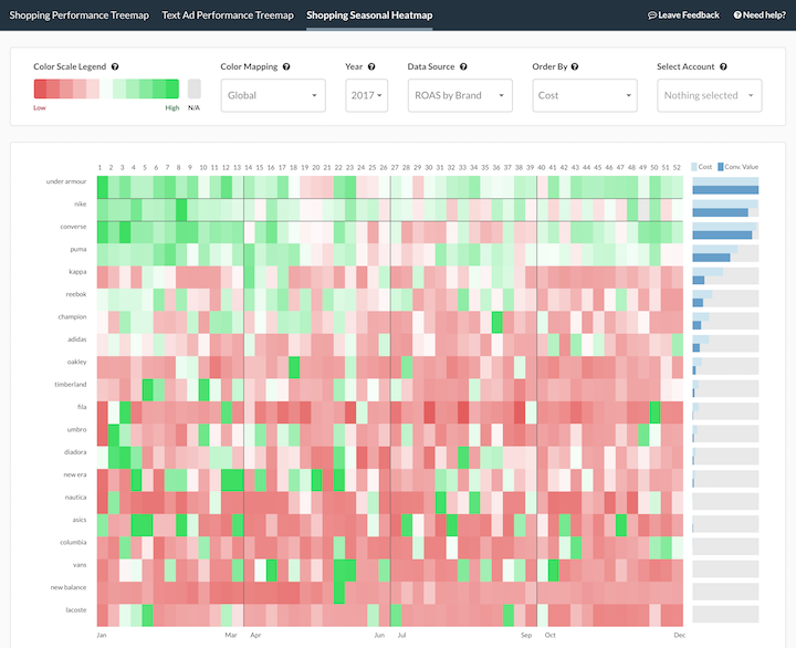
The seasonal heatmap gives you an annual overview of your brand or category performance based on weekly increments. This helps you to spot trends, seasonalities, and the impact of marketing activities across the calendar year.
It’s quite powerful — able to display data for Return on Ad Spend (ROAS), costs, or conversions. It can be mapped at the global (account) level, or mapped per row (brand or category). This means, for example, that you can review your costs at the global level to see all cell data weighed against each other (revealing your largest cost drivers), and then “zoom in” by switching to the row-level mapping. Here, cells are only weighed against other cells in the same row. You can then hover your mouse over any cell to reveal its ROAS.
Plus, you can set your own priorities, sorting the rows by costs, conversions, or conversion value. And to the right of the overall visualization is a supplemental bar chart which displays the accrued cost & conversion value of each row for the whole year.
Tip: Click on any cell to see the Google Shopping Trends annual performance for that brand in the given target country.
Show Me The Long Tail
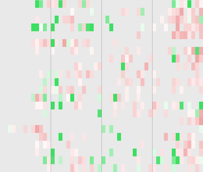
Also cool: at the bottom of the seasonal heatmap, you will see an irresistible button, “Show Me the Long Tail” — click it. Normally the heatmap only displays your top 20 brands or categories. When you click on the long tail, however, the view expands to show up to 200 rows, depending on your dataset.
For a lot of PPC managers, the result will look pretty hazy, like this:

That’s because most retailers only have a small number of data-rich best-selling brands & categories — perhaps 20% of the entire assortment. That other 80% cannot be ignored: it’s still generating revenue based on 1 or 2 conversions per month that together form a very large percentage of the total revenue. However, as you can see for yourself, there just aren’t a lot of data points, so it’s quite tough — arguably impossible — for humans to optimize.
Tip: Try using a bid management tool to optimize your long tail with the help of machine learning.
How to Unpack Nested Data
The seasonal heatmap is great for an annual or quarterly perspective. But what if you need to check your account health on a weekly basis? Or what if you want to see the Google quality score of every single ad group for your text ad campaigns? Or the ROAS performance for each of your Google Shopping product types and brands in one view? Orbiter’s PPC treemap can handle the job.
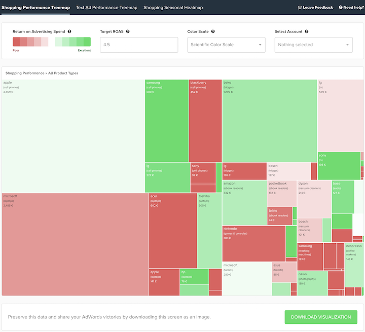
Treemap visualizations are used to flatten branching hierarchical data structures into highly-detailed overviews that are also quite compact. Each branch of the hierarchy becomes a rectangle containing all of its sub-branches as smaller rectangles, while the area and color of each rectangle signify different dimensions of the data.

In 2017, we chose treemap technology as Orbiter’s launch capability because it’s a stable, proven design that strongly accentuates human brainpower. Treemaps offer numerous immediate advantages to PPC managers and data analysts:
- Organized, high-capacity structure displays your entire campaign data
- Nested, zoomable layout is perfect for either a global view or granular analysis
- Size & color codes encourage your eyes to find contrast and compare data points
- Rigorous tiling algorithm that will not distort the data — a natural fit
Orbiter unpacks your complex AdWords data and translates it into a neatly organized grid, based on an intuitive small-to-big, red-to-green scheme. In the case of your Google Shopping data, the two dimensions, size and color, represent cost and performance respectively. Performance here is the measurement of an individual brand’s ROAS against your target ROAS during the last 30 days. This means you can easily spot and prioritize your ad spend winners and losers at a glance.
Tip: Click the question mark next to any menu item or the “Need help?” button to initiate a quick walkthrough.

For your text ad data, the rectangle size can still represent costs, but also clicks or impressions based on your needs. Meanwhile, the color scale reflects the quality score achieved by a given campaign over the last 7 days. This means you can instantly direct your attention to previously invisible links between quality score and your other KPIs.
Final Thoughts
Data is an urgent second language for today’s marketers, but according to Google, 61% of marketing decision-makers struggle to integrate data. This not because of a lack of data: if anything, PPC managers are overloaded by reports and KPIs. That’s why Smarter Ecommerce built Orbiter data visualizations — to combine the most vital measurements of your AdWords health and efficiency into easily-digestible, interactive overviews. This tool is ideal for identifying winning and losing strategies, spotting trends, finding new correlations, and even sharing your AdWords victories with less technical-minded decision makers in the company. Best of all, this tool is accessible on demand and for free.
Don’t miss hidden opportunities in your AdWords performance — Use Orbiter for free.