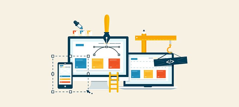
Image Credit: Thomas Digital
We’ve already established numerous times that web design is extremely important as a first impression for your customer base – from the choice of colour to the layout – but how does it affect content marketing? Well, it can affect many different aspects of your online business presence, and so you must choose carefully when designing your website yourself, or when hiring a web design agency like ours.
Content marketing involves the creation of valuable material that does not explicitly promote a brand, but encourages interest by providing relevant information associated with it. For example, you can publish How-To guides, cost-saving guides, or provide informational videos on a certain topic. Whichever you choose, ensure that each of these things links back to the kind of items or services that you sell. If you sell bathroom fittings, be sure to post a How-To guide on how to install it yourself – customers will more than likely buy the required equipment from you as well!
So how does your web design impact this? Well, there are four key areas which allow for customers to use your site to get what they need to. Once you’ve brought customers in with your marketing, you need them to make a purchase, right? And what better way to do that than by ensuring that they can navigate your site easily and quickly, therefore making it a pleasant experience. Hey, who knows, you may get repeat buyers from this too!
Ease of Access
If you’re publishing a large amount of content on your website (i.e. the How-To guides we mentioned earlier), you’ll need to make sure that it’s easy to both find and read. Navigation needs to be exceptional, so that your customers can find the information that they want without having to search. After all, if it’s too much hard work, your customers may just leave your website and go elsewhere. An easy way to combat this is to provide drop-down menus where possible, and ensure that there is an option to go back to previous webpages with ease.
Impression
Professional and attractive are the main words to keep in mind when thinking about your website’s appearance. Your website will make an impression on a user with the first click, so it’s important that they find it visually appealing. No-one likes scrolling through badly designed websites with clashing colours and no sense of layout! The way your website looks can give a user the idea of whether you are a valuable resource, or whether they should go elsewhere. Make sure it’s the former!
Recommended for You
Webcast, February 13th: Creating a Complete Sales Funnel from Facebook Ads

Image Credit: Resource Techniques
Readability
There are many different fonts and colours to use in web design software, but it doesn’t mean that you need to use them. It’s best to stick to one font for headings and one font for paragraphs so that it’s formatted professionally across all pages. Multiple fonts can look messy and jumbled, and you need to ensure that your visitors can get the information they need without a struggle. Similarly, if your font colour is too close to your background colour, or clashes violently, then visitors will more than likely leave without reading. The best thing to remember is that simple is the way forward; large enough to read, a plain font, and a good contrasting colour to your background.
Understanding
It may feel like you want to just type everything out and explain to people exactly what you are talking about with no bells or whistles. That’s fine, but you must remember that everyone has a different way of learning. If you want to change it up a little, think about posting educational videos. On social media, there are many pages who post quick five-minute recipes or crafts, and users are happy to sit through the entire thing, even if they don’t wish to try it out themselves. However, these visuals can actually improve your customer’s knowledge of your product or service, and can help them get to grips with why they should buy from you. Plus, photos and videos are more visually attractive than huge blocks of text!
In summary, you must think of your website as your own personal project. Bringing the many different elements of web design together can help to create a website that holds all the information you require, but the actual look of the pages is up to you. Think about your own personal experience of browsing webpages, and the kind of sites that you like or dislike. Keeping your readers in mind can help improve your brand as a whole, as your website should be designed FOR your visitors! After all, they’re the ones using it. Make sure that everything is easy to find, and you’ll end up with brilliant results.

Image Credit: Commonsense Marketing
