Hey there, marketer. 👋
Let me introduce myself. I’m your target market.
I’m actively looking for what you offer. I just Googled your solution, clicked your ad, and I’m on your landing page.
Right now, I’m somewhere between interested in and desperate for what you’re selling. I’m ready to say “yes” to a call to action, but… I’m not going to say yes to yours.
Let’s be clear.
The reason I’m not converting has nothing to do with the length of your headline or whether the model in the photo is looking at your product. Your CTA button could even be a non-contrast color that says “submit” and that alone wouldn’t stop me from clicking.
But while you’ve been following cosmetic “best practices” to tune up your landing page, you’ve been ignoring the most critical factor in conversion rate optimization: me.
Let’s look at what went wrong, and how to turn it around.
1. Your ad promised me something you didn’t deliver
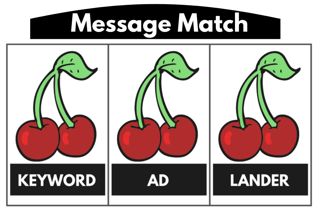
You’ve likely heard about the importance of “message match” (also known as “ad scent” or “congruence”). Message match is really not that complicated. It simply means that the search keyword, ad, and landing page should all be about the same thing.
Think of it this way:
When you read about pitfalls in message matching, it’s often about aesthetics. Maybe a green banner ad drives to a purple landing page. Or a longtail keyword phrase isn’t included verbatim in the headline of the ad or landing page.
Yes, these mismatches can disorient the visitor. And there’s a cost to you as an advertiser. Assets that don’t align can lower your ad relevance and landing page experience, which affects your Quality Score and can raise your cost-per-clicks.
But aesthetic mismatches generally won’t keep me (your target customer) from taking action if I want the offer on the page.
Here’s what will keep me from converting though.
An ad like this one, which promises a great deal on local storage:

Driving to a landing page like this, where the $7/month deal is nowhere to be found:
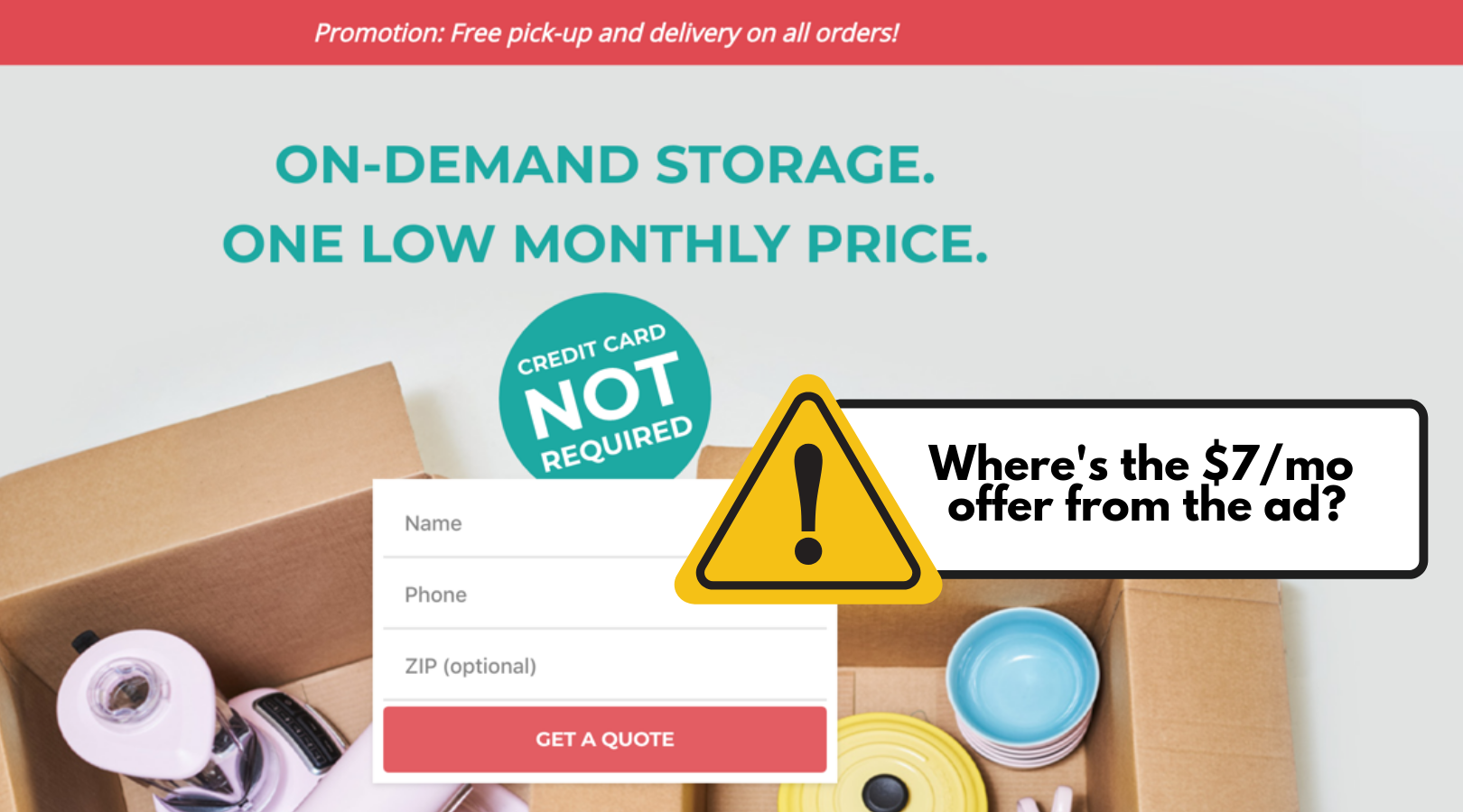
The landing page has some great qualities. It’s pretty and simple with no distractions. It tries to minimize risk by not asking for my credit card too early.
But it doesn’t reflect the offer I saw in the ad, which is why I clicked in the first place. Even after I complete all the forms and quote requests that pop up on the site, I can’t get to a $7/month storage offer.
As a visitor, I feel tricked. I’m mad.
And I’m not going to convert on an ad sequence that doesn’t keep its own promise.
How to fix message mismatch
Don’t put anything in your ad that a visitor can’t easily find on your landing page (dedicated landing pages can really help with this!). And be sure to review your ad groups to make sure offers haven’t expired or changed.
2. You targeted me with your ad but rejected me with your page
Sales teams want sales qualified leads (SQLs) who are ready to buy. Marketing managers want ads with high CTRs and conversion rates. But when MQL and SQL goals collide, it gives visitors whiplash.
Here’s a decent-enough ad about selling houses:

Looks good. I click.
Then I get to the landing page, and I have no idea why I’m here:
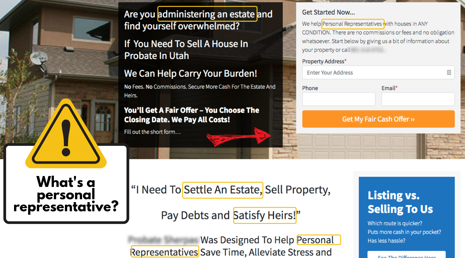
What’s a “personal representative”? Am I administering an estate? I don’t know. Am I supposed to know?
None of these things were mentioned in the ad, and now I’m worried about filling out the form. I don’t know if I’m in the right place, and I don’t feel ready to take the next step.
Where did this marketer go wrong?
I’d guess that the sales team (or business owner) is trying to weed out tire-kickers by tweaking the LP messaging. But when it comes to the Google Ads, “personal representative” takes up too much space and probably drives lower CTRs.
Lots of marketers are afraid to qualify clicks at an ad level because it can translate to a lower expected CTR, which can bring down your Quality Score. But it’s better to pay a little more for fewer qualified clicks than to spend a little less for clicks that won’t convert.
Looking again at our example, the best move for improving conversions depends on the company’s target and goal. If estate administration is an essential characteristic of the audience, it should be included in the ad to attract visitors ready to take action on the LP. If it’s unimportant, there’s no reason to introduce it on the LP.
How to fix targeting conflicts
Your target audience needs to be the same for both marketing and sales departments (and both ads and LPs). Know who you’re trying to reach, and make sure your ads and landing page treat your visitors the same way.
3. You’re asking for my contact info for no good reason
If you’re reading this article, you’ve likely either created or visited landing pages that ask you for your personal information to move forward.
It’s not just your name and email, either. They want to know your company name, size, and revenue. They want your job title, phone number, and maybe even your address or salary.
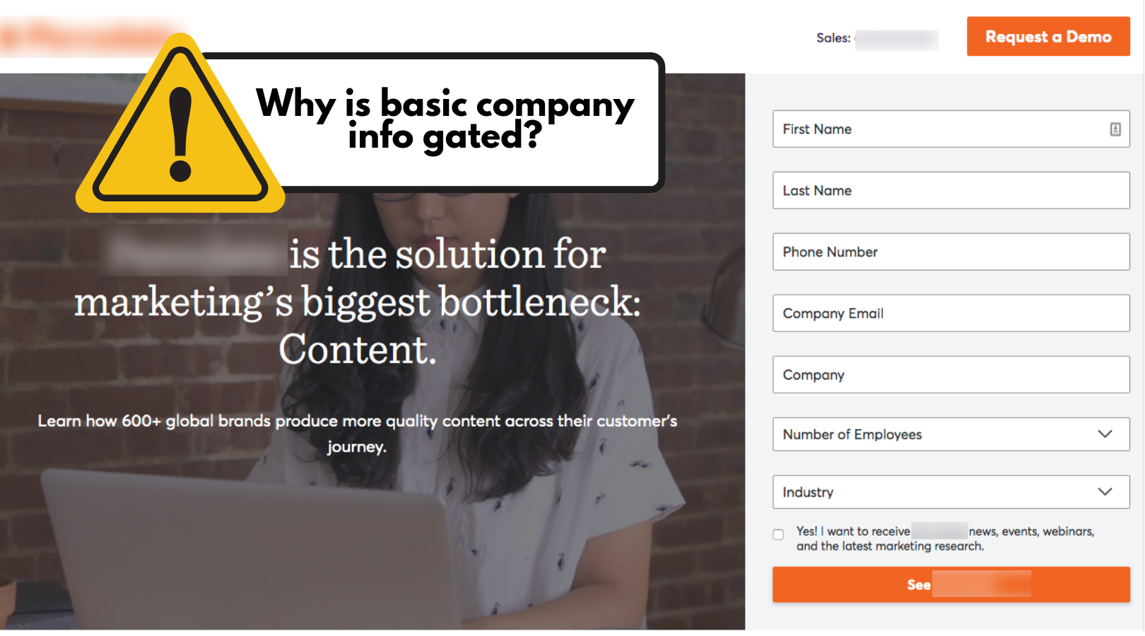
You know how frustrating it is when the information you’re looking for is gated for no reason. If you often find yourself hitting the back button rather than submitting the form, you’re not alone. (Drift even made a great 40-second video showing how aggravating this would be if it happened offline.)
Potential customers who just want to understand what a business does shouldn’t have to pay an entry fee of personal information.
According to a LinkedIn study, in fact, more than 80% of tech buyers skip downloading gated content. That means for advertisers gating their content, the potential pool of converters is just 20% of the traffic they paid for. And since 60% of consumers are providing false personal information anyway, gating basic content is not the most effective way to drive real conversions from real prospects.
So we’re all in agreement that gated content has to go, right?
Not so fast, Billy Ray.
Data-driven marketers who are responsible for lead generation still need to fill their pipeline. There’s a KPI-shaped hole that’s left when campaigns stop collecting email addresses at the door. The solution (and you may be noticing a pattern here) is to bring the focus back to the needs of your target market.
You know the adage, people love to buy but hate to be sold to.
As your future customer, I don’t want you to “capture” my info to call, text, or email me. It’s invasive and backward. Why not let me buy from you on my own terms?
Engaging with motivated buyers like me through conversational marketing or guided selling gives us more control of our own journey so we can become customers faster, without the roadblocks associated with filling out forms.
How to fix gated content
Reduce bounce rates, false information, and wasted time chasing non-buyers by giving your prospects more control over what details they share with you and when.
4. You didn’t tell me how your offer works
The science of landing page design has evolved over the years. We know what moves visitors towards action and what scares them away. Landing page templates now come pre-built with elements based on user psychology and motivation.
One of the big factors keeping people from converting is anxiety. If your visitors don’t understand your offer or know whether they can trust you, they’re unlikely to take action.
Landing page elements like testimonials, client logos, ratings, and security badges ship standard with most templates to help reduce customer anxiety. But social proof and credibility won’t eliminate anxiety on their own.
If I get to your landing page and I don’t understand what your offer is or how it works, I don’t care how many endorsements are rotating through the carousel, I’m not going to convert.
Here’s a landing page about dog training. It has a clear headline with lots of on-page credibility indicators:
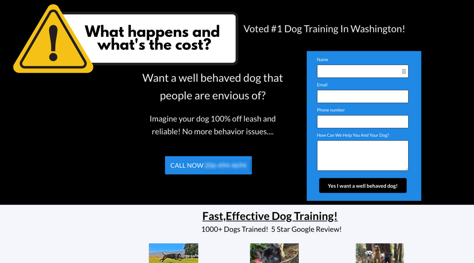
But I don’t know what the offer is:
- How does the training work?
- How much does it cost?
- And how long does it take?
I don’t want to fill out a form (or worse, receive a phone call) only to discover that the dog training is $3,000 or that classes are an hour from my house.
Also, what happens after I click the button?

Are they going to send me a well-behaved dog? Probably not—but I’m 100% unclear as to what happens next, and my anxiety is quickly rising.
To help me feel more interested in taking action, you can start by reworking your page to make sure I can easily answer these questions:
- What is this about?
- Can it help me?
- Do I like it? And do others like it?
- Do I trust it?
- How do I get it?
How to fix offer anxiety
Make sure your landing page and CTA tell your visitor what the offer is about, with enough detail that they can confidently say “yes” or “no” to the next step.
5. You forgot we’re not exclusive yet
Paying for traffic that doesn’t convert is like someone stealing your wallet and then punching you in the face. Losing the money is gut-wrenching as it is, but then it’s painfully personal too.
For as data-driven as you try to be, it’s hard not to feel rejected when you struggle to give your audience just what they’re looking for and pay good money for their ad click—only to have them ghost you on your landing page.
In what I’m going to say next, I may be coining this phrase here in Unbounce’s blog, which would be pretty cool:
A click is not a contract.
Even though you paid for my click, I don’t owe you anything. I’m not on the hook to buy from you or give a reason for leaving early. As a matter of fact, I’m probably clicking other ads. Visiting other websites. Having conversations with other company reps. Exploring other offers.
Most marketers understand I still have free will, but they wrongly believe that once I make it to the landing page, it’s their sale to lose. If you don’t make it clear how your offer makes my life better, I’m going to give my attention—and probably my business—to your competitors who do.
If I were extremely motivated to train my dog, for instance, I might submit the form on the above landing page to see what’s on the other side. But since I have my pick of Seattle dog trainers, I’ll go with one that’s more upfront about how their program works.
A Compare Metrics study revealed that 71% of customers are shopping with a scenario (or problem) in mind, rather than a specific product. Building a page focused on your products and services rather than the needs of your customer is a fast way to lose two-thirds of your business to competitors.
As your potential audience, I care mostly about what’s in it for me (WIIFM). I’ll sell my house with the company that works with everyday homeowners, and not just estate administrators. I’ll choose a storage company with transparent and honest pricing. I’ll work with a brand that answers my questions; not one that tries to push a white paper I never even wanted in the first place.
How to fix presumed exclusivity
Start your process with customer research to better understand your audience. Then check out the offers and landing pages in your space. Where are they getting it right? What context are they giving your market to drive action? Where is your page too quiet in the conversation?
It’s not you, it’s me
I know you’re doing the best you can with the tools you have.
You’re juggling a lot trying to make better ad campaigns, build better landing pages, optimize your funnel, and improve your conversion rates. Just look at everything you’re doing:
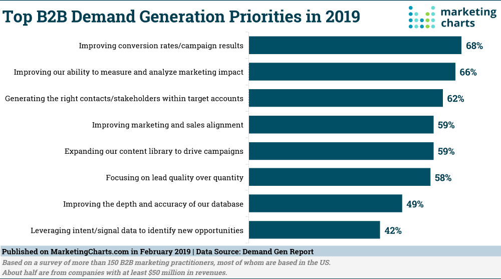
It’s overwhelming. But the good news is that when you focus on your ideal customer (me), your job actually becomes easier.
I’m already interested in your offer. So if you build the page around solving my problems and handling my objections, there’s a very good chance I’ll take the action you want me to take. (The brands that provide the best customer experiences drive 5.7 times more revenue than their competitors, according to Forrester.)
And since your conversion rate and ROI will now be through the roof, you don’t have to waste time running split tests and collecting research on trivial elements that don’t help your visitors convert. Instead, you can spend your time doing more of what works, and less of what doesn’t.
Which just happens to be my favorite definition of “optimization.”
