UX is not just about simplicity and design, it is how users experience a site.
Experiencing a site boils down to three things:
- Getting to the site.
- Exploring content.
- Converting or satisfying a need.
In an organic search journey, this experience manifests through landing on a page from the SERP and clicking through internal links to find related content or convert.
It’s these interactions – the user’s interactions – that showcase just how important the user’s site experience is to SEO.
In an organic search journey, SEO and UX are intertwined through the information architecture and linking conventions used on the site.
So, how can you take SEO data points and turn them into insights that shape your UX?
Let’s explore how “Information Architecture” (the framework of your site) and “Linking Hierarchy” (your site’s pathways or web of links) can be used to create a user experience tailor-made for your user’s needs.
What Is Information Architecture?
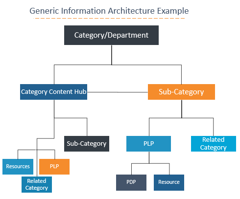
Information Architecture (IA) is the framework, or the anatomy, of a site that provides a home for each piece of content living on it.
IA often references how the site is structured and how the pages are nested, or grouped, together.
Information Architecture is not URL structure.
I repeat: Information Architecture is not the same as folder and subfolder relationships in a URL.
Yes, it can be supported by folders and subfolder in the URL structure, though it is not solely URL-based. It is the bones of the site itself.

What Is Linking Hierarchy?
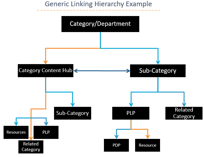
Information Architecture is experienced by users via the site’s Link Hierarchy.
The Linking Hierarchy is the physical connection, or link, between pages within the assigned framework, or architecture. It is the actual path that a user navigates to travel through the site.
The Linking Hierarchy should support the intended Information Architecture, making sure all the pieces are connected. Think of it as no page left behind.

If we look at Information Architecture as our “framework” and the Linking Hierarchy as the “pieces”, we have essentially completed the puzzle to create a map of all the possible user touchpoints on the site.
Pretty cool, right?
Our a href links that pass link equity for spiders also enable our users to navigate our site’s IA.
Because we now have the pieces and the framework, there is only one element left to factor in to optimize your site’s content: How do your users expect to navigate through your site?
Considerations for IA & Linking Design That Improve Conversion & SEO
Now that we have defined Information Architecture and Linking Hierarchy, our primary objective should be to design a clear funnel aligned to the buyer’s journey that allows the user to intuitively navigate the site.
Below are considerations to help you make decisions about how to update content and linking to accomplish this goal:
- Keywords: Use them to inform related content topics/pages that should be linked.
- Intent: Consider user intent when making linking decisions and designing your IA.
- Dead ends: Avoid them. Make the next step in the conversion funnel obvious and provide ways to consider other pieces of information to service their existing funnel position, or go higher in the funnel, if needed.
- Data: Evaluate it to confirm your assumptions and evaluate your funnel.
1. Keyword Strategy Indicates Typical Page Paths
So, how do you know where users want to travel on your site?
Keyword strategy is a big indicator in understanding the user’s desired navigation paths and creating those key page relationships.
The keyword strategy should align the most relevant piece of content with the most relevant search query.
The most relevant search query also has related search queries, and those related search queries have their own most relevant pieces of content.
See how we now have subsets of related pages from leveraging our vast keyword strategy prowess?
Key Takeaway
By organizing your related keywords and aligning them to specific pages, you can create a natural information architecture made up of subsets of related pages.
Linking between these related pages can provide an intuitive and comprehensive experience to users.
2. Leverage User Intent to Win the Conversion Funnel
Another consideration here is user intent. Each piece of related content may service different intents, or goals, of user search. This ranges from top-of-funnel searchers to bottom of funnel searchers. (P.S. If your content is not servicing the varying intents of your user, leveraging user intent might be your next big content opportunity.)
Our linking hierarchy should incorporate ways for users to navigate between levels of the conversion funnel. This reduces the friction that may sometimes occur within the funnel.
A user’s path to conversion is not always linear, so linking to different points in the conversion funnel can reduce friction for the user.
Key Takeaway
By targeting the varying intents of the target audience, you are naturally closing the gaps between those levels and smoothing those transitions in the journey – to top of funnel content or down to bottom of funnel content.
Information Architecture should support a linking hierarchy that aligns content and user intent to foster each stage of the conversion funnel.
3. Avoid Site Exits: Align Experiences to Expectations & Avoid Siloed Experiences
Let’s look at an example that can relate to website strategy: You’ve booked a flight to the Bahamas. The only way to get to the Bahamas is by taking a connection through Miami. T
he first leg of the journey goes smoothly, and you arrive in Miami in your sunglasses, bathing suit, and flip-flops ready to take on the Bahamian sunshine.
Turns out there isn’t actually a flight from Miami to the Bahamas, leaving you stranded. You end up leaving the airport, floppy hat in hand, and take a boat instead.
In this example, the goal was to make it to the Bahamas. Turns out, the path you chose to get there wasn’t what you expected and didn’t provide you with a clear path to reach your goal. So, you went to a competitor.
Now consider this example as a website. If the user cannot easily navigate your links and pages, it doesn’t matter how good your site’s content is or how many queries you rank for because the user is not going to have the experience they expected to have.
They may get stuck on a page without a way forward or backward. They may go down the wrong path for their needs and find themselves stuck in a silo, unaware of other available content.
These common scenarios often lead to site exits.
Key Takeaway
Don’t leave the user stranded. Review your different page paths to ensure that dead ends and silos do not exist at any point of the funnel.
4. Engagement Metrics Signal Users’ Site Satisfaction
You can even take your optimizations a step further by understanding the user engagement metrics.
Take a look at your analytics and see how your users interact with your site. Let them tell you what they want.
- Where do they go?
- How did they get there?
- At what point did they exit?
- What path led to your specific KPIs?
User engagement metrics might be one of the most powerful tools in the SEO toolbox.
They provide insights directly into how target users navigate through, resonate with, and how satisfied they are with the experience you provide.
Here are some common questions that these metrics can help to answer:
- User Click Paths
- What is the natural flow users take through the site?
- Where are clear exit and entry points?
- Are there dead-ends?
- Do the users experience any friction or confusion when navigating a section of the site?
- Bounce Rate: Keep in mind that a low click page with low bounce rate can be more valuable than a high click page with a high bounce rate.
- Why are people bouncing off our high click page?
- Is the experience provided here aligned to the expected experience?
- Does this content resonate with the user?
- Are there ways for a user to navigate deeper into the sight?
- Is there a clear path to the logical next step?
- Time on site
- Does avg. time on site make sense with the content type?
- What do pages with longer TOS have that shorter TOS pages don’t?
- Pages Per Visit
- Are users making it past page one?
- What features, structure or attributes exist on pages with higher PPVs?
- Click-Through Rate
- Is the title working?
- Does the intent meet the expectation?
- Does the meta description accurately reflect the page?
Sometimes users do not do what you expect them to do, and that’s OK.
Each one of these elements gives us a valuable piece of insight you can use to improve your user experience with tweaks to the site structure (linking), keyword strategy iterations, content additions, and much more.
Key Takeaway
Use analytics data to back up, and improve, your strategy to ensure you’re servicing your users in the best way possible.
Think:
- What’s the most relevant piece of content that would provide value here?
- How can you optimize this page to better support the users need?
Conclusion: Leverage Your Users’ Experience Onsite to Create a Better UX
Providing the right experience at the right time is the key to taking the user past the landing page and closer to conversion.
Support user click-paths by aligning keywords to intents, intents to content, content to pathways.
Let your information architecture provide the structure for your pathways to be connected, without islands, and implement those connections through a well-optimized linking hierarchy.
The goal of UX is to create the best possible experience for your users.
Optimal Information Architecture creates a linking hierarchy that supports the users’ natural flow onsite while optimizing for the conversion funnel.
When you work to understand your users wants and needs to provide them the experience they expect when they land from the SERP and facilitate their journey through the site, you create a positive user experience tailored to your specific users.
More Resources:
Image Credits
Screenshots taken by author, August 2019
