It’s hard to believe Facebook is no longer the cool network. Younger consumers aren’t even getting Facebook accounts. It’s Instagram and Snapchat that appeal to the younger crowd.
Facebook presumably thought of this years ago, which is why, in 2012, it acquired Instagram. Thus younger generations may only have only an Instagram account, but they’re still plugged into the Facebook advertising ecosystem, available to target.
If your audience skews younger, your brand has to be on Instagram — even if you’re not advertising. If you have an image-heavy brand, or you use photos and video to tell the story that sells your brand, you need to be on Instagram. If your brand falls into both of those categories — younger audience and image-heavy messaging — Instagram is your new primary medium of communication with customers and prospects.
… younger generations may only have only an Instagram account, but they’re still plugged into the Facebook advertising ecosystem …
Why focus on Instagram and not Snapchat? As a social media marketer, I’ve found that Snapchat is for big brands and advertisers with large budgets. Given the limited timeframe of the Snapchat messages — and no brand page with long-term content — you have to put in a lot of constant work, and reach people at the exact right moment, which is difficult.
Snapchat’s self-service ad platform is growing. But some advertisers report that the platform is not effective at driving a direct action, such as signups or sales. Moreover, Facebook and Instagram offer Snapchat-like features — think stories — than Snapchat does itself. And since Instagram is more established with the support of Facebook, it’s the better choice, in my experience.
Instagram: Dos, Don’ts
Instagram ads are managed in the Facebook ad platform. The process for advertising on Instagram is the essentially the same as on Facebook, including targeting options. Only the placement selection is different.
When it comes to composing your ads for Instagram, consider these pointers.
- Keep the text brief. With Instagram, you have only two or three lines before the … appears and users have to tap to expand the text. Always keep your text shorter than that. If you have to include more, insert the most important words upfront.
- Get to the point with video. Remember that users are scrolling through a feed. So emphasize the first three seconds of your video, to capture users’ attention. Otherwise you might lose them.
- Be careful with the carousel format. Stick to using the carousel format for remarketing, but not for prospecting as there’s not enough visible information.
- Scrutinize your landing page. Remember that Instagram users are likely browsing on a phone — advertisers can even target specific makes and models of phones. So make sure your landing page looks good on mobile and on an in-app browser, as that’s what will load.
- Change images often. Creative fatigue is real on Instagram. Don’t run your ads for too long. The length varies depending on the brand and the message, but generally do not exceed two weeks per ad.
Instagram Ad Examples
Gekks sells “No Show Sock for Flats, Loafers, & Sneakers.” While the bright green background (below) attracts attention, it blends into the green lining of the sock. The ad is an animated GIF, with the sock moving up and down slowly. It doesn’t make sense. The text is descriptive — “Don’t let sockless stench steal your mojo. Elevate your sock game … “— but not enough to interest me. Gekks should pick a more contrasting image, ditch the GIF, and move to a slideshow, showcasing real people using the product.

This ad from Gekks for socks could use some work. The colors blend into each other, and the ad does not show people using the product.
—
The ad for Gravity Blankets, below, uses a slideshow. The ad features an image of the product in three formats: neatly laid out, in use, and messy. The text is long — “Throw away your comforter. The Gravity Cooling Blanket is your new go-to for … ” — but what’s visible is a hook. It prompts me to want to learn more.

This ad from Gravity Blankets shows the product in three ways, including people using it.
—
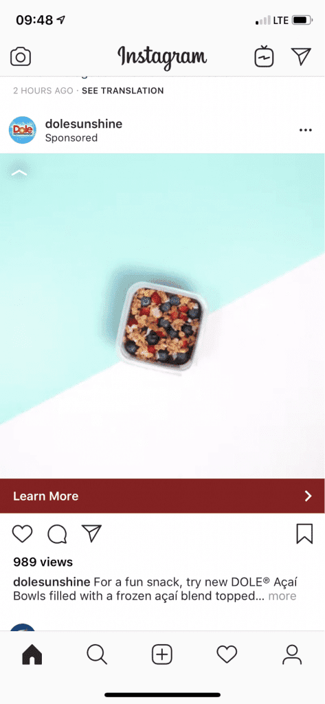
This ad from Dole, below, features a GIF of the individual fruit items moving in and out of the bowl. It’s quick and grabs my attention. The text is informative and direct — “For a fun snack, try new DOLE Açaí Bowls filled with a frozen Açaí blend topped … .” I know exactly what it is.

This ad from Dole features a GIF of the individual fruit items moving in and out of the bowl. It’s quick and grabs attention.