Maybe you’ve been here: You’re building a new email but don’t have a clue what the subject line should be when you start. You want to jump ahead to the design step, so you drop some random text into the subject line field of the campaign builder. And while you plan on going back to switch it out, you forget and end up sending the email.
Or maybe you’ve sent an email to the wrong list or segment, because you forgot to go back to the recipients step and change it after updating your content for a different audience. You’re not alone—here at MailChimp, we’ve had a few bloopers of our own.
If you’ve been using MailChimp to send email campaigns for a while, you know that our campaign builder is a series of steps that need to be completed in a specific order: You choose your list, write your subject line, add your content, and so on.
But as we started expanding into other channels, we found that the linear process for building an email wasn’t the best design for new features like Facebook and Google remarketing ads and landing pages.
And when we talked with customers about the step-by-step process, we learned that it wasn’t the right solution for everyone. “The campaign builder makes us finish steps we’re not ready for,” is something we heard a lot. So, we decided it was time to update the way emails are built in MailChimp.
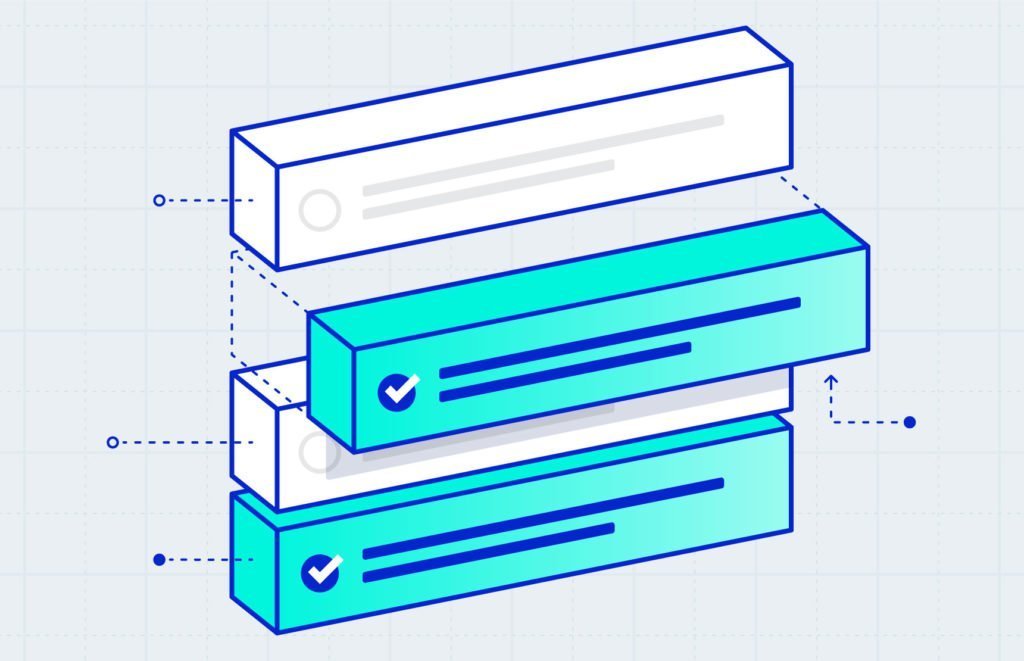
Here’s how we redesigned the campaign builder to look and work like a checklist, giving you the power to create an email in any order you want.
A check off your list
Whenever we’ve made enhancements to the campaign builder over the years, we’ve either added new features or improved ones we already have. In the past 2 years alone, we introduced web fonts, added the ability to insert background images into basic templates, and created drag-and-drop product content blocks to name a few.
But this is the first time we’ve taken a step back to look at the experience of using the builder as a whole.
We know that our customers have different roles, different skill sets, and different needs. If you run your own business, for example, you probably don’t have an expert marketer sending your emails.
Our main goal for introducing the checklist editor was to make creating and sending an email easier by showing the different components of your campaign—including a quick preview—all in one place.
This new design gives you more control over the way you build your emails, so you can feel more at ease before your sweaty finger hits the send button.
Before making this big change, we took some time to test the checklist on our newer features. Now, we’re ready to roll out the new campaign builder to all users, and you should see it in your account in the next few days.
More options for sharing
Sharing your campaign on social media is a great way to get more people to see it, especially folks who aren’t subscribed to your list. In the new campaign builder, we made auto posting to Facebook and Twitter even simpler. Choose whether you want to share your email on one or both platforms, then quickly tailor the message for your post.
And instead of including the URL for your campaign archive page, you can link to your store, your website, or even your MailChimp landing page to drive traffic from different channels in a single campaign.
Get to work on your next campaign
Over the past few months, a beta version of the new campaign builder has been available for people to switch to at any time. In fact, over 1.5 million customers have already sent 2.3 million campaigns using the new builder.
They’ve also given us lots of great feedback and have some nice things to say about its efficiency and design.
Now that the new campaign builder will be available to everyone in the next few days, we’d like to know what you think. So create an email and give us your feedback. We’ll continue refining the checklist to make the process even better.

